Telecommunications Software & SaaS Professional Website Template
Signal is a dark, data-dense telecommunications landing page template built for mobile app lead generation. It opens with a zip code input tool surrounded by animated teal signal rings, then scrolls through a carrier coverage grid, savings comparison table, and dead-zone heat map. Every section feels like a live dashboard, guiding visitors toward a progressive lead capture form.
by Rocket studio
Quick summary
Signal is a single-page, dashboard-style landing page template designed for a telecommunications discovery app. It leads with a functional zip code tool, then reveals carrier data, savings comparisons, and coverage maps as the visitor scrolls. The layout uses a dark Network Operations Center aesthetic, a teal-and-magenta color system, and a progressive lead form built to reduce friction at every step.
Who this template is for
This template is built for teams launching a telecommunications mobile app that helps users compare wireless carriers and plans. It fits products where the tool itself is the best sales argument.
- Mobile app founders or product teams targeting US wireless consumers
- Telecommunications software companies offering coverage discovery or plan comparison tools
- Marketers running lead generation campaigns for multi-line or family plan switchers
What problem this template solves
Most telecommunications landing pages push features at visitors before proving the product works. Signal flips that approach. The visitor's first action on the page is entering a zip code, which means the app demonstrates real value before any persuasion copy appears.
- Families paying over $180 per month on bloated wireless plans need proof of savings, not promises
- Remote workers on capped "unlimited" plans need to see actual throttle thresholds and real coverage data
- Small business owners juggling multiple lines across several carriers need a clear, ranked view of their options
What you get with this template
You get a fully structured, single-page lead generation layout with six distinct content sections. Each section is designed to feel like a new tab loading inside a dashboard the visitor already controls.
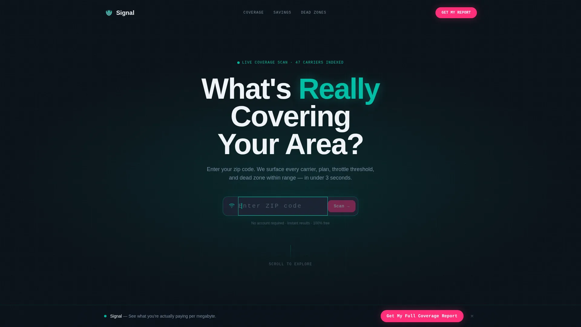
- A hero section with a live-looking zip code calculator, animated teal signal rings, and a radial glow header
- A carrier coverage grid, a savings comparison table, a dead-zone heat map section, a social proof block with a progressive lead form, and a horizontal flow footer
- A sticky bottom call-to-action bar, a secondary SMS opt-in path, and progressive form disclosure that surfaces one field at a time
Feature list
This template includes a focused set of interactive and visual components. Each one serves the lead generation goal without adding clutter.
Zip Code Hero Calculator
The header is a full-bleed dark viewport with a centered zip code input field. A blinking cursor and concentric teal signal rings at 15% opacity make it feel live. The headline "What's Really Covering Your Area?" fades in above the input, and the visitor's first interaction is already the product working.
Carrier Coverage Data Grid
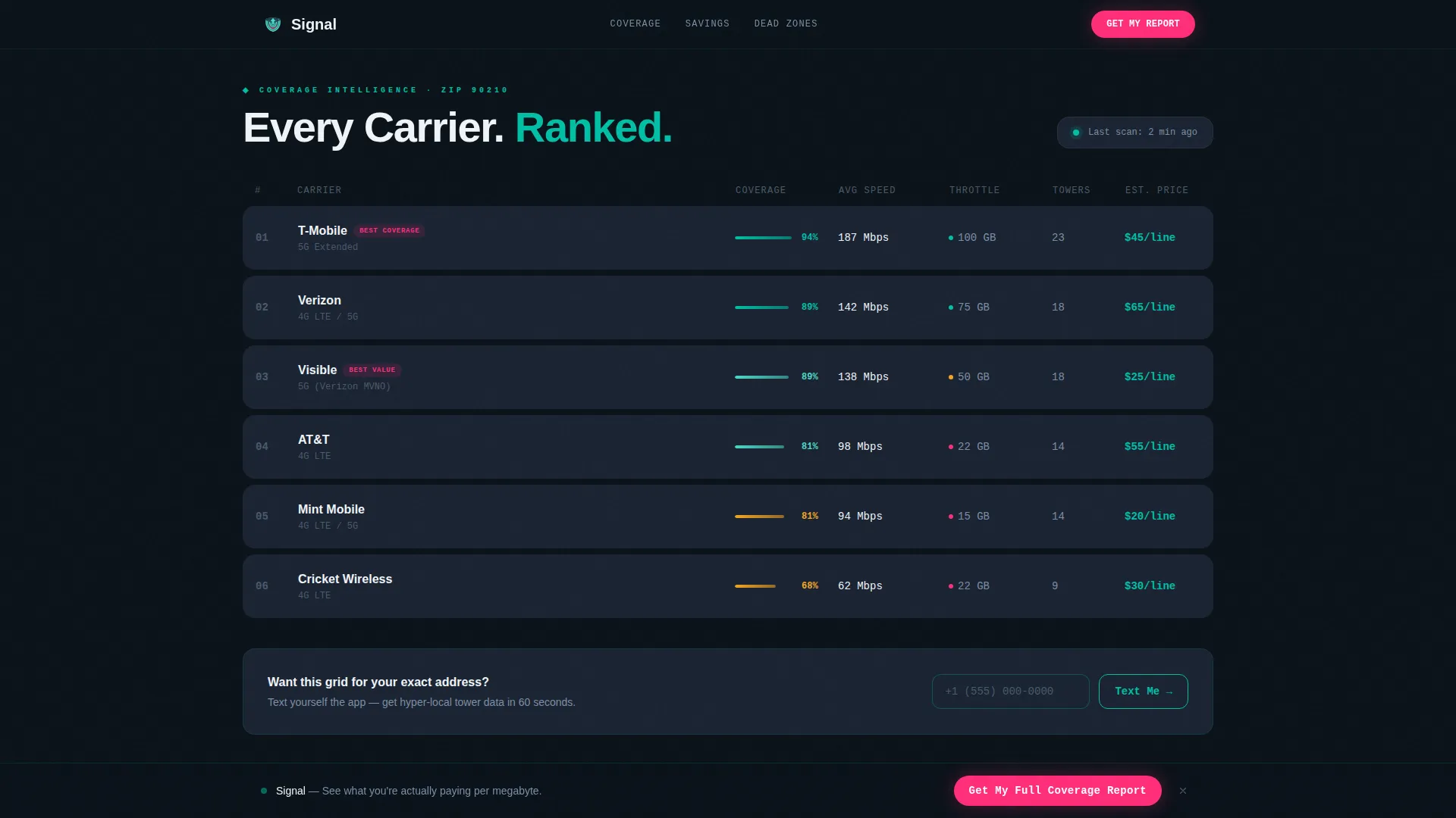
Below the hero, a ranked data table displays carriers sorted by actual coverage strength. Each row includes signal strength bars and hover states that highlight on interaction. Staggered grid reveals triggered on scroll make the data feel like it is loading in real time.
Savings Comparison Table
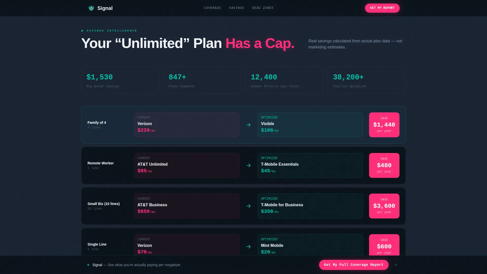
A side-by-side table shows the visitor's estimated current monthly spend versus optimized plan options. Magenta callouts highlight the savings figures, drawing the eye to the most compelling numbers in the layout.
Dead Zone Heat Map Section
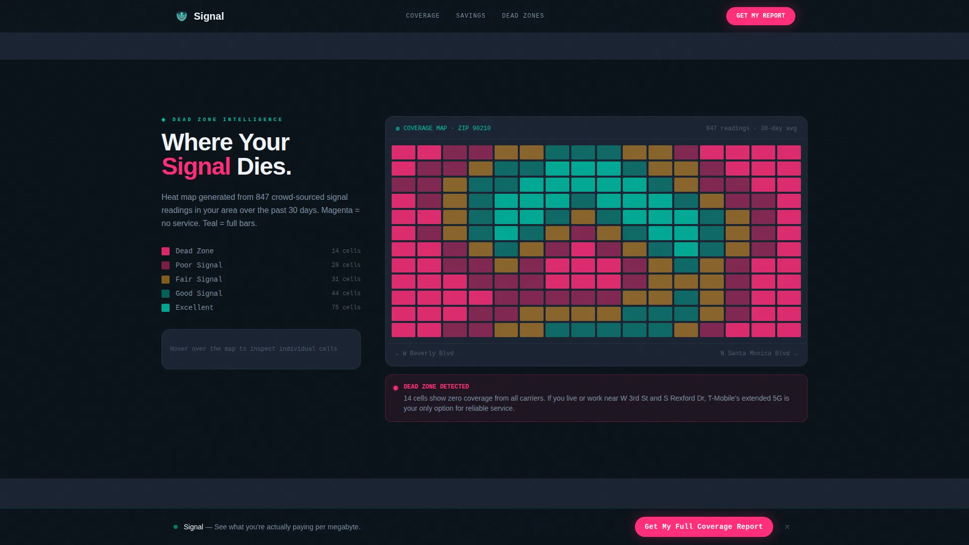
A visual coverage map uses a magenta-to-teal gradient overlay to show where dead zones exist in the visitor's area. This section makes invisible coverage gaps tangible and gives the app's core value a spatial, easy-to-read format.
Progressive Disclosure Lead Form
The primary lead form collects information one field at a time. Zip code comes first (already captured in the hero), followed by email, current carrier from a dropdown, and household line count. Each field appears only after the previous is completed, keeping friction as low as a single keystroke per step.
Sticky Call-to-Action Bar
After the first scroll interaction, a sticky bottom bar activates with a magenta "Get My Full Coverage Report" button. It stays visible throughout the page, giving visitors a consistent conversion path without interrupting the dashboard scroll experience.
Page sections overview
| Section | Purpose |
|---|---|
| Hero Zip Calculator | Captures zip code input and introduces the app with animated signal rings and a radial teal glow |
| Carrier Coverage Grid | Displays ranked carrier data with signal strength bars and scroll-triggered staggered reveals |
| Savings Comparison Table | Shows current versus optimized plan costs with magenta savings callouts |
| Dead Zone Heat Map | Visualizes coverage gaps using a magenta-to-teal gradient map overlay |
| Testimonials Lead Form | Combines social proof with the progressive disclosure lead capture form |
| Footer | Horizontal flow footer pattern for navigation and secondary links |
Design & branding system
The visual identity follows a Directory and Discovery theme expressed through the Teal Catalyst color system. Every design choice reinforces the feeling of a live Network Operations Center running at 2 AM.
- Core palette: deep comm-tower black (#0B1219) for backgrounds, operational teal (#00BFA6) for active elements and signal rings, slate panel gray (#1A2332) for card surfaces, and hot signal magenta (#FF2D78) reserved strictly for alerts, savings callouts, and primary calls to action
- Typography: DM Sans for all interface and body text, JetBrains Mono for data values and numbers, creating a clear visual split between narrative and technical information
- No stock photography or phone mockups appear anywhere on the page; the tool, the glow, and the data carry the entire visual story
Mobile & speed optimization
This template is built mobile-first because its target users are on phones actively comparing wireless plans. The layout prioritizes thumb-friendly tap targets and readable data grids at small screen sizes.
- Progressive form disclosure keeps the mobile input experience minimal, with one field visible at a time to reduce scroll fatigue on small screens
- The sticky call-to-action bar is positioned at the bottom of the viewport, placing the primary conversion action exactly where a thumb rests on a phone
How this template helps you convert
The page is structured so that conversion pressure builds naturally through demonstration rather than persuasion. By the time a visitor reaches the lead form, the app has already delivered real value once for free.
- The hero calculator captures zip code intent immediately, turning the page's first interaction into a product trial that requires no signup
- The savings comparison table and dead-zone heat map build urgency by showing specific cost gaps and coverage problems in the visitor's own area, making the "Get My Full Coverage Report" call to action feel like the logical next step
Other information about this template
This template was designed for the telecommunications mobile app niche within the broader Technology category. It is specifically suited to software and software-as-a-service products in the telecommunications discovery space.
- The template style is Dashboard and Data Grid, matching the data-dense, ranked-list experience that carrier comparison tools require
- Animation is handled through GSAP ScrollTrigger for pulsing rings, count-up numbers, and staggered grid reveals; interactivity includes hover states on data rows and a reactive progressive form
- A secondary conversion path, an SMS opt-in asking only for a phone number, is placed beside the carrier comparison grid where visitor intent is highest
- Social proof blocks include specific savings amounts, named users, line counts, and carrier names to ground the testimonials in real-world detail
- The template is localized for United States audiences, using US zip codes, USD pricing, and US carrier references in its data grid and comparison table structures
Theme
Directory & Discovery
Creative direction
Calculator/Tool First
Color system
Teal Catalyst
Style
Dashboard/Data Grid
Direction
Lead Generation
Page Sections
Zip Code Hero Calculator
Ranked Carrier Coverage Grid
Savings Comparison Table
Dead Zone Heat Map
Progressive Disclosure Lead Form
Sticky Call-to-action Bar
Related questions
What kind of app is this template designed for?
Does the template include a lead capture form?
What makes the hero section different from a standard header?
Is there more than one conversion path on this page?
Who is the target audience this template is designed to reach?



