Ground Station Network Landing Page Template
Signal is a single-page landing page template built for space communication service providers. It combines an isometric signal-chain header, zigzag alternating sections, and an inline link budget calculator to guide technical buyers from curiosity to conversion. The warm-stone color system and mission-console aesthetic make complex infrastructure feel approachable and credible.
by Rocket studio
Quick summary
Signal is a precision-built landing page template for ground station network operators. It uses a zigzag layout to walk visitors through the full signal chain, section by section. A comparison-first conversion strategy and an inline link budget calculator help technical buyers see their own numbers, not just marketing claims.
Who this template is for
This template speaks directly to operators and teams that live in the intersection of orbital mechanics and business reality. It is designed for people who understand link budgets, contact windows, and the cost of a missed pass.
- Commercial satellite operators managing contact window schedules
- NewSpace startups commissioning their first low Earth orbit constellation
- University CubeSat teams that need a reliable ground link after launch
What problem this template solves
Selling ground station access to a technical audience requires proof, not promises. Most generic templates cannot carry the credibility weight that aerospace buyers demand before they share orbit parameters with a vendor.
- Generic layouts bury specification data instead of leading with it
- Visitors cannot self-qualify without seeing their own mission numbers reflected back
- Side-by-side comparisons against legacy providers are absent, leaving buyers guessing
What you get with this template
The template delivers a full single-page layout structured as a physical journey along the signal path. Every section is designed to accumulate technical evidence as the visitor scrolls.
- An isometric cutaway header showing the complete signal chain with data callouts for frequency bands, latency figures, and link margins
- Five or more zigzag alternating sections styled as distinct "rooms" in the ground station architecture
- An inline link budget calculator and a detailed eight-metric versus table for direct provider comparison
Feature list
This template ships with purpose-built components for the space communication niche. Each one earns its place by serving a specific buyer need.
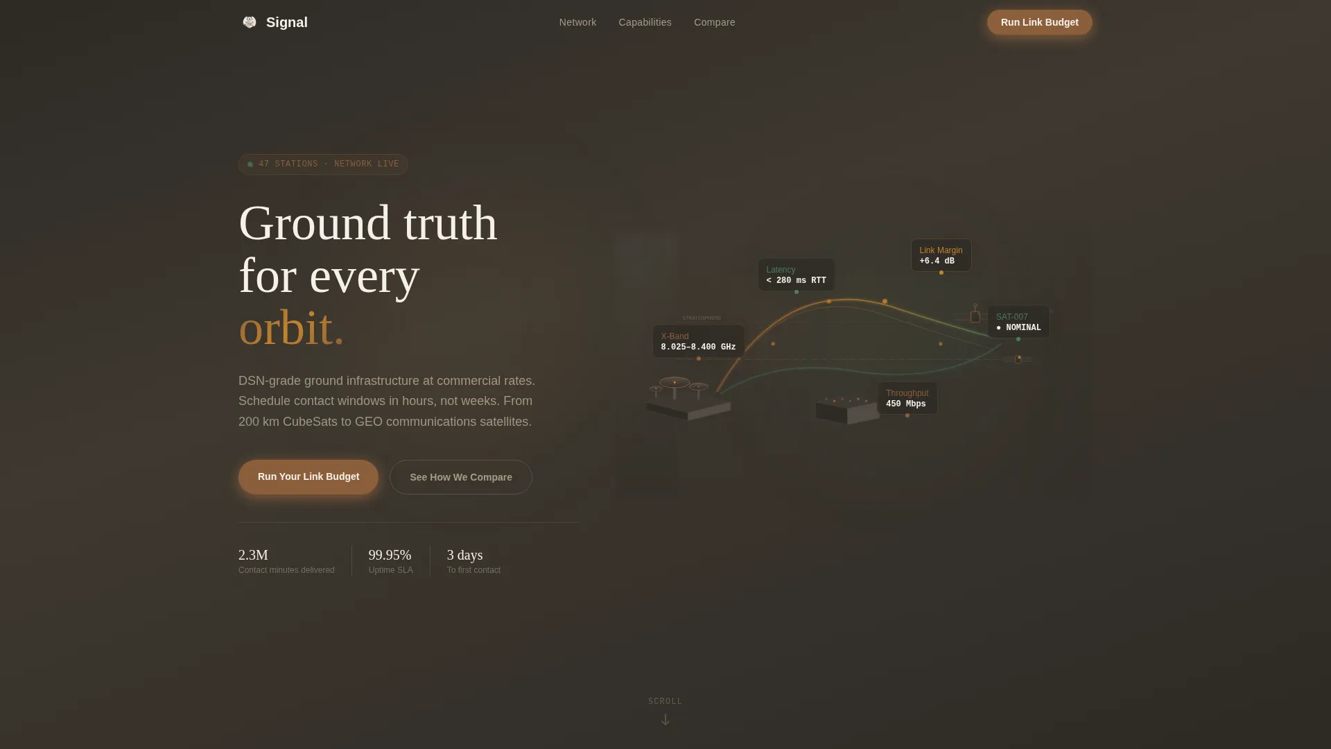
Isometric Signal-Chain Header
The header renders the full ground station architecture as a tilted, architectural-model cutaway. Antenna arrays sit on the left, satellites pulse on the right, and the signal path arcs between them through atmospheric layers. Floating data callouts display frequency bands, latency figures, and link margins directly on the diagram, giving the impression of a live engineering schematic.
Zigzag Alternating Section Layout
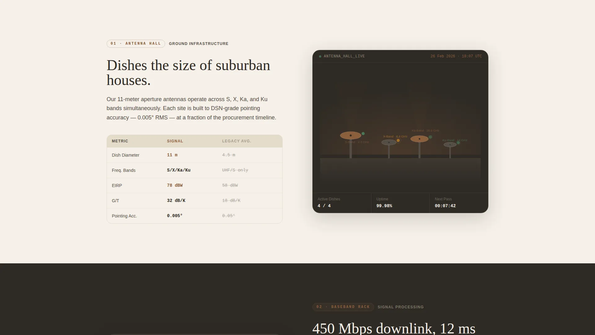
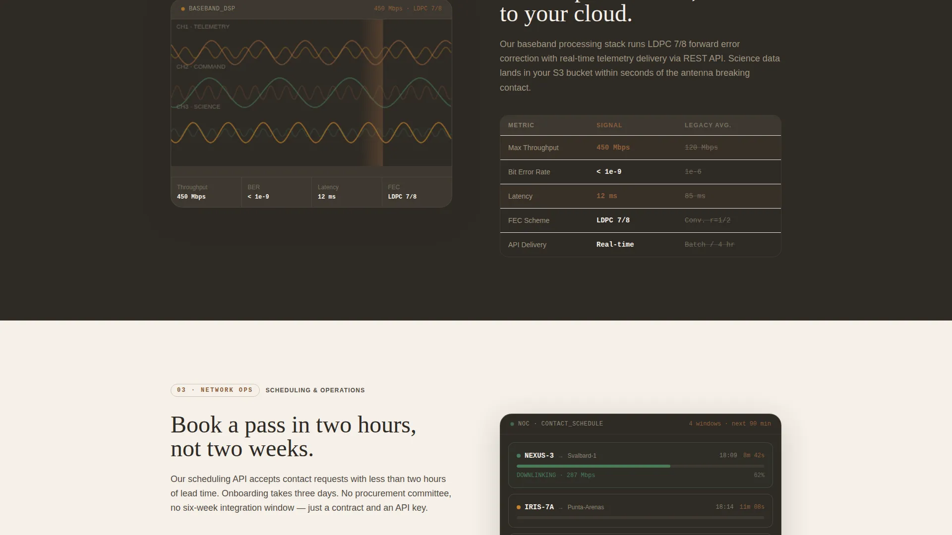
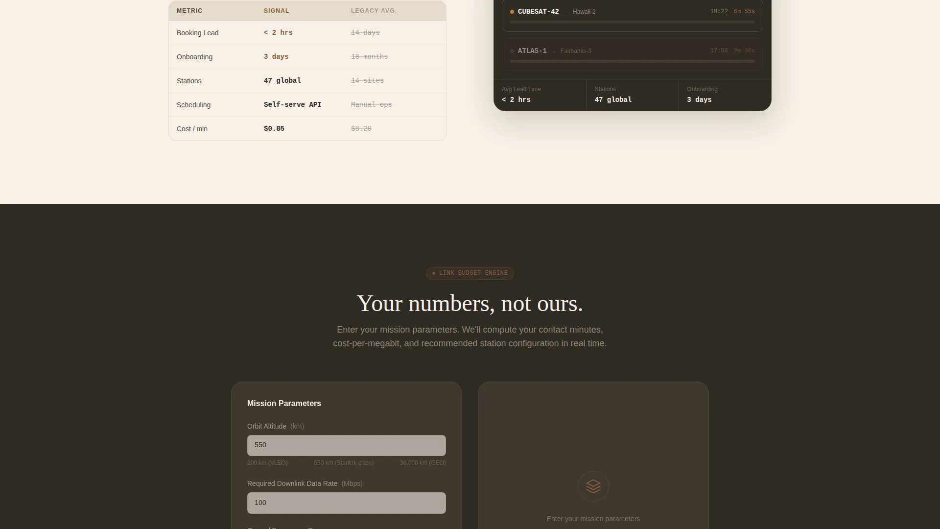
Left-right alternation mirrors the physical ping-pong of uplink and downlink signals. Each section functions as a distinct room in the ground station architecture: the antenna hall, the baseband processing rack, the network operations floor, and the orbital relay. This spatial narrative keeps scroll momentum high and grounds technical content in a familiar physical metaphor.
Inline Link Budget Calculator
Positioned after the third zigzag section, the calculator lets visitors input orbit altitude, data rate requirement, and number of ground passes per day. The tool returns the visitor's own mission numbers, shifting the page from a sales pitch to a proof exercise. The primary call to action, "Run Your Link Budget," opens this calculator inline.
Side-by-Side Specification Blocks
Every zigzag section pairs the operator's system against legacy providers in specification blocks. Metrics include contact minutes per pass, cost per megabit downlinked, scheduling lead time, and onboarding weeks. Visitors accumulate comparative evidence with each scroll rather than landing on a single crowded table.
Eight-Metric Versus Comparison Table
A dedicated lower-page section benchmarks the service across eight performance metrics. The secondary call to action, "See How We Compare," anchors directly to this table. The structured layout makes it straightforward for procurement teams to copy figures into their own evaluation sheets.
Warm Stone Dashboard Branding System
The entire page uses a consistent four-color identity: sandstone base, mission-console charcoal, deep sienna for interactive elements and comparison highlights, and parchment white for card surfaces and data panels. The result is a control-room aesthetic that feels precise without feeling cold.
Page sections overview
| Section | Purpose |
|---|---|
| Isometric Hero Header | Visualize the full signal chain with live-status data callouts |
| Antenna Hall Section | Introduce ground infrastructure with specification comparison block |
| Baseband Processing Rack | Explain signal processing with side-by-side legacy comparison |
| Network Operations Floor | Show scheduling and contact window management capabilities |
| Orbital Relay Section | Cover satellite-side link details and constellation support |
| Link Budget Calculator | Let visitors calculate mission numbers using their own parameters |
| Versus Comparison Table | Benchmark service on eight metrics against legacy providers |
| Final Call to Action | Close with primary and secondary conversion prompts |
Design & branding system
The visual identity is built around the Dashboard Pro theme using a Warm Stone color system. The palette sits between an adobe observatory and a mission operations center, blending analog warmth with digital precision.
- Sandstone base (#D4C5A9) and parchment white (#F5F0E8) create warm, readable card and panel backgrounds
- Mission-console charcoal (#2E2A25) anchors text and structural chrome with weight and authority
- Deep sienna (#8B5E3C) highlights interactive elements, comparison callouts, and conversion touchpoints
Mobile & speed optimization
The layout is structured for clean reflow across screen sizes. Zigzag columns stack vertically on smaller viewports without losing the spatial narrative.
- Isometric header scales with subtle depth-of-field blur preserved at edges for visual coherence
- Specification blocks reformat as stacked comparison cards on narrow screens
- The inline calculator maintains full input functionality at mobile widths
How this template helps you convert
The page is built around a Comparison/Versus conversion strategy. Every design choice pushes the visitor toward a decision backed by their own data.
- The zigzag scroll accumulates technical proof section by section, so credibility builds naturally before any call to action appears.
- The "Run Your Link Budget" calculator makes the conversion moment personal. Visitors commit after seeing numbers that reflect their actual mission, not a generic pitch.
Other information about this template
Signal fits naturally into the Aerospace and Defense category, specifically the Space and Satellite subcategory. It is purpose-designed for the space communication system niche where buyers are engineers, not marketers.
- The template style is Zigzag/Alternating, the theme is Dashboard Pro, and the creative direction is Spatial and Architectural
- The header concept is Isometric, delivering an architectural-model perspective tilted at thirty degrees with depth-of-field edge blur
- The landing page direction is Comparison/Versus, with the primary call to action placed after the third zigzag section where technical credibility peaks
- The Warm Stone color system draws from terracotta and adobe architecture, making it distinctive within a category that typically defaults to cold blues and dark grays
Theme
Dashboard Pro
Creative direction
Spatial & Architectural
Color system
Warm Stone
Style
Zigzag/Alternating
Direction
Comparison/Versus
Page Sections
Isometric Signal-chain Header
Zigzag Alternating Section Layout
Inline Link Budget Calculator
Side-by-side Specification Blocks
Eight-metric Versus Comparison Table
Warm Stone Dashboard Branding System
Related questions
Who is this landing page template designed for?
What makes the inline calculator important for conversion?
Can this template be adapted for a different space communication niche?
How does the eight-metric comparison table work within the page?
What does the Warm Stone color system bring to an aerospace landing page?


