Signal - Ruthless Telecom Landing Page Template
Signal is a Bold Brutalist landing page template built for telecommunications AI lead scoring platforms. It guides VP-level sales ops leaders and revenue operations teams through a Problem-to-Solution arc, using a Feature Tab Switcher header, an interactive waste calculator, a versus comparison table, and a qualification form to drive pilot sign-ups.
by Rocket studio
Quick summary
Signal is a single-page, hub-and-spoke landing page template designed for a machine-learning lead scoring platform in the telecom sector. It walks high-intent buyers through a tight Problem-to-Solution narrative, quantifies wasted pipeline with an interactive calculator, and closes with a direct pilot sign-up form. Every design choice is uncompromising, industrial, and built to convert.
Who this template is for
This template is purpose-built for telecom-sector sales and revenue teams who need to communicate a complex AI product with urgency and authority. It speaks directly to buyers who already feel the pain of wasted rep time and want a credible, fast path to a solution.
- VP-level sales operations leaders at regional carriers evaluating lead prioritization tools
- Enterprise account directors and revenue operations teams at managed-service providers and MVNOs (Mobile Virtual Network Operators) who are missing quota because reps spend the majority of their day on low-probability leads
What problem this template solves
Most AI platform pages bury the value proposition under generic copy and soft visuals. For a telecom lead scoring tool, that approach kills credibility before the first scroll. Signal solves the presentation problem by structuring every section around a buyer who is already frustrated and needs proof fast.
- Reps wasting roughly sixty percent of their day dialing leads that will never convert, with no clear way to show the revenue cost to a skeptical executive audience
- Generic platform pages that fail to differentiate a telecom-specific scoring model from broad CRM scoring or one-size-fits-all intent tools
What you get with this template
Signal delivers a fully structured, single-page layout with clearly defined spoke sections, interactive components, and a conversion-focused form. Every element is wired to the Problem-to-Solution narrative so the page reads like a coherent argument, not a feature dump.
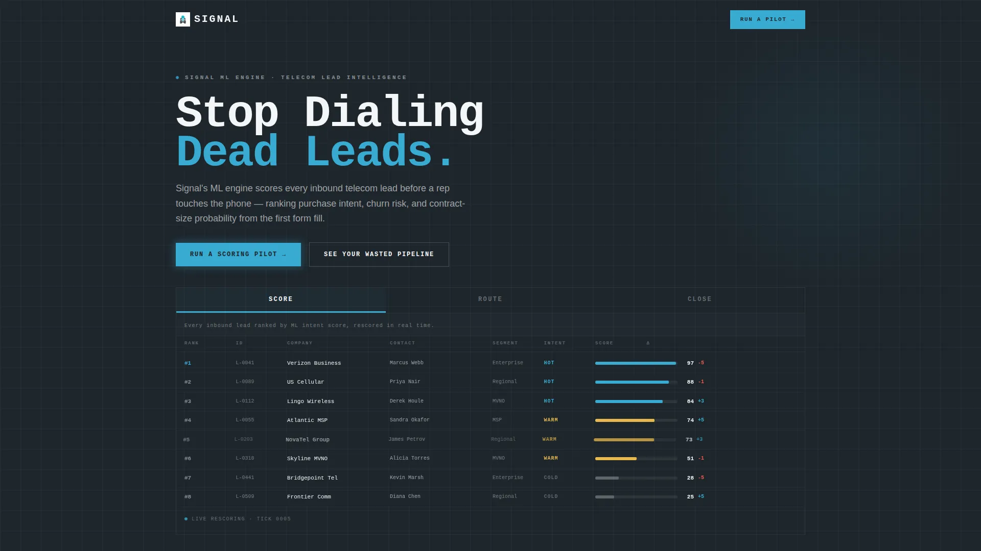
- A Feature Tab Switcher header with three brutalist tabs (SCORE, ROUTE, CLOSE), each revealing a distinct live-data animation panel
- An interactive revenue waste calculator, a three-layer architecture diagram, and a six-dimension versus comparison table
- A primary qualification form ("Run a Scoring Pilot") capturing carrier type, current CRM, and monthly lead volume, plus a secondary email-capture path ("See Your Wasted Pipeline") linked to the calculator
Feature list
This template packages its core capabilities into distinct, independently scannable components. Each one serves a specific moment in the buyer's decision journey.
Feature Tab Switcher Header
Three brutalist concrete tabs labeled SCORE, ROUTE, and CLOSE anchor the top of the page. Each tab reveals a different live-data animation: a lead list re-ranking in real time, leads auto-distributing into rep queues by territory, and a pipeline funnel collapsing to a tight band of high-probability deals. The headline "Stop Dialing Dead Leads" sits in 80-pixel knockout white directly above the active animation.
Problem-to-Solution Spoke Architecture
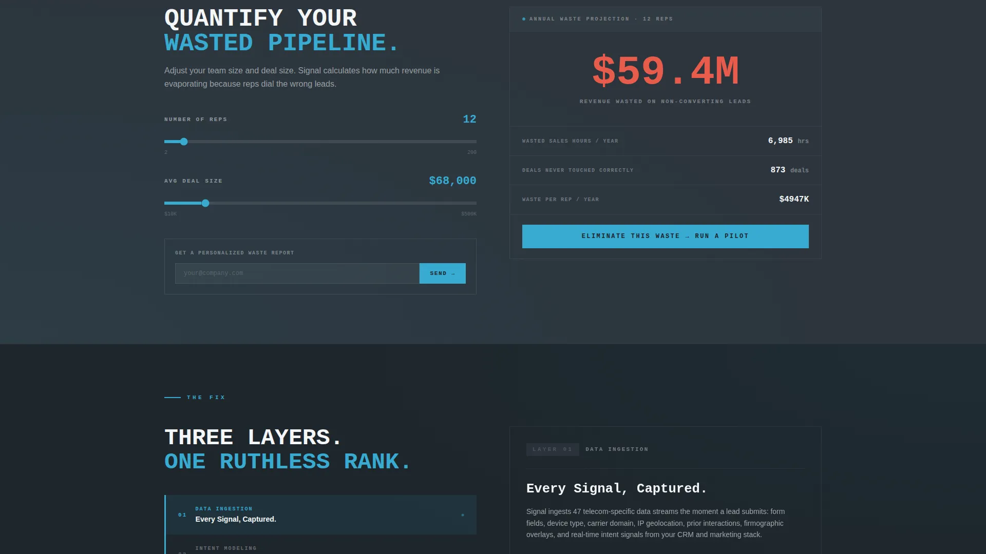
The anchor navigation locks to the top and guides visitors through three escalating spokes. THE PROBLEM delivers a single damning stat as a massive typographic slab. THE COST opens an interactive calculator. THE FIX presents a three-layer scoring diagram covering data ingestion, intent modeling, and score output. Hard-cut transitions between spokes replace fades, keeping the pace aggressive and the energy high.
Interactive Revenue Waste Calculator
Visitors input their rep count and average deal size to see a real-time estimate of wasted revenue. This component doubles as a low-commitment entry point: the "See Your Wasted Pipeline" secondary call to action captures an email address in exchange for a personalized waste report, building a lead path outside the primary form.
Six-Dimension Versus Comparison Table
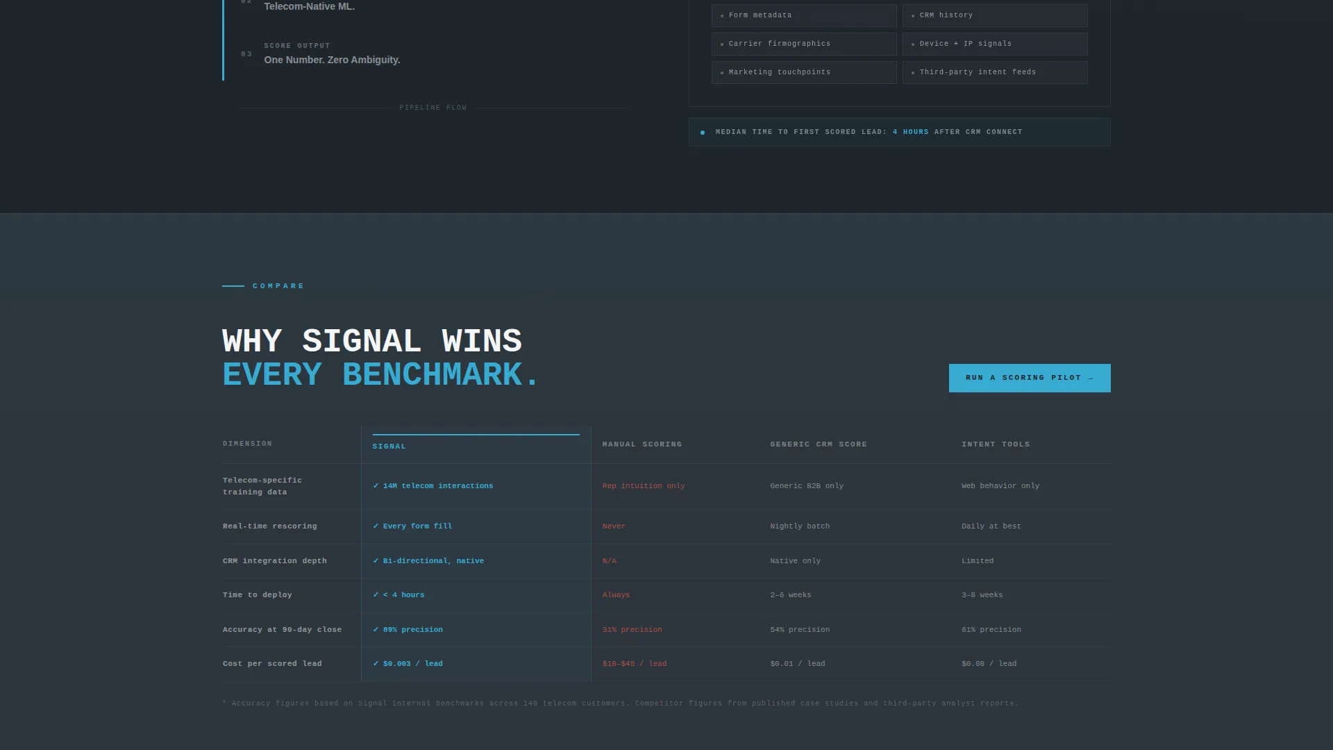
A persistent "See How We Compare" anchor scrolls to a side-by-side table. Signal is compared against manual lead scoring, generic CRM scoring, and one-size-fits-all intent tools across six dimensions: telecom-specific training data, real-time rescoring, CRM integration depth, time-to-deploy, accuracy at 90-day close, and cost per scored lead.
Pilot Qualification Form
The primary call to action is "Run a Scoring Pilot." The short form collects three fields: carrier type (MVNO, regional, or enterprise), current CRM in use, and monthly lead volume. This keeps friction low while gathering the qualification data needed to route the right leads to a sales conversation.
Bold Brutalist Visual System
The Slate and Sky color system and oversized monospaced typography are built into every component. Deep gunmetal slate, exposed-concrete mid-gray card surfaces, and open-sky cyan accents on buttons, score indicators, and active navigation states create a visual identity that feels like a dispatch console, not a marketing brochure.
Page sections overview
| Section | Purpose |
|---|---|
| Tab Switcher Header | Introduce SCORE, ROUTE, CLOSE with live animations |
| Anchor Navigation Bar | Lock spoke links to top on scroll |
| THE PROBLEM Spoke | Deliver the 63% wasted-touches stat as a typographic slab |
| THE COST Spoke | Interactive calculator for rep count and deal size |
| THE FIX Spoke | Three-layer scoring architecture diagram |
| Versus Comparison Table | Side-by-side Signal versus. competitor scoring methods |
| Pilot Qualification Form | Capture carrier type, CRM, and lead volume |
| Waste Pipeline call to action | Secondary email-capture path via calculator |
Design & branding system
The visual identity is drawn from a Bold Brutalist theme using the Slate and Sky color system. The aesthetic deliberately avoids decorative softness. Every surface, label, and interaction state reinforces the dispatch-console metaphor: sorted, flagged, and ruthlessly prioritized.
- Color palette: deep gunmetal slate (#1E252B) for background slabs, exposed-concrete mid-gray (#4A545E) for card surfaces, open-sky cyan (#38ABD2) as the sole accent on buttons and score indicators, and raw white (#F4F6F8) for body text and data labels
- Typography: oversized monospaced letterforms throughout, with the hero headline set at 80 pixels in knockout white, delivering an industrial and unapologetic visual tone
Mobile & speed optimization
The template's layout is structured to remain functional and readable at smaller viewport sizes. The brutalist grid and high-contrast palette naturally support legibility across device types without requiring additional visual complexity.
- Anchor navigation, tab switcher, and calculator components are designed to stack and reflow cleanly on narrower screens
- High-contrast color ratios between background slabs and text labels maintain readability without relying on decorative elements that could slow render or clutter smaller displays
How this template helps you convert
Signal is built around a deliberate conversion architecture. Every section moves the visitor one step closer to the pilot form while giving them a credible reason to trust the product.
- The interactive calculator creates a personalized, quantified pain moment early in the scroll, making the "Run a Scoring Pilot" form feel like a logical next step rather than a cold ask.
- The versus comparison table gives skeptical VP-level buyers the side-by-side evidence they need to justify a decision internally, directly addressing the competitive objections that stall telecom AI purchases.
Other information about this template
Signal is a hub-and-spoke landing page with anchor navigation, meaning each spoke section functions as a self-contained argument that can also be deep-linked directly from external campaigns or email outreach. The template is categorized under Technology and the AI for Telecommunications subcategory, making it a natural fit for platforms targeting the telecom AI lead scoring market. The hard-cut spoke transitions are intentional design choices, not placeholder animations. They reflect the brutalist philosophy: no visual softening, no padding, no delay between the pain and the fix. Buyers in this niche move fast and expect tools that match their pace.
- Built for single-page hub-and-spoke deployment with persistent anchor navigation
- Covers the full telecom AI buyer journey from stat-driven pain to architecture proof to pilot commitment
- Secondary call to action path captures email leads at the calculator stage, creating a two-track conversion funnel within one page

Theme
Bold Brutalist
Creative direction
Problem→Solution Arc
Color system
Slate & Sky
Style
Hub & Spoke (Anchor Nav)
Direction
Comparison/Versus
Page Sections
Feature Tab Switcher Header
Problem-to-solution Spoke Navigation
Interactive Revenue Waste Calculator
Six-dimension Versus Comparison Table
Pilot Qualification Form
Bold Brutalist Visual Identity
Related questions
Who is the Signal template designed for?
What are the three tab sections in the header?
What does the interactive calculator do?
What fields does the pilot qualification form collect?
Can this template support a B2B AI product outside telecom?



