Signal - Unified Telecom Marketing Landing Page Template
Signal is a split-screen landing page template built for telecommunications marketing automation platforms. It opens with a live cost estimator, flows into a scrolling feature comparison matrix, and uses an iridescent dark color system to make every inefficiency in a legacy telecom stack feel immediately visible. Designed for telecom resellers, managed service providers, and channel sales teams.
by Rocket studio
Quick summary
Signal is a single-page, split-screen landing page template for telecommunications marketing automation platforms. It leads with a real-time cost estimator and moves into a scrolling feature matrix that compares unified automation against legacy multi-vendor stacks. The layout is built to turn visitor curiosity into a clear, data-driven decision.
Who this template is for
This template speaks directly to professionals who manage telecom marketing at scale. It is designed for teams where campaign performance ties directly to per-minute costs and provisioning complexity.
- Telecom resellers managing large pools of direct inward dialing numbers across multiple carriers
- Managed service providers bundling unified communications as a service with marketing campaign delivery
- Channel sales directors who need to prove campaign return on investment against real infrastructure costs
What problem this template solves
Running SMS blasts, interactive voice response flows, and number provisioning across separate vendor dashboards creates friction, wasted spend, and blind spots. This template is built to make that problem impossible to ignore.
- Visitors land on a live estimator that reflects their own monthly volume, active numbers, and campaign frequency
- A scrolling comparison matrix exposes the gap between fragmented legacy stacks and a single automation layer
- Every section moves the visitor closer to understanding their current cost before asking them to act
What you get with this template
The template delivers a complete single-page layout structured around two conversion paths. The visual system and interactive components work together to hold attention from the first input field to the final call to action.
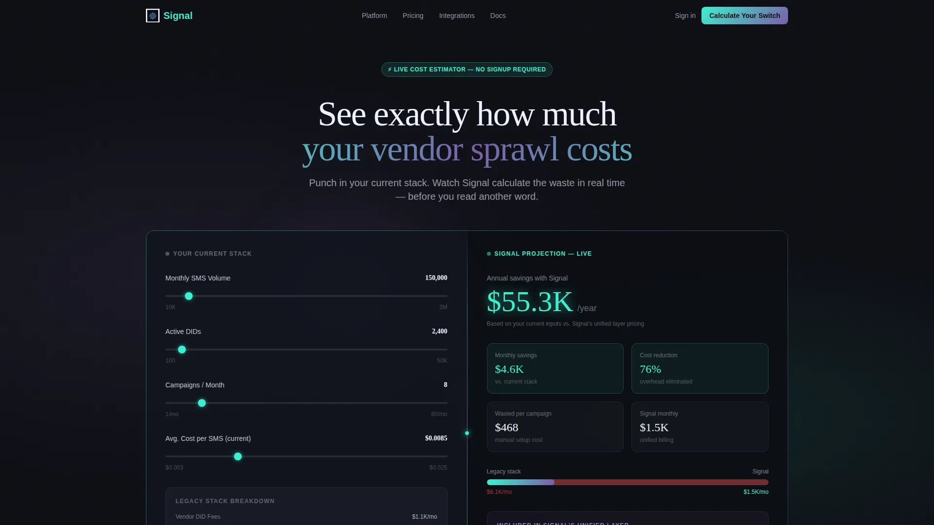
- A 50/50 split-screen header with a live cost estimator on the left and an animated savings projection on the right
- A feature comparison matrix section that scrolls from basic capability gaps to enterprise-grade differentiators
- A sticky "Calculate Your Switch" button and a secondary gated download path for the full comparison sheet
Feature list
This section covers the core built-in components and design behaviors included in the Signal template.
Live Cost Estimator Header
The header opens as a split-screen calculator. Visitors enter their current monthly SMS volume, active direct inward dialing number count, and average campaign frequency. The right panel updates in real time with animated counters showing projected savings. No submit button is required and no page reload occurs.
Scrolling Feature Comparison Matrix
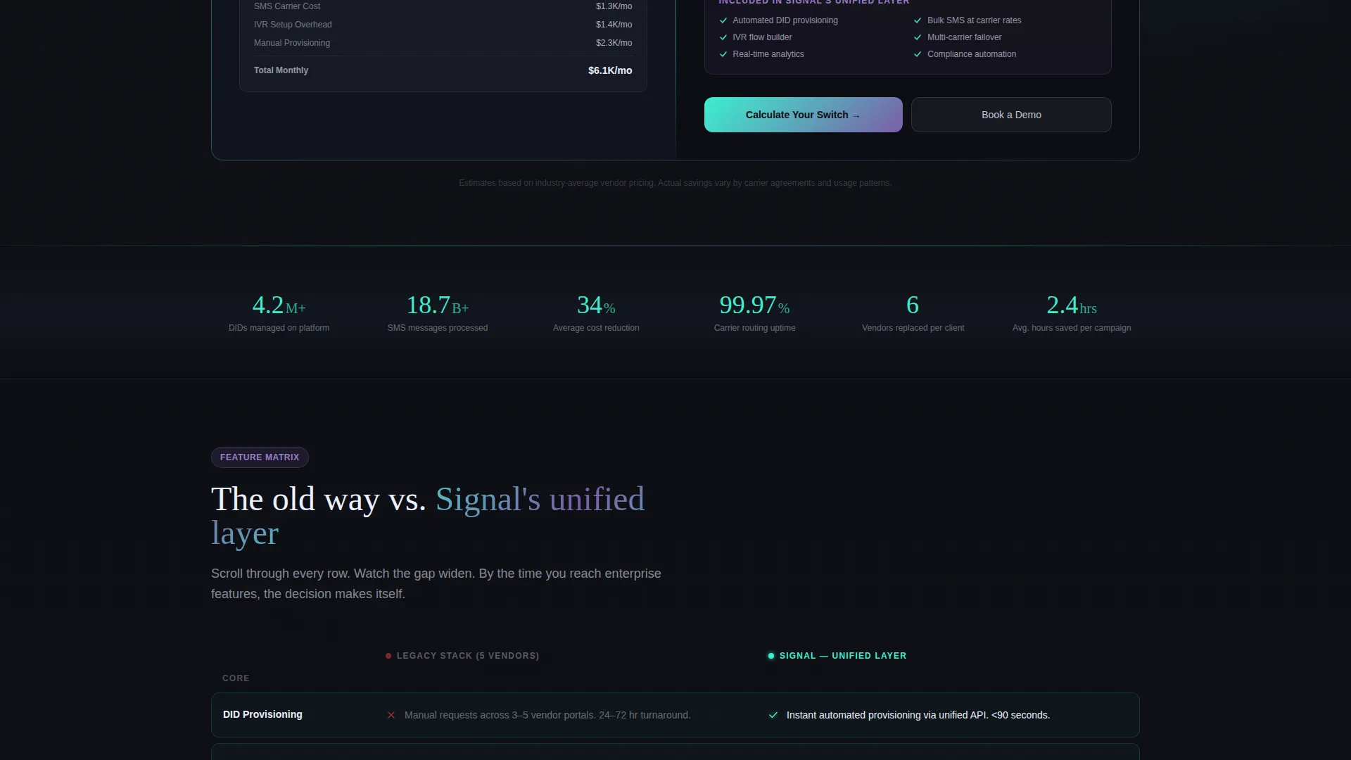
Below the header, a side-by-side grid compares legacy telecom marketing stacks against a unified automation layer. The left column shows the old approach: manual provisioning, siloed analytics, and per-vendor billing. The right column shows the unified alternative. Each row lights up with iridescent teal as it enters the viewport during scroll.
Escalating Matrix Rows
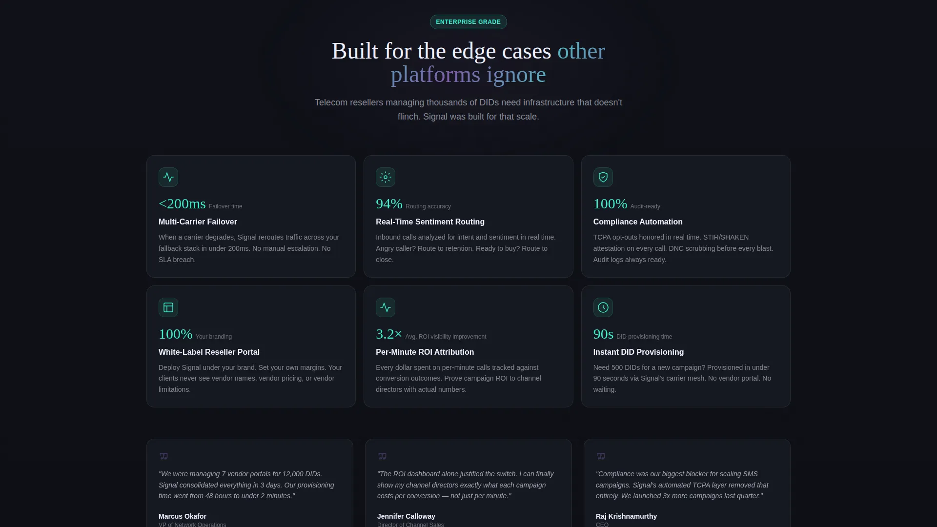
The comparison grid is structured to escalate in complexity as the visitor scrolls. Early rows cover foundational feature gaps. Later rows introduce enterprise-grade differentiators such as multi-carrier failover, real-time sentiment routing, and compliance automation. The sequence makes the decision feel increasingly obvious.
Sticky Primary Call to Action
A "Calculate Your Switch" button stays fixed during scroll. It is anchored inside the header estimator and persists as a sticky element throughout the page. This keeps the primary conversion path visible without interrupting the reading flow.
Gated Comparison Sheet Download
A secondary conversion path offers a downloadable portable document format comparison sheet. Access is gated behind an email address and company size field. This path targets visitors who want to share the comparison internally before committing.
Iridescent Dark Visual System
The template uses a four-color palette built around deep comm-tower black, holographic violet, iridescent teal, and signal-pulse white. Teal marks live data and active states. Violet anchors headings and comparison highlights. White carries body text and divider lines across the dark background.
Page sections overview
| Section | Purpose |
|---|---|
| Split-Screen Header | Hosts the live cost estimator and animated savings projection side by side |
| Feature Matrix Grid | Compares legacy stack limitations against the unified automation layer row by row |
| Enterprise Differentiator Rows | Escalates comparison depth to multi-carrier failover and compliance automation |
| Sticky call to action Bar | Keeps the primary conversion button visible throughout the full scroll |
| Gated Download Section | Captures email and company size in exchange for the full PDF comparison sheet |
Design & branding system
The visual identity follows a Directory and Discovery theme using the AI Iridescent color system. The palette is designed to feel like fiber-optic light refracting through a dark server room.
- Four-color system: deep comm-tower black (#0D0F14) for backgrounds, holographic violet (#7B5EA7) for headings and comparison highlights, iridescent teal (#3CEFCF) for live data and active viewport states, and signal-pulse white (#EDF0FF) for body text and dividers
- Black dominates large surface areas to keep focus on the luminous accent colors
- Teal functions as a live-state indicator, lighting up matrix rows as they scroll into view
Mobile & speed optimization
The split-screen layout is structured to reflow cleanly on smaller viewports. The estimator and matrix components are built with a responsive stacking behavior in mind.
- The 50/50 split-screen header stacks vertically on mobile so the estimator inputs remain usable without horizontal scrolling
- The feature matrix rows compress into a single-column format on narrow screens while preserving the left-versus-right comparison logic
- Animated counters and viewport-triggered teal highlights are scoped to the visible section to avoid unnecessary rendering on load
How this template helps you convert
Signal is structured around a specific conversion philosophy: let visitors see their own waste before asking them to act. Every layout decision supports this sequence.
- The live estimator puts the visitor's own data on screen immediately, creating a personal stake in the comparison before any marketing copy is read
- The scrolling matrix systematically removes each reason to stay with a legacy stack, row by row, until the decision feels self-evident
- The dual call-to-action structure captures both ready-to-act visitors via the sticky button and research-mode visitors via the gated comparison sheet download
Other information about this template
Signal is part of a broader template category focused on telecommunications software and software as a service marketing. It is built for the intersection of telecom infrastructure management and demand-generation marketing.
- The template style is Split Screen (50/50), which suits platforms where a before-and-after or input-and-output narrative drives the pitch
- The creative direction is Feature Matrix, meaning the page earns credibility through structured comparison rather than hero copy alone
- The header concept is Calculator/Estimator, placing the visitor's own numbers at the center of the experience from the first second
- The landing page direction is Comparison/Versus, making it well suited for platforms competing against established multi-vendor telecom marketing workflows

Theme
Directory & Discovery
Creative direction
Feature Matrix
Color system
AI Iridescent
Style
Split Screen (50/50)
Direction
Comparison/Versus
Page Sections
Live Split-screen Cost Estimator
Scrolling Feature Comparison Matrix
Escalating Enterprise Differentiator Rows
Sticky Primary Call to Action
Gated Comparison Sheet Download
AI Iridescent Dark Visual System
Related questions
Who is the Signal template built for?
Can I customize the cost estimator inputs?
What are the two conversion paths on this page?
How does the scrolling feature matrix work?
Is this template suitable for platforms with multiple carrier relationships?



