Sign & Banner Digital Presence Reviews Website Template
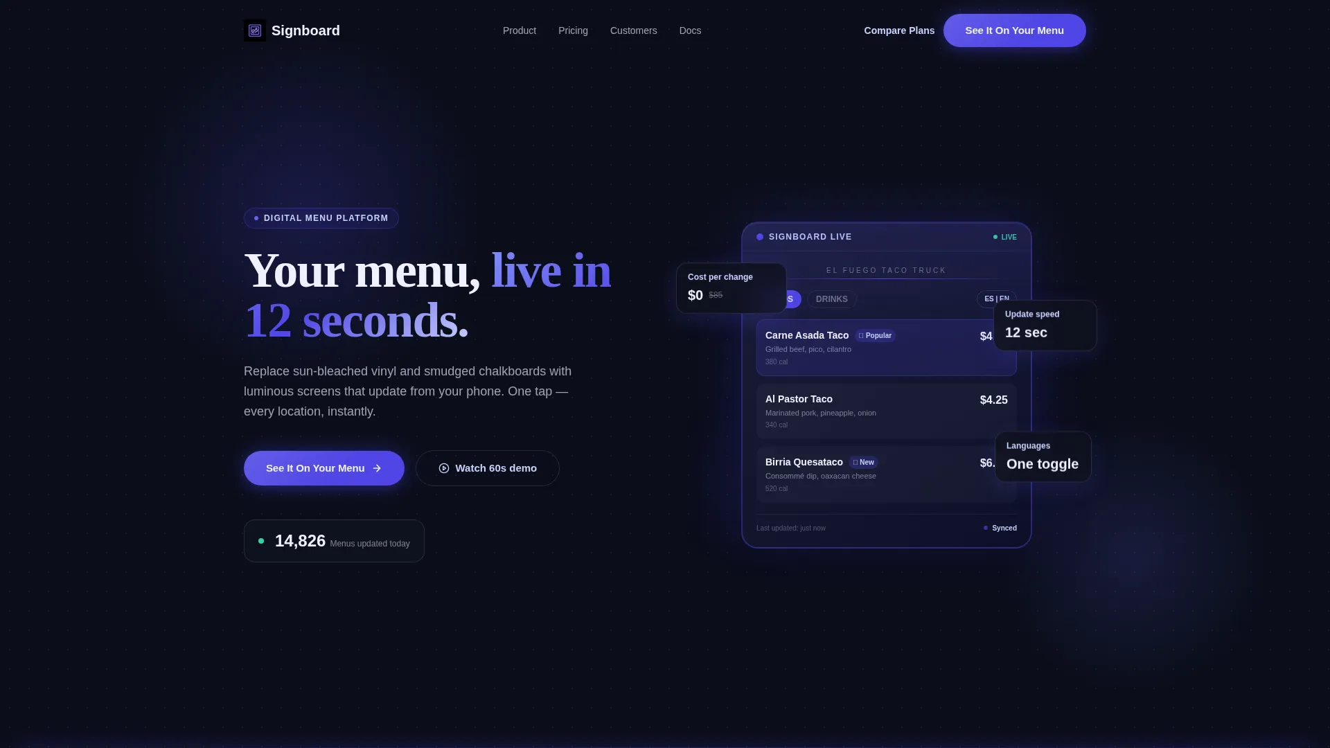
Signboard is a comparison table landing page template built for digital menu platforms. It opens with a live, in-browser menu board preview, walks visitors through a striking static-versus-digital comparison, and drives them toward a guided demo. The Tech Glass visual identity in Electric Indigo makes every screen feel sharp, backlit, and unmistakably modern.
by Rocket studio
Quick summary
Signboard is a single-page landing page template designed for digital menu platforms. It pairs an interactive in-browser menu board preview with a persuasive comparison table that puts static signage side by side with digital. The Electric Indigo color system and Tech Glass visual theme make the page feel like a glowing screen in a dark room.
Who this template is for
This template is built for businesses and operators in the sign and banner digital menu space who need to sell the switch from print to digital. It works best when the product sells itself visually and the buyer needs convincing with hard numbers.
- Franchise owners managing multiple locations from a single dashboard
- Food truck operators who swap lunch and dinner menus on the fly
- Bar managers who need nightly specials live before happy hour starts
What problem this template solves
Static menus create real operational pain. Reprints cost money, take time, and fade in the weather. Multilingual updates mean starting from scratch. This template frames all of that friction visually before introducing the digital alternative.
- Update speed: driving to a printer versus updating in 12 seconds from a phone
- Cost per change: paying for reprints versus updating at no cost
- Weather and durability: vinyl that fades in six months versus a weatherproof screen
What you get with this template
You get a fully structured, single-page landing page built around a Problem-to-Solution narrative arc. Every section is designed to build trust and push visitors toward a demo or pricing page.
- An interactive header that renders a live digital menu board in the browser
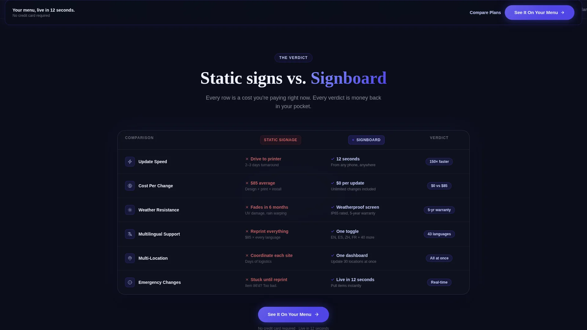
- A side-by-side comparison table covering speed, cost, durability, and language support
- Two clear conversion paths: a primary demo builder call to action and a secondary pricing link
Feature list
This template includes purpose-built components designed around the digital menu use case. Each one serves a specific moment in the visitor's decision process.
Interactive In-Browser Menu Preview
The header renders a functioning digital menu board directly in the browser. It cycles through restaurant items with smooth transitions, animates price changes in real time, and shows a visible cursor dragging a daily special into place. A taco truck layout populates with photos, calorie counts, and a Spanish-language toggle, all inside a device frame with a subtle indigo edge reflection.
Static versus. Digital Comparison Table
The comparison table is the persuasive core of the page. It places static signage and digital menus side by side across four key rows: update speed, cost per change, weather durability, and multilingual support. Each row is written to land like a verdict, building pressure toward the solution section below.
Problem-to-Solution Scroll Arc
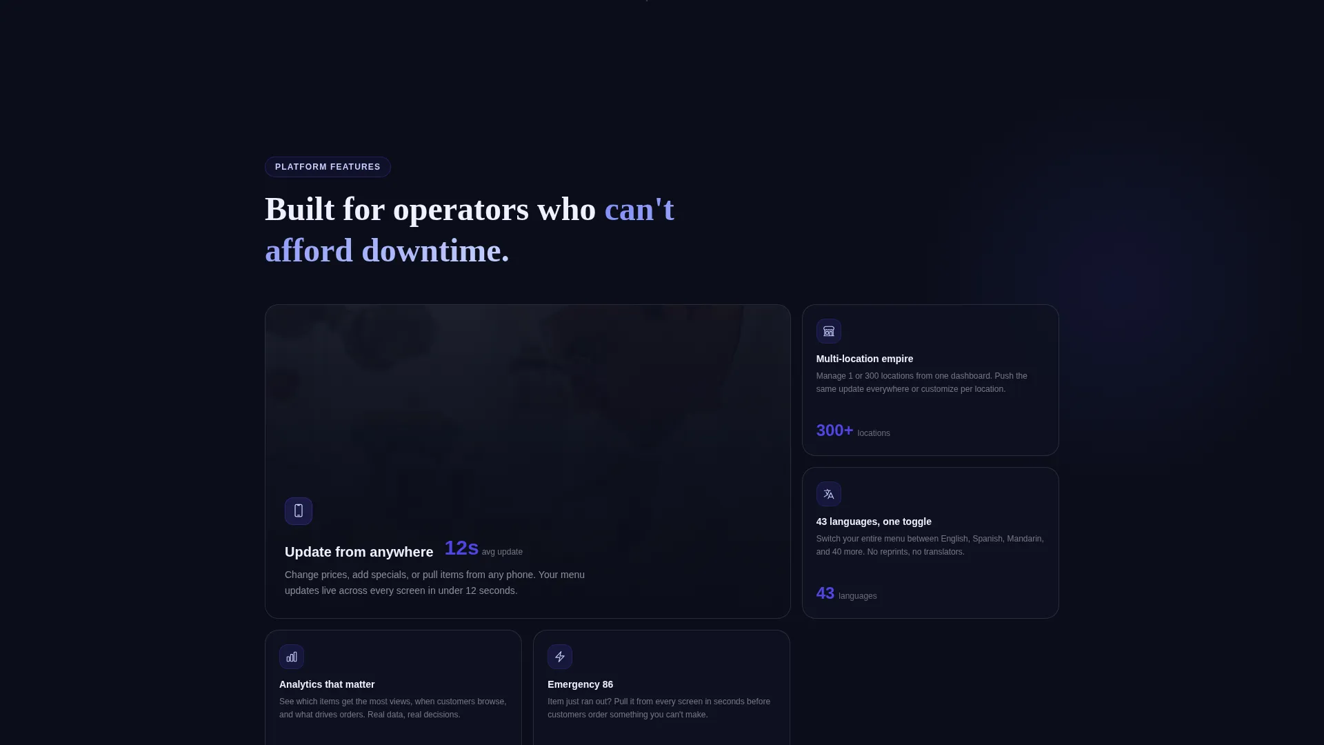
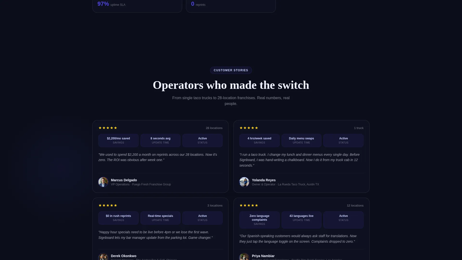
The page is structured as a deliberate narrative. It opens with pain, delivers the comparison table as evidence, then pivots into solution territory with dashboard screenshots, a live counter showing menus updated today, and a sixty-second video of an owner updating three locations from a parking lot.
Persistent Bottom Bar with Primary Call to Action
After the first scroll, a sticky bottom bar keeps the primary call to action visible at all times. The button reads "See It On Your Menu" and routes visitors to a guided demo builder where they can upload their own menu items and preview them on a simulated screen.
Live Platform Activity Counter
A real-time counter displays the number of menus updated across the platform today. It reinforces platform credibility and gives visitors a sense of active, living infrastructure behind the product.
Dual Conversion Path Layout
The template supports two parallel conversion paths. The primary path routes to the demo builder. The secondary path links to a pricing comparison page via a "Compare Plans" call to action. Both paths coexist without competing for visual attention.
Page sections overview
| Section | Purpose |
|---|---|
| Interactive Menu Header | Demonstrates the product live in-browser as the page hero |
| Comparison Table Block | Contrasts static signage with digital across four key metrics |
| Solution Pivot Zone | Shifts narrative from problem to product with screenshots and video |
| Live Activity Counter | Shows real platform usage to build credibility |
| Persistent call to action Bar | Keeps primary conversion action visible after initial scroll |
| Secondary Pricing Link | Provides a low-commitment path to the pricing page |
Design & branding system
The visual identity follows a Tech Glass theme built entirely on the Electric Indigo color system. Every color choice reinforces the feeling of a backlit screen glowing in a dark environment.
- Deep void black (#0B0E1A) anchors full-bleed backgrounds so content appears to float forward like projected light
- Electric indigo (#4F46E5) drives every interactive element, button, and toggle state across the page
- Frosted glass lilac (#C7D2FE) fills comparison table headers and secondary containers, creating translucent panel depth
- Interface white (#F0F0FF) handles body text and panel surfaces for high contrast and effortless readability
Mobile & speed optimization
The template is designed so every section reads cleanly on smaller screens without losing the visual drama of the Tech Glass aesthetic. The comparison table and sticky bar are built to hold their structure at mobile widths.
- The interactive menu preview scales inside its device frame so the product demo remains legible on phone screens
- The persistent bottom bar is sized for thumb reach, keeping the primary call to action accessible without scrolling back up
- The comparison table collapses gracefully on narrow viewports so every row remains readable and scannable
How this template helps you convert
The page is built around a single principle: show the problem clearly, then make the solution feel inevitable. Every layout decision supports that flow.
- The comparison table does the persuasion work early, using specific numbers like 12-second update speed and zero cost per change to make the case before a visitor has to read a paragraph
- The interactive header removes abstraction entirely by letting visitors watch the product work in real time, which lowers the barrier to the demo call to action
- The persistent bottom bar and dual call-to-action layout ensure there is always a next step available, whether the visitor is ready to try the demo or just wants to compare plans first
Other information about this template
This template is part of the Sign and Banner Digital Presence subcategory under the Technology category on the platform. It is designed for the sign and banner digital menu niche and carries an intersection match score of 13, indicating a strong alignment between the template style, creative direction, and audience intent.
- Template style: Comparison Table, optimized for side-by-side decision making
- Theme: Tech Glass with Electric Indigo color system
- Creative direction: Problem-to-Solution Arc
- Header concept: Interactive Preview with live in-browser rendering
- Landing page direction: Click-Through, with two defined conversion paths
Theme
Tech Glass
Creative direction
Problem→Solution Arc
Color system
Electric Indigo
Style
Comparison Table
Direction
Click-Through
Page Sections
Live In-browser Menu Board Preview
Side-by-side Comparison Table
Problem-to-solution Narrative Arc
Persistent Sticky Call-to-action Bar
Dual Conversion Path Layout
Live Platform Activity Counter
Related questions
Who is this landing page template designed for?
What makes the comparison table effective here?
What are the two conversion paths in this template?
Does the interactive menu preview require custom development?
Can I launch this template without a finished video or live screenshots?



