Sign & Banner Digital Presence Professional Website Template
Signcraft is a bento grid landing page template built for a sign industry knowledge base app. It presents substrate specs, vinyl tolerances, mounting data, and wind-load references in a dark, high-contrast design. The layout drives app downloads with a sticky call-to-action bar, contextual nudges, and a frictionless phone-number send link, built for shop floors, not conference rooms.
by Rocket studio
Quick summary
Signcraft is a single-page bento grid template designed for a sign and banner knowledge base app. It organises hundreds of technical specifications into scannable, self-contained cards. The Electric Indigo color system gives it the visual authority of a neon channel letter glowing in a dark shop. Every section pushes one action: install the app.
Who this template is for
This template is built for teams launching a technical reference app aimed at sign industry professionals. It speaks directly to people who live on production floors and job sites.
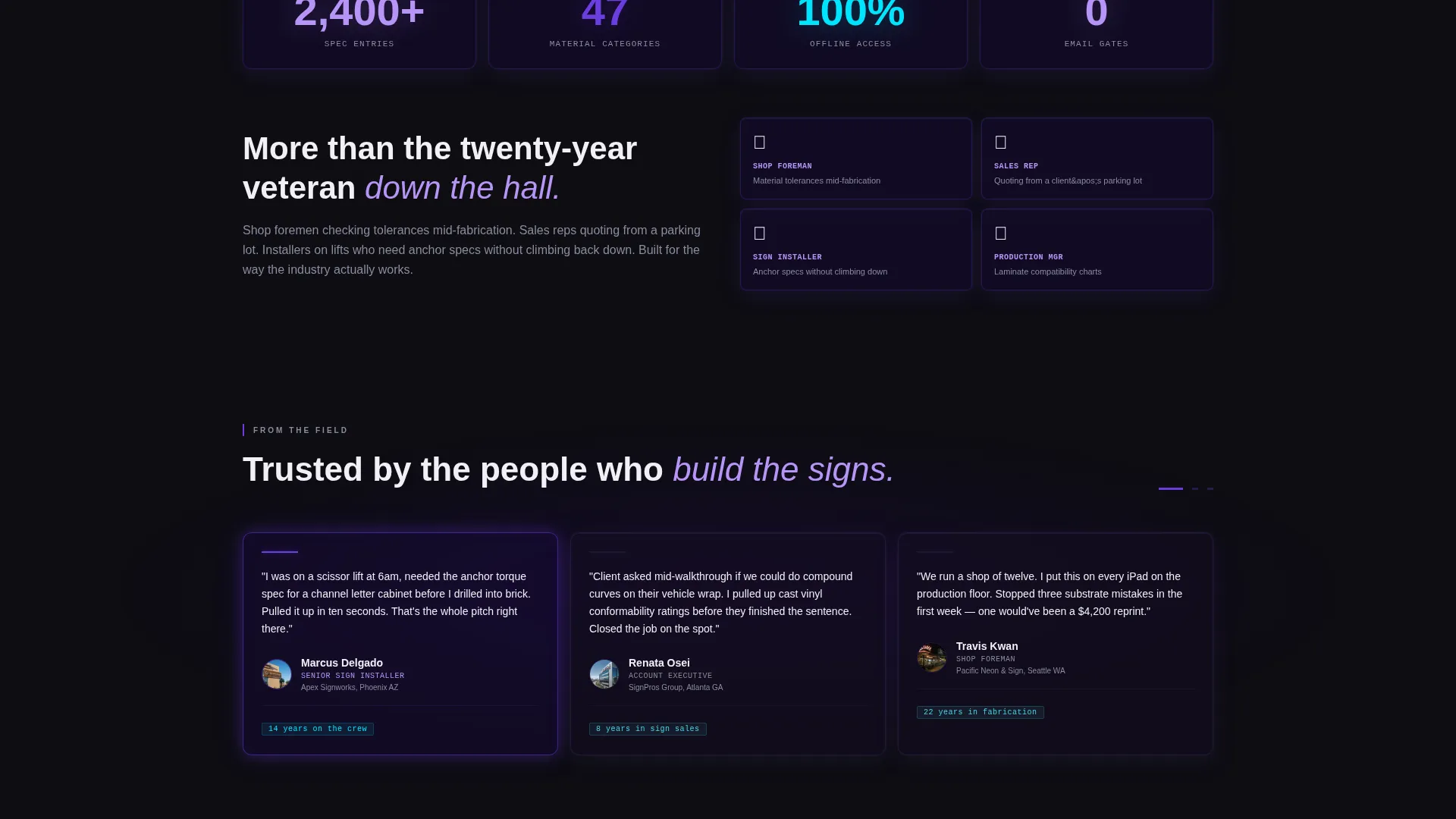
- Shop foremen who need material tolerance checks mid-fabrication
- Sales representatives quoting jobs from a client's parking lot
- Sign installers on lifts who cannot afford to climb down for an anchor spec
What problem this template solves
Most sign industry reference materials are scattered across printed binders, manufacturer PDFs, and memory. There is no fast, offline pocket reference built for fabricators and installers. This template solves the discovery and download problem for exactly that product.
- Professionals lose time hunting for specs across multiple sources during active jobs
- App download pages for trade tools often feel generic and fail to earn trust fast
- Installers in the field need a frictionless path to get the app without typing long URLs
What you get with this template
You get a complete, ready-to-customise landing page that showcases the knowledge base app with technical credibility and clear visual hierarchy. Every section is pre-structured for fast scanning and immediate action.
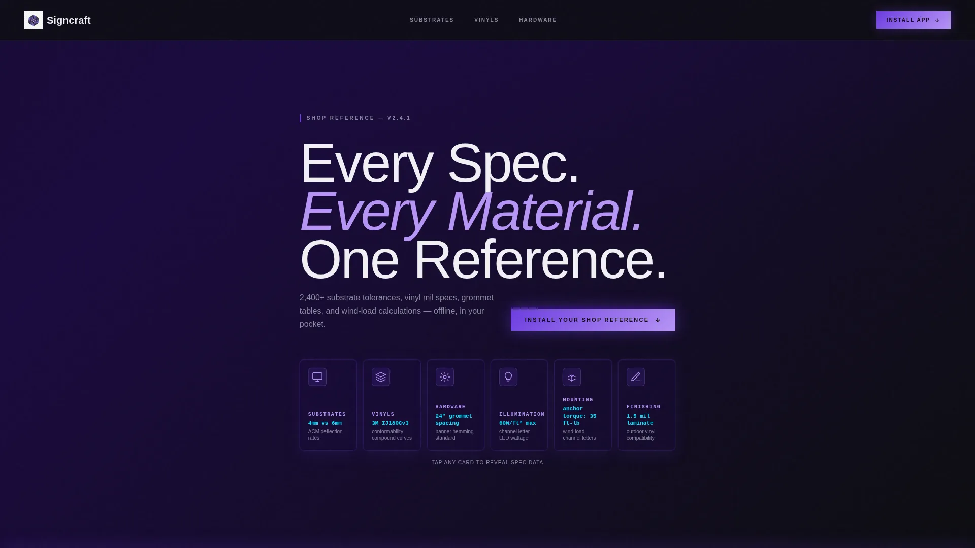
- A Dark Glass Panels header with frosted category cards, ghosted icons, and visible spec stats
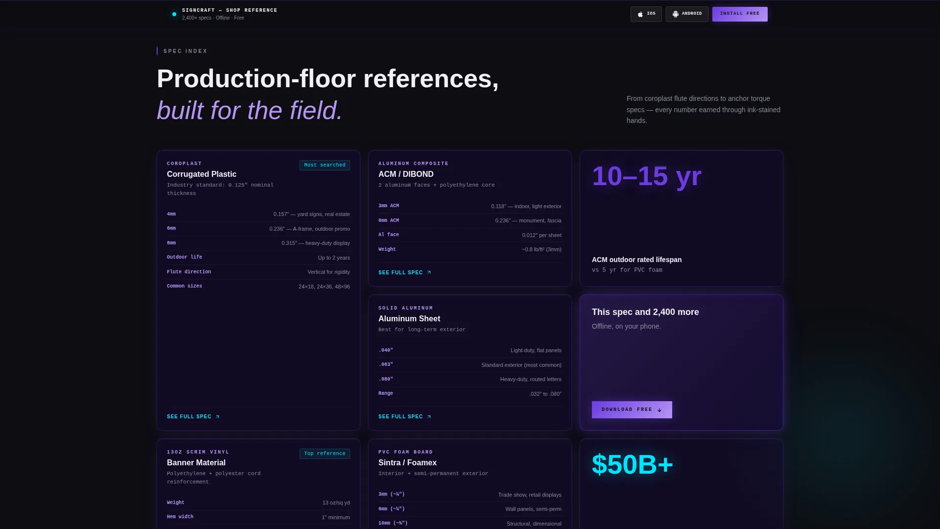
- A scrolling bento grid of spec knowledge cards covering substrates, vinyls, hardware, illumination, mounting, and finishing
- A sticky app download bar, in-grid contextual nudges, and a phone-number send-link field
Feature list
This section covers the core built-in components and layout capabilities included in the Signcraft template.
Dark Glass Panel Header
The header presents a grid of frosted, translucent cards floating over a near-black background. Each card displays a spec category with a ghosted icon and a single visible data point, such as deflection rates or conformability ratings. One card slowly rotates on load to reveal a data-dense reverse side, demonstrating depth before any interaction.
Bento Grid Spec Cards
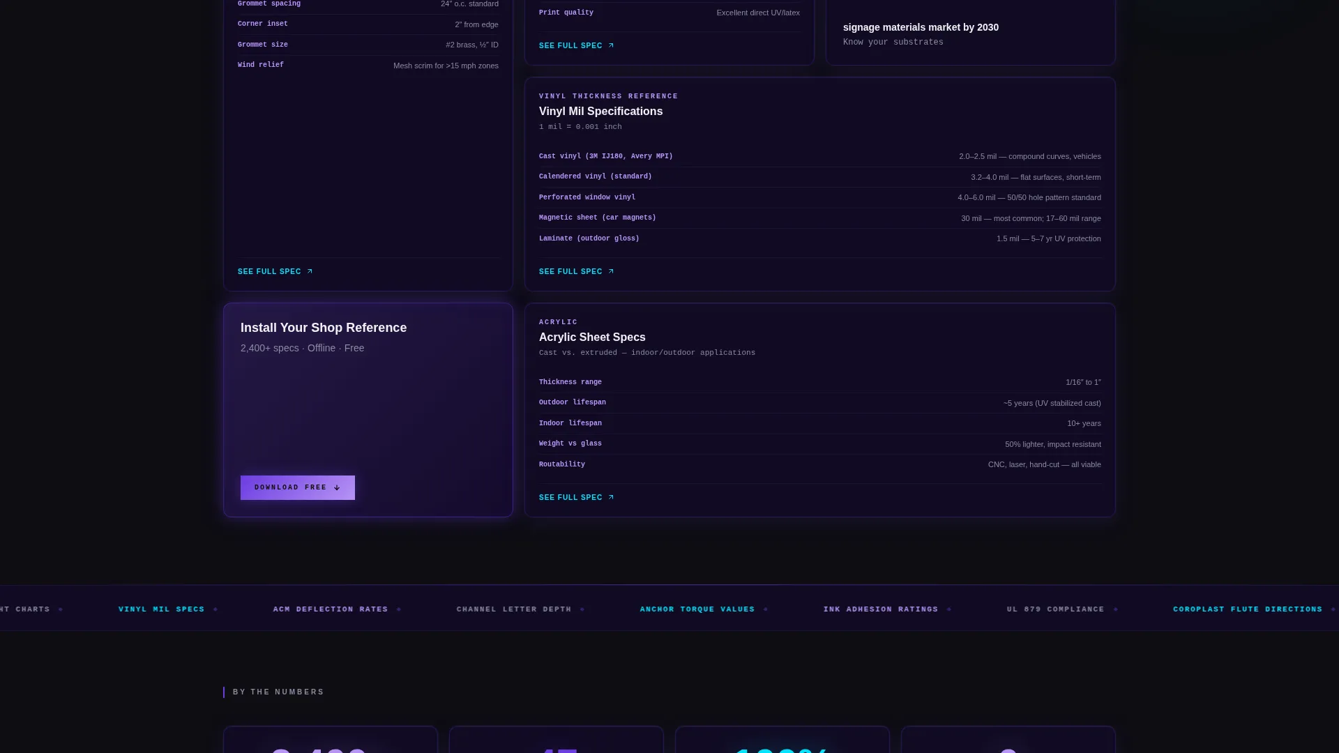
The main scroll area is built as a bento grid where each cell is a self-contained knowledge card. Cards include a material name, a cross-section diagram area, key tolerances in monospaced type, and a "see full spec" expansion trigger. The grid starts with the most-searched references and cascades into deeper, more specialised data rows as the user scrolls.
Sticky App Download Bar
A persistent bottom bar carries the primary call-to-action throughout the entire page. It displays iOS and Android app store icons alongside the "Install Your Shop Reference" label, keeping the conversion path visible at all scroll depths without interrupting content consumption.
In-Grid Contextual Nudges
After every third spec card in the bento grid, a contextual nudge card appears. It reinforces the app value proposition with a short line referencing the full spec library available offline. This keeps the download prompt relevant and tied directly to the content a visitor just read.
Phone-Number Send Link
A secondary conversion path lets installers with gloved hands receive a direct download link via a single phone-number input field. No email address, no form complexity, just ten digits and a thumb tap. This reduces friction for the most time-pressured users in the target audience.
Spec Sheet Creative Direction
The scroll experience is designed to feel like flipping through a technical binder. Typography uses monospaced type for tolerances and measurements. The visual rhythm rewards deeper scrolling with progressively denser, more specialised content rows, reinforcing the message that this reference knows more than any single veteran on the floor.
Page sections overview
| Section | Purpose |
|---|---|
| Dark Glass Header | Introduce spec categories with frosted cards and live data glimpses |
| Primary call to action Bar | Sticky bottom bar driving app store downloads throughout the page |
| Top Spec Grid | Most-searched references including banner hemming and grommet spacing |
| In-Grid Nudge | Contextual app download card after every third knowledge cell |
| Mid Spec Grid | Deeper cards covering illumination wattage and wind-load calculators |
| Send Link Field | Phone-number input for one-tap download link delivery |
| Deep Spec Grid | Specialist rows on substrate weight, laminate compatibility, and ACM specs |
Design & branding system
The design language is built around the Startup Velocity theme with an Electric Indigo color system. The palette is deliberately industrial, neon against black, like a channel letter firing up in an empty shop before dawn.
- Core colors: deep void indigo (#1A0A3E), charged violet (#6C3CE0), bright plasma lilac (#B794F6), reactive cyan (#00E5FF) for interactive elements, and carbon-dark panels (#0D0D12) as the base surface
- Typography uses crisp white (#F0F0F5) for spec text and monospaced formatting for tolerances, measurements, and technical data points
- Frosted glass card edges catch faint indigo light to simulate LED backlighting, and the card rotation animation on load signals data depth from the first second
Mobile & speed optimization
The template is structured for use by professionals actively on job sites, often on mobile devices in low-connectivity environments. The layout choices reflect that reality throughout.
- The sticky download bar and phone-number send-link field are thumb-friendly and remain accessible at every scroll position on small screens
- Bento grid cells are sized and spaced for one-handed reading, with monospaced spec text rendered at a size that holds legibility under bright outdoor light
- The single-page layout keeps all critical conversion paths on one scrollable surface, removing the need for multi-page navigation under field conditions
How this template helps you convert
The page is engineered around a single conversion goal: get the app installed. Every layout decision reduces steps between landing and download.
- The rotating Dark Glass Panel header creates immediate authority by showing real spec data before a visitor scrolls, earning trust in the first three seconds of the visit.
- The sticky download bar combined with in-grid nudges after every third card means the call-to-action is never more than a short scroll away, keeping intent high throughout the session.
- The phone-number send-link field serves installers who cannot type a URL mid-job, converting a high-friction moment into a ten-digit action that completes in seconds.
Other information about this template
This template is part of the Technology category with a Sign and Banner Digital Presence subcategory focus. It is built specifically for the Sign and Banner Knowledge Base niche and carries a strong intersection match for teams in that space.
- The template style is Bento Grid, making it well-suited for presenting large collections of structured technical data without overwhelming the visitor
- The Startup Velocity theme and Electric Indigo system are paired to give a product-led, app-forward visual identity that signals modernity to a traditionally print-focused industry audience
- The Spec Sheet creative direction and Dark Glass Panels header concept are both matched intersection fields, meaning this template was purpose-built for this exact use case combination
- The App Download landing page direction means there are no lead-capture forms, no email gates, and no multi-step funnels, the template is optimised for direct, low-friction app store referrals
Theme
Startup Velocity
Creative direction
Spec Sheet
Color system
Electric Indigo
Style
Bento Grid
Direction
App Download
Page Sections
Dark Glass Panel Header
Bento Grid Spec Layout
Sticky App Download Bar
In-grid Contextual Nudges
Phone-number Send Link
Spec Sheet Scroll Experience
Related questions
Who is the primary audience for this landing page template?
Does this template include a form for collecting email addresses?
Can I customise the spec categories shown in the header cards?
How does the in-grid nudge system work?
Is this template suitable for desktop as well as mobile users?



