Sign & Banner Digital Presence Advanced Professional Website Template
Signspec is a split-screen landing page template built for a sign and banner mobile app. It pairs real-world field chaos against clean digital spec cards in a deliberate 50/50 layout. Designed for sign shops, print brokers, and event teams, it guides estimators from crumpled job notes to a fully specced quote in one tap.
by Rocket studio
Quick summary
Signspec is a single-page landing page template built around a head-to-head comparison layout. It shows the messy reality of sign estimating on one side and the app's clean digital workflow on the other. Every scroll section escalates the job complexity while the app side stays calm, earning the conversion before the call-to-action ever appears.
Who this template is for
This template speaks directly to the people standing in parking lots with a tape measure and a deadline. It is built for teams where speed and accuracy on the job site determine whether a quote wins or loses.
- Field estimators who spec banners, channel letters, and vehicle wraps on location
- Production managers tracking multiple active jobs and needing specs locked in fast
- Franchise coordinators rolling out identical signage across many locations at once
What problem this template solves
Sign estimating is full of friction. Crumpled spec sheets, back-and-forth email chains, and spreadsheets that only one person understands create delays and costly errors before a single panel is cut.
- Handwritten field notes get lost or misread, leading to wrong material orders
- Quote approvals stall because clients cannot visualize dimensions and hardware choices
- Multi-site rollouts break down when specs drift between locations
What you get with this template
You get a fully structured, single-page landing page layout built around the Comparison/Versus conversion pattern. Every visual and structural decision supports the goal of showing, not just telling, why the app is a better workflow.
- A Product Screenshot header split showing real job chaos beside the fully specced app screen
- Three escalating 50/50 comparison sections covering field notes, quote generation, and multi-site rollouts
- A primary call-to-action placed at the split seam and a secondary sticky demo bar at the bottom
Feature list
This template is built with purposeful structure. Each component earns its place by reinforcing the contrast between the old workflow and the app experience.
50/50 Split Screen Header
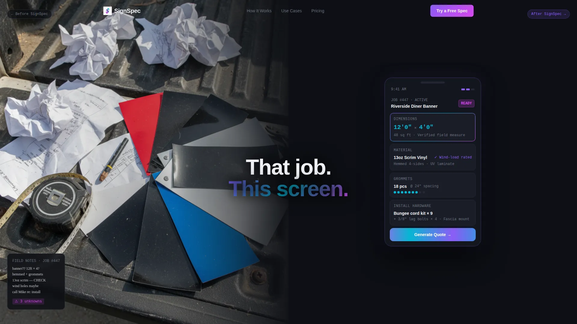
The header divides the viewport dead center. The left half shows a real-world photo of a cluttered sign shop estimate, complete with crumpled spec sheets and material samples on a truck tailgate. The right half shows the app screen floating on black with the same job fully specced in clean dashboard cards. The headline "That job. This screen." bridges both halves with no animation on load.
Escalating Comparison Scroll Sections
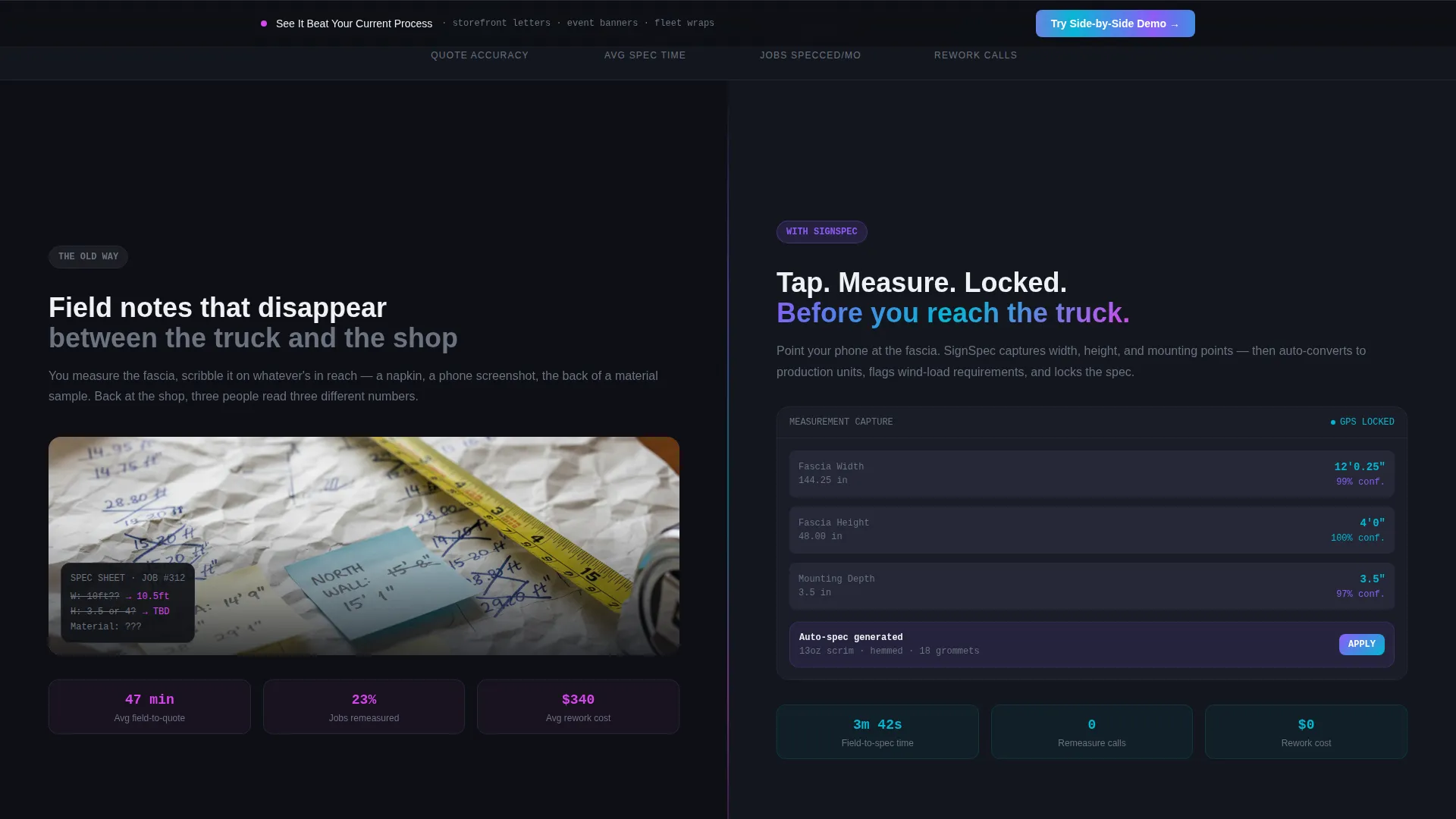
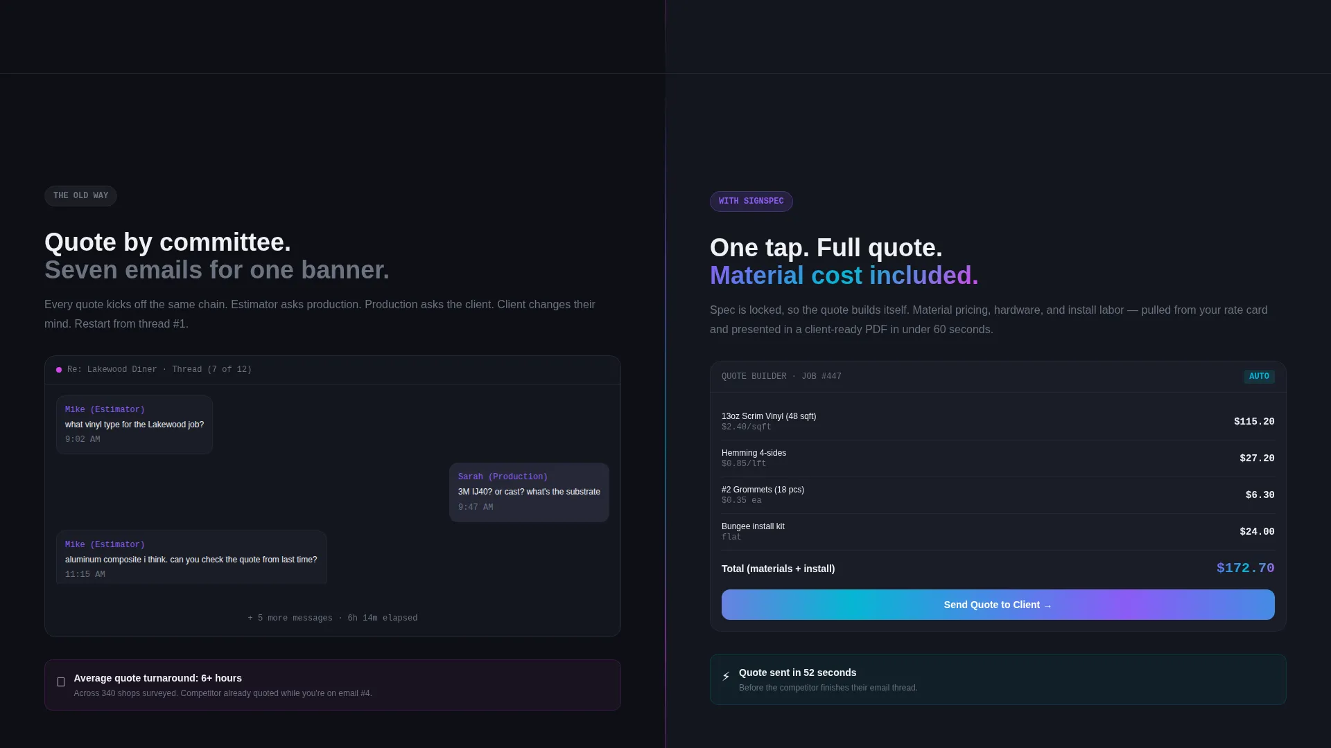
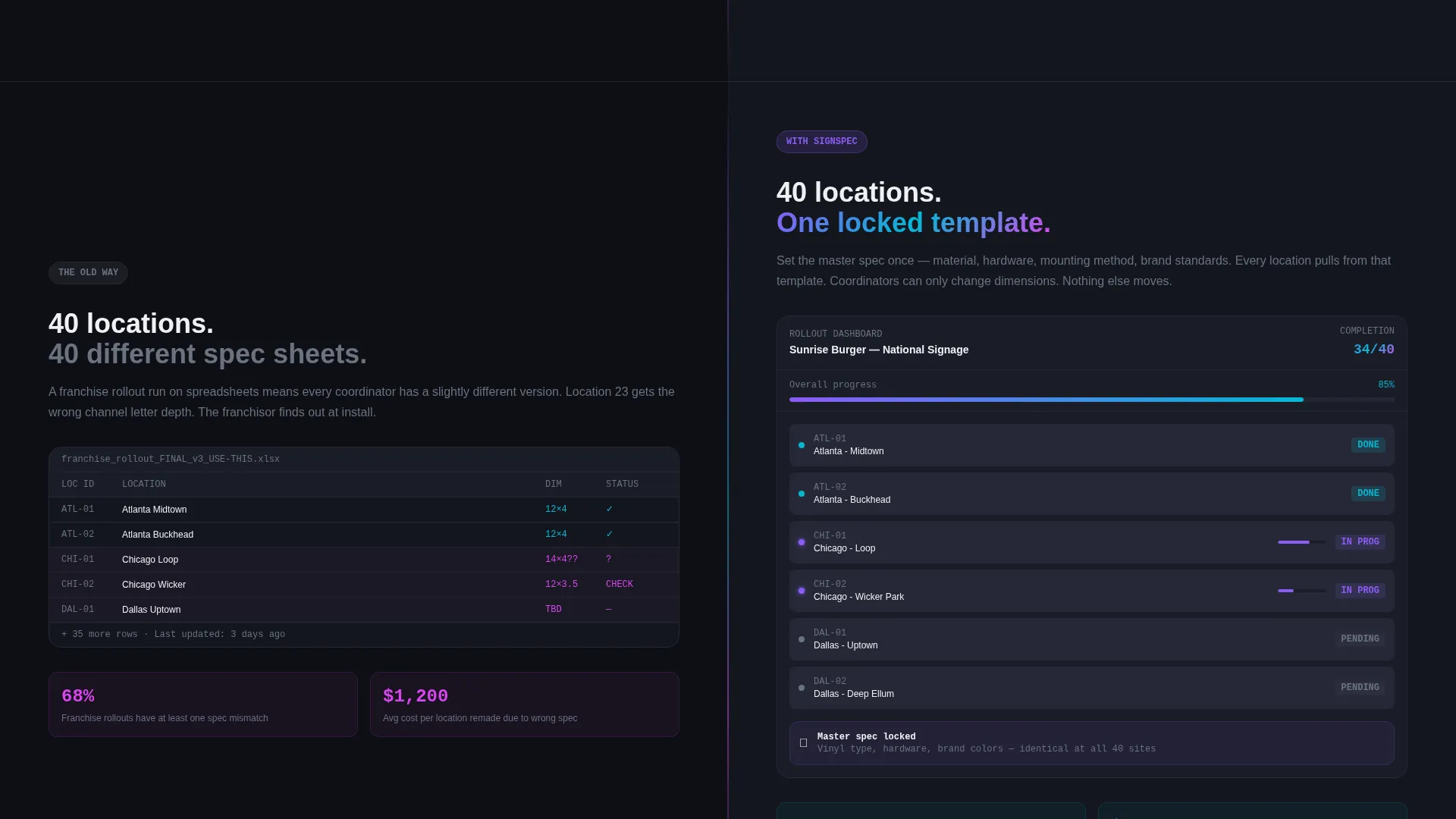
Three scroll sections each present a head-to-head pair. Section one contrasts handwritten field notes with the app's digital measurement capture and auto-conversion. Section two replaces back-and-forth email chains with one-tap quote generation and material cost breakdowns. Section three shows a chaotic multi-location spreadsheet beside the app's multi-site rollout dashboard. Each pair answers the next objection before the visitor forms it.
Primary Split-Seam Call-to-Action
After the third comparison pair, a "Try a Free Spec" call-to-action sits directly at the visual split seam. Its placement is intentional: by this point the visitor has seen three escalating proofs. The prompt invites them to spec a real job, making the first click feel productive rather than promotional.
Sticky Demo Bar
A persistent bar anchors to the bottom of the viewport throughout the scroll. It reads "See It Beat Your Current Process" and links to an interactive side-by-side demo. Users can toggle between the old workflow and the app workflow for three common job types: storefront channel letters, event banners, and fleet wraps.
Iridescent Interactive Accents
Interactive surfaces carry the iridescent gradient treatment. Toggle switches, progress rings, and swipe indicators shift from holographic violet to electric cyan, making every touchable element visually distinct. Signal magenta is reserved strictly for active-state buttons and badge counts, so the eye goes immediately to what needs action.
Multi-Site Rollout Dashboard Card
The third comparison section features a dashboard card representing a franchise rollout across many locations. Status badges glow in magenta and cyan to indicate job progress at a glance. This card communicates scale and control without requiring any explanatory body copy.
Page sections overview
| Section | Purpose |
|---|---|
| Split Screen Header | Establishes the core contrast with a real job photo and the app screen side by side |
| Field Notes Comparison | Contrasts handwritten measurements with the app's digital capture and auto-conversion |
| Quote Generation Comparison | Replaces email chains with one-tap quote generation and material cost breakdowns |
| Multi-Site Rollout Comparison | Shows spreadsheet chaos versus the app's franchise rollout dashboard with status badges |
| Split-Seam Primary call to action | Invites visitors to spec a real job at the moment of maximum proof |
| Sticky Demo Bar | Provides a persistent entry point to the interactive workflow comparison throughout the page |
Design & branding system
The visual identity follows a Dashboard Pro theme built on an AI Iridescent color system. The palette is designed to feel like the glow of a phone screen in a dim production warehouse: precise digital light cutting through a physical workspace.
- Core palette: deep app-shell black (#0D0F14) for backgrounds, clean interface white (#F0F1F5) for body text, holographic violet (#8B5CF6) shifting to electric cyan (#06B6D4) on gradient accents
- Signal magenta (#D946EF) is reserved for active-state buttons and badge counts only, keeping the eye focused on actionable elements
- The iridescent gradient appears exclusively on interactive surfaces such as toggle switches, progress rings, and swipe indicators, so decorative and functional elements never compete
Mobile & speed optimization
This template is built with the phone-first context of its audience in mind. Field estimators open links on mobile between job sites, so the layout is structured to read and convert on small screens without requiring a desktop session.
- The 50/50 split sections reflow cleanly for vertical mobile viewports, maintaining the contrast logic on smaller screens
- Interactive elements like the sticky demo bar and the split-seam call-to-action are sized and positioned for thumb-reach usability
- The no-animation-on-load header keeps the first paint fast and the contrast immediate, regardless of connection conditions
How this template helps you convert
Every structural and visual decision in this template is built to reduce hesitation and build confidence before the call-to-action appears.
- The scroll rhythm is designed as a progressive proof sequence: each comparison section answers the next likely objection, so the visitor arrives at the call-to-action already convinced rather than still evaluating.
- The sticky demo bar keeps a low-commitment entry point visible at all times, giving hesitant visitors a way to engage without committing to the primary call-to-action immediately.
- The split-seam placement of "Try a Free Spec" frames the first action as productive work rather than a sign-up form, lowering the perceived cost of clicking.
Other information about this template
This template is part of a broader category of technology landing pages designed for niche trade tools. It is particularly well suited for the sign and banner digital presence space, where buyers are practical and proof-driven rather than brand-driven.
- The template style is Split Screen (50/50), the creative direction is Spec Sheet, and the conversion pattern is Comparison/Versus
- The header concept is Product Screenshot, pairing a real-world image with an in-app view to establish credibility immediately
- The theme is Dashboard Pro using the AI Iridescent color system, making it visually distinct from generic SaaS templates in the same category
Theme
Dashboard Pro
Creative direction
Spec Sheet
Color system
AI Iridescent
Style
Split Screen (50/50)
Direction
Comparison/Versus
Page Sections
50/50 Split Screen Header
Escalating Comparison Scroll Sections
Split-seam Primary Call-to-action
Persistent Sticky Demo Bar
Iridescent Interactive Accents
Multi-site Rollout Dashboard Card
Related questions
Who is this landing page template designed for?
Can I change the comparison content to match my specific job types?
Does the template include the interactive demo feature?
How does the split-screen layout work on mobile devices?
Is this template suitable for a product launch or an ongoing marketing page?



