Operations Construction Landing Page Template
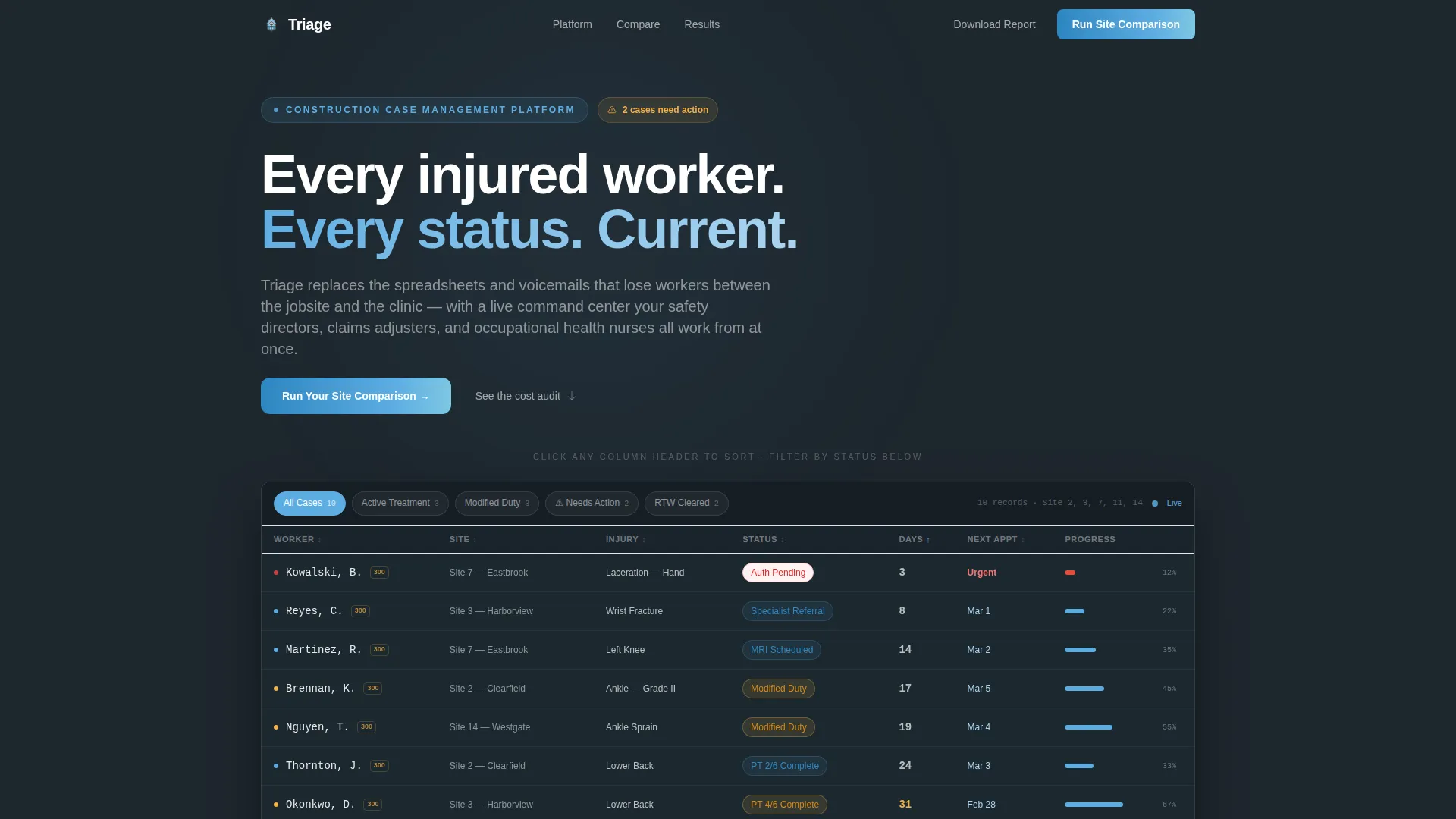
Triage is a dashboard-style landing page template built for construction patient management platforms. It features a live interactive data grid as the hero, an industry-report scroll structure with hard statistics, and a sticky comparison table that puts your current process head-to-head against a modern solution. The Slate and Sky color system gives every screen a grounded, authoritative feel.
by Rocket studio
Quick summary
Triage is a single-page landing page template designed for construction patient management platforms. It opens with a populated, interactive data grid that proves the product's value instantly. An industry-report scroll structure pairs cost statistics with live feature screenshots, and a sticky comparison table drives visitors toward a short qualifying call to action.
Who this template is for
This template is built for teams selling or deploying software that manages injured worker cases across active construction sites. It speaks directly to the people who live inside those workflows every day.
- Safety directors managing Occupational Safety and Health Administration (OSHA) logs across multiple active jobsites
- Claims adjusters handling paper-heavy medical authorization processes
- Occupational health nurses who need real-time visibility into worker treatment progress
What problem this template solves
Construction jobsite injuries generate paperwork, phone calls, and coordination across safety, clinical, and administrative teams. When those handoffs happen through spreadsheets and voicemails, workers fall through the gaps and costs climb. This template gives a platform the right landing page to show buyers exactly where their current process breaks down.
- Disorganized case tracking that loses workers between the incident report and return-to-work clearance
- No clear view of which workers are attending physical therapy or hitting treatment milestones
- Administrative friction that inflates lost-time claim costs well beyond the clinical expense itself
What you get with this template
You get a fully structured, single-page landing page layout designed around a construction patient management use case. Every section is purposeful and conversion-oriented, from the interactive header through to the qualifying call to action.
- A live interactive data grid hero that visitors can sort by site, injury type, or days since incident
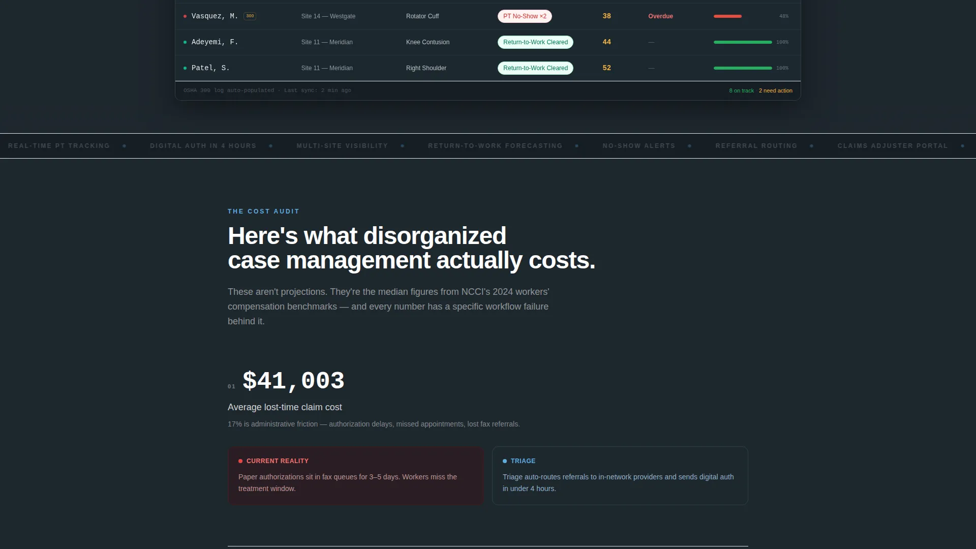
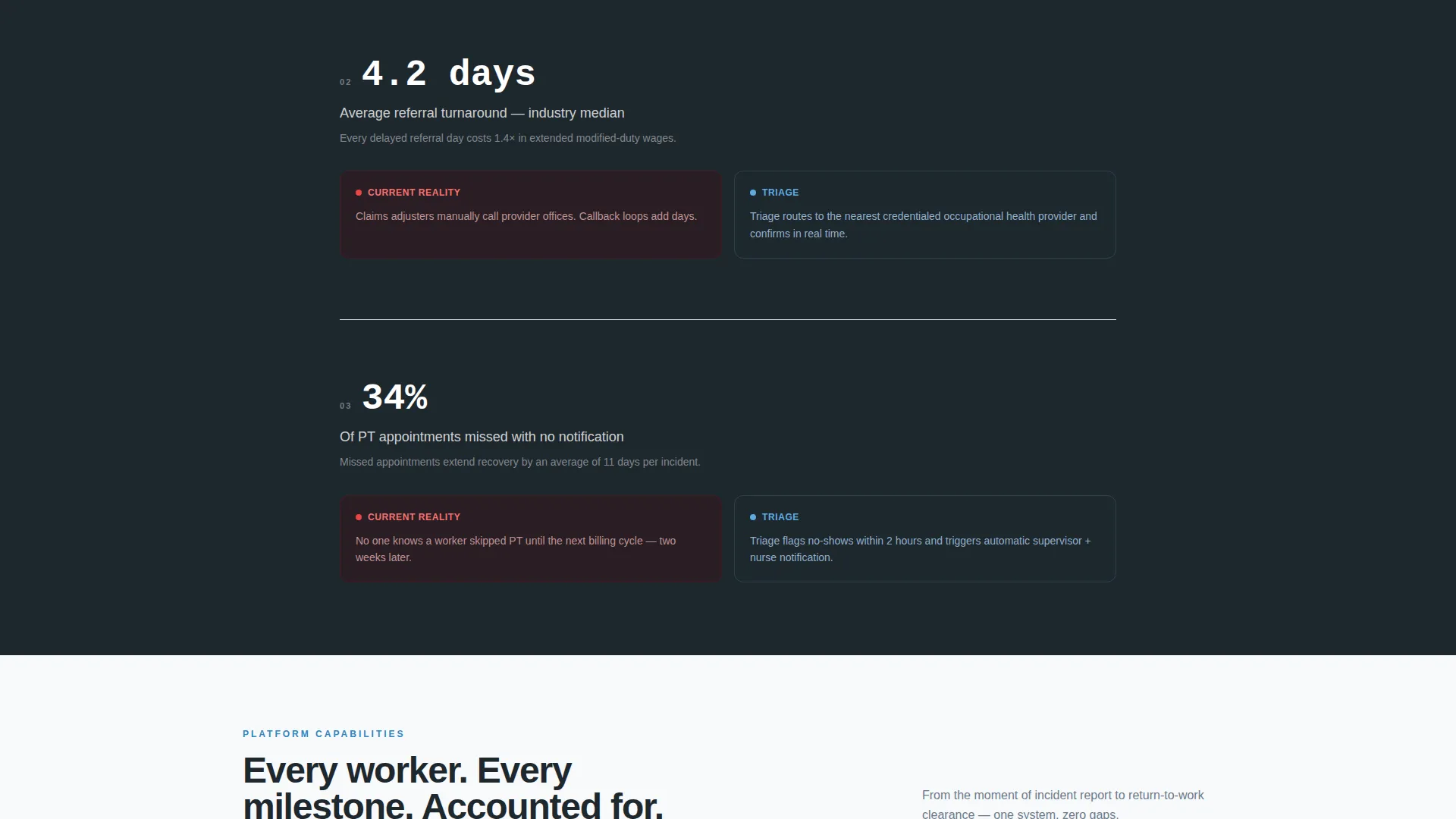
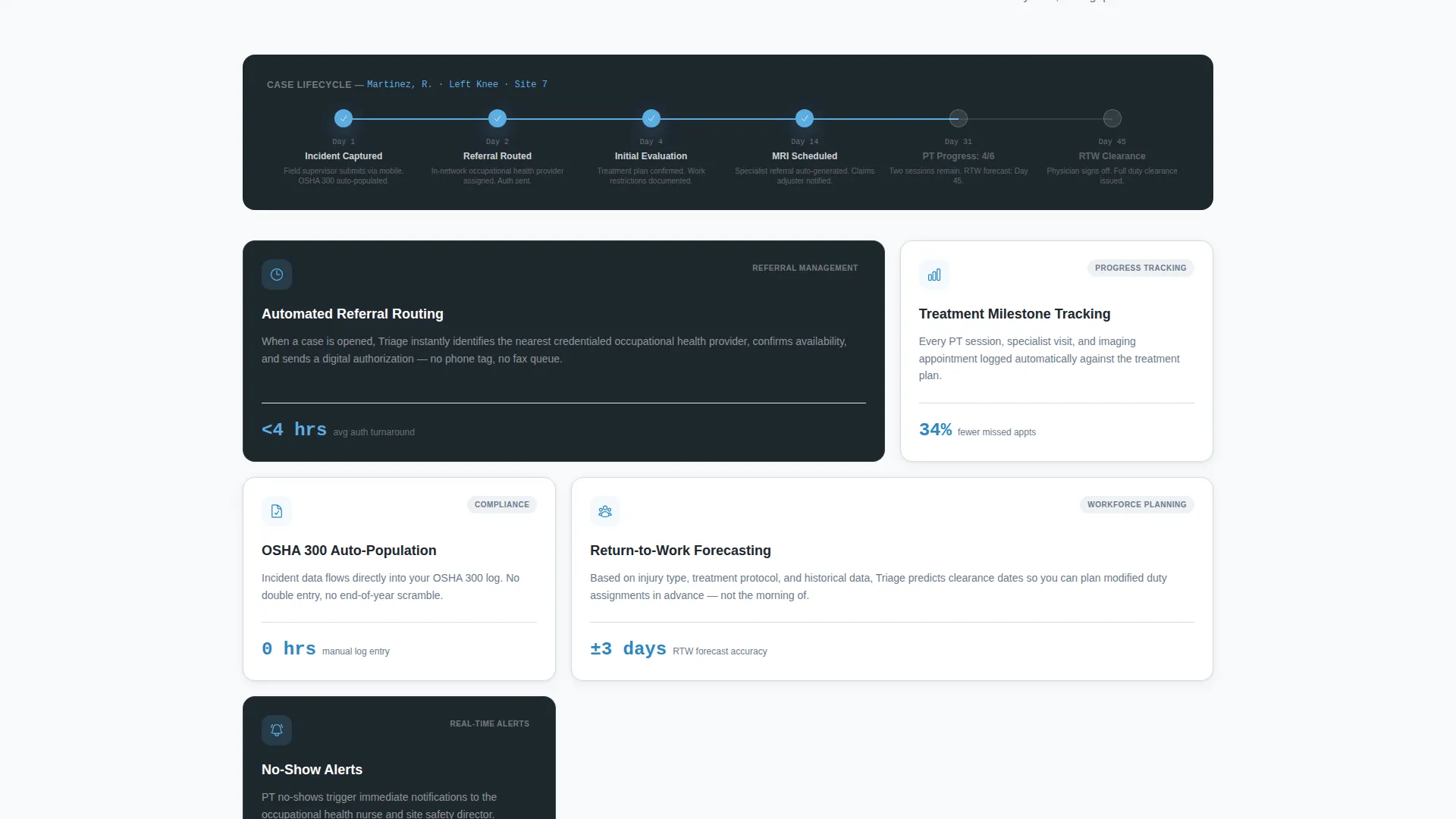
- An industry-report scroll flow pairing cost statistics with zoomed-in feature screenshots
- A sticky side-by-side comparison table covering twelve specific workflow dimensions
Feature list
This template includes six purpose-built components that work together to build trust and move visitors toward action.
Interactive Data Grid Header
The header is a functioning data grid populated with anonymized patient records mid-lifecycle. Visitors click column headers to sort rows in real time, demonstrating the platform's competence before reading a single line of body copy.
Industry Report Scroll Structure
Each scroll section opens with a hard cost statistic, such as the average lost-time claim costing $41,003 with seventeen percent attributable to administrative friction. Below each stat, the grid reappears zoomed into the feature that solves that exact problem.
Sticky Comparison Table
A side-by-side table anchors the lower third of the page. It contrasts the visitor's current process against the platform across twelve workflow dimensions including incident capture speed, referral turnaround, OSHA 300 auto-population, and provider network visibility.
Qualifying Call to Action
The primary call to action, "Run Your Site Comparison," asks three short qualifier questions: number of active jobsites, average monthly incidents, and current tracking method via a dropdown with options including spreadsheet, electronic health record, paper, and none.
Email-Gated Secondary Path
Visitors not ready to engage directly can download a full benchmark report behind an email gate. This secondary conversion path keeps softer leads inside the funnel without asking for a sales conversation.
Slate and Sky Visual System
The color system uses structural slate, rebar charcoal, open-sky blue, and hard-hat amber reserved exclusively for alerts and status flags. Sky blue traces every interactive element so visitors always know what is clickable.
Page sections overview
| Section | Purpose |
|---|---|
| Interactive Data Grid Header | Prove product competence with live sortable patient records |
| Cost Statistic Block | Reframe the financial cost of disorganized case management |
| Feature Screenshot Zoom | Show the exact grid feature that solves each identified friction point |
| Sticky Comparison Table | Contrast current workflow against the platform across twelve dimensions |
| Primary call to action Block | Qualify leads with three short questions before connecting them |
| Email Gate Block | Capture softer leads with a downloadable benchmark report |
Design & branding system
The visual identity follows a Directory and Discovery theme grounded in a Slate and Sky color palette. Every design choice reinforces authority and clarity, mirroring the feeling of a well-run project command center.
- Core palette: structural slate (#3B4856), rebar charcoal (#1E272E), open-sky blue (#5DADE2), and hard-hat amber (#F5B041) used only for alerts and status flags
- Backgrounds alternate between slate and near-white (#F8F9FA), with data cells sitting in cool gray containers
- Sky blue marks every interactive element including toggle switches, filter pills, and progress bars so the eye always knows what is clickable
Mobile & speed optimization
The template layout is built to remain functional and readable across screen sizes. The data grid and comparison table are structured to reflow cleanly on smaller viewports without losing their core usability.
- The interactive data grid header maintains sort functionality on touch devices
- The sticky comparison table is designed to scroll horizontally on narrow screens rather than collapsing content
- No stock photography or illustration is used, keeping the visual payload lean and the product itself central
How this template helps you convert
The entire page is structured as a Comparison and Versus conversion flow. Every scroll moment builds the case that the visitor's current process is measurably costly, and then immediately shows the solution already built.
- The interactive header creates instant credibility by showing real workflow data in motion, so visitors arrive at the body copy already trusting the product.
- The industry-report scroll pairs a specific dollar cost with the exact feature that eliminates it, making the value proposition feel audited rather than marketed.
- The qualifying call to action turns intent into a measurable lead by asking three short questions before any sales conversation begins.
Other information about this template
This template is categorized under Technology and Construction Software, and it is designed specifically for the construction patient management niche. It suits any team building a serious market presence in the injured worker tracking or occupational health coordination space.
- The template style is Dashboard and Data Grid, making it well suited for platforms where the interface itself is the selling point
- The creative direction follows an Industry Report structure, which works particularly well for buyers who respond to data and process audits rather than lifestyle marketing
- The header concept is an Interactive Preview, meaning no static screenshots or hero illustrations are needed since the product populates the demo itself
- Hard-hat amber (#F5B041) is reserved exclusively for alerts and status flags, keeping urgent information visually distinct from navigational and interactive elements
Theme
Directory & Discovery
Creative direction
Industry Report
Color system
Slate & Sky
Style
Dashboard/Data Grid
Direction
Comparison/Versus
Page Sections
Live Sortable Data Grid Hero
Industry Report Scroll Flow
Sticky Comparison Table
Three-question Qualifying Call to Action
Email-gated Benchmark Report
Slate and Sky Color System
Related questions
What kind of platform is this landing page template built for?
Does the interactive data grid require custom development to populate?
Who are the primary visitors this landing page is designed to convert?
Can the comparison table be customized to reflect different workflow dimensions?
What is the secondary conversion path for visitors not ready to request a comparison?



