Construction Survey & Feedback Landing Page
Sitecheck is a construction survey and feedback landing page template built for teams that need clarity on active sites. It pairs a dark, data-driven dashboard aesthetic with a scroll-driven Problem to Solution Arc, animated user interface previews, and a mobile-first app download flow, giving contractors, project managers, and inspectors one focused screen to replace the clipboard.
by Rocket studio
Quick summary
Sitecheck is a single-page construction survey and feedback template. It opens with a live-feeling animated dashboard preview and walks visitors through a Problem to Solution Arc. The design runs on void black and high-vis lime with industrial urgency baked into every section. It ends with a clear app download call to action backed by App Store and Play Store badges.
Who this template is for
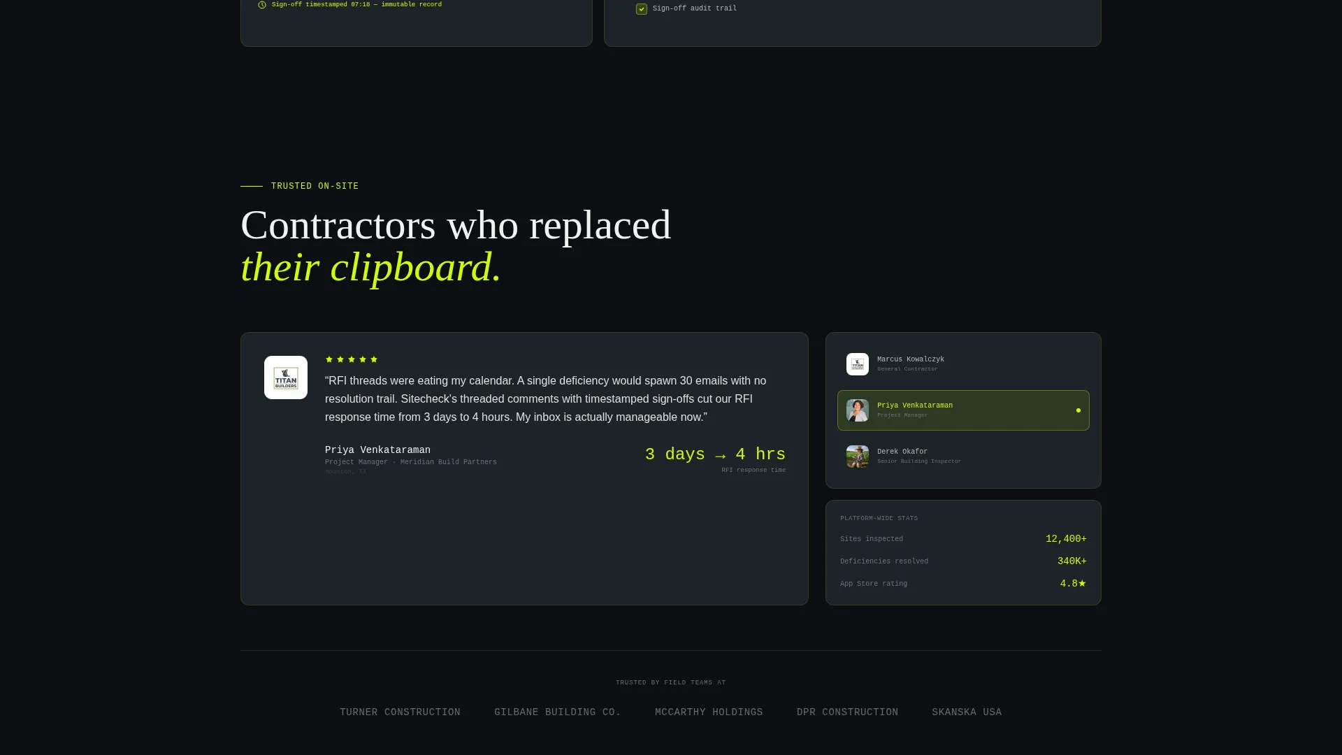
This template is built for teams who manage physical sites and need a faster way to capture, track, and resolve deficiencies. It speaks directly to the people still carrying clipboards and drowning in email threads.
- General contractors managing multiple active sites simultaneously
- Project managers overwhelmed by inspection reports and RFI threads
- Building inspectors looking for a faster, structured walkthrough tool
What problem this template solves
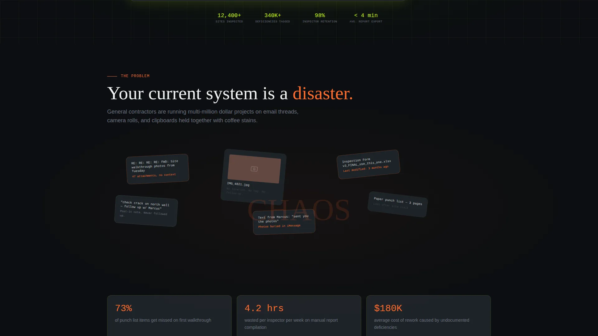
Site teams lose time every day chasing scattered feedback. Photos sit in camera rolls with no context. Paper punch lists disappear before sign-off. This template frames those exact frustrations visually before presenting a solution.
- Scattered email threads and lost paper forms have no clear home
- Photos of deficiencies are captured without location or timestamp context
- Manual reports slow down sign-off and delay project completion
What you get with this template
You get a full single-page layout designed around a construction survey and feedback platform. Every section is purposeful, motion-enhanced, and structured to move a visitor from problem recognition to app install.
- An animated isometric dashboard hero with live-data visual effects
- A scroll-triggered Problem to Solution Arc with glitch-styled chaos and clean resolution
- A floating mobile call-to-action bar with paired App Store and Play Store badges
Feature list
This template delivers six distinct design and layout capabilities rooted directly in the source brief. Each one is built to serve the construction software audience with honesty and visual impact.
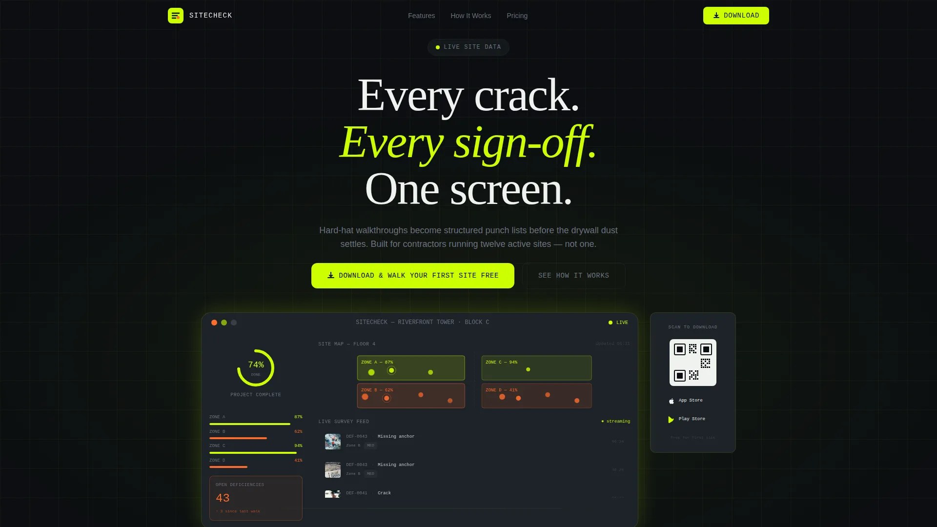
Animated Dashboard Hero
The header features an isometric app screenshot showing a live project view. Color-coded site zones, a deficiency counter, a photo grid of tagged issues, and a completion percentage ring all animate subtly on load. Data points pulse, a new survey response slides into the feed, and the ring nudges forward one percent.
Problem to Solution Arc Layout
The scroll flow begins with a deliberately chaotic section: glitched email threads, scattered paper forms, and context-free photos rendered as a vibrating collage. As the visitor scrolls, each pain point snaps into a clean dashboard module that solves it directly. The motion tightens progressively until a single green checkmark marks a completed project.
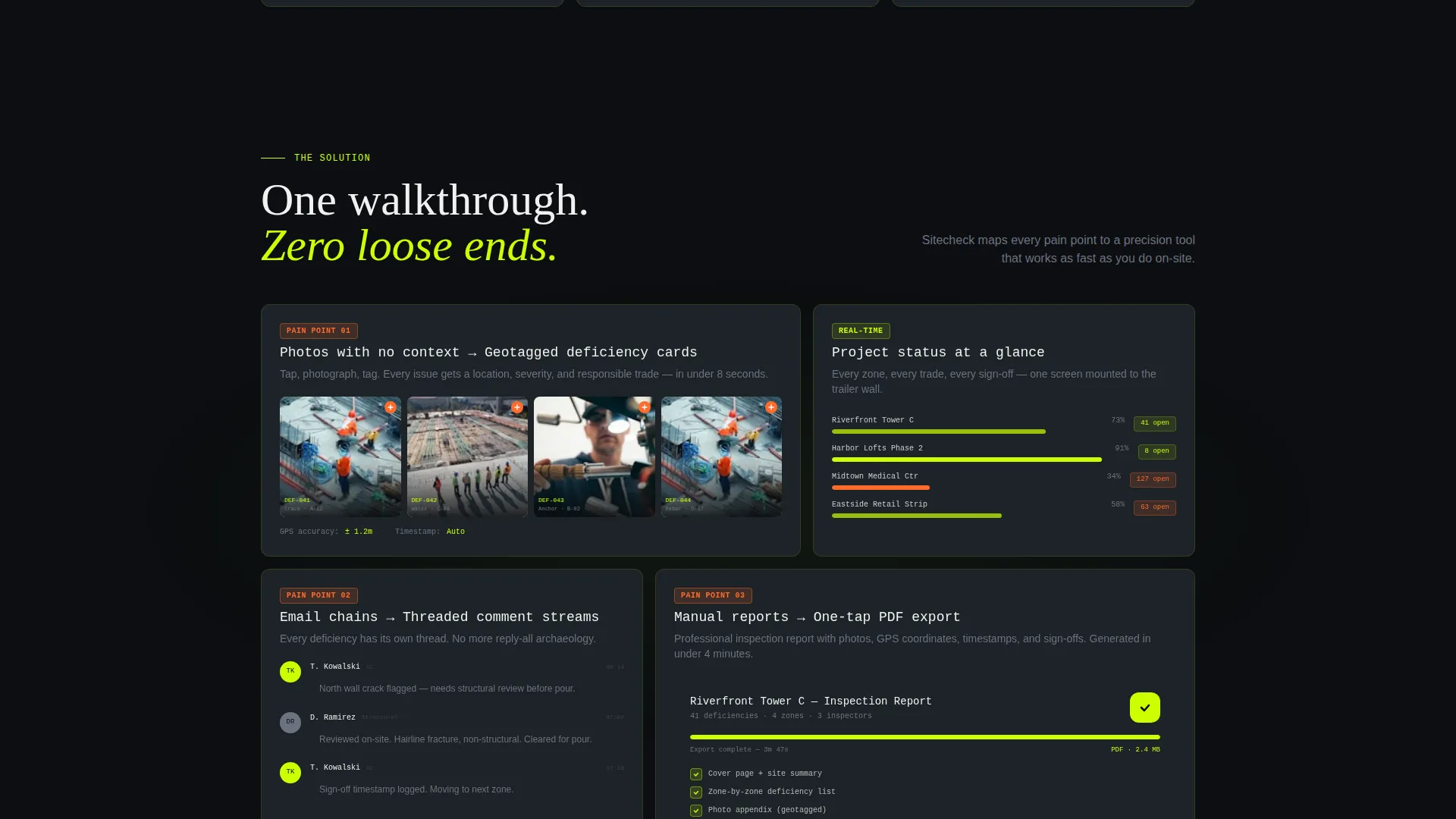
Deficiency-to-Dashboard Module Pairing
Each problem the visitor recognizes is answered by a matching product section. Photo capture becomes geotagged deficiency cards. Email chains become threaded comment streams. Manual reports become one-tap PDF exports. Each pairing is its own visual section with corresponding dashboard user interface.
Floating Mobile Call-to-Action Bar
On mobile, the primary call to action "Download and Walk Your First Site Free" is pinned as a floating bottom bar. App Store and Play Store badges sit beside it at all times. The bar stays present throughout the scroll so the download prompt is always within reach.
Desktop QR Code Integration
Above the fold on desktop, a QR code sits beside the animated dashboard preview. Desktop visitors can scan instantly without searching for a download link. This removes friction for the audience most likely to be sitting at a job-trailer workstation.
Scroll-Triggered Motion System
Animations are tied to scroll depth and escalate in speed as the visitor moves through problem and solution sections. The motion system is intentional: it mimics the urgency of a live site and rewards forward momentum with progressively tighter, faster transitions.
Page sections overview
| Section | Purpose |
|---|---|
| Animated Dashboard Hero | Grabs attention with a live-feeling app preview above the fold |
| QR Code Panel | Lets desktop visitors scan and download without leaving the page |
| Chaos Collage Section | Visualizes the scattered-feedback problem with glitch motion |
| Photo Deficiency Module | Shows how camera-roll photos become structured geotagged cards |
| Comment Stream Module | Replaces email threads with threaded in-app conversations |
| PDF Export Module | Demonstrates one-tap report generation from live site data |
| Completed Project Close | Ends the arc with a still green checkmark on a finished project |
| Floating Download Bar | Pins the primary app download call to action on mobile |
Design & branding system
The visual identity runs on the Acid Digital color system. The palette feels like a safety vest thrown over a dark terminal screen: industrial urgency electrified by neon data pulses.
- Void black (#0B0E11) and rebar charcoal (#1E2328) form the background layer
- High-vis lime (#CCFF00) drives primary actions, live data highlights, and the glowing screen edge effect
- Signal orange (#FF6B2B) marks alerts, deficiency counts, and critical status indicators
Mobile & speed optimization
The template is structured with a mobile-first call-to-action approach. The floating bottom bar ensures the download prompt is always visible on smaller screens without interrupting the scroll narrative.
- Floating call to action bar stays pinned at the bottom of the viewport on mobile throughout the full page
- App Store and Play Store badges are paired and accessible at all scroll depths on mobile
- Scroll-triggered animations are designed to escalate progressively rather than load all at once
How this template helps you convert
The conversion strategy is embedded in the scroll sequence itself. Visitors are not asked to download the app until the template has already shown the product doing real work.
- The animated dashboard hero lets visitors see the product in action before reading a single feature claim, building immediate trust through demonstrated utility.
- The Problem to Solution Arc mirrors the visitor's daily frustrations, making the product feel like a direct answer rather than a generic software pitch.
- The pinned floating download bar and above-the-fold QR code remove every remaining step between intent and install.
Other information about this template
This template sits at the intersection of construction software and technology-focused landing page design. It is built for a niche where trust is earned through specificity, not marketing language.
- The template style is Dashboard and Data Grid, suited to products where live data is a core selling point
- The Dynamic Motion theme is applied through scroll-triggered escalation, not decorative animation for its own sake
- The creative direction follows a strict Problem to Solution Arc, meaning each section earns the next through logical visual progression
- The header concept is a Dashboard Preview, making the product interface itself the hero rather than photography or illustration
- The landing page direction targets app downloads, with dual-platform badges and a QR code handling both mobile and desktop visitors
Theme
Dynamic Motion
Creative direction
Problem→Solution Arc
Color system
Acid Digital
Style
Dashboard/Data Grid
Direction
App Download
Page Sections
Animated Isometric Dashboard Hero
Scroll-triggered Problem to Solution Arc
Deficiency Module Pairing Sections
Floating Mobile Download Bar
Desktop QR Code Panel
Acid Digital Color System
Related questions
What kind of product is this template designed to promote?
Can I use this template if my product does not have a mobile app yet?
How does the animated hero section work?
Is this template suitable for a general construction company website?
What scroll behavior should I expect from the motion system?


