Bold Preschool Careers Landing Page Template
Crayon is a bold brutalist daycare job board landing page template built for early childhood educators and center directors. It combines a high-contrast Void & Violet design system with an interactive comparison table, live filter toggles, expandable center profiles, and data-rich job cards that display real ratios, pay bands, and benefits side by side.
by Rocket studio
Quick summary
Crayon is a single-page brutalist job board landing page built for the early childhood education sector. It surfaces real staff-to-child ratios, verified pay bands, and benefits data inside a dark, high-contrast design that takes the profession as seriously as the people who work in it. Every section earns the visitor's next scroll.
Who this template is for
This landing page was designed for people who know exactly what a bad ratio feels like. It speaks plainly and proves its value through data, not decoration.
- Lead teachers and assistant caregivers seeking centers with ratios under 1:8, fair pay, and real benefits
- Center directors competing for bilingual infant specialists and credentialed kindergarten educators in tight metro markets
- EdTech founders and recruitment platforms serving the early childhood education sector who need a professional website presence fast
What problem this template solves
Most daycare job boards show kids a generic title, a vague salary range, and a submit button. Educators who have survived understaffed classrooms need more than that before they apply.
- Job seekers cannot compare centers side by side on ratios, pay, and benefits without clicking through dozens of individual pages
- Center directors have no structured way to showcase classroom culture, accreditation, or tuition reimbursement at a glance
- Existing job board website designs look sterile and fail to reflect the crafts, energy, and community of early childhood education
What you get with this template
You get a fully designed, section-led landing page that puts transparent center data front and center. This template is built to save teams hours of layout work while delivering a website that feels intentional and authoritative.
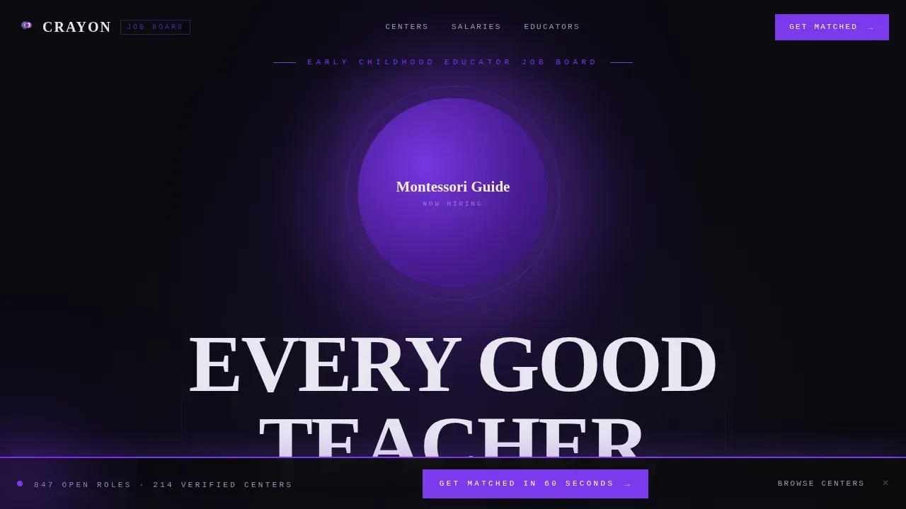
- A dark full-bleed hero with a pulsing violet orb, rotating role keywords, and a brutalist all-caps headline
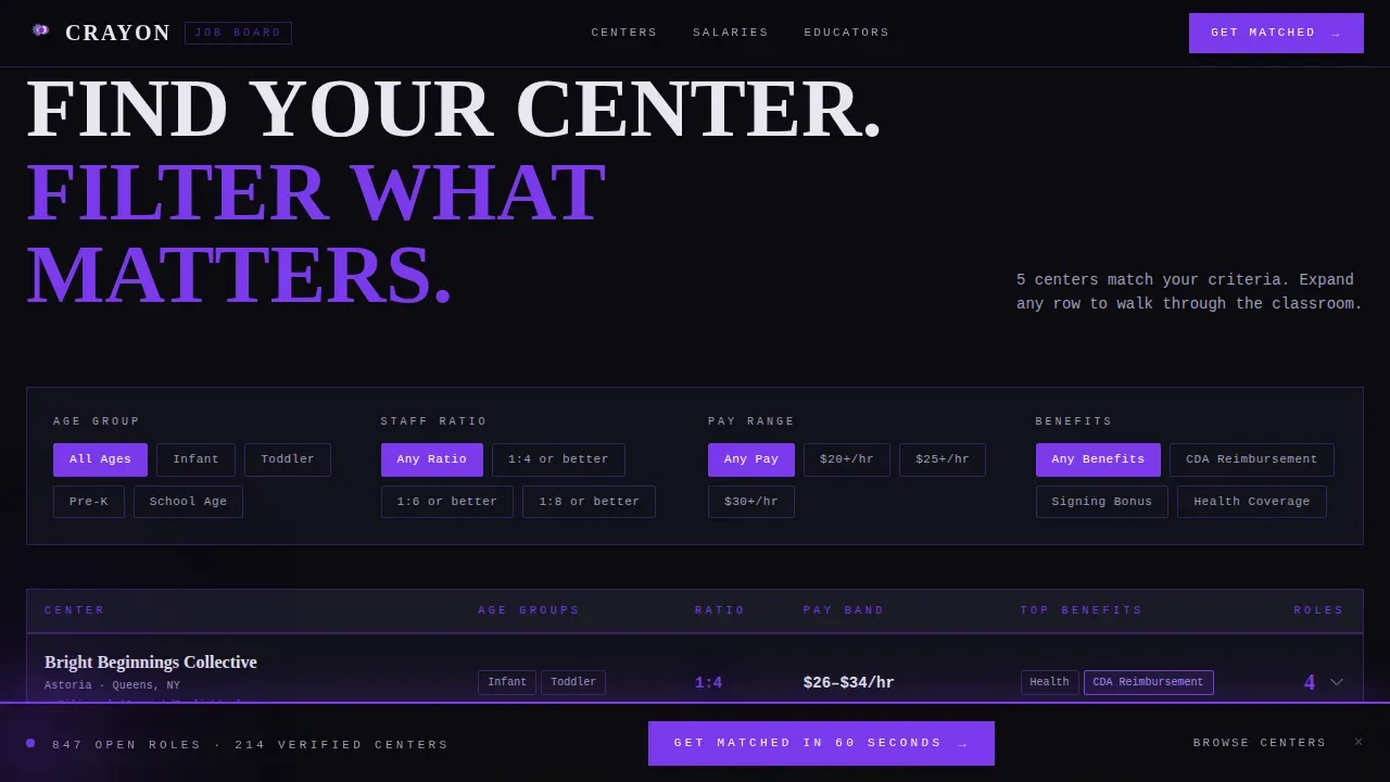
- An interactive comparison table with live filter toggles covering age group, ratio, pay range, and credential requirements
- A benefits comparison table, a salary heatmap section, an educator testimonials section, and a streamlined single-row footer
Feature list
This template ships as a complete design system. Each section is structured, purposeful, and ready to populate with real center data.
Dark Full-Bleed Hero with Pulsing Orb
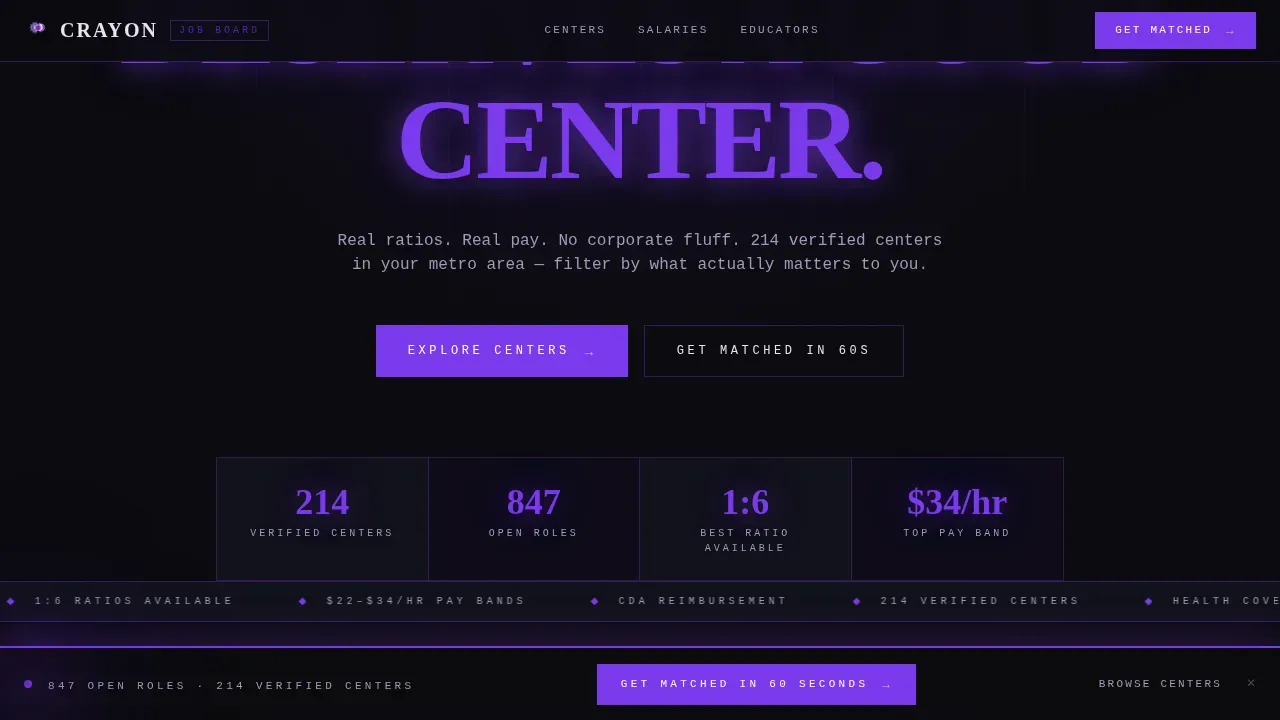
The hero section opens on a pure abyssal black field. A single glowing violet orb pulses at center screen, rotating through role keywords such as "Infant Lead," "Toddler Floater," and "Pre-K Director." The brutalist all-caps headline sits beneath it, set in a condensed slab typeface for maximum visual impact. This hero design follows the principle that the hero section includes a bold heading, a brief value proposition, and a clear call-to-action.
Interactive Comparison Table Explorer
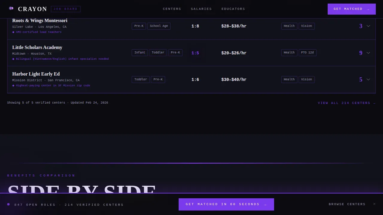
The core of the landing page is a live filter table. Visitors toggle age group, ratio, pay range, and credential filters and watch center rows reorganize in real time. Each row is a full center profile showing name, neighborhood, ratio, pay band, and benefits badge icons. Transparent job cards display pay ranges, hours, and certifications directly on the main page, giving educators the information they need without extra clicks.
Expandable Center Profiles with Micro-Gallery
Every table row expands inline to reveal a micro-gallery of actual classroom spaces. This design choice supports a culture showcase approach, allowing the page to feature visual evidence of each center's mission and environment. A "See Open Roles at This Center" call-to-action button lives inside every expanded row, creating a direct path from discovery to application.
Benefits Comparison Table
A dedicated section presents a side-by-side table comparing paid time off (PTO), Child Development Associate (CDA) tuition reimbursement, and health coverage across centers. This structured display makes benefit differences scannable without requiring the visitor to visit multiple pages.
Salary Heatmap by Zip Code
The salary heatmap visualizes pay data by zip code using a violet intensity scale. Educators can see where pay concentrates across metro areas. This section rewards deeper scrolling and gives the website a data depth that generic job boards cannot match.
Persistent Bottom Bar with Quick-Match call to action
A fixed bottom bar carries a secondary call-to-action: "Get Matched in 60 Seconds," linking to a short qualification quiz covering age group preference, years of experience, and zip code. This bar stays visible as visitors scroll, ensuring the path to matching is never more than one tap away.
Page sections overview
| Section | Purpose |
|---|---|
| Hero with Orb | Open with bold identity and role keywords |
| Interactive Filter Table | Compare centers by ratio, pay, credentials |
| Expanded Center Rows | Reveal classroom micro-galleries inline |
| Benefits Side-by-Side | Compare PTO, CDA reimbursement, health |
| Salary Heatmap | Visualize pay by zip code |
| Educator Voices | Build trust through outcome-driven testimonials |
| Persistent Bottom Bar | Keep secondary call to action visible while scrolling |
| Single-Row Footer | Provide navigation and essential links |
Design & branding system
The design system is built on the Void & Violet color palette, a set of four values that create a blacklight-in-concrete atmosphere. The typography pairing reinforces the template's dual personality: structural and emotional.
- Colors: abyssal black (#0B0B0F), electric violet (#7C3AED), deep ultraviolet (#4C1D95), and chalky off-white (#E8E5F0) for text and table cells
- Typography: DM Mono for functional elements and table data, Fraunces slab for emotional headlines; table rows alternate between void and a faint violet wash
- Brutalist design details include thick violet borders as structural dividers, visible gridlines, raw textures, oversized condensed headings, and hover states that erupt in full electric violet
Mobile & speed optimization
The landing page is designed desktop-first, reflecting how center directors research and post roles. Full mobile responsiveness ensures that teachers browsing on smartphones can still access and interact with every section.
- Mobile layout stacks table content into a single column, keeping filter controls and center rows readable on smaller screens
- Animations are handled through CSS for the pulsing orb and GSAP ScrollTrigger for section reveals, keeping the code lean and load times practical
- The bottom bar call to action remains persistent on mobile, so the quick-match quiz is always within reach regardless of scroll depth
How this template helps you convert
This landing page is designed around a Click-Through direction. Every section earns the visitor's trust before asking for action.
- The interactive comparison table proves the website knows more about each center than the center's own careers page does, building credibility before any call to action appears
- The "See Open Roles at This Center" button appears inside every expanded row, creating a natural next step the moment a visitor finds a center they like
- The persistent bottom bar keeps the "Get Matched in 60 Seconds" quiz accessible at all times, providing a low-friction entry point for visitors who are not yet ready to commit to a single listing
Other information about this template
This template draws inspiration from crayon themed classroom aesthetics while transforming them through a brutalist lens. The result is a website that feels both familiar to educators and structurally serious.
- The crayon bold brutalist daycare job board landing page template is suited for EdTech platforms, independent job boards, and early childhood staffing agencies
- Editable crayon name tags, classroom labels, and similar crayon themed design assets used in kindergarten settings share the same philosophy of clear, readable information display that this template applies to job data
- Crayon themed templates can enhance classroom organization and management, and this template applies that same logic to center discovery and job matching
- Templates with a crayon theme are often used for newsletters, name tags, and behavior charts in kindergarten and pre-K settings; this template redirects that visual energy into a high-stakes hiring context for kids-focused organizations
- Using a ready-made template can save teams significant time compared to building a job board website from scratch, particularly for small platforms without dedicated design resources
- The black and white structural grid underlying the brutalist design system provides visual clarity even before color is applied, making the layout easy to adapt if needed
- Raw text testimonials and candid educator quotes are built into the Educator Voices section, supporting the principle that real testimonials build trust more effectively than polished marketing copy
- Trust indicators such as accreditation logos and industry certifications can be prominently displayed within the existing table and profile structure
Theme
Bold Brutalist
Creative direction
Interactive Explorer
Color system
Void & Violet
Style
Comparison Table
Direction
Click-Through
Page Sections
Dark Hero with Pulsing Violet Orb
Live Interactive Comparison Table
Expandable Profiles with Micro-gallery
Side-by-side Benefits Comparison
Salary Heatmap by Zip Code
Persistent Bottom Bar Call to Action
Related questions
Who is this landing page template designed for?
Can the comparison table be customized with real center data?
Does this template support both desktop and mobile visitors?
What design style does this template use?
How does this template help reduce time-to-launch?



