Dynamic Booking Landing Page Template for Retail Software
Slate is a dynamic booking landing page template built for retail scheduling software. It uses a card grid layout to showcase each core capability, from multi-location sync to automated reminders, with proof points, micro-illustrations, and a live dashboard preview. The design drives freemium trial signups with a focused, operator-first visual identity.
by Rocket studio
Quick summary
Slate is a single-page booking software template designed for scheduling platforms targeting salons, fitness studios, and spas. It leads with a live-style dashboard preview, then builds trust through a modular card grid that isolates each feature with proof points. The goal is simple: show the product working before asking for a signup.
Who this template is for
This template is built for scheduling software products that serve hands-on service businesses. It speaks directly to operators who manage appointments across multiple staff members, locations, or service types every single day.
- Multi-location salon owners managing bookings across several sites
- Boutique fitness studio managers handling class rosters and drop-ins
- Independent spa operators who currently confirm bookings by hand
What problem this template solves
Service business owners lose hours every week to appointment chaos. Missed confirmations, double-bookings, and manual roster updates pile up fast when your tools do not talk to each other. This template gives the scheduling software a landing page that makes those pain points feel immediately solved.
- Visitors arrive and see a full, real-looking dashboard before reading a single feature claim
- Each card targets one specific operator frustration with a direct, quantified payoff
- The trial signup form is short enough to complete in under a minute
What you get with this template
Slate delivers a complete, scroll-driven single-page layout built around conversion. Every section is designed to move a skeptical operator from "I have this problem" to "I want to try this today."
- A full-width dashboard preview header with headline and dual call-to-action options
- A staggered card grid covering six core software capabilities with micro-illustrations and proof points
- A persistent mobile bottom bar and a lightweight three-field signup form for freemium trial capture
Feature list
Slate bundles every section a scheduling software launch page needs into one ready-to-customize template.
Dashboard-First Header Section
The header opens with a three-quarter-angle screenshot of the live booking grid, visibly full mid-week. Colored appointment blocks, a check-in sidebar with confirmed dots, and a floating "2 new online bookings" notification create an immediate sense of a system already at work. The headline "Your Calendar Runs Itself Now" sits above the image with the primary call-to-action directly below it.
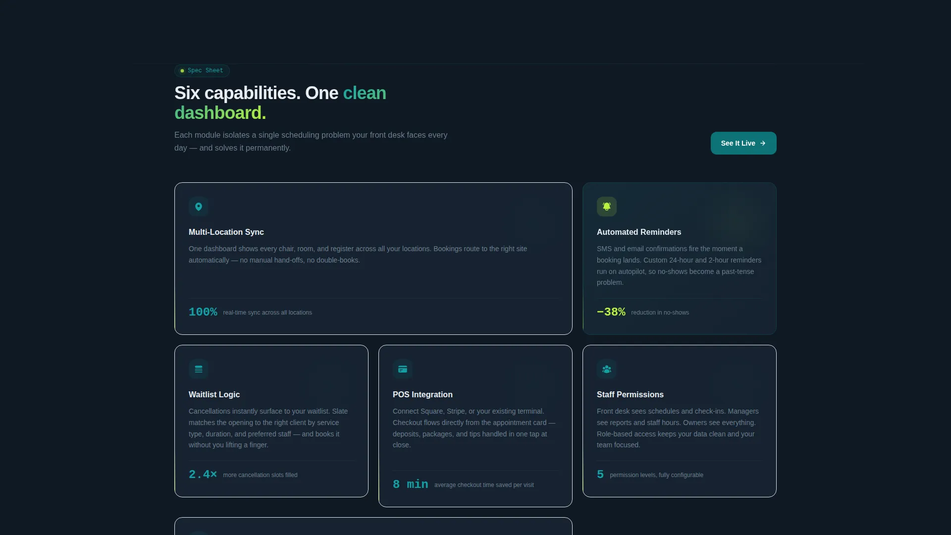
Modular Capability Card Grid
Six feature cards tile below the header, each isolating one platform capability: multi-location sync, automated reminders, waitlist logic, point-of-sale integration, staff permissions, and client profiles. Every card includes a micro-illustration, a three-line operator-language explanation, and a single quantified proof point. Cards stagger in on scroll with subtle upward motion, arriving beat by beat.
Dual Conversion Path Design
The primary call-to-action, "Start Your Free 14-Day Calendar," appears in the header and again as a persistent bottom bar on mobile. A secondary path, "Watch a 90-Second Demo," captures email on video play for visitors who are not yet ready to commit. This two-path structure meets buyers at different stages of readiness without cluttering the page.
Lightweight Three-Field Signup Form
The freemium trial form asks only for business name, email address, and number of locations, offered as three simple options: 1, 2 to 5, or 6 and above. Keeping the form this short removes friction and lets the onboarding flow personalize itself based on the operator's scale.
Scroll-Triggered Stagger Animation
Each card in the grid arrives with a subtle upward entrance motion, delayed slightly from the one before it. The cumulative effect makes the feature set feel like a platform assembling itself in real time, reinforcing the product's promise of a system that builds order from chaos.
Dynamic Motion Visual Theme
The Dynamic Motion theme uses purposeful animation only where it adds meaning: scroll-triggered card entrances and an electric chartreuse hover pulse on interactive elements. Nothing moves without a reason, which keeps the page feeling focused rather than distracting.
Page sections overview
| Section | Purpose |
|---|---|
| Dashboard Preview Header | Opens with a live-style booking grid screenshot and the primary headline plus call-to-action |
| Feature Card Grid | Presents six platform capabilities in a staggered modular layout with proof points |
| Trial Signup Form | Captures business name, email, and location count with a minimal three-field form |
| Mobile Bottom Bar | Keeps the primary call-to-action visible on smaller screens throughout scrolling |
| Secondary Demo Path | Offers a 90-second video demo as an email-capture alternative for undecided visitors |
Design & branding system
The Teal Catalyst color system anchors the page in a focused, operational mood. The palette is deliberately limited so every color carries a specific role and nothing competes for attention.
- Deep operational teal (#0D7377) on primary actions and navigation; midnight dashboard (#0F1923) behind data-rich sections; clean surface white (#F4F7F9) on card faces
- Electric chartreuse (#B8F23E) reserved exclusively for live-state indicators, toggle confirmations, and hover pulses, making active states impossible to miss
- The Dynamic Motion theme applies scroll-triggered card entrances and subtle hover pulses, keeping animation meaningful and tied directly to user interaction
Mobile & speed optimization
The template is built with mobile operators in mind. A salon owner checking their dashboard between clients or a studio manager glancing at bookings before a class both need the page to work cleanly on a phone.
- The persistent bottom bar keeps "Start Your Free 14-Day Calendar" reachable without scrolling back to the top
- The card grid reflows into a single column on smaller screens so each feature stays fully readable
- The three-field signup form is thumb-friendly by design, with large tap targets and a simple selection for location count
How this template helps you convert
Slate is structured around a proof-before-promise conversion strategy. Visitors see the product in action before they encounter any marketing language.
- The dashboard preview header acts as immediate social proof, showing a calendar that is already full and a notification confirming live bookings are arriving
- Each feature card pairs a real operator pain point with a quantified outcome, making the value concrete rather than abstract before the visitor reaches the signup form
- The dual call-to-action structure captures both ready-to-start users and cautious researchers in a single page flow, without requiring a second page or a separate campaign
Other information about this template
Slate fits naturally into a broader retail software marketing strategy. The template's structure and visual identity are designed to support scheduling tools at any stage of growth, from an early-stage product to an established platform expanding into new service verticals.
- The location-count field in the signup form segments new users immediately, making onboarding personalization straightforward from day one
- The Spec Sheet creative direction means each card functions as a standalone proof unit, easy to update when metrics or features change
- The template is suited to retail booking software contexts including appointment-based retail, class-based fitness scheduling, and multi-service wellness operations


Theme
Dynamic Motion
Creative direction
Spec Sheet
Color system
Teal Catalyst
Style
Card Grid (Modular)
Direction
Freemium/Trial
Page Sections
Dashboard Preview Header
Modular Capability Card Grid
Dual Call-to-action Conversion Paths
Three-field Trial Signup Form
Scroll-triggered Stagger Animation
Teal Catalyst Color System
Related questions
Who is the Slate template designed for?
What does the signup form collect?
Can I customize the feature cards?
What are the two conversion paths on this page?
Does the stagger animation affect usability on slower devices?


