Specialist Software & SaaS Appointment Booking Website Template
Slate is a split-screen landing page template built for appointment scheduling software. It uses a Feature Tab Switcher header, live competitor comparison sections, and an interactive savings calculator to turn browsers into sign-ups. The Monochrome Steel color system and Startup Velocity theme give it a sharp, engineered look that builds trust fast.
by Rocket studio
Quick summary
Slate is a single-page template designed to market appointment scheduling software. It pairs a 50/50 split-screen layout with interactive comparison sections, a tab-driven header, and a no-friction sign-up flow. The Monochrome Steel palette keeps every element crisp and purposeful, so the product speaks for itself from the first scroll.
Who this template is for
This template is built for SaaS founders and marketing teams who need to convince busy buyers quickly. It works especially well when the product competes in a crowded market and the visitor has already tried alternatives.
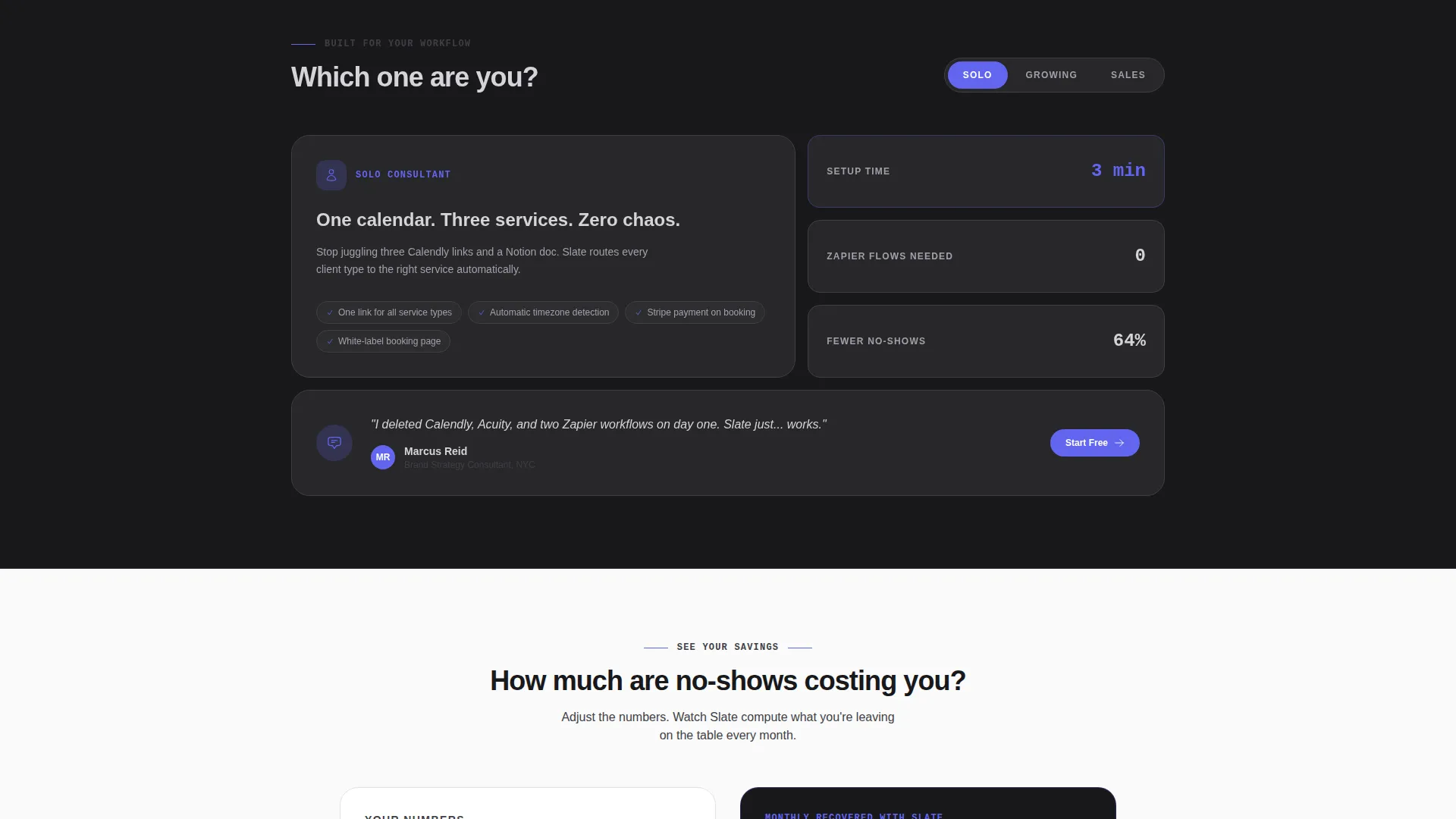
- Solo consultants who manage multiple booking links and want a cleaner way to present one solution
- Growing clinics and small practices where the front desk handles scheduling, billing, and follow-ups at once
- Sales teams whose demo pipeline stalls because booking links break or time zones cause confusion
What problem this template solves
Scheduling software is hard to sell because everyone has already tried something similar and walked away frustrated. The template addresses that skepticism head-on by framing every section as a direct, winnable comparison.
- Visitors arrive with doubt, so the layout leads with proof rather than promises
- Manual booking workflows, no-show losses, and embed-code headaches are shown side by side with the cleaner alternative
- The sign-up flow removes friction by asking only for work email and team size, with no credit card field
What you get with this template
You get a complete, structured landing page layout ready to adapt to your scheduling product. Every section has a clear job, and the design system is consistent from header to footer.
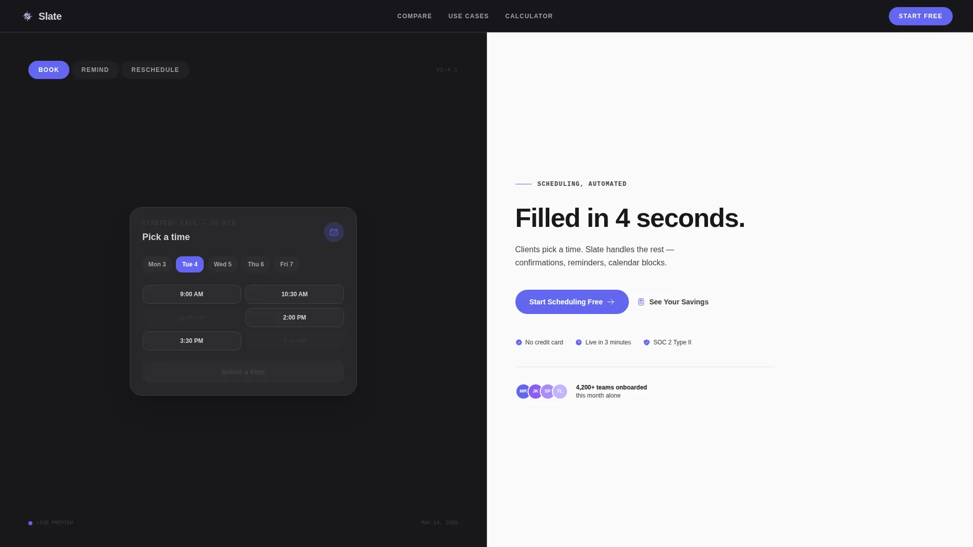
- A tab-switching header that cycles through three core product actions with matching headlines
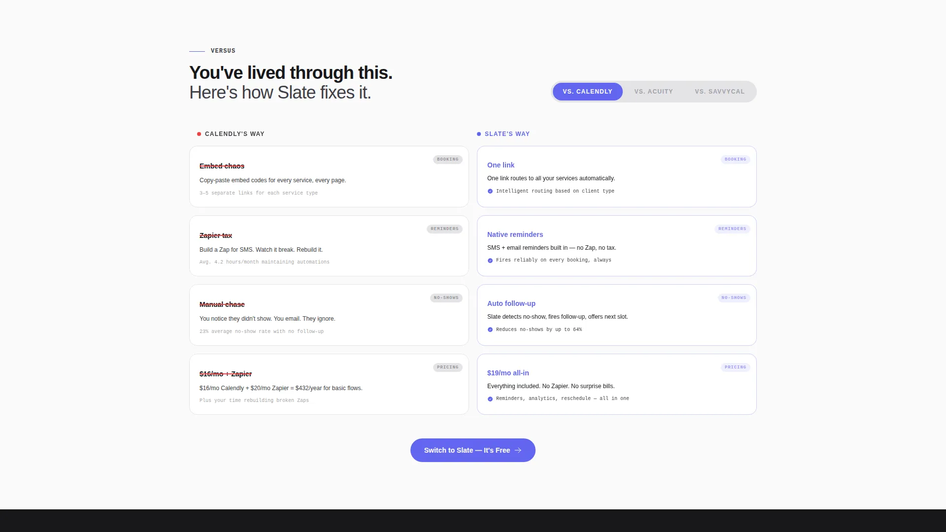
- A versus-style comparison explorer with a live pill selector to toggle between competitor scenarios
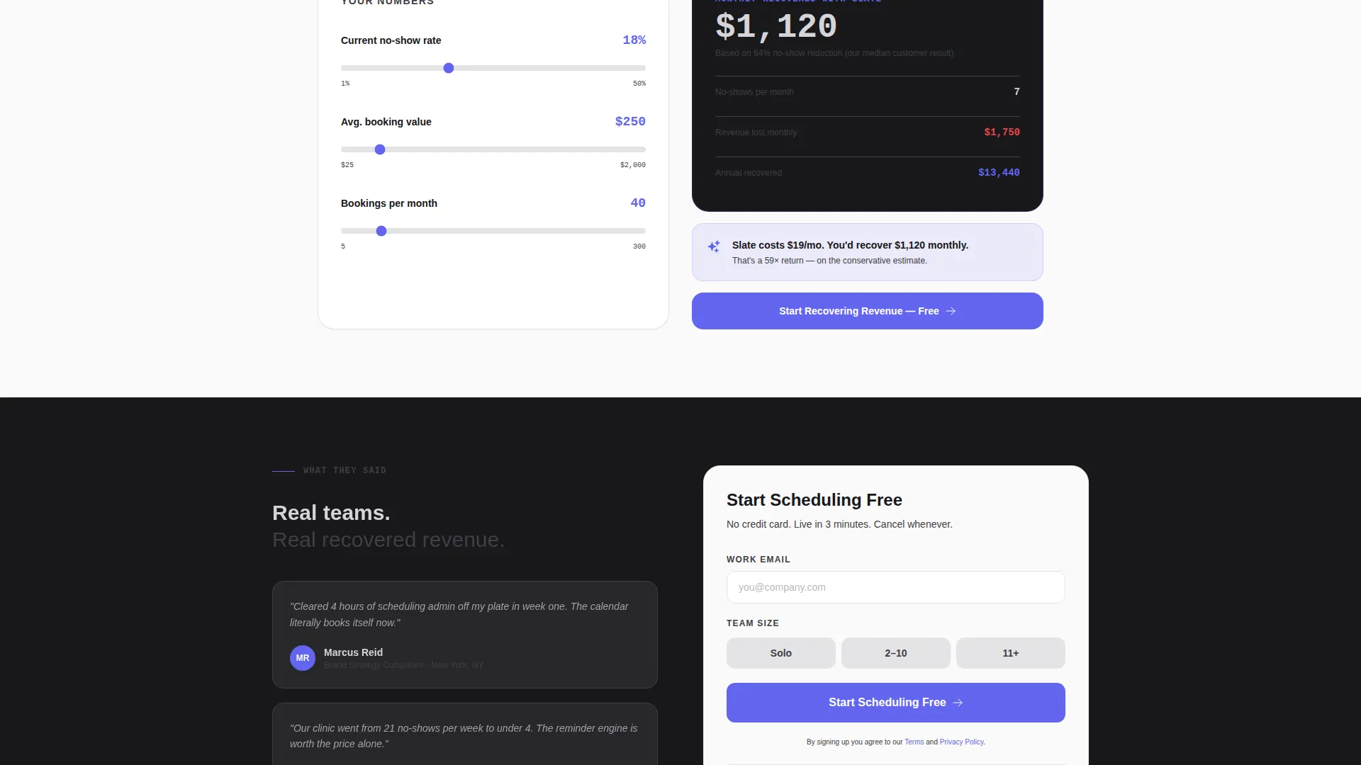
- A secondary conversion path featuring an interactive calculator that estimates recovered revenue from reduced no-shows
Feature list
This template ships with six tightly scoped layout sections, each designed to push a specific conversion moment. The feature set below maps directly to what the prompt defines.
Feature Tab Switcher Header
The header splits 50/50 between a three-tab product mockup panel and a headline area. Tabs labeled "Book," "Remind," and "Reschedule" each load a different user interface mockup mid-action. The headline on the right rewrites itself to match: "Filled in 4 seconds," "Sent before they forget," and "Moved, not lost."
Live Competitor Comparison Explorer
Below the header, each section frames the visitor's current pain against the solved version. A pill selector lets the visitor toggle between competitor scenarios, and the comparison content reshuffles to match. The left column shows the old way in muted graphite; the right column shows the resolved state in chrome with indigo highlights.
Interactive Savings Calculator
A secondary conversion path asks visitors to enter their current no-show rate and average booking value. The calculator then displays an estimated figure for recovered revenue. This section earns the click by grounding the value proposition in the visitor's own numbers.
Pinned Mobile Call to Action
The primary call-to-action button reads "Start Scheduling Free" and stays pinned to the bottom of the viewport on mobile. On desktop it anchors to the right split panel. The button uses the electric indigo accent so it is always visible and always distinct from surrounding content.
Minimal Sign-Up Flow
The sign-up form asks only for work email and team size, with three size options: solo, 2 to 10, and 11 or more. No credit card field appears anywhere in the flow. This keeps the entry barrier low for the three core buyer personas described in the brief.
Escalating Comparison Stakes
The comparison sections are ordered deliberately. They move from basic booking through integrations, then analytics, then pricing. Each step widens the perceived gap between the old workflow and the Slate approach, building conviction as the visitor scrolls.
Page sections overview
| Section | Purpose |
|---|---|
| Tab Switcher Header | Introduce three core product actions with swappable user interface mockups and matching headlines |
| Competitor Comparison Explorer | Show the old workflow versus the product's approach, with a live pill selector for competitor toggles |
| Integrations Comparison | Widen the gap at the workflow and tool-connection level |
| Analytics Comparison | Demonstrate reporting and insight advantages over manual tracking |
| Pricing Comparison | Contrast value and cost against competitor tiers |
| Savings Calculator | Let visitors estimate recovered revenue based on their own no-show data |
| Primary call to action Panel | Capture work email and team size with a single low-friction sign-up form |
Design & branding system
The Monochrome Steel palette is the visual backbone of this template. Every color decision is intentional: forge-black backgrounds signal focus, the electric indigo accent appears only on interactive elements, and nothing competes with the product user interface mockups for attention.
- Forge-black (#18181B) and near-white (#FAFAFA) alternate as section backgrounds, keeping the page from feeling flat across long scrolls
- Polished chrome (#D4D4D8) and brushed graphite (#3F3F46) handle all body text, with chrome on dark backgrounds and graphite on light
- Electric indigo (#6366F1) is reserved exclusively for buttons, tabs, hover states, and draggable elements, so every interactive moment is immediately obvious
Mobile & speed optimization
The layout is structured so the most important conversion elements stay accessible on smaller screens without requiring a redesign. The pinned call to action and tab interactions are core to the mobile experience, not afterthoughts.
- The primary call to action button pins to the bottom of the viewport on mobile so it is never out of reach during scrolling
- The split-screen 50/50 layout stacks responsively on narrow viewports to preserve readability without losing the comparison structure
- Tab switching and pill selector interactions are designed for tap as well as click, keeping the interactive experience consistent across device types
How this template helps you convert
This template is built around the principle that showing beats telling. Every layout decision is designed to move a skeptical visitor one step closer to signing up.
- The tab-driven header puts the product in motion immediately, replacing static hero images with a live-feeling user interface demonstration that matches each headline
- The competitor comparison explorer makes the visitor's current frustration visible and then resolves it in the same viewport, turning recognition into motivation
- The savings calculator personalizes the value proposition, so the visitor's decision is anchored to their own estimated numbers rather than generic claims
Other information about this template
This template sits inside the Technology category, specifically the Software and SaaS subcategory, with a focus on the appointment scheduling niche. It is built with the Startup Velocity theme and the Interactive Explorer creative direction, meaning the layout rewards curiosity and clicking rather than passive reading. The Comparison/Versus landing-page direction means the page is structured to outperform competitor comparison search queries and intent.
- The template style is Split Screen (50/50), giving equal visual weight to the product demo and the persuasive copy at every section
- The header concept is a Feature Tab Switcher, which is a reusable pattern well suited to SaaS products with multiple distinct workflow features
- This template can support use cases beyond scheduling software: any SaaS product with a clear "old way versus new way" story can adopt the comparison and calculator sections with minimal structural changes
Theme
Startup Velocity
Creative direction
Interactive Explorer
Color system
Monochrome Steel
Style
Split Screen (50/50)
Direction
Comparison/Versus
Page Sections
Feature Tab Switcher Header
Live Competitor Comparison Explorer
Interactive Savings Calculator
Pinned Mobile Call to Action
Minimal Sign-up Form
Escalating Comparison Structure
Related questions
Who is the Slate template designed for?
Do visitors need a credit card to sign up through this template?
Can I replace the competitor labels in the pill selector?
How does the savings calculator section work?
Is this template suitable for SaaS products outside of appointment scheduling?



