Slate - Powerful Booking Landing Page Template
Slate is a dashboard-style landing page template built for entertainment booking software. It combines a live metrics header, an industry-report scroll structure, and a comparison-driven conversion flow. Designed for booking agents, venue managers, and independent promoters, it makes the case for switching by turning workflow data into a compelling, evidence-first argument.
by Rocket studio
Quick summary
Slate is a single-page, dashboard-style landing page template for entertainment booking software. It opens with a frozen-mid-season metrics command center, walks visitors through an industry teardown, and closes with a comparison-driven audit call to action. The design runs on a Void and Violet color system that feels like a production booth at capacity.
Who this template is for
This template is built for software teams and founders who sell into the live entertainment and touring industry. The target visitor already knows their current workflow is broken and needs a page that confirms it fast.
- Booking agents handling large artist rosters across festival season
- Venue operations managers who need to confirm holds at any hour
- Independent promoters running multiple markets with lean teams
What problem this template solves
Most booking software pages lead with feature lists and screenshots. Visitors in the entertainment industry do not need another feature tour. They need proof that their current process is costing them time and money before they will take action.
- Spreadsheets and email threads create costly delays in deal confirmation
- No single view connects offers, holds, contracts, and settlement in one place
- Generic software pages fail to speak the language of talent buyers and tour routers
What you get with this template
You get a fully structured landing page designed around the entertainment booking workflow. Every section is purposeful and sequenced to build a case, earn trust, and push the visitor toward a high-intent conversion action.
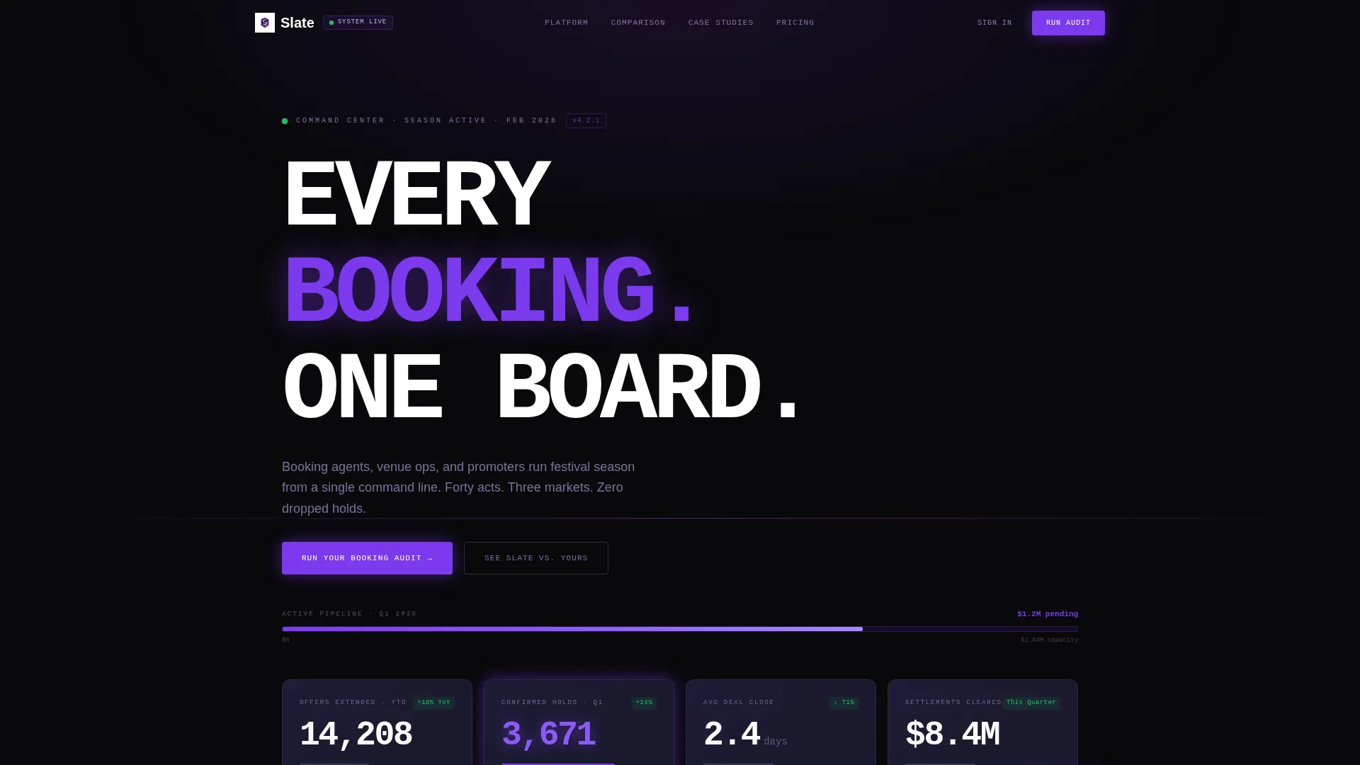
- A live-data metrics header with oversized monospace numbers and animated violet accent bars
- A competitive comparison grid formatted as an industry analyst briefing
- A dual-call to action conversion system with a primary audit trigger and a sticky secondary configurator link
Feature list
This template packs several purpose-built components into a single, scrollable page. Each one serves the Industry Report creative direction without padding or decoration.
Live Metrics Command Header
The header displays four real-time-style statistics: 14,208 total offers extended, 3,671 confirmed holds this quarter, 2.4-day average deal close time, and a $1.2 million pending contracts pipeline bar. Numbers render in oversized monospace type against void black, with violet bars animating upward on page load. The data is the hero, no photography required.
Competitive Landscape Grid
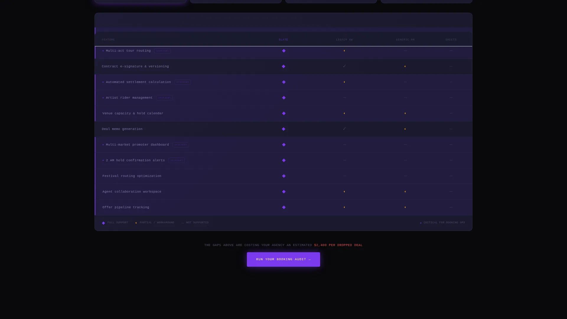
A structured feature comparison grid presents Slate against the broader competitive field. Each row maps a workflow capability to checkmarks and gap indicators, so visitors can see at a glance where alternatives fall short. The format mirrors an analyst briefing and reads like a teardown that keeps confirming what the visitor already suspected.
Workflow Benchmark Section
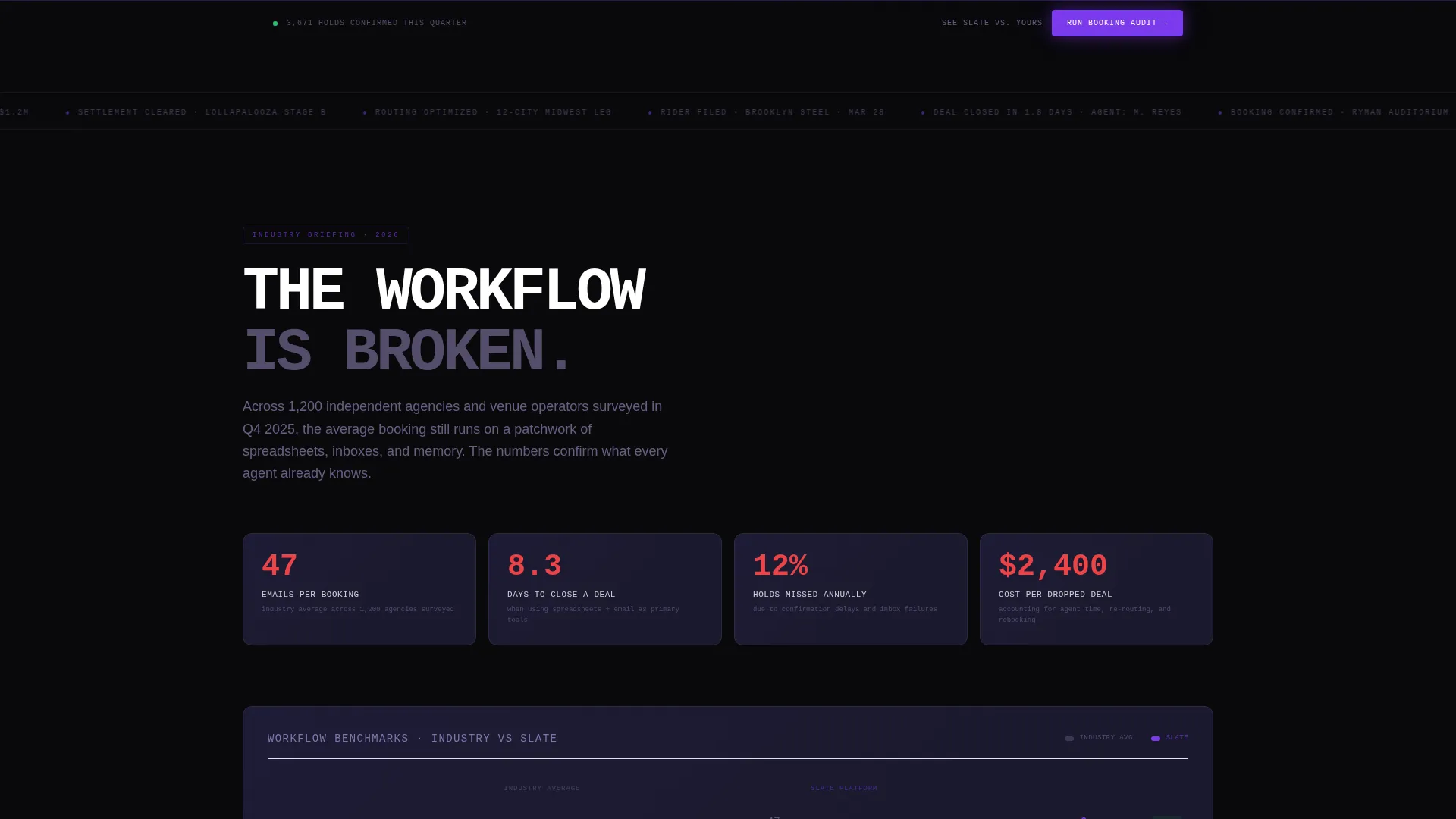
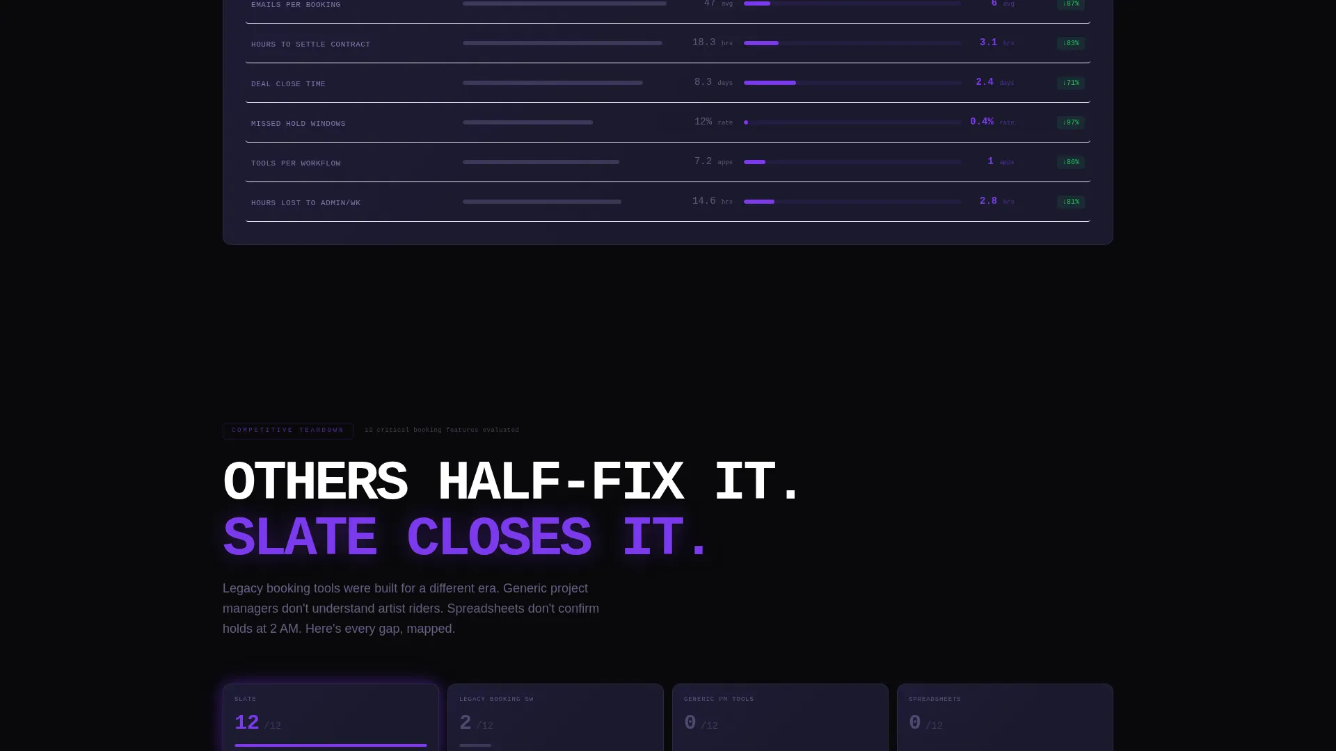
This section surfaces average industry benchmarks, including emails per booking and hours per settlement, and contrasts them against Slate's workflow. Before-and-after efficiency metrics from real-agency case studies show the cost of the current process in concrete numbers.
Booking Audit call to action Block
The primary conversion block sits directly below the competitive grid. It invites visitors to input their current tool stack and monthly booking volume to receive a personalized efficiency gap report. The friction is low because the visitor has already done the math by the time they reach this point.
Sticky Secondary call to action
A persistent sticky call-to-action labeled "See Slate versus. Yours" stays in view as the visitor scrolls. It links to an interactive versus configurator, keeping the comparison mechanic accessible at every stage of the page without interrupting the scroll narrative.
Data Command Visual System
The entire page is styled around a production-booth aesthetic. Void black backgrounds, deep console gray panels, electric violet on active states and data highlights, and phantom lavender for secondary text and grid lines create a palette where every glow carries meaning. Typography is monospace-led for data blocks and clean for body copy.
Page sections overview
| Section | Purpose |
|---|---|
| Stats Metrics Header | Opens with live-style booking KPIs to establish authority immediately |
| Industry Problem Frame | Establishes that the current booking workflow is systemically broken |
| Competitive Landscape Grid | Compares feature coverage across tools with gap indicators |
| Workflow Benchmark Data | Quantifies time and effort cost of legacy booking processes |
| Agency Case Studies | Shows before-and-after efficiency gains from real booking operations |
| Booking Audit call to action | Primary conversion block tied to personalized gap report |
| Sticky Secondary call to action | Persistent "See Slate versus. Yours" link to interactive configurator |
Design & branding system
The visual identity follows a Data Command theme built entirely around the Void and Violet color system. Nothing in the palette is decorative. Every color choice signals a system state, a data point, or an interaction.
- Absolute void black (#09090B) as the page base, deep console gray (#1A1A2E) for panel surfaces, electric violet (#7C3AED) on active states and data highlights, and phantom lavender (#C4B5FD) for secondary text and grid lines
- Oversized monospace typography for all metric figures, giving the header the density of a mission control screen
- No stock photography and no artist imagery anywhere on the page; the data visualization and comparison grids carry all visual weight
Mobile & speed optimization
The template is designed to remain readable and functional across screen sizes. The dashboard layout scales down without losing the hierarchy that makes the data legible at a glance.
- Monospace metric blocks reflow cleanly so the KPI header remains impactful on smaller screens
- The sticky secondary call to action is positioned to stay usable on touch devices without covering critical content
- The comparison grid is structured for horizontal scrollability on mobile, keeping all column data accessible
How this template helps you convert
The page is engineered around a single insight: visitors will not convert until they believe their current workflow is costing them. The template earns the click before asking for it.
- The metrics header establishes immediate credibility with hard numbers, signaling that the platform operates at real industry scale and setting the tone for everything that follows.
- The industry report scroll builds a layered argument, moving from broken industry to incomplete competitors to Slate's complete grid, so the visitor arrives at the audit call to action already convinced.
- The dual-call to action system gives high-intent visitors two entry points, a personalized audit for those ready to engage and a versus configurator for those still comparing, reducing drop-off at both ends of the decision curve.
Other information about this template
This template is a strong fit for entertainment technology teams positioning against legacy booking tools or general-purpose event management software. It is also well suited for product launches targeting mid-size agencies and venue groups that have outgrown spreadsheet-based workflows.
- The Industry Report creative direction makes the template useful beyond launch; it can support campaign-specific landing pages tied to conference season or trade press moments
- The template style is Dashboard and Data Grid, meaning it is optimized for data-heavy, evidence-first storytelling rather than lifestyle or brand-awareness positioning
- The Comparison and Versus landing-page direction is particularly effective when the audience is already evaluating tools and just needs a final, confident push
- Template theme is Data Command, which pairs naturally with any entertainment booking software brand that wants to communicate operational confidence and system reliability
Theme
Data Command
Creative direction
Industry Report
Color system
Void & Violet
Style
Dashboard/Data Grid
Direction
Comparison/Versus
Page Sections
Live Metrics Command Header
Competitive Comparison Grid
Workflow Benchmark Section
Booking Audit Call to Action Block
Sticky Secondary Call to Action
Data Command Visual System
Related questions
Who is the ideal audience for this landing page template?
Can I replace the placeholder metrics with my own data?
Does the template require design experience to customize?
Why does the page use no photography or artist imagery?
Is this template suitable for a product launch or just ongoing marketing?



