Slate - Powerful Scheduling Landing Page Template
Slate is a bold, dark-themed scheduling landing page built for early-stage startup founders and ops leads. It pairs a dramatic Dark Glass Panels header with a live Feature Matrix comparison table, exposing the cost of manual scheduling workflows and positioning Slate as the sharp, founder-priced alternative. A single email capture drives lead generation from the bottom of the table.
by Rocket studio
Quick summary
Slate is a single-page scheduling landing page built for SaaS founders and ops leads who are done patching together calendar tools. The layout opens with a cinematic Dark Glass Panels header, drops into a brutalist Feature Matrix comparison table, and closes with a focused email capture. Every section earns the next click.
Who this template is for
This template speaks directly to early-stage startup teams where one person handles sales, demos, and support. It is built for people who feel the pain of manual scheduling before they ever read the first row.
- Seed-round SaaS founders managing demos, sales calls, and support from a single calendar link
- Operations leads at Series A companies stitching together calendar tools and project documents
- Solo technical founders who want to ship product instead of playing email back-and-forth over meeting times
What problem this template solves
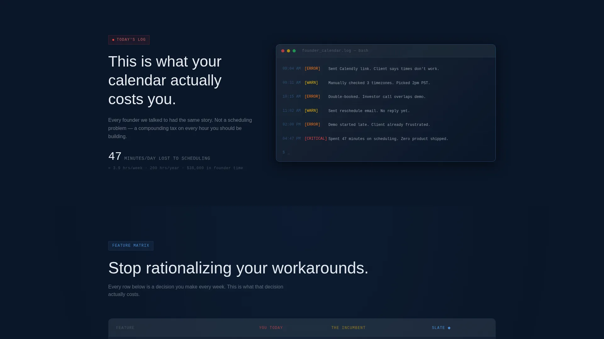
Early-stage teams waste hours every week on scheduling friction. Timezone math, double-bookings, and thread-heavy rescheduling pile up fast when no dedicated ops function exists. This template makes that pain visible and positions a better path forward.
- No clear way to show prospects why manual scheduling workflows are costing them real time
- Existing tools either feel too enterprise-heavy or require workarounds that add more complexity
- Landing pages for scheduling products often bury the value and lead with features instead of felt cost
What you get with this template
You get a complete, single-page lead generation layout with a strong visual identity and a purposeful conversion flow. Every section is designed to move a skeptical technical founder from recognition to action.
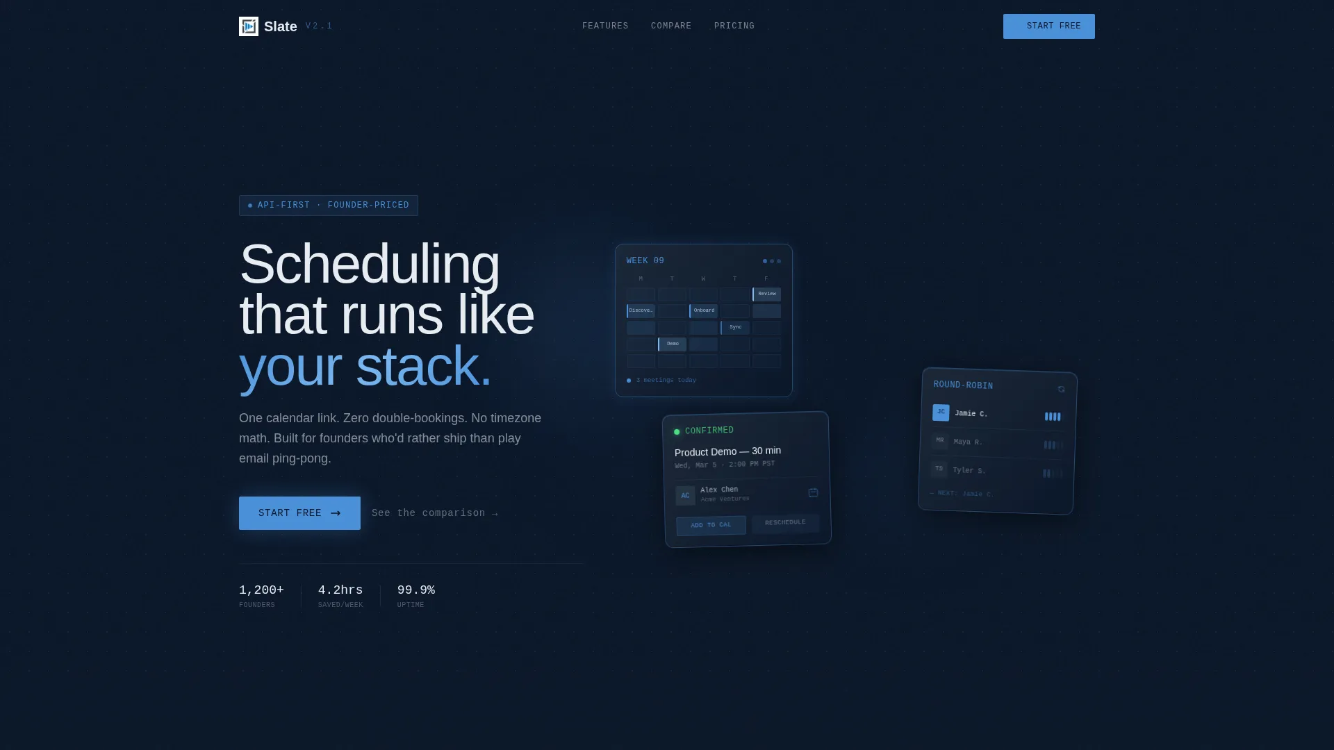
- A cinematic header featuring three frosted-glass interface cards showing different scheduling views
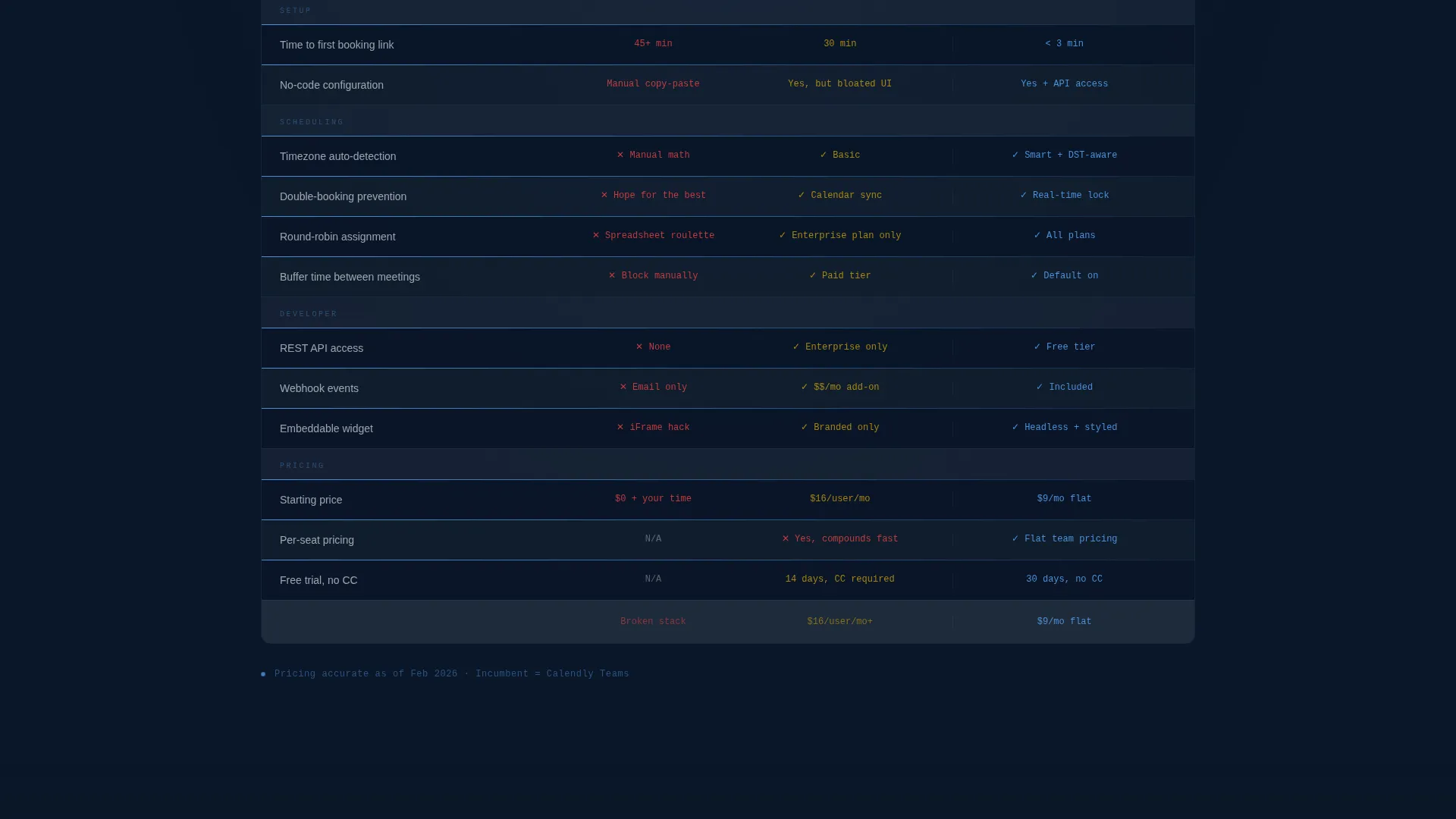
- A full Feature Matrix comparison table contrasting manual workflows, an enterprise incumbent, and Slate
- A bottom-anchored email capture field with a primary call-to-action and a secondary booking widget path
Feature list
This template delivers a focused set of high-impact visual and structural features grounded in the source brief.
Dark Glass Panels Header
Three translucent, frosted-glass interface cards float against a deep navy background. Each panel shows a different scheduling view: a weekly grid with color-coded blocks, a round-robin assignment flow, and a booking confirmation with a client avatar. The panels sit at slight Z-axis rotations with soft directional shadows, lit from the upper left like a product on a pedestal.
Feature Matrix Comparison Table
The core of the page is a living three-column comparison table. Column one shows the visitor's current manual workflow, column two reflects a bloated enterprise incumbent, and column three presents Slate's focused, founder-priced approach. Each row reveals on scroll with a brutalist horizontal rule, escalating the visitor's sense of cost row by row.
Lead Generation Email Capture
A single-field email capture is anchored directly below the comparison table. The primary call-to-action reads "Start Scheduling Free." A ghost-text secondary link below it reads "or book a 10-min walkthrough," opening an embedded scheduling widget that proves the product by using it.
Embedded Scheduling Widget
The secondary conversion path includes an embedded booking widget accessible from the ghost-text link. This lets the visitor experience the product directly within the page, removing any gap between the promise and the proof.
Bold Brutalist Visual System
The entire layout follows a Bold Brutalist design direction. Hard edges, high contrast, and zero decorative elements keep every pixel functional. The interface feels like a command-line environment designed for focus and speed.
Page sections overview
| Section | Purpose |
|---|---|
| Dark Glass Header | Establish product identity with three floating interface preview cards |
| Feature Matrix Table | Compare manual workflows, enterprise tools, and Slate across key criteria |
| Email Capture Block | Convert visitor intent into a lead with a single-field form and dual call to action |
| Embedded Booking Widget | Prove the product in-page via the secondary walkthrough path |
Design & branding system
The design follows a Midnight Blue color system built on four precise values. The palette reads like a spacecraft cockpit: functional, cold, and entirely intentional.
- Background layers use deep command-line navy (#0A1628) and gunmetal interface gray (#1E2A3A), with table rows alternating between the two
- Column headers and hover states use cold status-light blue (#4A90D9), with hover states producing a 1-pixel blue underline that pulses like a cursor blink
- Text and dividers use sharp signal white (#E8ECF1) to maintain contrast without warmth or decoration
Mobile & speed optimization
The layout is structured as a single-page flow with minimal decorative overhead. The focused structure keeps the page lean and easy to navigate on any screen size.
- Single-column reflow on smaller screens keeps the comparison table readable without horizontal scrolling
- No stock photography or human faces in the design reduces visual load and keeps the interface-as-hero aesthetic intact on mobile
How this template helps you convert
The conversion strategy is sequential and deliberate. The page builds pressure before it asks for anything.
- The header immediately signals product quality through interface previews, establishing trust before the visitor reads a single line of copy
- The Feature Matrix escalates pain row by row, making the cost of the visitor's current workflow concrete and visible before reaching the call-to-action
- The dual-path conversion block offers both a low-commitment email capture and a direct booking option, meeting visitors at different levels of readiness
Other information about this template
This template is categorized under Technology and sits within the Startup Digital Presence subcategory, targeting the Startup Booking and Scheduling Site niche. It is a strong fit for founders evaluating alternatives to tools like Calendly, which many early-stage teams use as a default before outgrowing its limitations.
- The template style is Comparison Table, making it particularly effective for positioning against well-known incumbents in the scheduling software space
- The creative direction is Feature Matrix, a proven format for SaaS landing pages where differentiation needs to be felt, not just listed
- The Bold Brutalist theme and Midnight Blue color system are intentionally distinct from warmer SaaS aesthetics, helping the product stand out in a crowded scheduling market
Theme
Bold Brutalist
Creative direction
Feature Matrix
Color system
Midnight Blue
Style
Comparison Table
Direction
Lead Generation
Page Sections
Dark Glass Panels Header
Feature Matrix Comparison Table
Dual-path Conversion Block
Embedded Booking Widget
Bold Brutalist Visual System
Related questions
What kind of business is this template designed for?
Can I use this template without a developer?
How does the comparison table work in this template?
Does this template include live booking widget functionality?
Is this template a good fit for a product in early access or beta?



