Slate - Precision Architecture Landing Page Template
Slate is a landing page template built for architecture scheduling platforms. It features a live hours-recovered estimator in the header, an anchor-nav spoke layout with interactive feature modules, and a freemium conversion flow. The design uses a dark Dashboard Pro aesthetic with electric chartreuse accents, giving it the focused authority of a professional-grade tool.
by Rocket studio
Quick summary
Slate is a single-page, hub-and-spoke landing page template designed for architecture booking and scheduling platforms. The header runs a live calculator that shows visitors exactly how many hours and conflicts their current workflow is costing them. Each anchor-nav section lets visitors interact with a miniature version of the product, from solo calendar to multi-team orchestration.
Who this template is for
This template is built for founders and product teams launching scheduling tools aimed at the architecture and construction space. It works equally well for solo operators and growing firms who need to communicate complex workflow value in one scroll.
- Solo architecture practitioners managing multiple residential projects across different municipalities
- Mid-size firm office managers who need to coordinate structural engineers, interior designers, and site visits without scheduling conflicts
- Project architects and product marketers who want a high-converting freemium landing page without starting from scratch
What problem this template solves
Architecture teams lose real billable time to fragmented scheduling. Back-and-forth emails, double-booked site visits, and consultant calendar conflicts are invisible costs that compound weekly. This template makes that cost visible the moment someone lands on the page.
- Visitors see their personal hours-lost number before they read a single feature claim
- The spoke-nav layout removes decision fatigue by guiding visitors through use cases that match their firm size
- The inline booking path proves the product works by using it to schedule a sales walkthrough
What you get with this template
You get a fully structured, single-page layout with every section and interaction mapped out. The template covers the full conversion journey from awareness to signup, with no placeholder flows left open.
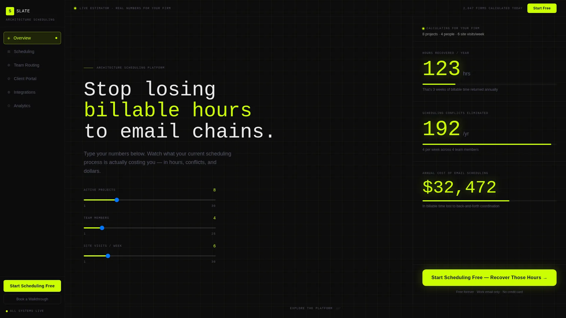
- A live estimator widget in the header that calculates hours recovered, conflicts eliminated, and annual coordination cost
- Five anchor-nav spoke modules covering Scheduling, Team Routing, Client Portal, Integrations, and Analytics
- A freemium signup flow asking only for work email and firm size, plus a secondary "Book a Walkthrough" path for larger firms
Feature list
This template is built around one principle: the product should sell itself. Every section is a working demonstration, not a static description.
Live Header Estimator Widget
Visitors enter their number of active projects, team size, and average weekly site visits. The widget instantly returns hours recovered, scheduling conflicts eliminated, and annual cost of email-based coordination. Results display as ticking acid-green counters against the black field, making the value personal and immediate.
Persistent Anchor Navigation Rail
A fixed left-rail spoke menu stays visible throughout the entire scroll. It links to five self-contained feature modules and always surfaces the primary call-to-action button, so visitors can convert at any point in their journey without scrolling back to the top.
Interactive Feature Modules
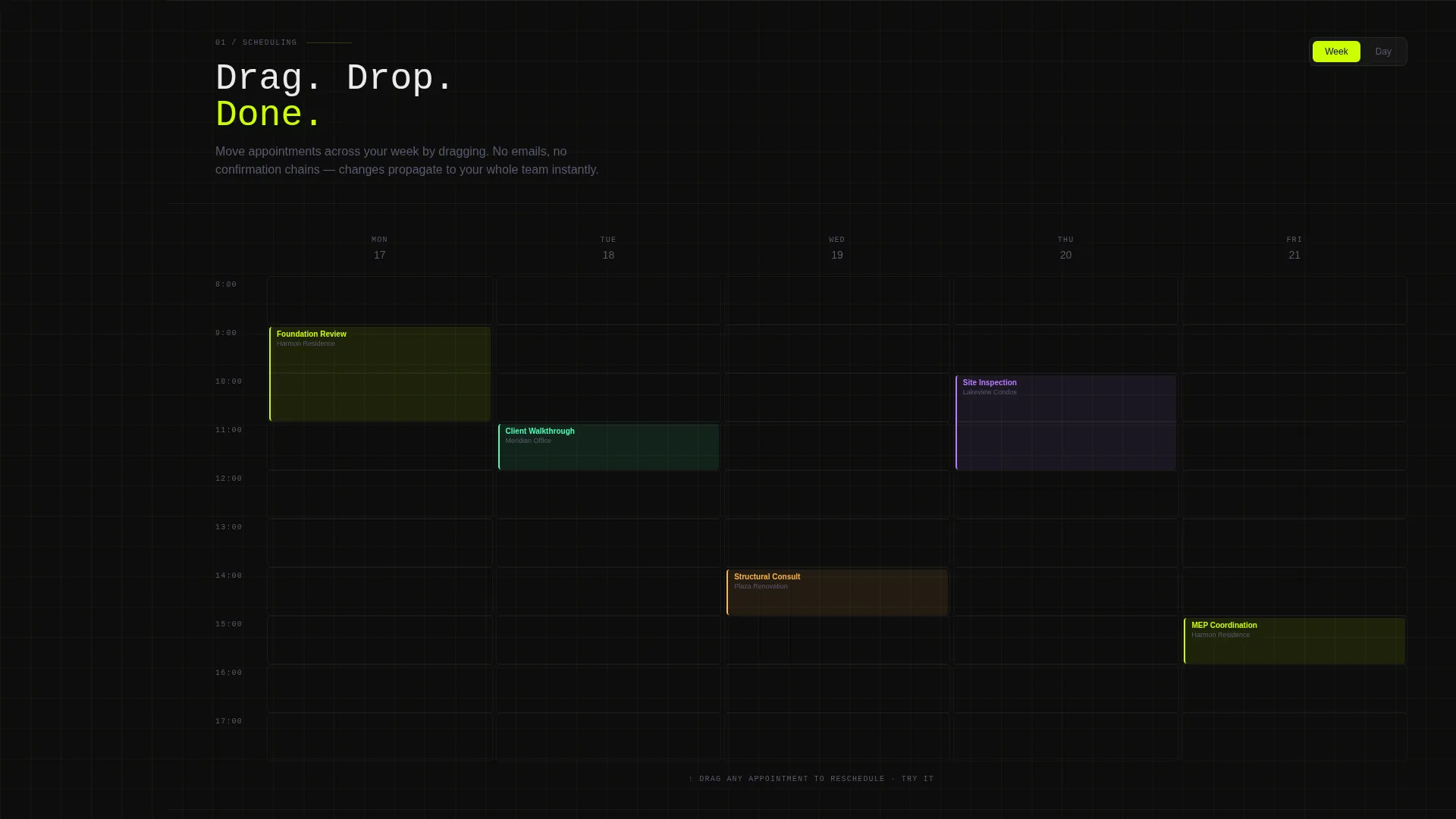
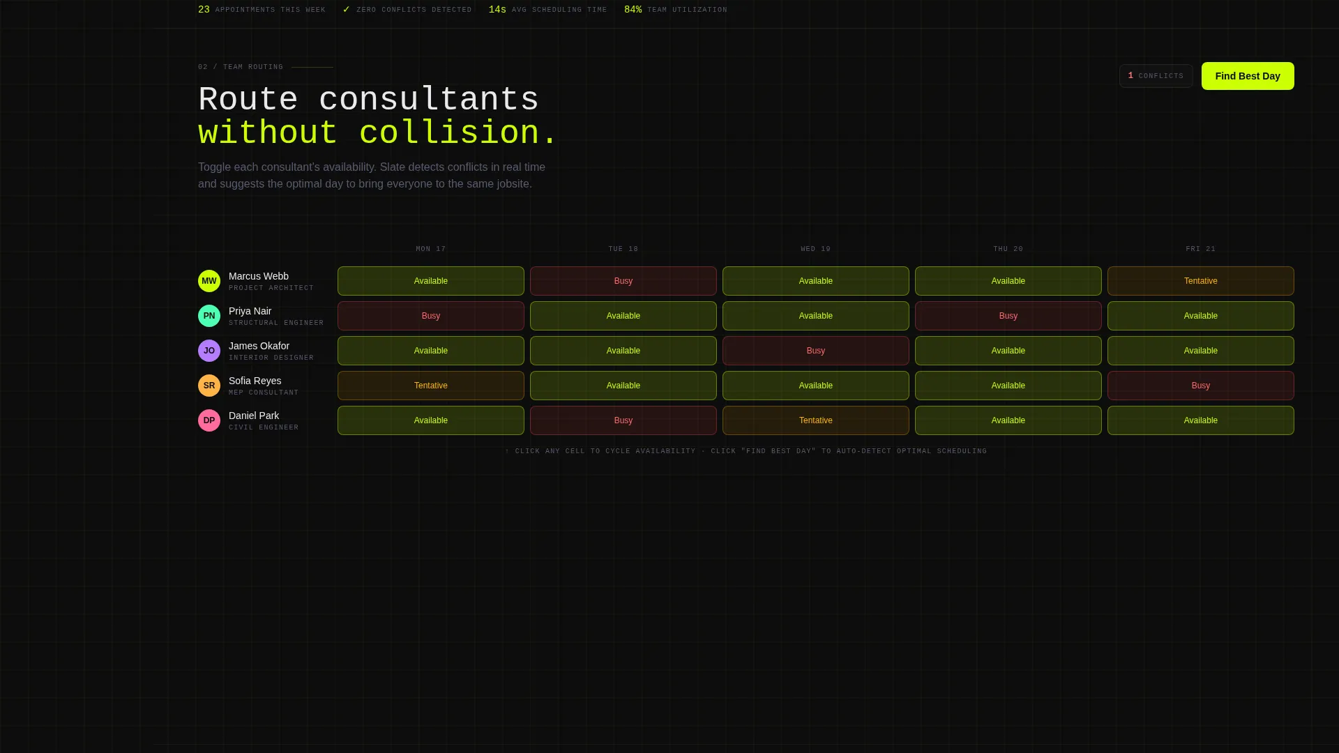
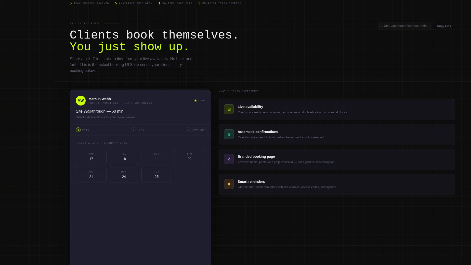
Each spoke section contains a sandbox version of the platform feature it represents. Visitors can drag a mock appointment, toggle a consultant's availability, or preview a client-facing booking link. The modules escalate in complexity to mirror the growth arc of the visitor's own firm.
Freemium Conversion Flow
The primary call-to-action, "Start Scheduling Free," appears first inside the estimator results and then stays fixed in the anchor nav rail. The signup form asks only for work email and firm size, with three options: solo, 2-10, or 11 and above. No credit card or phone number is required.
Inline Walkthrough Booking
Firms with eleven or more team members see a secondary call-to-action: "Book a Walkthrough." Clicking it opens an inline Calendly-style picker that uses the product's own booking interface. This approach proves the tool in the act of selling it.
Dashboard Pro Visual Theme
The template uses the Acid Digital color system throughout. Void black forms the background, cool slate surfaces the cards, phosphor white carries the body text, and electric chartreuse marks every interactive element and live-state indicator. The result is a focused, cockpit-style interface where nothing glows unless it earns the light.
Page sections overview
| Section | Purpose |
|---|---|
| Header Estimator | Personalizes value instantly with live calculated results |
| Anchor Nav Rail | Keeps navigation and primary call to action persistent throughout scroll |
| Scheduling Module | Demonstrates solo drag-and-drop calendar interaction |
| Team Routing Module | Shows multi-consultant jobsite coordination without conflicts |
| Client Portal Module | Previews the client-facing booking link experience |
| Integrations Module | Presents platform connection points within the spoke layout |
| Analytics Module | Displays reporting dashboard at the highest complexity tier |
| Freemium Signup | Converts visitors with a minimal two-field form |
| Walkthrough Booking | Qualifies larger firms with an inline booking picker |
Design & branding system
The visual identity follows the Dashboard Pro theme using the Acid Digital color system. Every color decision is intentional: dark fields create focus, and chartreuse reserves its energy for the elements that actually move.
- Void black (#0D0D0D) as the primary page background, cool slate (#1E1E2E) for card surfaces, and phosphor white (#EAEAEC) for body text
- Electric chartreuse (#CAFF04) applied exclusively to interactive elements, live-state indicators, toggle states, active nav pills, hover borders, and call-to-action buttons
- No stock photography or illustration used anywhere; the product interface itself serves as the visual hero throughout the page
Mobile & speed optimization
The layout is structured to work cleanly at smaller viewport sizes. The left-rail anchor nav adapts to the scroll behavior of touch devices without losing the persistent call-to-action presence.
- Card surfaces and spoke modules are sized for readability on tablet and mobile screens
- The estimator widget inputs are touch-friendly and return results without page reloads
- Dark background and minimal decorative elements keep the visual weight low across all screen sizes
How this template helps you convert
Every structural decision in Slate points toward one outcome: turning a curious visitor into a free account or a booked walkthrough.
- The header estimator delivers a personalized cost-of-inaction number before the visitor reads any marketing copy, creating urgency that is grounded in their own numbers rather than generic claims.
- The escalating complexity of the spoke modules mirrors the visitor's own growth narrative, making the product feel like a natural fit whether they are a solo practitioner or managing a firm of twenty.
- The inline walkthrough booking path dogfoods the platform's own scheduling interface, giving enterprise-tier visitors a live proof-of-concept in the moment they are most open to it.
Other information about this template
Slate is designed specifically for the architecture booking and scheduling niche, where generic SaaS landing page templates fail to speak the language of project architects and firm managers. The template's spoke layout and sandbox modules make it particularly well suited to platforms that need to communicate layered functionality without overwhelming first-time visitors.
- The Moleskine grid notebook aesthetic referenced in the design brief gives the page a tactile, precision-focused personality that resonates with architecture professionals
- The template supports the full freemium-to-paid journey and can be adapted for platforms targeting adjacent construction management or real estate coordination verticals
- The "Book a Walkthrough" path is intentionally segmented by firm size, allowing product teams to route solo users toward self-serve and larger firms toward a high-touch sales conversation
Theme
Dashboard Pro
Creative direction
Interactive Explorer
Color system
Acid Digital
Style
Hub & Spoke (Anchor Nav)
Direction
Freemium/Trial
Page Sections
Live Header Estimator Widget
Persistent Left-rail Anchor Nav
Interactive Sandbox Modules
Freemium Signup Flow
Inline Walkthrough Booking
Dashboard Pro Dark Visual Theme
Related questions
Who is this landing page template designed for?
Does the estimator widget require a backend connection to work?
Can I adapt the five spoke modules to different feature sets?
What does the signup form actually ask for?
How does the 'Book a Walkthrough' path work?



