Burger Franchise Landing Page Template | Luxe Minimal
Smash is a scroll-reveal landing page built for a premium burger franchise targeting serious franchise investors. It leads with device mockups, real unit economics, and a progressive card-reveal structure that builds conviction before asking for anything. The obsidian and gold visual system signals a high-value opportunity. Two conversion paths capture both ready-to-commit operators and those still evaluating.
by Rocket studio
Quick summary
Smash is a single-page franchise investment landing page designed for operators already running one location and ready to grow. It uses a slow scroll-reveal rhythm to surface unit economics, territory maps, and franchisee proof points one at a time. The result feels less like a sales pitch and more like a private briefing.
Who this template is for
This template is built for franchise brands that need to attract experienced, growth-minded operators rather than first-time buyers. It speaks directly to people who already understand the business and just need the right numbers in front of them.
- Existing single-unit franchisees evaluating a second or third territory
- Multi-brand operators scouting a next portfolio addition
- Regional investors looking for a concept that performs like fast casual but presents like a premium brand
What problem this template solves
Most franchise landing pages list benefits in bullet points and ask for a form fill before earning any trust. That approach fails with sophisticated operators who have seen every franchise pitch before and need evidence, not enthusiasm.
- The page hides nothing and reveals everything in a deliberate order, building the case before asking for commitment
- Two conversion paths serve both ready buyers and early-stage researchers without diluting either message
- The design itself signals quality, so the brand impression is set before a single word is read
What you get with this template
You get a fully structured, scroll-triggered franchise investment landing page with a clear visual hierarchy and two distinct lead capture flows. Every section is designed to move a qualified prospect one step closer to reserving a territory.
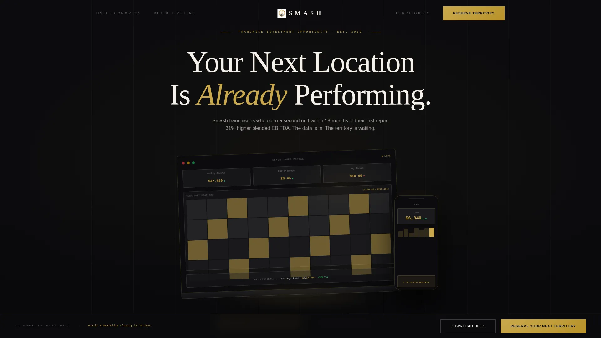
- A device mockup header showing a proprietary owner dashboard with a live profit and loss summary, territory heat map, and unit performance ticker
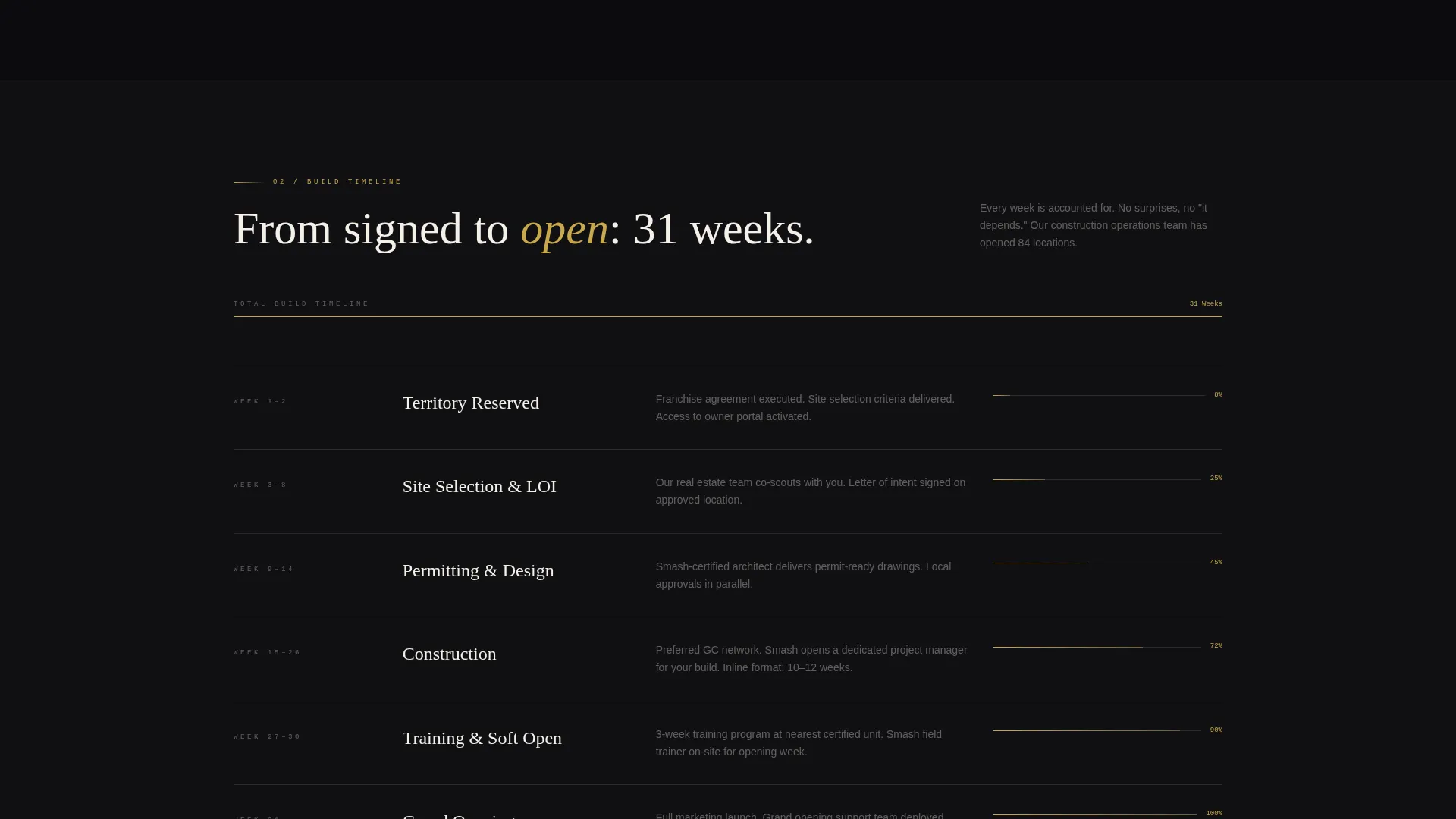
- A progressive card-reveal layout that unveils unit economics, a construction timeline, franchisee testimonials, and a territory availability map as the visitor scrolls
- A primary qualification form with location count, preferred expansion market, and projected open date, plus a secondary gated download path for the multi-unit investment deck
Feature list
This template is built around a specific conversion logic. Each feature below serves a defined purpose in the prospect journey.
Scroll-Reveal Card Progression
Each section of the page enters the viewport as a distinct card, triggered by scroll position. The rhythm is intentionally slow and deliberate, giving each data point room to land before the next one appears.
Device Mockup Header
A floating MacBook and iPhone sit against a full obsidian background, angled as if placed on a boardroom table. The screens display a franchise owner dashboard with revenue figures highlighted in gold, a territory heat map, and a real-time unit performance ticker.
Unit Economics Display
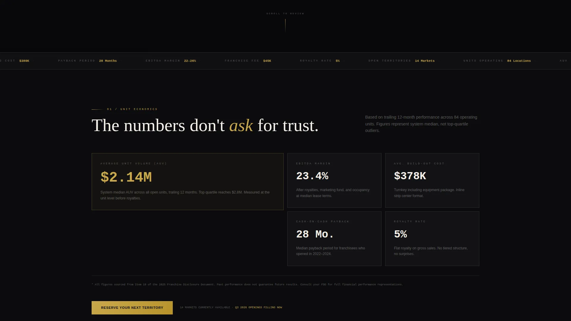
Actual average unit volume figures are presented as a dedicated reveal card. Financial highlights are rendered in brushed gold against the dark background, making key numbers impossible to miss.
Interactive Territory Map
A territory availability map illuminates open markets as the visitor scrolls past the relevant section. This creates a moment of discovery that feels personal rather than generic.
Dual Conversion Path Design
The primary call to action, "Reserve Your Next Territory," pins to the bottom of the viewport after the unit economics reveal. A secondary path, "Download the Multi-Unit Deck," captures leads behind a minimal name-and-email gate for prospects not yet ready to commit.
Qualification Form with Smart Inputs
The lead form asks three targeted questions: current location count via dropdown, preferred expansion market via a searchable map selector, and projected open date via a quarter and year picker. This filters for quality over volume.
Page sections overview
| Section | Purpose |
|---|---|
| Header Mockup | Anchor attention with a device-led dashboard visual and the headline "Your Next Location Is Already Performing" |
| Unit Economics Card | Present average unit volume and key financial figures in gold to establish immediate credibility |
| Construction Timeline | Render the build-out path as a minimal gold progress bar to reduce perceived complexity |
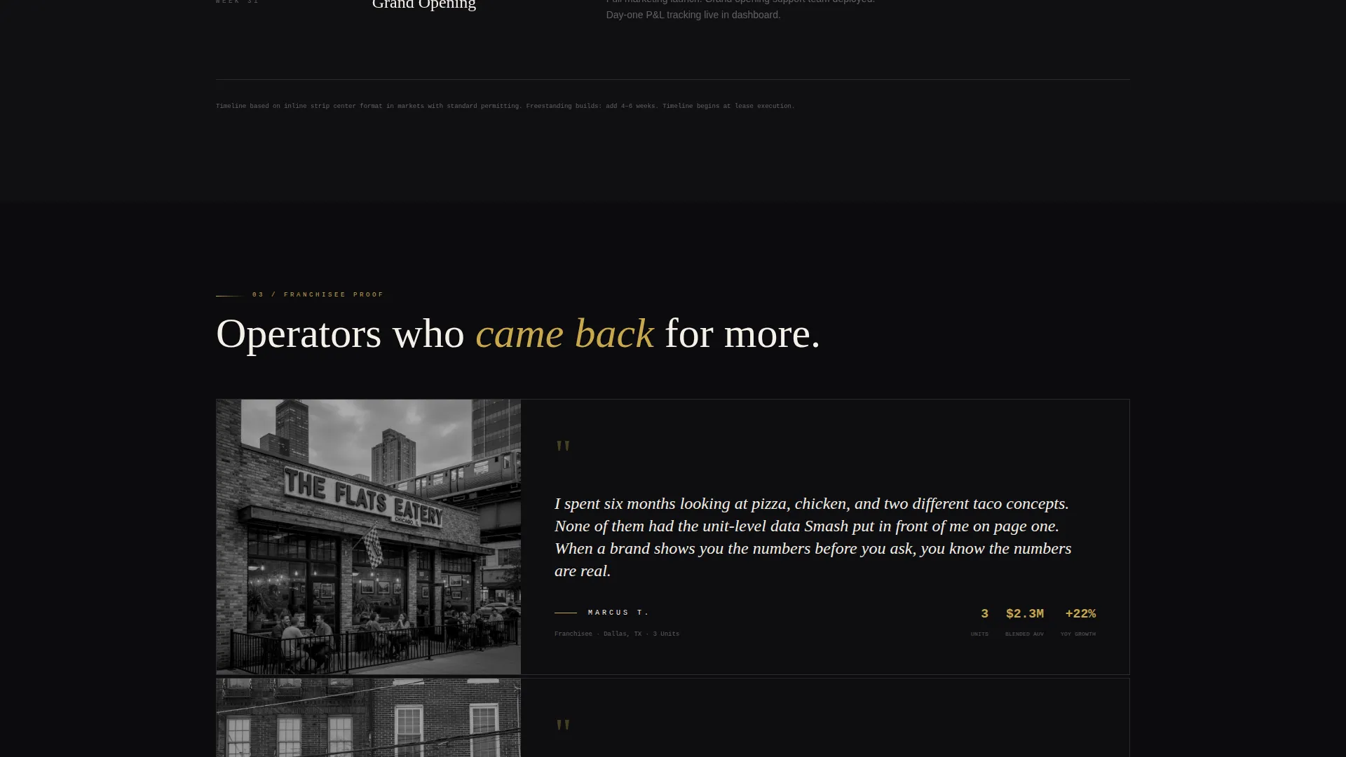
| Franchisee Testimonial | Display a moody black-and-white operator quote to add human proof without breaking the visual tone |
| Territory Availability Map | Illuminate open markets on scroll to create a personalized sense of opportunity |
| Primary call to action Bar | Pin the "Reserve Your Next Territory" button to the viewport after the economics reveal |
| Multi-Unit Deck Gate | Offer a secondary lead path for prospects who want the full deck before committing |
Design & branding system
The visual identity follows a Luxe Minimal theme built entirely around restraint. Every color, surface, and spacing decision reinforces the idea that this is a serious investment opportunity, not a consumer marketing page.
- Deep obsidian black (#0B0B0D) floods full-bleed section backgrounds; brushed gold (#C9A84C) is reserved for accent lines, hover states, and financial figures; warm charcoal (#1E1E22) surfaces cards and dividers; clean bone white (#F5F0E8) handles all body text
- Typography is tracked out in bone white for headlines, creating a high-contrast, editorial feel against the dark backgrounds
- The overall palette is described in the brief as evoking the inside of a Japanese whisky box: matte black, restrained metallic, nothing decorative, every surface implying value underneath
Mobile & speed optimization
The template is structured for a clean mobile experience without sacrificing the visual weight that makes the desktop version feel premium. Scroll-reveal triggers are designed to work across viewport sizes.
- Full-bleed obsidian backgrounds and card surfaces maintain contrast and legibility at all screen widths
- The pinned call to action bar and qualification form inputs are sized for thumb-friendly interaction on smaller screens
- Device mockup angles and card spacing are calibrated to reflow naturally on mobile without losing the boardroom-table aesthetic
How this template helps you convert
The conversion logic is embedded in the page structure itself. Prospects are shown value before they are ever asked to act.
- The unit economics card appears before the first call to action, so the decision to engage is already informed by real performance data rather than brand promises alone.
- The pinned "Reserve Your Next Territory" button enters the viewport at the exact moment credibility peaks, removing friction at the highest-intent point in the scroll journey.
- The secondary "Download the Multi-Unit Deck" path ensures that prospects who are not yet ready to commit still enter the funnel, extending the reach of a single page into a two-stage lead pipeline.
Other information about this template
This template sits within the Franchise Business subcategory under Retail and E-Commerce. It was built with a high intersection match score, reflecting strong alignment between the franchise niche and the investment-focused landing page direction.
- The template is designed as a single scroll-reveal landing page, not a multi-page site
- The qualification form is intentionally minimal, asking only three questions to keep the friction low while filtering for serious operators
- The "Download the Multi-Unit Deck" secondary path is gated behind name and email only, making it a low-commitment entry point for early-stage prospects
- The page structure suits any premium food and beverage franchise concept where the target audience is experienced operators rather than first-time buyers
Theme
Neo-Retro
Creative direction
Comparison Journey
Color system
Ink & Paper
Style
Overlap/Layered
Direction
Click-Through
Page Sections
Scroll-reveal Card Progression
Device Mockup Header Display
Unit Economics Reveal Card
Interactive Territory Availability Map
Dual Conversion Path Design
Targeted Qualification Form
Related questions
Who is this landing page template designed for?
Can I edit the unit economics figures and territory map content?
What are the two conversion paths included in this template?
Does the scroll-reveal animation work on mobile devices?
Can this template be adapted for a different food franchise concept?



