Agriculture Software Professional Website Template
Cultivate is a hub-and-spoke agriculture email marketing landing page built for grain traders, co-op marketers, seed reps, and precision-ag teams. It leads with oversized performance stats, a three-tab feature switcher, and a frictionless free-trial signup. The design runs on a terminal-black-and-phosphor-green palette that feels urgent, data-driven, and impossible to scroll past.
by Rocket studio
Quick summary
Cultivate is a single-page agriculture email marketing landing page designed for agribusiness professionals. It opens with a bold stat headline, walks visitors through three core product tabs, and closes every spoke section with a phosphor-green "Start Sending Free" call to action. The Stats-First Impact creative direction keeps numbers front and center at every scroll stop.
Who this template is for
This template is built for agribusiness teams who need email campaigns that actually get opened. It serves sellers and marketers operating in fast-moving agricultural markets where timing is everything.
- Regional ag suppliers and co-op marketers sending pre-season booking reminders
- Livestock auctioneers and grain traders promoting time-sensitive sale events
- Precision-ag startups nurturing leads who are still early in the buying journey
What problem this template solves
Ag inboxes are brutal. Weather alerts, futures prices, and machinery newsletters compete for attention every morning. A generic email marketing page does nothing to convince a skeptical grain buyer that your platform belongs in that inbox.
- Generic templates fail to communicate the performance gap between average ag email open rates and what specialized platforms deliver
- No clear path from stat to proof to signup leaves motivated visitors without a reason to act
- Disconnected page sections break the rhythm that moves a visitor from awareness to trial
What you get with this template
You get a complete, anchor-nav landing page structured around a Stats-First Impact creative direction. Every section is pre-built to deliver a number before the narrative, keeping scroll momentum high.
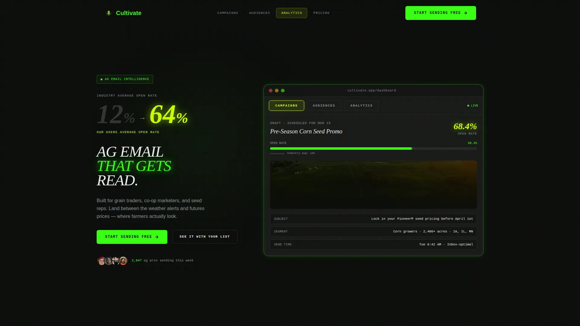
- A Feature Tab Switcher header with three mocked product screenshots for Campaigns, Audiences, and Analytics
- Spoke sections pairing animated stat callouts with real case study context and a three-step builder walkthrough
- A dual conversion path: a single-field "Start Sending Free" signup and a "See It With Your List" guided demo entry point
Feature list
This template is built around six purposeful components, each grounded in the agriculture email marketing use case.
Feature Tab Switcher Header
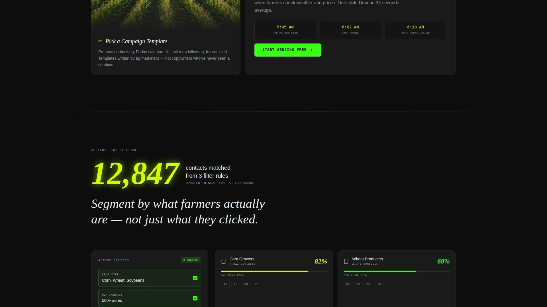
Three tabs labeled Campaigns, Audiences, and Analytics sit inside a mocked-up product interface frame. Each tab reveals a different screenshot: a corn seed promo mid-edit, an audience segmenter filtered by crop type and county, and an analytics view showing a 68.4% open-rate bar in phosphor green.
Stats-First Scroll Architecture
Every anchor section opens with a large animated counter or percentage before any supporting copy appears. The rhythm alternates between number and narrative, pulling the visitor forward through each spoke like checkpoints on a field pass.
Anchor Navigation Hub
A sticky anchor nav links to every spoke section from the top of the page. Chartreuse highlights mark active nav states, so visitors always know where they are and can jump directly to the section most relevant to them.
Dual Conversion Path
The primary call to action, "Start Sending Free," links to a single email-field signup that provisions a sandbox account with 500 sends. A secondary path, "See It With Your List," lets visitors paste a CSV and preview a mock campaign without committing to a full signup.
Case Study Proof Cards
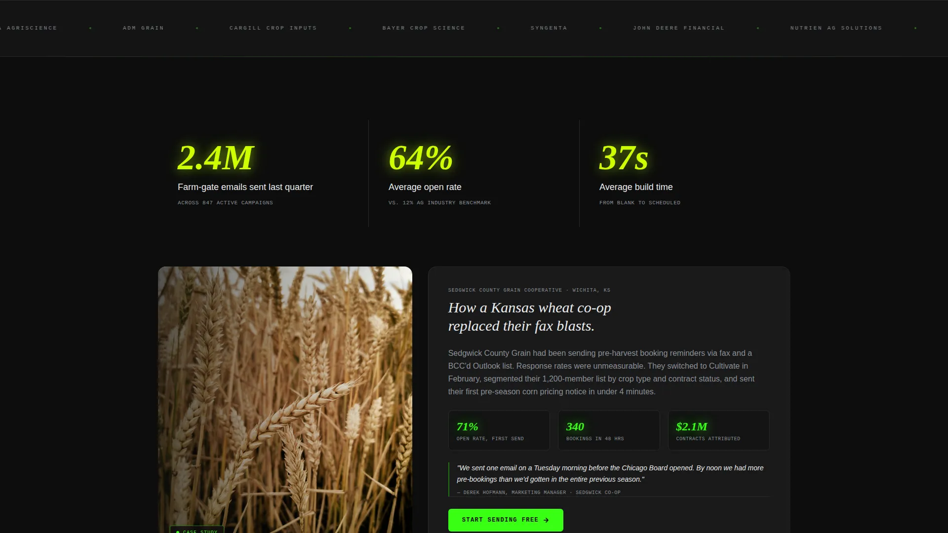
Spoke sections include case study card slots grounded in real agricultural contexts. The template shows how to pair a headline stat with a named proof source, such as a Kansas wheat cooperative result, to make the performance claim credible.
Acid Digital Color System
The palette uses terminal black, phosphor green, electric chartreuse, and data-white in a role-specific way. Phosphor green drives calls to action and live counters, chartreuse signals active navigation states and stat callouts, and data-white keeps body copy clinical and easy to scan against the dark background.
Page sections overview
| Section | Purpose |
|---|---|
| Tab Switcher Header | Introduces three core product tabs with mocked screenshots and a stat headline |
| Anchor Nav Bar | Provides sticky jump links to every spoke section with active chartreuse states |
| Stats Headline Block | Leads with oversized open-rate comparison numbers to establish immediate credibility |
| Campaigns Spoke | Pairs the "2.4M farm-gate emails" counter with a cooperative case study card |
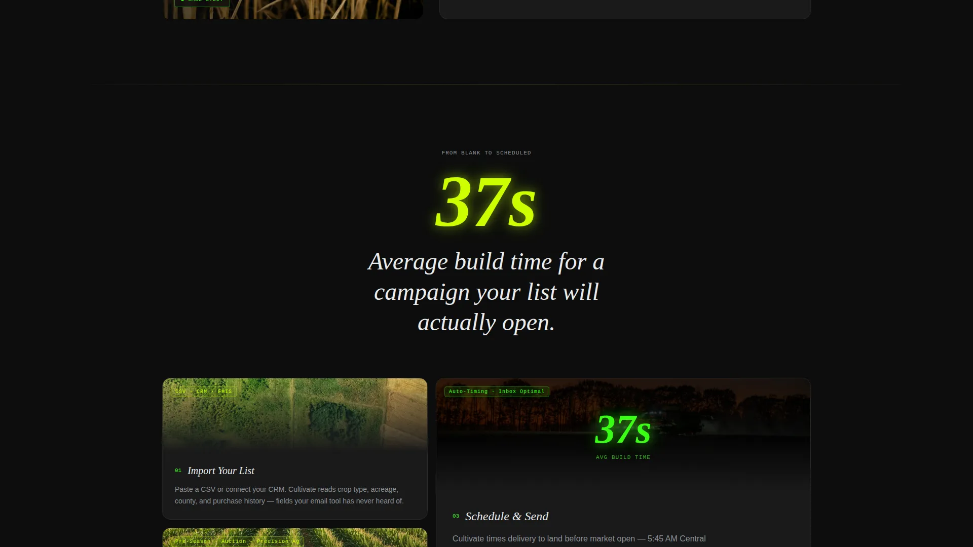
| Builder Walkthrough | Shows the "37-second average build time" stat then walks through three builder steps |
| Audiences Spoke | Highlights crop-type and county segmentation with an animated audience counter |
| Analytics Spoke | Presents the 68.4% open-rate visual with supporting performance context |
| Free Trial call to action | Collects a single email field to provision a 500-send sandbox account |
| Demo Path Section | Offers the "See It With Your List" CSV-paste demo as a lower-friction alternative |
Design & branding system
The visual identity follows a Directory and Discovery theme powered by the Acid Digital color system. The overall feeling is a soil-sensor dashboard glowing inside a dark equipment cab: synthetic, urgent, and data-dense.
- Terminal black (#0D0D0D) covers every background, phosphor green (#39FF14) drives calls to action and live counters, electric chartreuse (#CCFF00) highlights anchor nav states and stat callouts, and data-white (#EAECEE) keeps body text clinical and readable
- Typography is oversized for stat headlines to make numbers feel like live yield monitor readings, while body copy stays compact and scannable
- The mocked product user interface frames inside the tab switcher reinforce the platform-as-tool narrative without requiring real product screenshots
Mobile & speed optimization
The template is structured to keep scroll momentum intact on smaller screens where ag professionals often check emails and research tools between field passes.
- The anchor nav collapses cleanly so spoke sections remain reachable without disorienting the visitor
- Stat counters and tab switcher components are laid out to reflow gracefully on narrow viewports, keeping the number-first impact intact on mobile
How this template helps you convert
The conversion strategy is built into the page structure itself. Every layout decision reduces doubt before it asks for anything in return.
- The stat headline, "Ag emails average 12% open rates. Our users average 64%," appears above the fold and creates an immediate performance gap the visitor needs to close, making the rest of the page feel like proof rather than promotion.
- The free trial path is reduced to a single email field with no payment details, and the sandbox account with 500 sends is framed as already generous enough to run a real first campaign.
Other information about this template
This template is well-suited for agribusiness teams exploring agriculture email marketing software options across a range of platforms and tools.
- The hub-and-spoke anchor navigation structure makes the page easy to adapt: add, remove, or reorder spoke sections without breaking the overall flow
- The "See It With Your List" demo path is especially useful for precision-ag startups whose leads prefer to evaluate tools with their own data before committing
- The Stats-First Impact creative direction is transferable to other agribusiness verticals such as fertilizer distributors, equipment dealers, and farm credit lenders who need to lead with proof
Theme
Directory & Discovery
Creative direction
Stats-First Impact
Color system
Acid Digital
Style
Hub & Spoke (Anchor Nav)
Direction
Freemium/Trial
Page Sections
Feature Tab Switcher Header
Stats-first Scroll Architecture
Sticky Anchor Navigation
Dual Conversion Path Design
Case Study Proof Cards
Acid Digital Color System
Related questions
Can I adapt this template for a different agribusiness product?
How does the dual conversion path work?
Is the Acid Digital color system easy to customize?
What makes this template different from a general email marketing landing page?
Who is the target audience for this landing page template?



