Quiet Luxury Footwear Landing Page Template
Sole is a quiet luxury footwear landing page template built for Italian-craft shoe brands that sell on restraint rather than noise. It uses an overlap and layered scroll structure, a Neo-Retro Ruby and Chrome visual identity, and a season-as-narrative creative direction to carry visitors from first impression straight to the collection shop page, with no forms and no friction.
by Rocket studio
Quick summary
Sole is a single-page, click-through landing page template for understated luxury footwear brands. It tells a seasonal story through overlapping image cards, intimate location moments, and a fixed call-to-action bar that emerges as the visitor scrolls. The design feels more like a curated editorial than a storefront, making the leather real before a price is ever mentioned.
Who this template is for
This template is built for brands that compete on craft and discretion rather than logo recognition. It suits founders, creative directors, and brand managers who need their digital presence to match the quiet authority of the product itself.
- Independent luxury shoe brands rooted in artisan or atelier production
- Creative studios building a launch page for a new footwear collection
- Established makers who sell by consultation and need a page that earns the visit
What problem this template solves
Most footwear landing pages default to grid layouts, aggressive discounting banners, and conversion popups that undercut the premium feel the brand has spent years building. Sole solves the specific mismatch between a high-craft product and a low-craft digital experience.
- Visitors leave too early because the page feels indistinguishable from a mass-market storefront
- The brand story gets buried under product filters and size selectors before trust is established
- There is no single, emotionally resonant path that earns the click before asking for it
What you get with this template
You get a fully structured, single-page layout built around a seasonal narrative flow. Every section has a defined purpose, and the visual depth is built directly into the layout so the atmosphere is present from the first load.
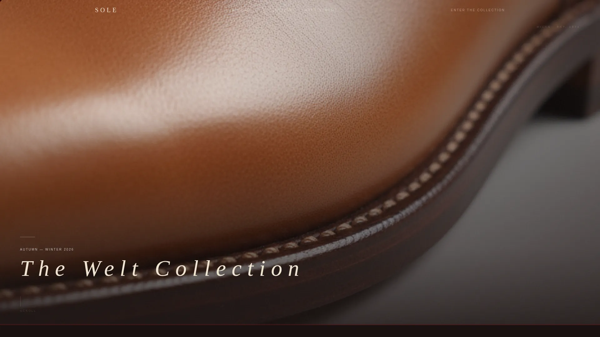
- A macro close-up header with a warm, side-lit photographic frame and a delayed serif type fade-in
- A scroll-driven sequence of five location moment sections, each overlapping the previous by forty pixels
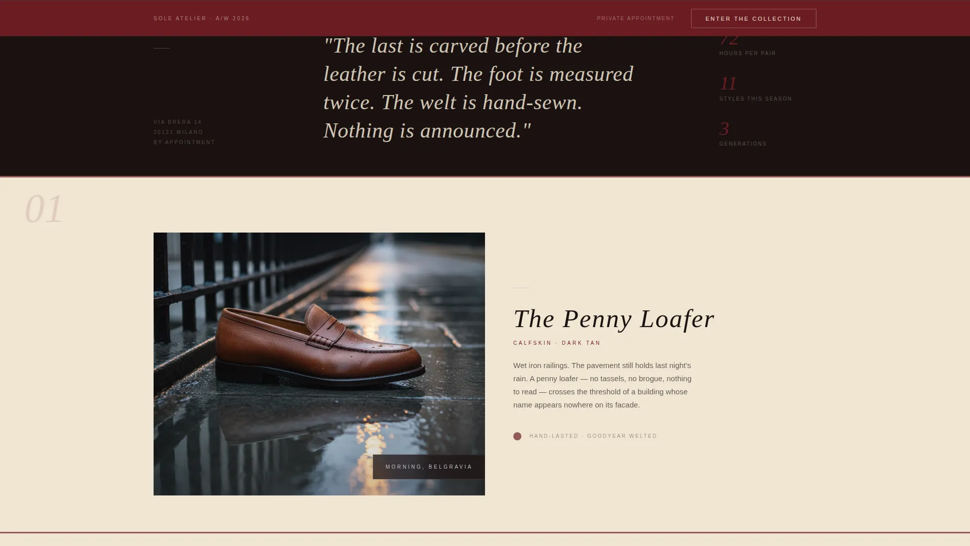
- A ghost-button primary call to action that anchors as a fixed burgundy bar after the third scroll moment
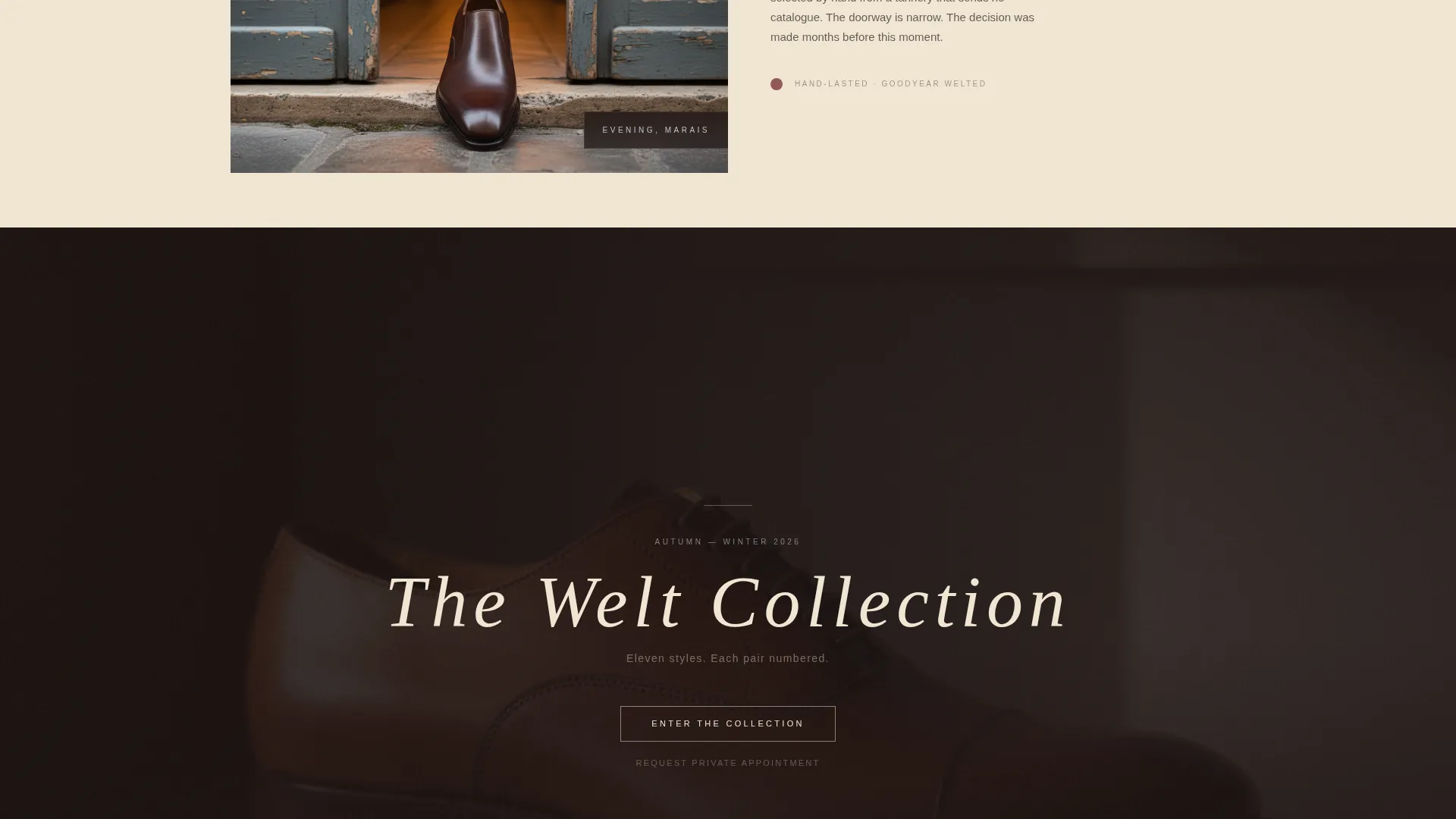
- A quiet secondary text link for private appointment requests, positioned beneath the main call to action
Feature list
The template is assembled around a small set of high-intention design decisions, each of which does specific work for the brand.
Overlap and Layered Scroll Architecture
Cards slide beneath cards as the visitor scrolls. Images tuck under type blocks. The forty-pixel overlap between sections creates a sense of physical depth that rewards slow, deliberate scrolling rather than fast scanning.
Macro Close-Up Header Frame
The header fills the full viewport with an extreme close-up of welt stitching and calfskin grain. No headline appears at first. The shoe name and season then fade in at the bottom left in thin, wide-tracked serif type, overlapping the image edge like a label laid on a photograph.
Seasonal Moment Narrative Sequence
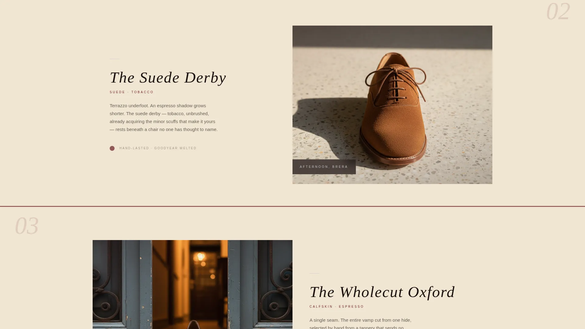
Five location vignettes, from "Morning, Belgravia" to a final solitary shelf image, carry the visitor through a single season's story. Each moment pairs a specific shoe with a specific setting, growing progressively more intimate as the scroll deepens.
Fixed Burgundy Call-to-Action Bar
The primary "Enter the Collection" call to action starts as ghost-button text over the final layered image. Once the visitor scrolls past the third moment section, it anchors as a persistent burgundy bar at the bottom of the viewport, always available without interrupting the narrative.
Private Appointment Secondary Link
A discreet text link, "Request Private Appointment," sits beneath the primary call to action. It serves clients who prefer consultation-based buying without adding any form or friction to the main conversion path.
Ruby and Chrome Neo-Retro Color System
The four-color palette, deep burgundy, polished chrome silver, warm parchment, and near-black espresso, is applied with clear rules. Burgundy bleeds through layered cards. Chrome appears only on hover states and thin dividing rules. Parchment sits beneath everything as a breathing base.
Page sections overview
| Section | Purpose |
|---|---|
| Viewport-fill header | Introduces the brand through extreme close-up leather photography and a delayed serif title fade-in |
| Morning, Belgravia | Opens the seasonal narrative with a penny loafer against wet pavement and iron railings |
| Afternoon, Brera | Deepens the story with a suede derby over terrazzo and espresso shadow |
| Evening moment | Continues the sequence into a restaurant or doorway setting, increasing intimacy |
| Final shelf frame | Closes the narrative with a lone shoe on a shelf, creating stillness before the call to action |
| Fixed call to action bar | Anchors "Enter the Collection" at the bottom of the viewport after the third scroll moment |
Design & branding system
The Ruby and Chrome color system draws from a 1970s Milanese shoe salon aesthetic. Smoked mirrors, oxblood leather, and chrome catching afternoon light through slatted blinds inform every palette and spacing decision. The result is a Neo-Retro identity that feels inherited rather than designed.
- Deep burgundy (#6B1C23), polished chrome silver (#C0C0C8), warm parchment (#F0E6D3), and near-black espresso (#1A1110) form the full four-color system
- Thin, wide-tracked serif typography carries the shoe name and season labels in a quiet, authoritative voice
- Chrome is reserved for hover states and dividing rules only, keeping metallic accents earned rather than decorative
Mobile & speed optimization
The overlap and layered structure is designed to translate the depth of the desktop experience into a format that works on smaller viewports without losing its atmospheric quality. The fixed call-to-action bar remains functional and visible at all screen sizes.
- Layered card overlaps and image tuck-unders are structured to restack cleanly on mobile viewports
- The fixed burgundy bar stays anchored at the bottom of the screen on all device sizes after the trigger scroll point
- Warm, side-lit photography and parchment base tones are chosen to render consistently across display types
How this template helps you convert
The page is built as a click-through funnel, not a browse experience. Every design decision moves the visitor toward one action: entering the collection shop page.
- The macro close-up header creates sensory trust before any product claim is made, so the visitor is already invested when the narrative begins.
- The sequential location moments build progressive intimacy, so "Enter the Collection" feels like a natural next step rather than an interruption when the fixed bar appears.
- The private appointment link gives high-consideration buyers a second path without branching the main conversion flow or adding any form friction.
Other information about this template
This template is suited for seasonal drop campaigns, atelier launch pages, or any single-season editorial moment where the goal is a direct handoff to a shop or booking page.
- The template style is Overlap/Layered, the theme is Neo-Retro, and the creative direction is Seasonal/Moment
- The header concept is Macro Close-Up and the landing page direction is Click-Through
- It sits within the Fashion and Lifestyle category, specifically the Quiet Luxury Fashion subcategory and Quiet Luxury Shoe Brand niche
- The template can support brand photography substitution, seasonal copy updates, and palette adjustments while keeping the core layout and scroll behavior intact
Theme
Neo-Retro
Creative direction
Seasonal/Moment
Color system
Ruby & Chrome
Style
Overlap/Layered
Direction
Click-Through
Page Sections
Overlap and Layered Scroll Architecture
Macro Close-up Header Frame
Seasonal Moment Narrative Sequence
Fixed Burgundy Call-to-action Bar
Private Appointment Secondary Link
Ruby and Chrome Neo-retro Color System
Related questions
What kind of brand is this template designed for?
Does the page include any forms or checkout functionality?
Can I adapt the seasonal location moments for my own collection?
How does the fixed call-to-action bar work?
Is this template suitable for a brand that sells by appointment only?



