Voice-First Content Management Landing Page Template
Vox is a voice-activated CMS dashboard landing page template built for editorial teams, marketing ops leads, and founders who need to publish, restructure, and optimize content by speaking rather than clicking. The template features a Feature Tab Switcher hero, three Stats-First Impact spoke sections, a persistent anchor nav, and an Electric Indigo dark-workspace visual system designed to push visitors into an interactive voice command demo.
by Rocket studio
Quick summary
Vox is a hub-and-spoke landing page template for a voice-activated content management system. It opens with an animated dashboard hero featuring three switchable tabs, rolls into oversized stat metrics that anchor spoke sections, and closes every spoke with a primary call-to-action routing visitors to an interactive voice command sandbox. The visual system runs on deep black surfaces, Electric Indigo signals, and reactive cyan confirmations.
Who this template is for
This template is built for teams and individuals who manage large content libraries under real time pressure. It speaks directly to the people who know exactly how painful a keyboard-bound content management system feels at scale.
- Digital editors juggling backlogs of five hundred or more posts who need a faster way to publish, search, and restructure content without switching between multiple screen panels.
- Marketing operations leads who wire content systems to campaign pipelines under tight deadlines and need a web interface that communicates the speed and authority of a voice-first workflow.
- Solo founders and product managers who have outgrown plugin-heavy setups and are ready to move toward a cleaner, more capable solution that does not require deep technical knowledge to operate.
What problem this template solves
Keyboard-driven content management is slow. Editors click through nested menus, manually update metadata, drag files between folders, and repeat the same process dozens of times per day. A landing page for a voice-activated system needs to make that contrast immediate and visceral. Visitors should feel the inefficiency of the old way and understand the relief of the new way before they reach the first call-to-action button.
This template solves that communication gap with a precise sequence of visual proof and editorial confidence.
- It leads with three oversized performance metrics rendered in indigo type so that the value of the system registers before any explanatory copy appears, eliminating the "what does this actually do" question from the first screen.
- Each spoke section deepens one metric with an interactive proof element, such as a latency comparison, a migration time-lapse, or a before-and-after search engine optimization audit, so visitors never have to take a claim on faith.
- The primary call-to-action asks visitors to try a voice command inside a simulated sandbox rather than filling out a form, reducing friction and letting the product earn the click through demonstration rather than description.
What you get with this template
The template delivers a complete, production-ready landing page structure built around the Stats-First Impact creative direction and the Hub and Spoke anchor navigation pattern. Every section is designed to carry the visitor from initial recognition through evidence and into action without a single moment of confusion about what the system does or who it is for.
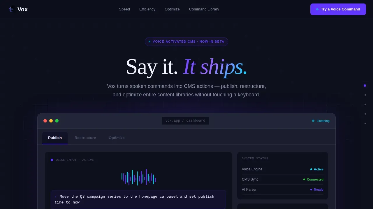
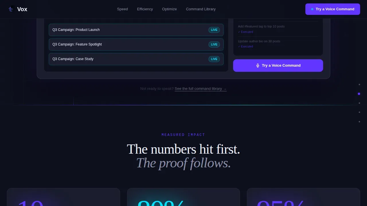
- A Feature Tab Switcher hero section with three tabs labeled Publish, Restructure, and Optimize, each displaying a distinct live dashboard mockup scene with an animated voice waveform, a rendered spoken command, and a simulated real-time CMS response including status pills and publish timestamps.
- Three spoke sections anchored to the stats hub, each pairing a large metric with an interactive proof element: a voice-to-publish latency comparison for speed, a two-hundred-page migration time-lapse for efficiency, and a rising search engine optimization score animation for content optimization.
- A persistent side navigation rail that links each spoke section by anchor, allowing visitors to jump directly to the proof that matters most to their specific role without scrolling through unrelated content.
Feature list
This template includes the following built-in design and structural features, all drawn directly from the source brief.
Animated Feature Tab Switcher Hero
The hero section presents a live dashboard mockup with three tabs across the top: Publish, Restructure, and Optimize. Each tab switches the entire dashboard scene when clicked. The default state displays a voice waveform animating across the center of the screen, a spoken command rendered as readable text on the display, and a simulated CMS response showing cards sliding, status pills flipping from draft to live, and a publish timestamp updating in real time. The waveform pulses in Electric Indigo, and every system response flashes reactive cyan before settling into its final state. This is not a static hero. The tab switcher gives visitors a direct, interactive way to understand what the system does across all three core use modes before reading a single line of body copy. Visitors who prefer to speak commands such as "Open dashboard" or "Create new post" will immediately recognize the interaction pattern this system is built for.
Stats-First Impact Hub Section
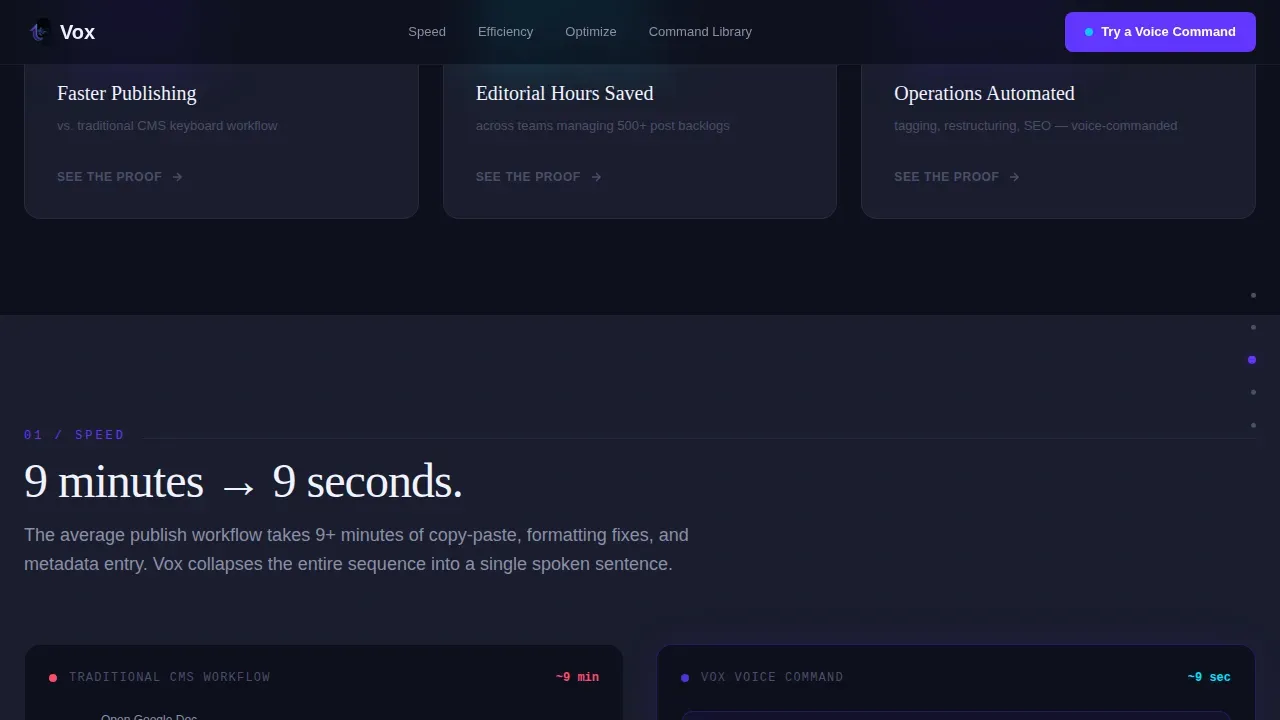
Immediately after the hero, three oversized performance metrics appear in large indigo type. These numbers represent publishing speed improvement, editorial hours saved, and the percentage of content operations automated. Each metric is scroll-linked to a counter animation that increments as the visitor enters the section, making the data feel live rather than static. This creative direction ensures that the value proposition of the voice-activated service registers at a data level before any explanatory prose arrives. The stats serve as anchors in the hub-and-spoke navigation structure, and each one links directly to the corresponding spoke section below. The approach is punch, then proof: the number lands first, and the evidence follows.
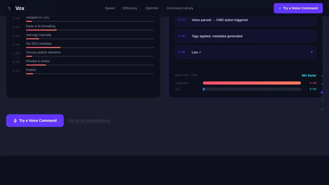
Speed Spoke with Latency Comparison
The first spoke section deepens the publishing speed metric with a live latency comparison between voice-to-publish workflow and a traditional keyboard-driven content management process. The comparison is displayed as an interactive element on screen, allowing visitors to see the time difference in a format that feels like a real system record rather than a marketing claim. This section gives digital editors the specific, quantified evidence they need to justify switching to a new service. It also gives marketing operations leads the data they can reference when making a business case to their teams. Every element in this section is created to serve the analytical buyer who will not move forward without proof.
Efficiency Spoke with Migration Time-Lapse
The second spoke section addresses the editorial hours saved metric with a time-lapse of a two-hundred-page content migration executed entirely by voice commands. Visitors watch the system process an entire content library restructure in a fraction of the time a manual workflow would require. The time-lapse is stored and played back as a visual proof element directly on the page, so visitors do not need to navigate away or request a separate video file. This section speaks directly to marketing ops leads and solo founders who have faced the reality of large-scale content migrations and know how many hours of manual work those processes typically consume. The visualization makes the efficiency claim tangible and specific.
Optimization Spoke with Live SEO Score Animation
The third spoke section pairs with the content operations automation metric and features a before-and-after search engine optimization audit visualization. As the visitor scrolls into this section, SEO scores climb on screen as metadata populates automatically. The animation shows the system identifying weak metadata fields, generating improved values, and confirming each update with a reactive cyan flash on the web interface. This section is particularly relevant to SEO managers and content strategists who need to see how the system handles metadata at scale without manual field-by-field editing. The visual proof is self-explanatory and does not require the visitor to interpret abstract claims.
Persistent Anchor Navigation Rail
A side navigation rail remains visible as the visitor scrolls the entire page. Each spoke section is accessible via a labeled anchor link in the rail, allowing visitors to jump directly to the proof element most relevant to their role. An editor focused on publishing speed can go straight to the latency comparison. A founder concerned about migration effort can jump to the time-lapse section. This navigation pattern respects the visitor's time and ensures that no relevant section is buried under unrelated content. The rail is part of the Hub and Spoke template style and is a core structural feature of this layout.
Page sections overview
| Section | Purpose |
|---|---|
| Hero Tab Switcher | Introduce the three core voice command modes with an animated, tab-switching live dashboard mockup |
| Stats Impact Hub | Display three oversized performance metrics in indigo type, each anchoring a spoke section below |
| Speed Spoke Section | Prove the publishing speed metric with an interactive voice-to-publish latency comparison |
| Efficiency Spoke Section | Prove the editorial hours saved metric with a two-hundred-page migration time-lapse video |
| Optimization Spoke Section | Prove the automation metric with a rising SEO score animation and metadata population sequence |
| Footer Horizontal Flow | Close the page with a Vercel-style horizontal footer layout and final call-to-action link |
Design & branding system
The visual identity for this template follows the Dashboard Pro theme and the Electric Indigo color system. The aesthetic is a dark workspace, modeled after a mixing console in a dimly lit studio where every surface recedes so the signal glows. Deep black frames everything. Indigo and cyan carry the meaning.
- The color palette uses four precise values: deep workspace black at hex code 0D0F1C for the background, primary Electric Indigo at hex code 6236FF for interactive affordances and waveform visualizations, cool interface gray at hex code 1A1D2E for card surfaces and the navigation rail, and reactive cyan at hex code 00E5FF for hover states and voice-input confirmation flashes.
- Typography pairs Fraunces, a high-contrast serif display face, for all headline and stat display settings with DM Sans, a clean geometric sans-serif, for all user interface body copy, labels, and navigation elements. This combination gives the page editorial authority at the headline level and functional clarity at the component level.
- Animation runs at a high intensity throughout the template: the voice waveform pulses continuously in Electric Indigo, tab-switching dashboard scenes swap with smooth transitions, scroll-linked stat counters increment as each section enters the viewport, and CSS keyframe beam animations fire on hover and voice-input confirmation states across the web interface.
Mobile & speed optimization
This template is designed with a desktop-first priority, which reflects the dashboard-heavy user interface, the tab switcher, and the side anchor navigation rail that define its core experience. A mobile responsive fallback is included to ensure that the layout remains functional and readable on smaller screen sizes and across different devices.
- The persistent side navigation rail collapses gracefully on smaller screens, and anchor links remain accessible so that mobile visitors can still navigate to each spoke section without scrolling through the full page length from the home screen.
- Interactive components, including the tab switcher dashboard and the scroll-linked stat counters, are built as client-side components only, while static and statically generated sections handle the rest of the page. This separation ensures that the heavy visual elements do not block the initial page render on any device or network connection.
- The template is structured for use on desktop-class computer displays first, where the full dashboard mockup, waveform animations, and side rail deliver their intended impact. Visitors on a phone or tablet will see a responsive layout that preserves the key proof elements and calls-to-action without the full animated treatment.
How this template helps you convert
The conversion architecture of this template is built around a single principle: let the product perform before asking for anything. Every section is a proof, and the call-to-action is simply the invitation to stop watching and start speaking.
- The primary call-to-action, labeled "Try a Voice Command," appears first inside the hero dashboard mockup and then resurfaces at the close of each spoke section. There is no form on this page. The button routes visitors directly to an interactive sandbox where they can speak a real command and watch a simulated CMS respond. This removes every barrier between interest and experience, which is the single most effective way to push a visitor from passive observation to active engagement with a voice-activated service.
- A secondary text link labeled "See the full command library" appears as an alternative path for the analytical buyer who wants to audit the system's capabilities before committing to the demo. This link catches the visitor who is not yet ready to speak a command but wants to verify that the system can handle their specific use case. Both calls-to-action serve the same goal through different channels: getting the visitor into direct contact with the product.
Other information about this template
This section covers additional context about the Vox template that is useful for anyone evaluating it for their project, whether they are a developer configuring the codebase, a designer adapting the visual system, or a content strategist assessing the structural fit for a voice-activated software product launch.
- The template is designed for use in no-code or low-code environments, meaning users can adapt the layout and content without extensive programming knowledge. AI-powered no-code development tools allow users to create applications without extensive coding knowledge, and this template is structured to be compatible with that approach. These tools often utilize natural language processing to interpret user instructions and generate code accordingly, which aligns naturally with the voice-first positioning of the Vox product this template promotes.
- AI-powered no-code platforms can handle backend integrations, deployment, and code generation automatically, which means teams using this template in conjunction with such platforms can move from configured template to live web application without traditional programming steps. Users can build full, production-ready apps and websites using AI-powered no-code tools, and this template is built to support that workflow. These platforms are designed for non-technical users, allowing them to go from idea to live app without traditional programming, and the template's static and client-component architecture is compatible with that model.
- AI-powered no-code tools are subscription-based, often with a free trial and various pricing plans. The target audience for AI-powered no-code tools includes product managers, solopreneurs, and small to medium businesses, which overlaps directly with the primary user personas this template is designed to serve. Competitors in the AI-powered no-code development space include Lovable, Cursor, and Bolt, and this template is designed to work within the ecosystem that those tools represent.
- The template's color system and animation configuration are fully documented so that a developer or designer can adapt the Electric Indigo palette, swap typefaces, or reconfigure the waveform animation settings without rebuilding the layout from scratch. Every color value, every animation mode, and every component configuration is set as an editable variable rather than hard-coded into the structure. This makes future reference and future adaptation straightforward for any team that takes ownership of the template after initial installation.
- Voice-activated CMS dashboard templates integrate Voice User Interface (VUI) technology to allow users to manage content using spoken commands, and the Vox template is designed to promote and demonstrate exactly that capability. The template incorporates high-contrast layouts and oversized typography as recommended for voice-first user interfaces. It also reflects the design principle that combined with screen readers, voice-activated interfaces allow visually impaired users to navigate dashboards through audio navigation, which improves the inclusivity of the digital platform. Developers can improve the inclusivity of their digital platforms by using voice-activated templates, and the Vox layout is built with that goal in mind.
- The template includes a Vercel Horizontal Flow footer pattern as the closing section. This footer provides a horizontal layout for secondary links, legal notices, and contact information. It is lightweight and does not introduce additional animation load at the bottom of the page.
- Templates often feature customizable settings for Voice-Activated Transmission (VOX), which triggers microphones based on sound thresholds. While the Vox template itself is a front-end landing page structure rather than a functional CMS application, the design references this concept in the waveform visualization and the simulated voice-input confirmation states shown in the dashboard mockup. This gives visitors a clear, intuitive understanding of how the underlying system would behave when deployed.
- The template is localized for English (United States) with USD currency references and MM/DD/YYYY date formatting. Teams deploying for other markets should note that the date display format, currency sign, and any locale-specific content in the proof elements will need to be updated for their target region.
- Voice recognition technology can enhance user interaction in applications by allowing users to control features through voice commands, and this template is designed to communicate that benefit visually and structurally. Voice recognition can be used to convert spoken messages into text, facilitating communication in various applications, and the rendered command text visible in the hero dashboard mockup illustrates this interaction pattern directly on screen.
- The template's server-side and client-side architecture separates static sections from interactive components. Static and statically generated sections handle all non-interactive content, while client components manage the tab switcher, waveform animation, and scroll-triggered stat counters. This separation means the bulk of the page content is served from the server without waiting for JavaScript to load, keeping the initial screen render fast on any network connection.
- For teams evaluating the template for a voice-activated software product that serves users with physical disabilities, it is worth noting that voice commands enable users to bypass the need for fine-motor skills, and the template's design reflects this inclusive intent throughout its visual language and copy structure. Voice interfaces can also simplify interactions for users with cognitive impairments by allowing natural language use rather than requiring navigation through nested menus.
- Real-time analytics and security measures for voice interactions are noted in the broader voice technology ecosystem as important factors for building user trust. While the template itself does not implement analytics or security infrastructure, the landing page structure includes space for trust signals, social proof statements, and persona-matched proof data points that can be configured to address these concerns for specific audiences.
- Vox voice-activated CMS dashboard templates, as represented by this template's structure and positioning, are designed to bridge the gap between traditional click-based content management systems and hands-free digital interaction. The landing page makes this gap visible and the solution tangible, which is the primary job of a click-through optimized page in this category.
- Voice-activated dashboards can support multiple languages, enhancing accessibility for diverse user groups. Teams adapting this template for multilingual deployments should note that the font pairing of Fraunces and DM Sans supports a wide range of Latin-script languages without modification. Non-Latin character sets may require a font substitution in the configuration.
- AI Voice Agent Landing Pages promote AI voice products and provide a modern, accessible interface. This template follows that category convention by centering the demo interaction as the primary conversion event rather than a contact form or a pricing table. The page earns the click by letting the product perform, and the visitor's first entry into the product experience is through a sandbox that responds to real spoken commands rather than through a sign-up gate.
- The template's design system stores all color variables, animation timing values, and typography scale settings as configurable tokens. This means a team can switch the Electric Indigo palette to a different brand color system without touching the structural code. The waveform animation timing, the tab-switch transition speed, and the scroll-linked counter duration are all set as adjustable configuration values.
- For teams using cloud-based deployment, the static and client-component architecture of this template is compatible with cloud hosting platforms that support server-side rendering and static site generation. Cloud storage is used for any media assets, including the migration time-lapse video and the social proof data files referenced in the spoke sections. All media files should be stored and served from a cloud-connected content delivery network to ensure consistent load performance across geographic regions.
- The template does not include a login screen or user authentication flow as part of its landing page structure. However, a login screen link can be inserted into the footer navigation or the secondary navigation area if the deployment requires visitors to access an existing account from the landing page. This is a lower priority configuration item for most deployments but should be noted for teams building a connected product where returning customers need a clear path back to their account.
- The first entry point into the product experience, as designed by this template, is the "Try a Voice Command" button in the hero section. This is intentional. The page is optimized for a click-through conversion to the sandbox demo, and any additional sign-up or account creation flow is handled downstream, outside the scope of this landing page template.
- Voice-activated features can be particularly beneficial in mobile applications, allowing users to interact hands-free while on the go. For teams whose target users will access the landing page from a phone while researching solutions during commutes or between meetings, the mobile responsive layout ensures the key messages and calls-to-action are accessible without the full animated desktop treatment.
- Data loss prevention is not a feature of this template itself, but the landing page structure includes space in the spoke sections and proof elements where teams can address data integrity messaging if their product offers data loss protection as a feature. This is relevant for enterprise content teams who will want reassurance that migrating large content libraries by voice does not risk data loss in the process.
- The template supports configuration for multiple communication channels. Teams can add links to support chat, contact forms, phone numbers, and email addresses in the footer and secondary navigation areas. This ensures that visitors who want to speak to a human before committing to the demo sandbox can find a direct path to the team. Note that none of these communication channel elements are pre-populated with real data and will need to be configured by the deploying team.
- Voice recognition systems can be integrated into mobile applications to allow users to send messages or commands without typing. While this template promotes a desktop-first CMS experience, the positioning of voice-first interaction as a productivity tool is equally relevant for teams whose users move between computer workstations and mobile devices throughout the day.
Theme
Dashboard Pro
Creative direction
Stats-First Impact
Color system
Electric Indigo
Style
Hub & Spoke (Anchor Nav)
Direction
Click-Through
Page Sections
Feature Tab Switcher Hero with Live Dashboard
Stats-first Impact Hub with Scroll-linked Counters
Three Spoke Sections with Interactive Proof Elements
Persistent Anchor Navigation Rail
Click-through Optimized Dual Call-to-action System
Electric Indigo Dark Workspace Visual System
Related questions
Can I use this template without writing any code?
Does the landing page include the voice command sandbox itself?
Who is this template best suited for?
How does the Feature Tab Switcher work in this template?
Can I adapt the color system to a different brand palette?


