Spa & Wellness Center Advanced Booking Website Template
Soothe is a precision wellness landing page built for spas that treat recovery as a science. It combines filterable treatment comparison tables, expandable FAQ rows, and a data-driven visual identity to help analytically minded visitors configure their ideal recovery protocol and download the booking app in seconds.
by Rocket studio
Quick summary
Soothe is a single-page wellness landing page that presents spa treatments the way engineers present specifications. Filterable comparison matrices, expandable table rows, and a clinical color system replace vague luxury copy with structured, decision-ready information. Every section earns trust through precision, and every interaction nudges visitors toward one clear action: downloading the app.
Who this template is for
This template is built for spa and wellness businesses whose clients arrive with research already done. It speaks directly to people who want data before they book, not mood boards.
- Overworked tech professionals who schedule recovery sessions the way they schedule work sprints
- Corporate wellness coordinators comparing vendor packages for large teams and needing side-by-side data
- Postpartum mothers and health-focused individuals researching treatment contraindications with clinical care
What problem this template solves
Most spa landing pages rely on soft imagery and vague promises of relaxation. That approach loses the modern wellness buyer who wants transparent pricing, treatment specifications, and clear contraindication information before committing.
- Visitors cannot easily compare massage types, facial treatments, or hydrotherapy options in one view
- Pricing ambiguity and missing health condition details force phone calls that most analytical buyers avoid
- There is no direct path from research to booking, creating drop-off before conversion happens
What you get with this template
You get a fully structured, single-page comparison engine designed to replace a generic spa menu with a decision-grade reference tool. Every section is purpose-built for a visitor who is actively choosing, not casually browsing.
- A filterable treatment comparison table covering massage types, facial treatments, and hydrotherapy options
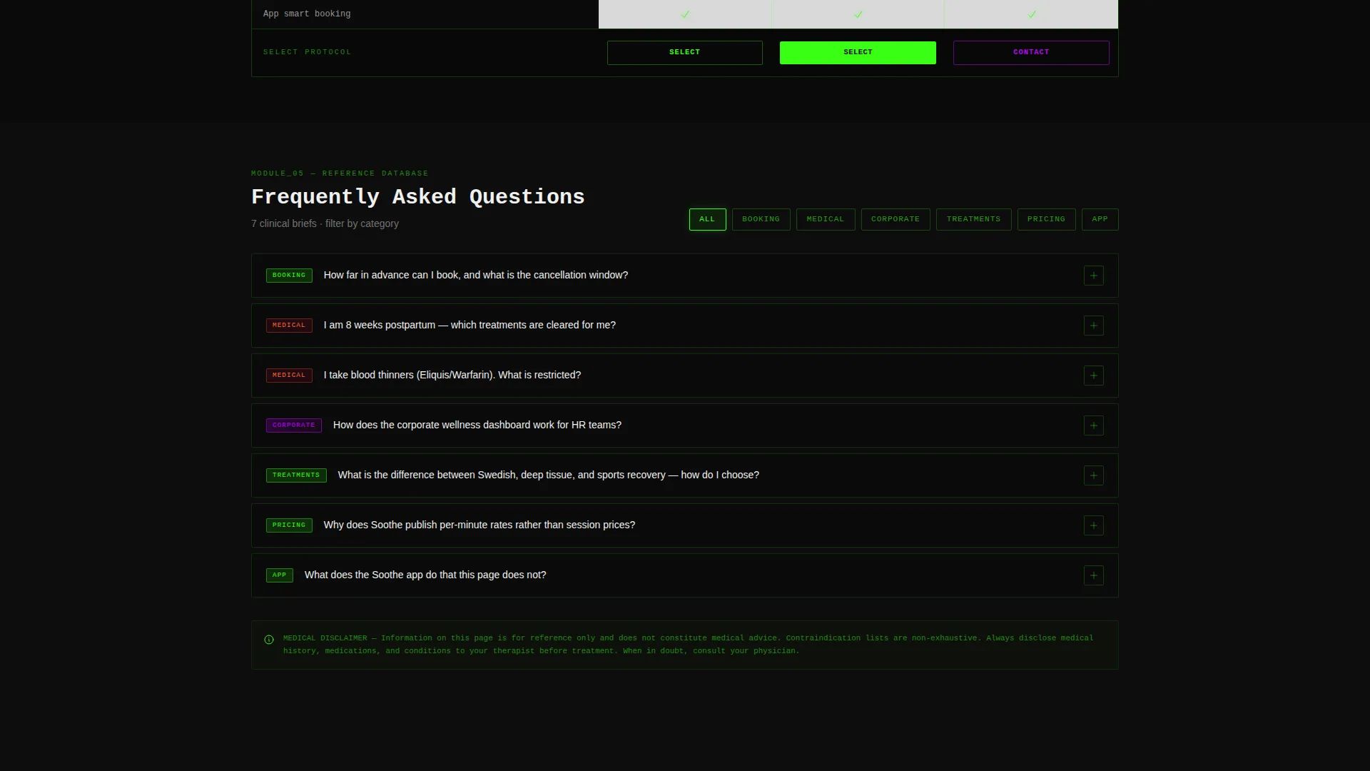
- Expandable table rows that reveal full FAQ answers on tap, making the page both a menu and a reference guide
- A sticky app-download bar with a primary call-to-action button and a secondary ghost button for mobile handoff
Feature list
This template delivers six purpose-built components that work together as a unified decision engine for the wellness buyer.
Filterable Treatment Comparison Table
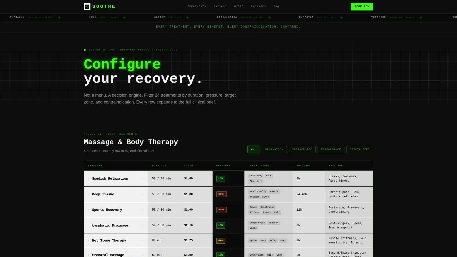
The first viewport presents a comparison table covering Swedish, deep tissue, sports recovery, and lymphatic drainage treatments. Each row includes duration, pressure level, target muscle zones, recovery time, and contraindications. Cells are color-coded by intensity so visitors can scan quickly and filter by what matters to them.
Expandable FAQ Row System
Every table row expands on tap to reveal the full FAQ answer for that treatment. This turns a single-page layout into both a comparison tool and a clinical reference. Visitors get the detail they need without leaving the page or opening a separate help section.
Secondary Treatment Matrices
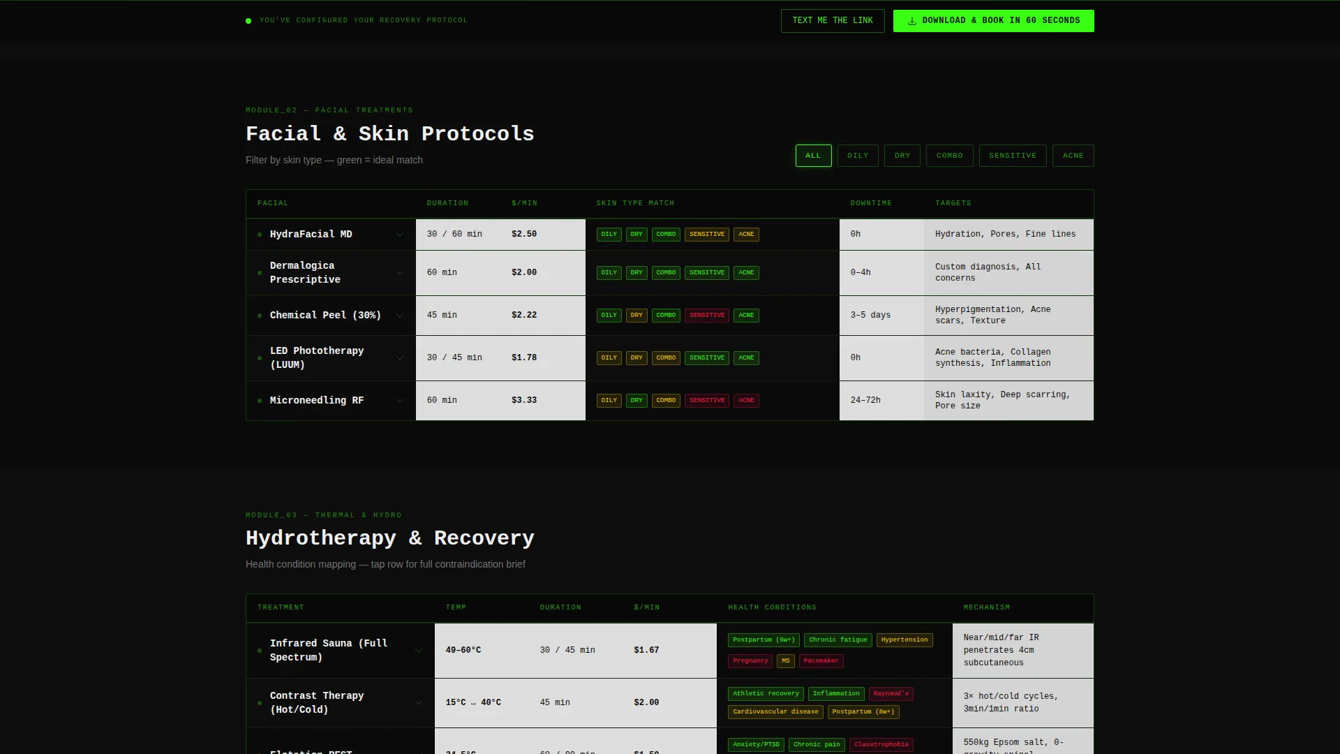
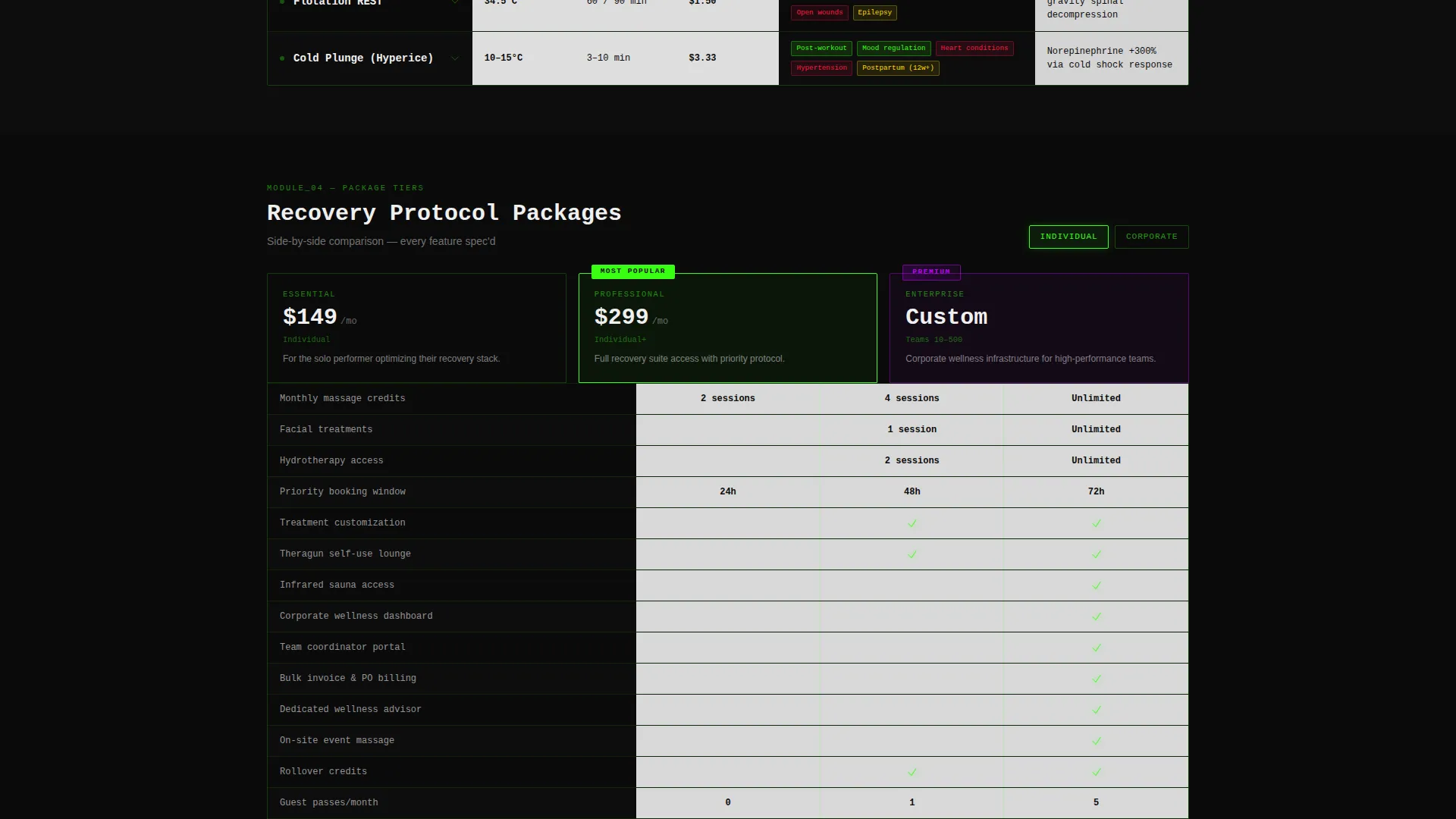
Beyond the primary massage table, the page includes additional comparison grids. Facial treatments are cross-referenced by skin type, hydrotherapy options are mapped against health conditions, and package tiers are compared side-by-side with checkmark indicators highlighted in the template's acid green.
Sticky App-Download Bar
A sticky bottom bar appears after a visitor interacts with any comparison filter. The primary button reads "Download and Book in 60 Seconds." A secondary ghost button offers "Text Me the Link" with a single phone number input field for frictionless mobile handoff.
Logo Bar Header
The header is a razor-thin strip displaying the wordmark in terminal green on a void black background. Partner brand micro-icons scroll slowly in a ticker-style animation, establishing credibility without taking up visual real estate. A single line of monospaced type below it sets the page's intent in one sentence.
Data Command Color System
The Acid Digital palette drives every visual decision on the page. Terminal green pulses on hover states and active filters. Ultraviolet marks premium tier badges. Void black dominates negative space. Sterile white keeps dense comparison grids readable and breathable.
Page sections overview
| Section | Purpose |
|---|---|
| Logo Bar Header | Establishes brand and partner credibility in a single ticker strip |
| Intent Tagline Strip | Sets the page's analytical tone with one monospaced sentence |
| Primary Massage Matrix | Lets visitors compare core massage treatments side by side |
| Facial Treatment Matrix | Cross-references facial options by skin type |
| Hydrotherapy Options Grid | Maps hydrotherapy treatments against relevant health conditions |
| Package Tier Comparison | Shows package tiers side by side with checkmark indicators |
| Sticky Download Bar | Drives app download after filter interaction is detected |
Design & branding system
The visual identity follows a Data Command theme built on the Acid Digital color system. The palette is intentionally clinical and electric, designed to signal precision rather than indulgence.
- Void black (#0D0D0D) dominates negative space; terminal green (#39FF14) pulses on hover and active filter states; ultraviolet (#BF00FF) marks premium tier badges; sterile white (#F0F0F0) keeps comparison grids breathable
- Monospaced typography reinforces the data-readout aesthetic, making treatment specs feel as authoritative as a technical document
- No hero image and no ambient video are used; the restraint itself signals confidence that the comparison data below needs no emotional preamble
Mobile & speed optimization
The template is structured so that its densest elements, the multi-column comparison grids, remain fully navigable on smaller screens. The sticky bar and ghost button make the mobile conversion path direct and low-friction.
- Expandable table rows condense information efficiently on small screens, surfacing detail only on tap
- The "Text Me the Link" ghost button with a single phone number field creates a direct mobile handoff without requiring immediate app store navigation
- The sticky bottom bar appears contextually after filter interaction, keeping the conversion prompt relevant rather than intrusive
How this template helps you convert
The page is designed as a proof-of-product experience. By the time a visitor reaches the sticky bar, they have already seen the kind of intelligent comparison data the app promises to deliver in pocket form.
- The filterable matrices qualify visitor intent in real time. A visitor who filters by contraindications is signaling high purchase readiness, and the page rewards that signal with immediate, detailed answers.
- The expandable FAQ system removes the final objection layer. Visitors find contraindication details, pressure level explanations, and pricing transparency without leaving the page, reducing the hesitation that causes drop-off.
- The sticky app-download bar appears only after filter interaction, timing the conversion ask to the moment of peak decision engagement rather than interrupting early browsing.
Other information about this template
This template sits at the intersection of the technology category and the spa and wellness center niche, making it a strong fit for businesses that serve digitally native, research-driven clientele.
- The template style is a Comparison Table layout, and the creative direction follows a Feature Matrix structure, both defined by the matched intersection context
- Partner brand visibility in the logo ticker supports credibility for wellness centers that use recognized equipment or product lines
- The landing page is designed to function as a direct preview of the app experience, so the download conversion feels like a natural next step rather than an interruption
- This template suits wellness operators who want to position their service as engineered recovery rather than ambient relaxation
Theme
Data Command
Creative direction
Feature Matrix
Color system
Acid Digital
Style
Comparison Table
Direction
App Download
Page Sections
Filterable Treatment Comparison Table
Expandable FAQ Row System
Secondary Treatment Matrices
Sticky App-download Conversion Bar
Logo Bar with Partner Ticker
Acid Digital Color and Typography System
Related questions
Can I customize the treatment categories in the comparison tables?
Does the sticky download bar appear for every visitor?
Can I use this template if my spa does not have a mobile app?
Who is the ideal audience this template is designed for?
How does the expandable row system work for FAQ content?



