AI for Agriculture Booking Website Template
Cultivate is a split-screen landing page template built for agriculture AI customer service platforms. It pairs a live-style call-log dashboard with a scrolling feature matrix that walks through real call scenarios. The layout is designed to build trust through accumulated evidence and push visitors toward a single, friction-free demo booking click.
by Rocket studio
Quick summary
Cultivate is a single-page, click-through landing page template for an AI phone platform serving seed dealers, equipment distributors, and crop input retailers. The 50/50 split-screen layout opens with an operational dashboard preview and scrolls through a feature matrix of resolved call scenarios. Every section builds toward one action: booking a live demo.
Who this template is for
This template is built for agriculture technology companies that need to communicate a complex AI product quickly and credibly. It speaks directly to buyers who have felt the pain of peak-season call overflow and need proof before they commit.
- Regional ag supply companies and co-op managers drowning in call volume during planting season
- Precision agriculture dealers whose technical staff should not be fielding billing or order-status calls
- Seed dealers, equipment distributors, and crop input retailers ready to evaluate AI-powered phone automation
What problem this template solves
Small ag supply offices face a brutal seasonal problem: call volume spikes exactly when every staff member is already stretched. A missed call during chemical order day is a lost sale. This template gives the AI platform a page that feels as operational as the product itself.
- Visitors arrive skeptical; the dashboard preview and call transcripts replace skepticism with evidence
- A single call to action removes decision fatigue and replaces form friction with one golden button click
- The escalating feature matrix shows breadth of coverage before any commitment is requested
What you get with this template
You get a fully structured, single-page layout with every section, copy direction, and visual system defined. Nothing is left vague or placeholder-dependent.
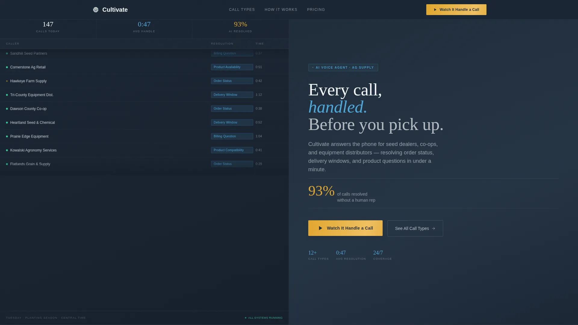
- A split-screen header with a live-style incoming call log on the left and headline, stat, and primary call to action on the right
- A scrolling feature matrix pairing specific call scenarios with AI capability cards showing resolution rate, average handle time, and sample transcript snippets
- Three call to action placements: header, mid-page after the third feature pair, and a sticky bottom bar
Feature list
This template is built around specific, source-defined components. Each one plays a direct role in moving a skeptical ag buyer toward a demo booking.
Live Call-Log Dashboard Header
The header splits the viewport cleanly down the center. The left panel shows a scrolling incoming call log with caller IDs like "Dawson County Co-op" and "Heartland Seed & Chemical," AI resolution tags in sky blue, and an average handle time of 47 seconds. The right panel holds the headline, a single stat ("93% of calls resolved without a human"), and the primary call to action button in harvest gold.
Scrolling Feature Matrix Sections
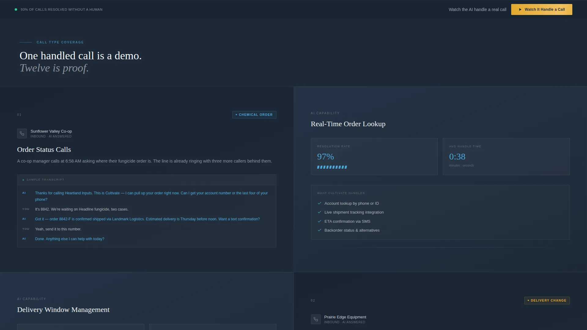
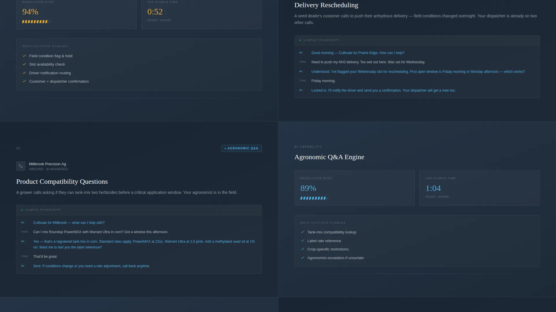
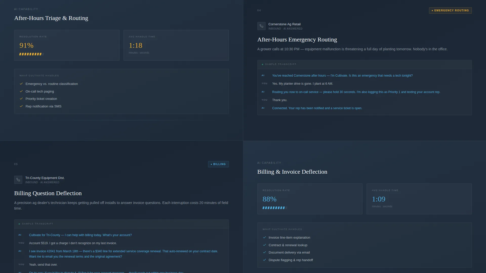
Each section below the header pairs a specific call scenario on the left with an AI capability card on the right. Scenarios include order tracking, delivery rescheduling, product compatibility questions, and after-hours emergency routing. Each card displays resolution rate, average handle time, and a real-feeling sample transcript snippet.
Escalating Proof Accumulation Layout
The scroll structure is designed intentionally. Complexity increases section by section, so by the time a visitor reaches the mid-page call to action, they have seen enough handled call types to recognize the platform covers their entire call sheet.
Three-Point call to action Architecture
The primary call to action, "Watch It Handle a Call," appears in the header, again after the third feature pair, and in a sticky bottom bar that travels with the visitor. All three clicks lead to the same dedicated demo page with an embedded video and a calendar widget.
Zero-Form Click-Through Design
There is no form on the landing page. The only ask is a single button click. This removes friction entirely and lets the evidence matrix do the trust-building work before any commitment is requested.
Startup Velocity Visual Theme
The Slate and Sky color system uses weathered field slate, deep furrow charcoal, open-sky blue, and horizon white across backgrounds and type. Harvest gold is reserved exclusively for calls-to-action, making every button visually distinct and intentional.
Page sections overview
| Section | Purpose |
|---|---|
| Split-Screen Header | Displays live call log and headline stat with primary call to action |
| Feature Pair One | Covers order tracking scenario with AI capability card |
| Feature Pair Two | Shows delivery rescheduling with resolution rate and transcript |
| Feature Pair Three | Handles product compatibility questions with sample dialogue |
| Mid-Page call to action | Reinforces demo booking after three feature pairs |
| Feature Pair Four | Demonstrates after-hours emergency routing capability |
| Additional Feature Pairs | Escalates complexity to show full call-sheet coverage |
| Sticky Bottom Bar | Persistent call to action ensuring demo access at any scroll point |
Design & branding system
The visual identity is built around the Startup Velocity theme and a Slate and Sky color system. Every color choice is grounded in a specific agricultural reference point, making the palette feel earned rather than arbitrary.
- Core palette: weathered field slate (#3B4856), deep furrow charcoal (#1E2A38), open-sky blue (#4DA8DA), and horizon white (#F4F7FA) for backgrounds and type
- Accent color: harvest gold (#E2A72E) used exclusively on calls-to-action, referencing a ripe wheat head catching afternoon light
- AI resolution tags appear in open-sky blue, creating a consistent visual language between the dashboard and the feature matrix cards
Mobile & speed optimization
The template is designed with a split-screen layout that adapts cleanly to narrower viewports. The structured single-page flow keeps the scroll experience focused regardless of screen size.
- The 50/50 split panels restack vertically on smaller screens so neither side competes for attention
- The sticky bottom bar remains accessible across all viewport sizes, keeping the demo call to action reachable at every scroll depth
- The single-call to action, no-form structure keeps the page lean by design, with no heavy form logic or multi-step interactions adding weight
How this template helps you convert
The entire layout is engineered to reduce hesitation and move visitors toward one specific action. Every structural decision serves that goal.
- The header dashboard looks operational, not conceptual, so visitors arrive in "I can picture this working" mode rather than "convince me" mode.
- The escalating feature matrix builds confidence through accumulation, turning each scrolled section into another piece of evidence before the ask appears.
- Three call to action placements at header, mid-page, and sticky bar mean a ready visitor never has to search for the next step.
Other information about this template
This template is purpose-built for the agriculture AI customer service space, where trust is earned through specificity rather than broad claims. The layout is intentionally designed to feel like a Tuesday in April during planting season.
- The template follows a click-through landing page direction, meaning no forms, no multi-step flows, and no data entry on the page itself
- The header concept is a Dashboard Preview, designed to look like a live operational screenshot rather than a marketing mock-up
- The creative direction is a Feature Matrix, a scroll-based proof structure that accumulates credibility section by section
- The template style is Split Screen (50/50), consistently dividing each section between scenario context and platform capability
- Built under the Startup Velocity theme, the design balances the grounded, field-worn feel of ag operations with the forward momentum of a technology product
Theme
Startup Velocity
Creative direction
Feature Matrix
Color system
Slate & Sky
Style
Split Screen (50/50)
Direction
Click-Through
Page Sections
Live Call-log Dashboard Header
Scrolling Feature Matrix Layout
Escalating Proof Accumulation Structure
Three-point Call to Action Architecture
Zero-form Click-through Design
Startup Velocity Visual Identity
Related questions
Who is this landing page template designed for?
Does this template include a contact form?
How many call to action placements does the template include?
Can I customize the call scenarios in the feature matrix?
What does the split-screen header section contain?



