Adaptive Bite-Sized Education App Landing Page Template
The Learn Dynamic Micro-lesson Education Mobile App Landing Page Template is a dark-themed, card grid landing page built to drive iOS and Android app downloads. It pairs glassmorphic hero panels, animated flip-card spec sheets, and zero-friction dual call to action buttons with strong social proof, making every section work to convert visitors into learners the moment they arrive.
by Rocket studio
Quick summary
This is a single-page, mobile-first app landing page template built for e learning products targeting time-constrained learners. The page captures visitor attention through animated glassmorphic panels, a modular flip-card spec sheet, and dual store download call to action buttons. It is designed to convert visitors into app downloads without forms or email gates, one tap, one clear path.
Who this template is for
This template fits any creator, developer, or education business launching a micro-learning mobile app. It works especially well when the product serves people who learn in short, stolen windows of time rather than dedicated study sessions.
- Founders and product teams launching an e learning app to adult learners with fragmented schedules
- Educators and course creators who want a professional landing page to promote an online course or training program delivered through a mobile platform
- Developers and designers creating an app landing page without needing to build everything from scratch
What problem this template solves
Most landing pages for e learning apps fail at the moment of first impression. They rely on static images, flat layouts, and generic copy that does not communicate the speed or energy of the product itself. Visitors leave before they feel the value proposition.
This educational landing page template solves that gap directly:
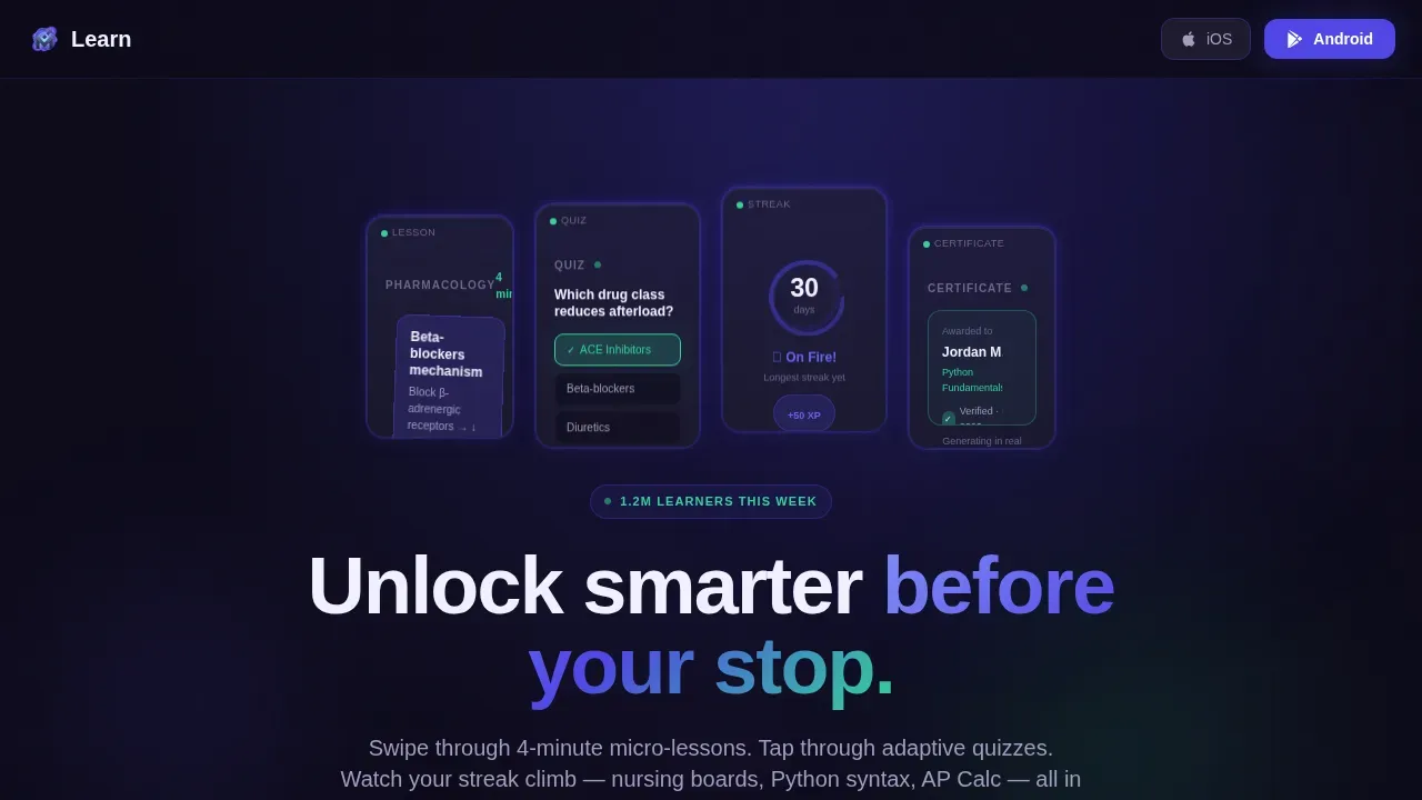
- It replaces static images with looping micro-animated glass panels that show the app mid-use, giving visitors an immediate feel for the product
- It structures the page as a spec sheet of bold, scannable feature cards rather than a long scroll of paragraphs, so visitors grasp key benefits in seconds
- It removes all friction from the conversion path by using dual prominent call to action buttons that send visitors straight to the app store
What you get with this template
You get a fully structured, visually appealing single-page layout built around one conversion goal: getting visitors to download the app. Every section is purpose-built, and nothing exists on this page without earning its place.
- A hero section with tilted glassmorphic panels, a compelling headline, and dual download call to action buttons placed above the fold
- A modular card grid spec sheet with flip-card hover reveals, a social proof bar with live learner counters and star ratings, a horizontal scroll testimonial row, and a final download card with both store badges
- A sticky bottom bar that slides up after the third card row, keeping the desired action visible as users scroll through the page on mobile devices
Feature list
This landing page template is built around six core capabilities, each tied directly to the brief.
Animated Glassmorphic Hero Panels
The hero section opens with a row of frosted dark glass panels, each tilted at a slight parallax angle. Every panel shows a different app screen mid-action: a lesson card being swiped, a quiz answer locking in, a streak counter at 30 days, and a certificate generating in real time. Looping micro-animations replace static images and make the hero image feel alive rather than staged.
Modular Flip-Card Spec Sheet Grid
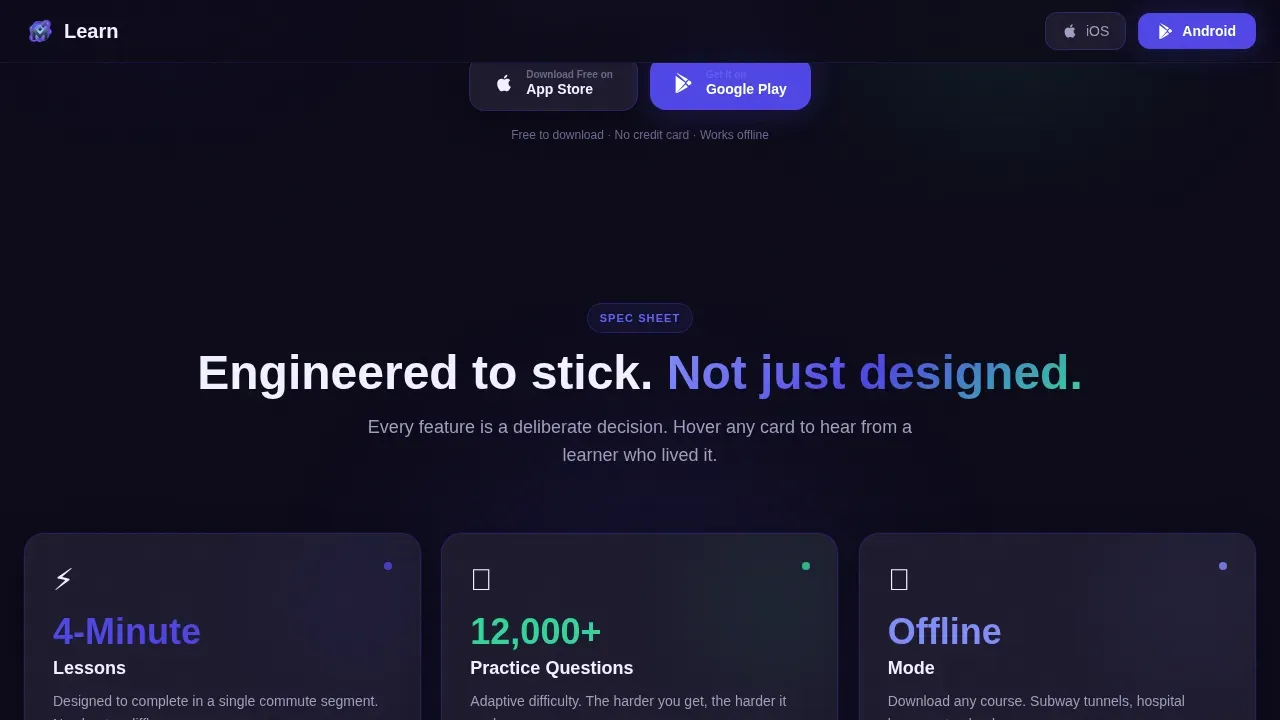
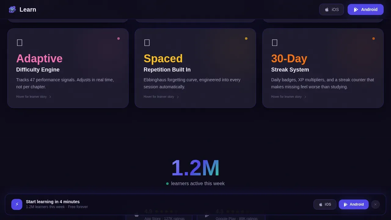
Below the hero section, cards snap into a grid one by one as the page scrolls. Each card holds a single bold metric, "4-Minute Lessons," "12,000+ Practice Questions," "Offline Mode," "Adaptive Difficulty Engine," "Spaced Repetition Built In." On hover, cards flip or expand to reveal a short animation or a single student testimonial quote. This turns a standard feature list into an interactive spec sheet that builds credibility fast.
Dual Download Call to Action System
Two call to action buttons appear in the hero section: "Download Free on iOS" and "Get It on Google Play." The same pair reappears in a sticky bottom bar that slides up after visitors scroll past the third card row. Multiple calls to action placed at the right scroll depth keep the conversion goal visible without interrupting the reading experience.
Social Proof Bar with Live Counter
A dedicated social proof bar displays a live learner counter ("1.2M learners this week") alongside App Store and Google Play star ratings. Strong social proof at this position anchors trust before visitors reach the testimonial section. Trust indicators like these are proven to build trust and increase conversions on educational landing pages.
Horizontal Scroll Learner Stories
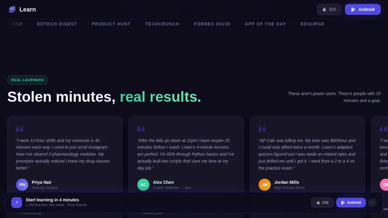
A horizontal scroll row of persona-based testimonials shows real learner types: a nursing student cramming pharmacology between shifts, a career-switcher picking up coding skills at midnight, a high schooler grinding AP prep in transit. Student testimonials are placed as cards with enough detail to make the learning experience feel personal and credible.
Sticky Bottom Bar and Final Download Card
A sticky bar slides into view after the third card row, keeping a prominent call to action on screen at all times for mobile users. The page closes with a final conversion card reading "Your first lesson takes 4 minutes" with both store badges side by side. No form, no email gate, no friction.
Page sections overview
| Section | Purpose |
|---|---|
| Hero Glass Panels | Open with animated app previews and dual download calls to action above the fold |
| Spec Sheet Grid | Deliver bold feature metrics in modular flip cards with hover reveals |
| Social Proof Bar | Show live learner count and App Store and Google Play star ratings |
| Learner Stories Row | Build trust through horizontal-scroll persona testimonials |
| Final Download Card | Close the page with a single, zero-friction store download prompt |
| Sticky Bottom Bar | Keep the download call to action visible throughout the entire scroll journey |
| Footer | Minimal dark-theme footer with essential links |
Design & branding system
The visual identity follows a Dynamic Motion theme with an Electric Indigo color system. The palette is built to feel like a phone screen glowing in a dark room, concentrated, alive, and quietly urgent. The typography uses Plus Jakarta Sans for bold headings and DM Sans for body text, creating a clean, readable hierarchy throughout the page.
- Color tokens: deep app-dark background (#0D0B1A), electric indigo (#4F46E5) for interactive cards and progress indicators, cool slate (#1E1B2E) for card surfaces, and phosphor mint (#34D399) for completion states and success animations
- Visual style: glassmorphism blur with indigo edge-light on hero panels, white space used deliberately to let cards breathe, clean lines between grid sections, and GPU-accelerated motion for blob glows and counter animations
- Typography and layout: bold Plus Jakarta Sans headings create a visually appealing hierarchy; DM Sans body copy stays legible at small sizes; the page layout uses clear sections and a card grid that adapts cleanly across screen widths
Mobile & speed optimization
This template is built mobile-first because the product is a mobile app and the target audience is most likely visiting on mobile devices. The entire page layout is designed to work on small screens without losing any of its visual energy or conversion clarity.
- The hero section places the primary cta button above the fold and sizes it for one-handed tap access, following best practice for touch-friendly mobile landing pages
- All animations use GPU-accelerated transforms only, keeping motion smooth without adding render load on mobile devices; the single column layout used in key scroll sections simplifies navigation for users on small screens
- The sticky bottom bar uses a slide-up behavior that keeps the cta button visible as visitors scroll, reducing bounce rate by maintaining conversion focus throughout the session
How this template helps you convert
An educational landing page succeeds when every scroll action moves visitors closer to a single conversion goal. This template is engineered around that logic from the first pixel to the last card.
- The hero section hooks visitor's attention immediately with a compelling headline, eye catching visuals in the form of animated glass panels, and dual call to action buttons that remove all barriers to the desired action
- The spec sheet grid builds credibility section by section, using bold metrics, flip-card student testimonials, and a social proof bar to convert visitors who need evidence before they commit to a download
- The sticky bottom bar and final download card close the loop, ensuring conversion goals are met without requiring visitors to scroll back up, keeping conversion rates high across both mobile and desktop sessions
Other information about this template
This template is ready to use on any no-code landing page platform that supports HTML, CSS, and JavaScript. No coding skills are required to swap in your own content. Drag-and-drop editors common to no-code landing page builders make it straightforward to update text, colors, and card content without touching the underlying code. The template can also be adapted for related educational offerings beyond micro-lessons, such as a full online course, a training program, or a broader educational platform with multiple subjects.
- The page layout functions as a standalone web page, meaning it operates independently as a standalone web without connecting to a course platform or learning management system unless you configure that separately
- Like well-known mobile app landing page examples such as Khan Academy Kids, which is an educational landing page built specifically to promote a mobile app, this template puts the app experience front and center rather than describing it in text
- The TikTok Academy landing page uses short videos as a trust signal; this template achieves a similar effect through looping micro-animations embedded directly in the hero panels, keeping visitors engaged without requiring video hosting
- The page supports lead generation indirectly through app store redirects rather than an email gate, which aligns with the zero-friction philosophy and keeps conversion goals focused on the single desired action
- Well-designed education landing page examples like the edX landing page and the HubSpot Academy landing page show that visitors respond to clear sections, scannable course details, and an obvious next step; this template is built on those same principles
- The Coursera for Business landing page leads with outcomes rather than features; similarly, this template's spec sheet grid surfaces results-oriented metrics first, helping visitors understand what they gain before they read the fine print
- The Skillshare landing page uses animation and color to mirror the creative energy of the product; this template applies the same thinking to a dark, high-motion app aesthetic that feels native to the product it promotes
- The Codecademy Coaching landing page introduces real people to make the experience personal; the learner stories row in this template does the same through persona-driven student testimonials with enough detail to feel human
- For teams running campaigns on social platforms, this app landing page can serve as the destination for paid traffic from any channel, with conversion goals already built into the structure
- No-code landing page builders often include features like A/B testing and analytics to help optimize conversion rates; this template is compatible with those workflows, letting you test headline copy, cta button color, or card order without redesigning the page
- The Harvard Business School Online landing page targets companies and leadership teams with serious, results-driven messaging; if your educational offerings serve a professional audience, the spec sheet format of this template adapts to that tone without modification
- Templates provided by no-code landing page builders can be tailored to specific industries or purposes; this one is purpose-built for the education niche but can be reskinned for any app-based learning product
- Using a no-code landing page builder can significantly reduce the time it takes to launch a marketing campaign, and this template is structured to save time by giving you a complete, conversion-ready page layout on day one
- The learn dynamic micro lesson education mobile app landing page template is the full product name for this asset in the marketplace
Theme
Dynamic Motion
Creative direction
Spec Sheet
Color system
Electric Indigo
Style
Card Grid (Modular)
Direction
App Download
Page Sections
Glassmorphic Hero Section with Animated Panels
Modular Flip-card Spec Sheet Grid
Dual Download Call to Action Buttons
Live Social Proof Bar with Star Ratings
Persona-driven Learner Stories Row
Sticky Bottom Bar and Zero-friction Close
Related questions
Can I use this template to promote an online course rather than just a mobile app?
Do I need coding skills to customize this template?
How does this template handle social proof?
Is this template optimized for mobile devices?
Can this landing page work as a standalone web page without connecting to a course platform?



