Online Course Platform Professional Website Template
Spark is a single-column landing page template built for micro-learning platforms. It combines a warm Community Hearth visual identity with the Dopamine Pop color system to create a page that feels alive, social, and inviting. The layout guides visitors from a bold header through human-centered storytelling sections to a frictionless free-resource form, turning curious visitors into engaged learners.
by Rocket studio
Quick summary
Spark is a single-column flow landing page template designed for micro-learning platforms. It uses a Community Hearth theme and a Dopamine Pop color palette to build trust through real faces, social proof, and a low-friction content offer. The primary call to action invites visitors to grab a free starter kit, no credit card or demo call required.
Who this template is for
This template speaks directly to the people building and selling short-format learning experiences. It is made for teams who want their page to feel like a warm gathering, not a product brochure.
- Micro-learning platform founders and product teams ready to grow their learner base
- Learning and development leads looking for a landing page that converts skeptical buyers into active users
- Course creators and online educators who serve mid-career professionals with limited time
What problem this template solves
Most online course platform pages feel cold and transactional. They lead with feature lists, ask for too much too soon, and give visitors no reason to believe the community is real. Spark solves this by leading with people instead of product specs.
- Visitors leave quickly when a page feels like a sales pitch rather than an invitation
- Low-friction offers get buried beneath pricing tables and demo request forms
- Short-format learning platforms struggle to communicate the habit-forming value of five-minute lessons before visitors scroll away
What you get with this template
You get a fully structured, single-column landing page layout ready to be customized for your micro-learning platform. Every section is designed with a specific conversion or trust-building job in mind.
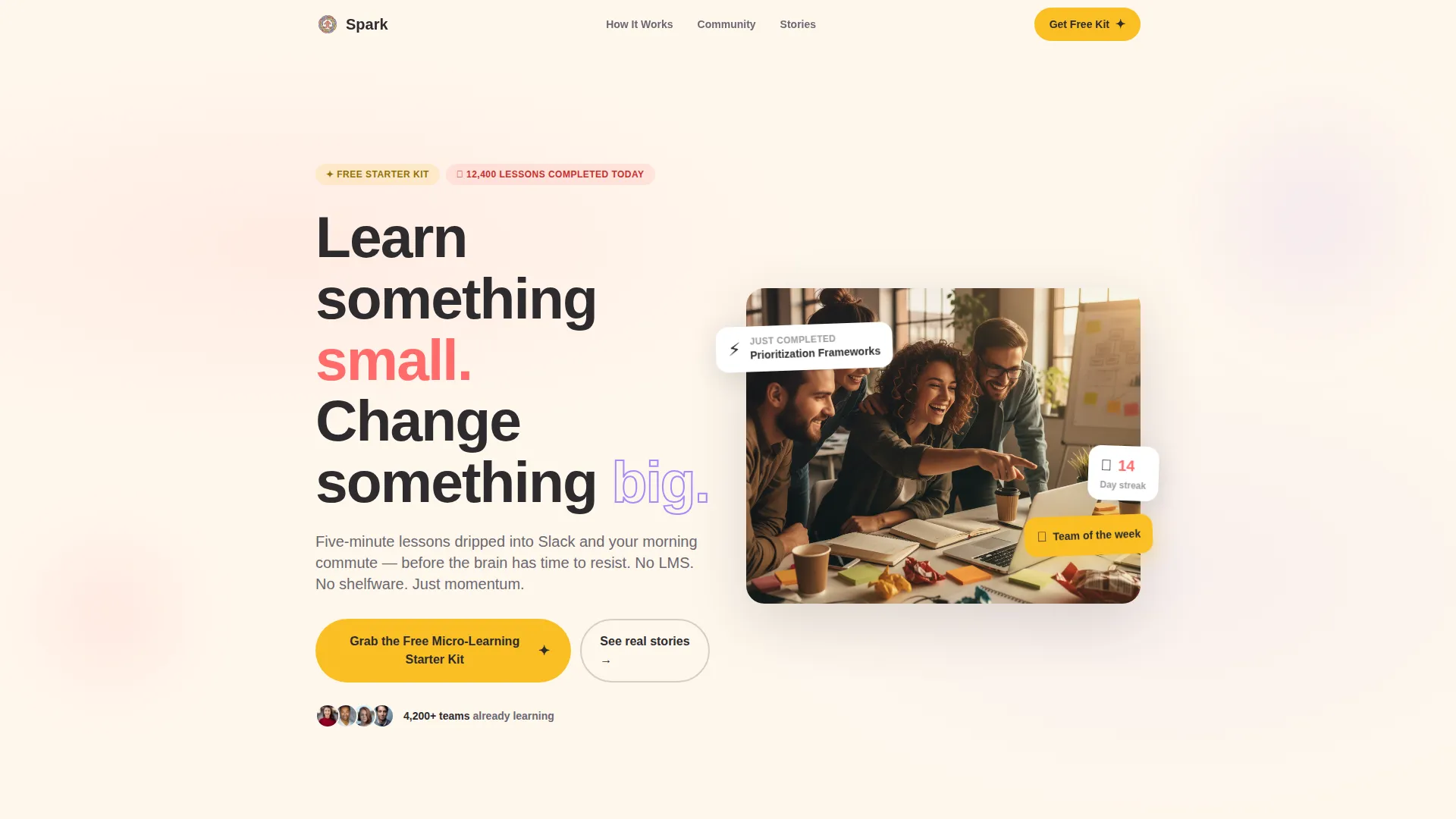
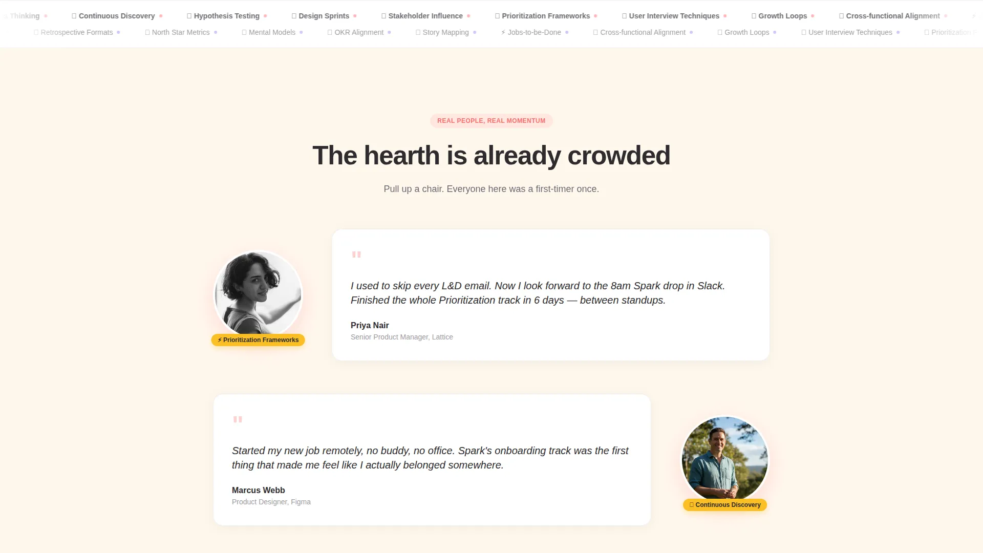
- A half-page photo and text header, individual learner quote blocks with circular portrait areas, a team-of-five hover grid, a live lessons-completed counter, and a growing avatar mosaic
- Two strategically placed calls to action, each opening an inline form that asks only for a first name and work email, with an optional weekly lesson toggle
- A complete Dopamine Pop visual system including warm charcoal body text, serotonin coral accents, electric lavender hover states, sunshine marigold badges, and a soft oat cream background
Feature list
This template is built around a set of intentional design and layout decisions that work together to lower resistance and build belonging.
Half-Page Header Composition
The header splits into a left-aligned headline area and a right-side candid team photograph space. The headline reads "Learn something small. Change something big." in a rounded, friendly sans-serif at generous scale. The photograph area is styled for a golden-hour, shallow depth-of-field image of teammates gathered around a laptop, creating warmth from the first scroll.
Learner Quote and Portrait Blocks
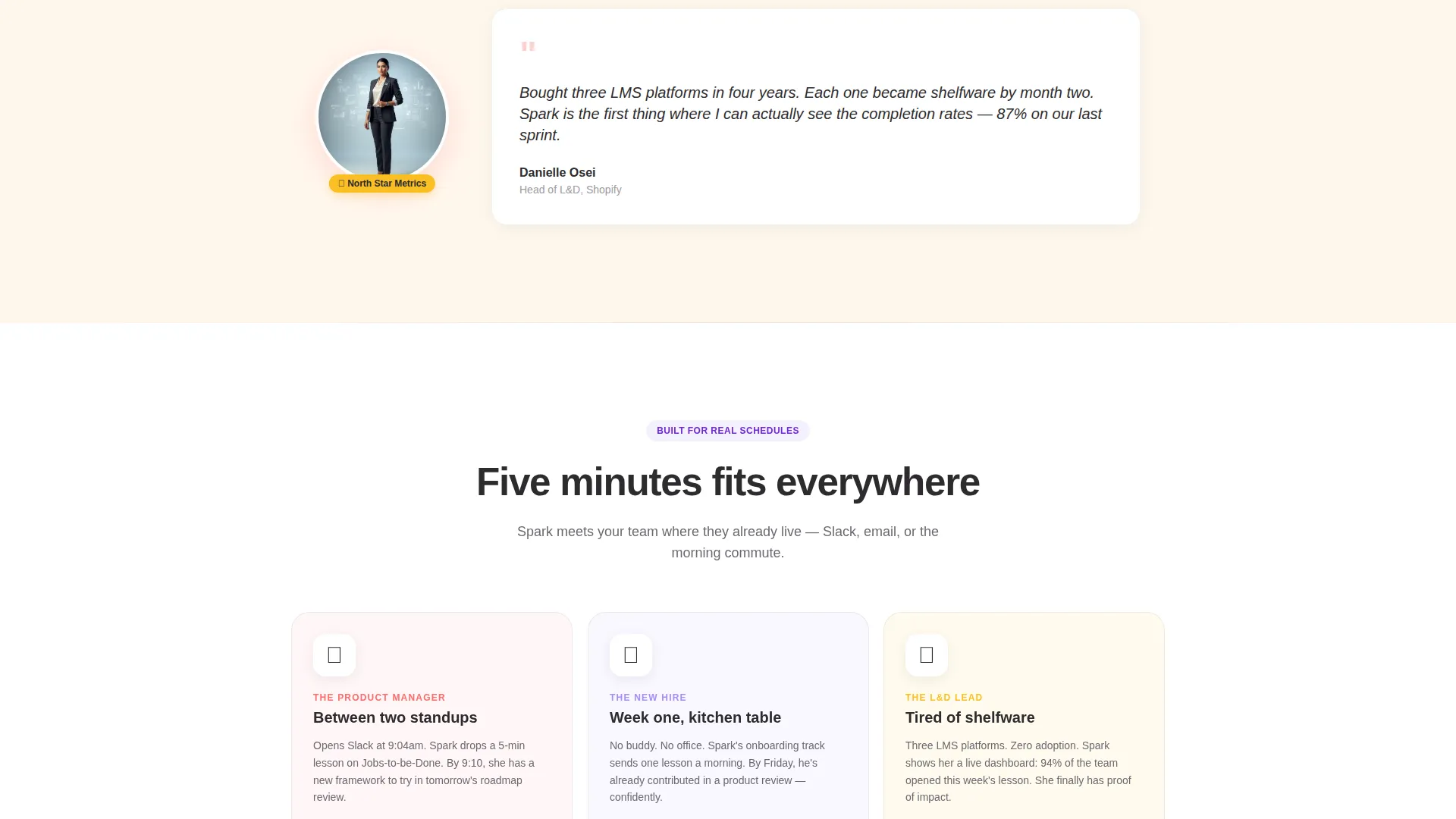
Individual learner quotes appear beside circular portrait areas as visitors scroll down. Each quote block is designed to surface a single person's voice and story. This rhythm of one face at a time builds intimacy and makes the platform feel human before it feels like software.
Team Hover Grid
A grid of five team member cards reveals each person's favorite five-minute lesson on hover. This interactive element rewards curiosity and communicates that the platform is used by real, specific people with real learning habits.
Pulsing Lessons Counter
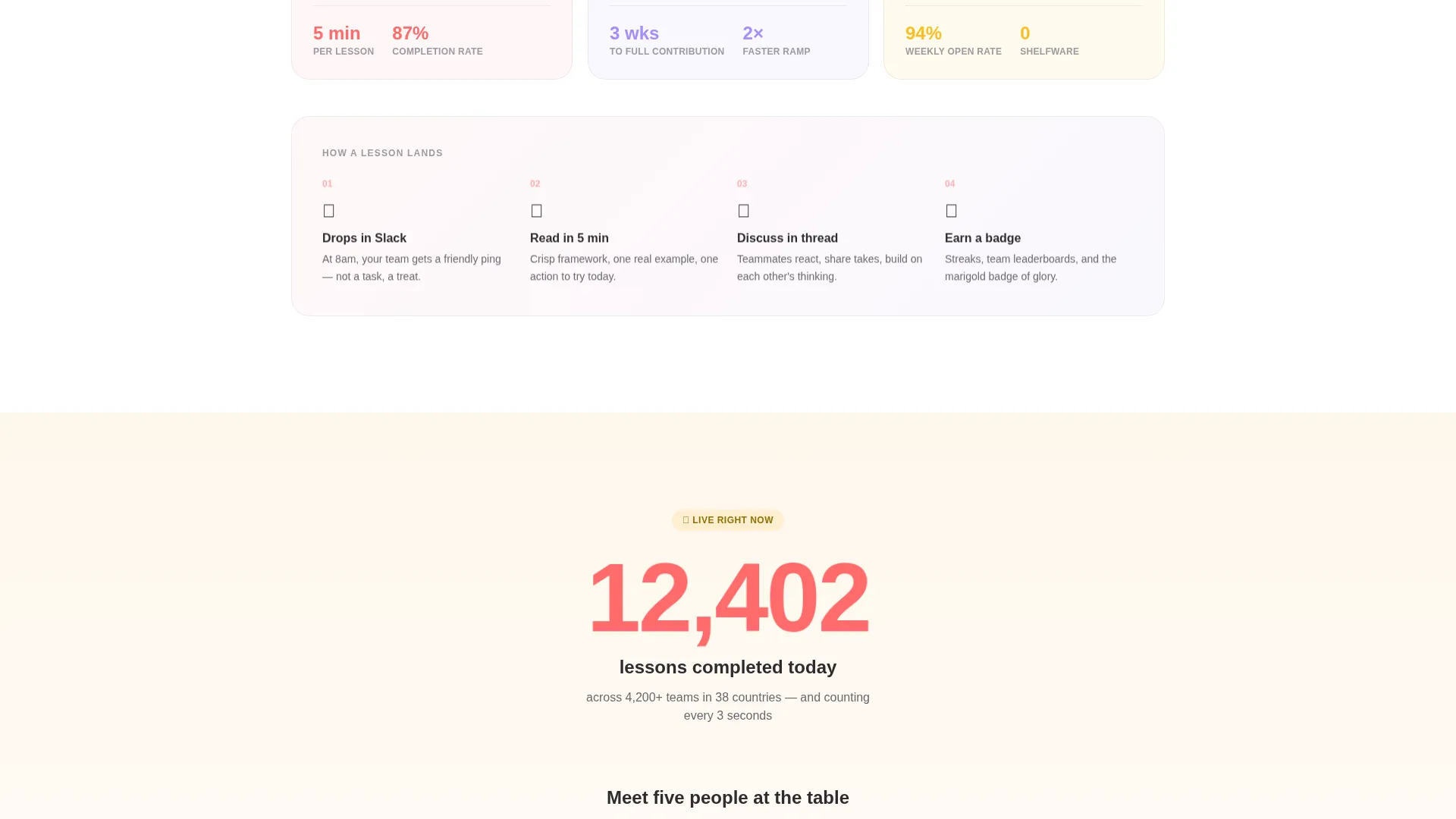
A live-counter block sits midway down the page and pulses gently to display lessons completed today across all teams. It communicates scale and activity without relying on static numbers that go stale.
Community Avatar Mosaic
The page builds visual momentum through a rhythm of one person, then three, then twelve, then a mosaic of hundreds of small avatars. This escalating density makes the community feel real, crowded, and warm before the second call to action appears.
Inline Lead Capture Form
Both calls to action open an inline form asking only for a first name and work email. A single toggle lets visitors opt in to a weekly five-minute lesson. No credit card, no demo call, no extra fields. The form is designed to feel like accepting an invitation, not filling out a registration.
Page sections overview
| Section | Purpose |
|---|---|
| Header hero | Introduce headline and team photo |
| Learner quote block | Surface individual voices and portraits |
| Team hover grid | Show real people and their lessons |
| Lessons counter | Communicate live platform activity |
| Avatar mosaic | Visualize growing community scale |
| Primary call to action form | Capture name and email with low friction |
| Secondary call to action form | Reinforce offer after social proof |
Design & branding system
The Dopamine Pop color system is built to feel energetic without tipping into anxiety. Every color choice has a specific emotional job on the page, and together they create the sensation of a well-loved, active workspace.
- Warm charcoal (#2D2B2E) anchors body text and grounding sections; serotonin coral (#FF6B6B) drives call-to-action buttons and accent moments; electric lavender (#A78BFA) activates hover states and progress indicators
- Sunshine marigold (#FBBF24) highlights badges and celebration elements, while soft oat cream (#FFF7ED) provides a background that feels like notebook paper left in sunlight
- Typography uses a rounded, friendly sans-serif at generous scale for headlines, keeping the tone warm and approachable across all screen sizes
Mobile & speed optimization
The single-column flow layout is naturally suited to smaller screens. Every section stacks cleanly without requiring horizontal scrolling or pinch-to-zoom interactions.
- The half-page header composition adapts to a stacked, full-width layout on mobile, keeping the headline and photograph visible without cropping
- Circular portrait blocks, the hover grid, and the avatar mosaic are all sized for touch interaction and finger-friendly tap targets
- The inline lead capture form stays compact on mobile with large input fields and a clearly visible submit button, reducing form abandonment
How this template helps you convert
Every design decision in Spark is pointed at reducing the distance between a first impression and a form submission. The page earns the click before it asks for anything.
- The page leads with a real team photograph and an immediately relatable headline, so visitors feel they have arrived somewhere rather than somewhere trying to sell them something.
- Social proof escalates naturally from one quote to a team grid to hundreds of avatars, creating a sense of momentum that makes downloading the free starter kit feel like joining a table that already saved you a seat.
- The inline form removes every common friction point, asking only for a first name and work email, with a single optional toggle, so the conversion moment feels like an easy yes.
Other information about this template
Spark is built specifically for the micro-learning platform category within the broader online course platform and education technology space. It suits teams building short-format learning products for professionals who learn in small windows throughout the day.
- The template is designed as a content and resource landing page, meaning its primary goal is lead generation through a free downloadable offer rather than direct purchase or subscription sign-up
- The Community Hearth theme is intentional for platforms targeting workplace learners, new hires onboarding remotely, and learning and development leads shopping for tools their teams will actually use
- The Dopamine Pop color system and Team and People creative direction are matched intersection attributes, meaning this template was designed with this specific niche and landing page direction in mind from the ground up
Theme
Community Hearth
Creative direction
Team & People
Color system
Dopamine Pop
Style
Single Column Flow
Direction
Content/Resource
Page Sections
Half-page Photo and Text Header
Learner Quote and Portrait Blocks
Team Hover Grid
Pulsing Lessons Counter
Community Avatar Mosaic
Inline Lead Capture Form
Related questions
Who is the Spark template designed for?
What is included in the primary call to action?
Can I customize the color palette and typography?
Does the template work well on mobile devices?
How many calls to action does the page include?



