Complete Electrical Digital Presence Professional Website Template
Spark is a split-screen landing page template built for an electrical mobile app. It uses a Feature Tab Switcher header, animated scroll sections, and a direct download call to action. The Acid Digital color system and Dynamic Motion theme give it an unmistakable high-voltage look that speaks directly to electricians in the field.
by Rocket studio
Quick summary
Spark is a single-page landing page template designed to promote an electrical mobile app. It combines a 50/50 split-screen layout, a three-tab interactive header, and kinetic scroll animations to hook tradespeople fast. The color system pairs void black with high-voltage chartreuse and arc-flash cyan for a visual identity that feels alive, urgent, and built for the job site.
Who this template is for
This template is built for developers, app marketers, and designers promoting a mobile tool aimed at electrical professionals. It works equally well for solo builders and marketing teams launching an app into the trades market.
- Journeymen and master electricians who want a fast, credible app download page
- App developers releasing a field-ready electrical reference or calculator tool
- Marketing teams targeting a trade-professional audience with a no-friction download funnel
What problem this template solves
Electrical professionals need tools that match the pace of their work. A generic app landing page does not earn trust from someone who spends their day reading load schedules and pulling wire. This template solves that mismatch by showing the app doing real work before the visitor scrolls past the first section.
- Generic templates fail to demonstrate app functionality at the moment of first impression
- Trade audiences distrust pages that lead with promises instead of proof
- Standard layouts bury the download call to action behind forms and feature paragraphs
What you get with this template
You get a fully structured, single-page landing page layout with every visual section and interaction pattern already defined. No filler content, no placeholder logic, the template is built around the specific workflows electricians recognize and trust.
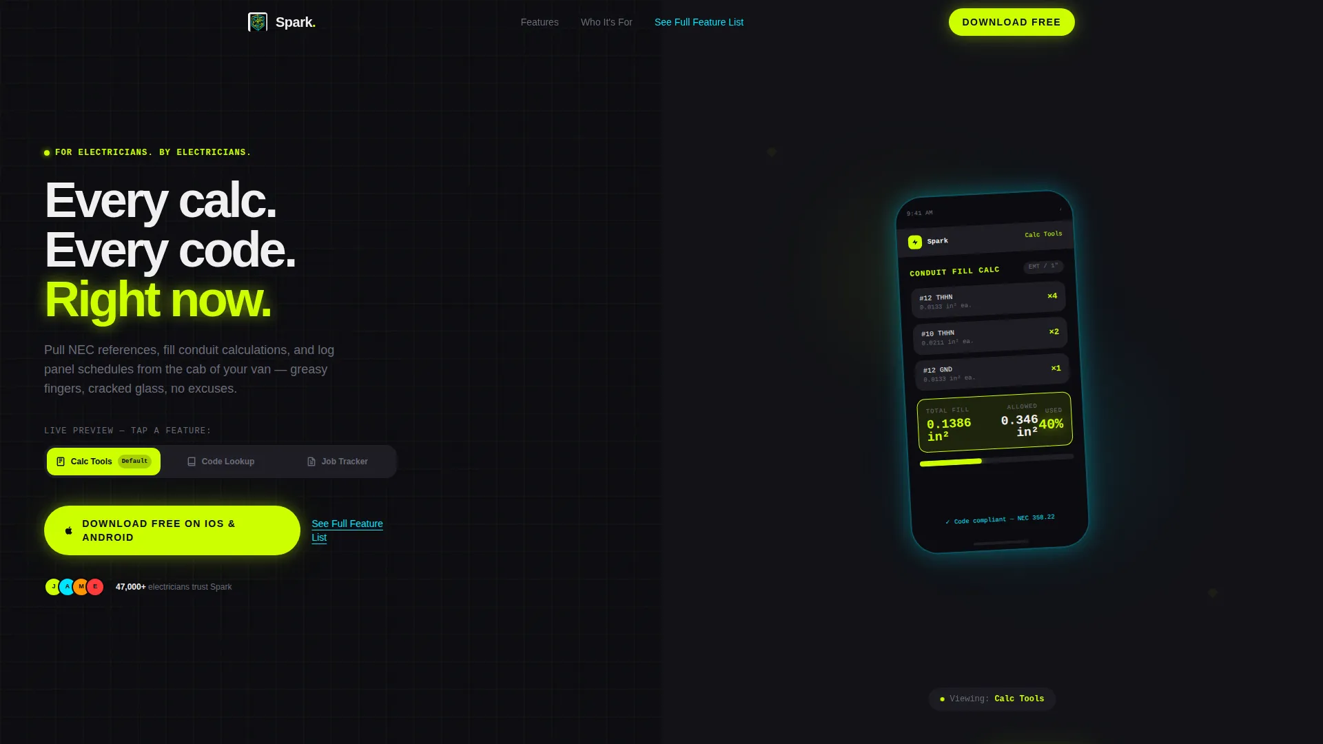
- A Feature Tab Switcher header with three tabs that swap phone mockup screens on click
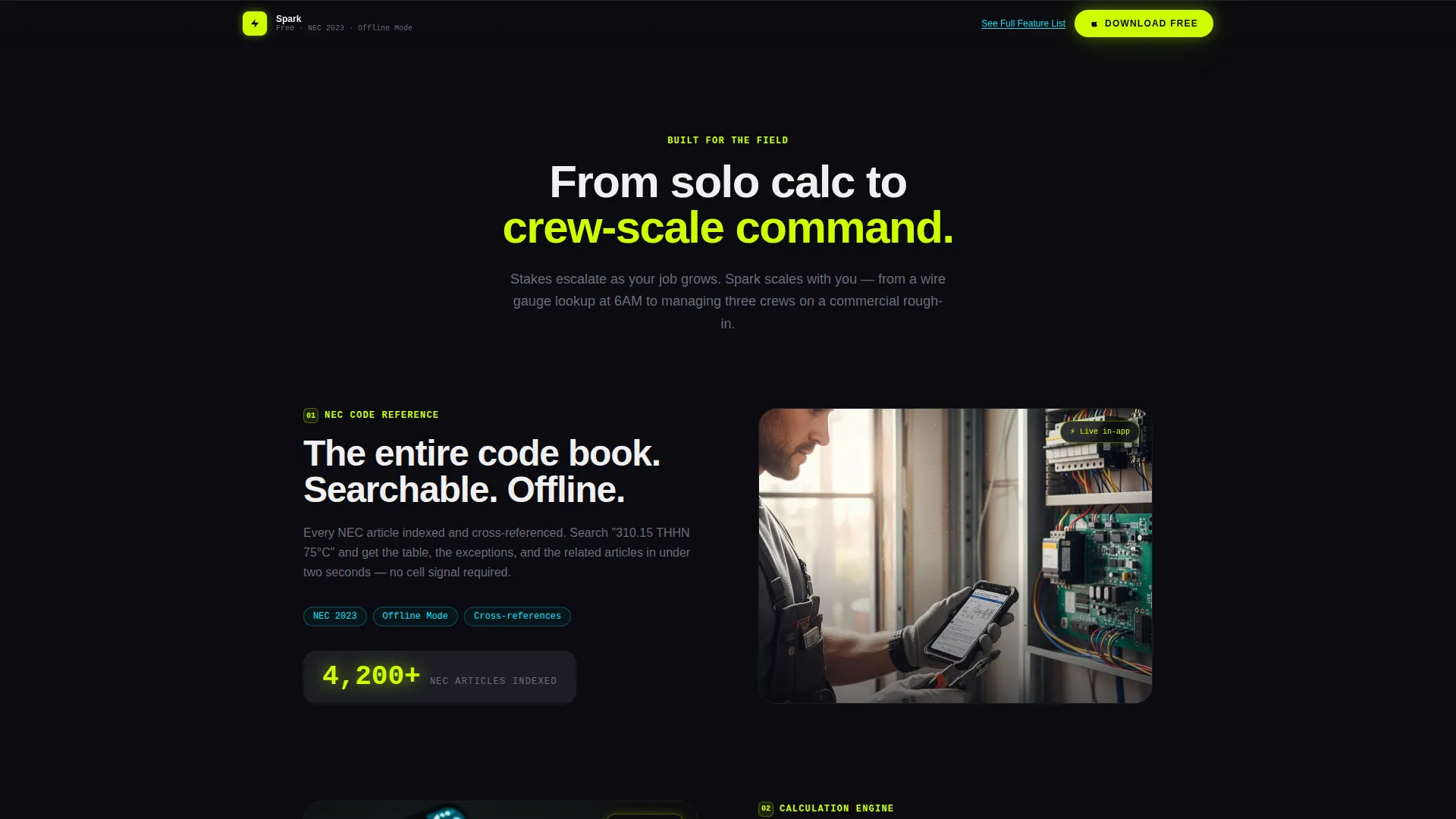
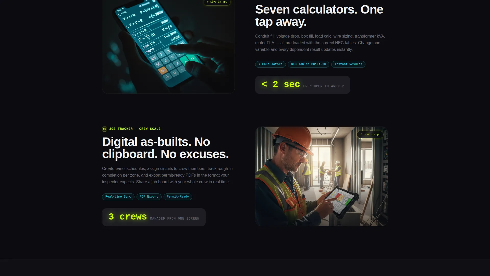
- A kinetic scroll reel with alternating left-right phone mockup sections and progressive screenshot reveals
- A sticky bottom download bar and a smart app store redirect button with no form or fields required
Feature list
This template delivers a focused set of purposeful components. Every element earns its place by moving the visitor one step closer to tapping the download button.
Feature Tab Switcher Header
The header splits 50/50 between three clickable tabs on the left and a floating phone mockup on the right. Tabs labeled "Code Lookup," "Calc Tools," and "Job Tracker" each trigger a smooth lateral slide on the device screen, mimicking a real thumb swipe. The default view opens mid-action with a conduit fill calculator already populated and results glowing in chartreuse.
Kinetic Scroll Feature Reel
Each feature section animates in on scroll with a left-right alternating layout. Phone mockups trade sides as the visitor moves down the page. Screenshots escalate in complexity, from single-user calculations to crew-scale shared job boards and permit-ready export views.
Sticky Download Bar
After the second scroll section, a sticky bottom bar locks into place and follows the visitor down the page. It repeats the primary call to action without interrupting the reading flow. The bar keeps the download action one tap away at all times.
Smart App Store Redirect Button
The primary call to action routes directly to the correct app store based on the visitor's device. There is no form, no email field, and no friction between the visitor and the download. The button appears first in the header and again in the sticky bar.
Live Counter Animation
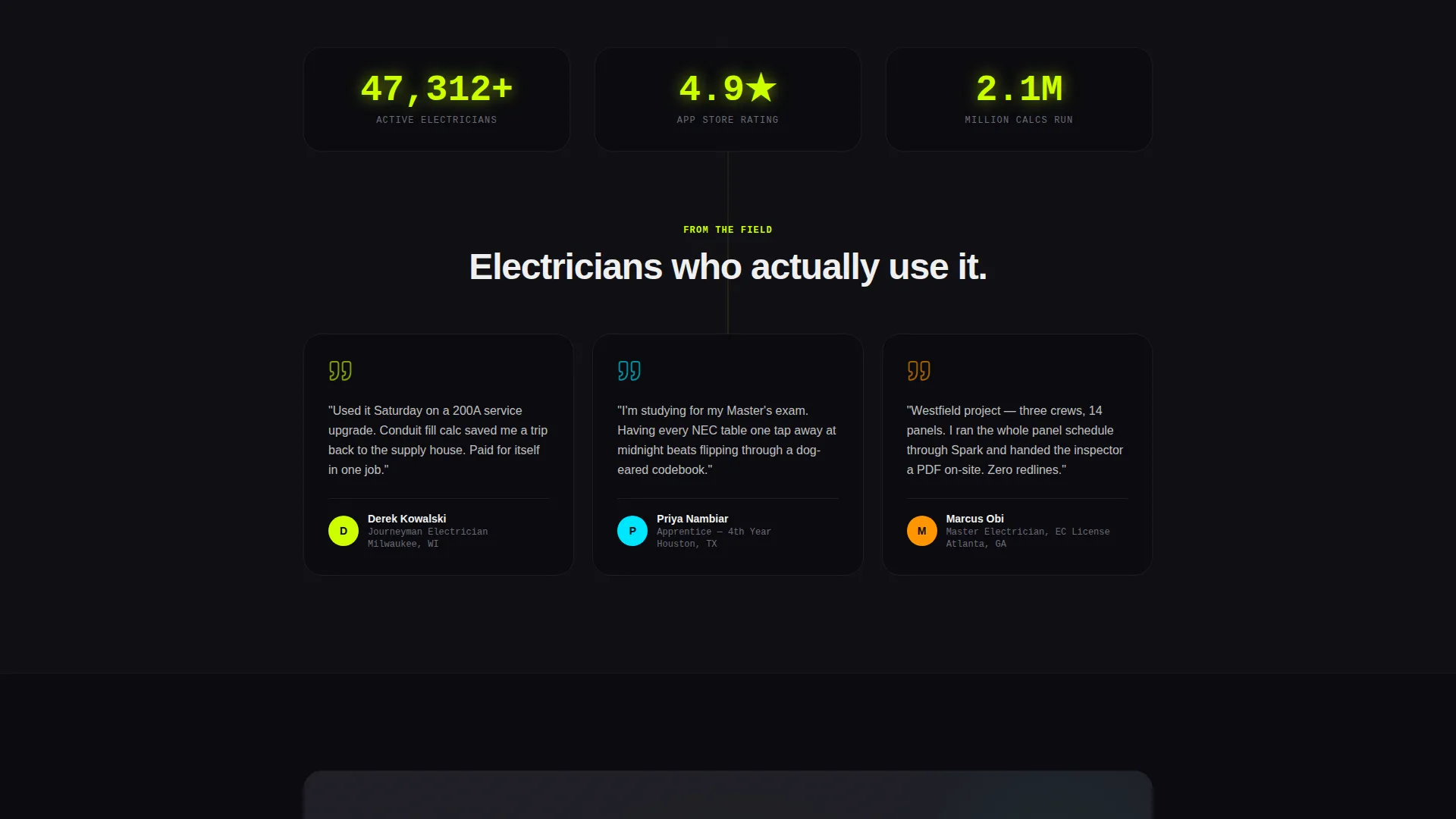
Scroll-triggered counters tick upward as sections come into view. A visible download number increments on load, suggesting an active and growing user base. This motion detail reinforces social proof without requiring static copy claims.
Secondary Feature Link
A text link labeled "See Full Feature List," styled in arc-flash cyan, sits below the primary call to action. It gives skeptical visitors a path to more detail without pulling them away from the conversion flow. The link color is intentionally distinct from the primary chartreuse button to signal a softer, exploratory action.
Page sections overview
| Section | Purpose |
|---|---|
| Tab Switcher Header | Demonstrates app features interactively above the fold |
| Feature Scroll Reel | Escalates app complexity across alternating left-right sections |
| Sticky Download Bar | Keeps primary call to action visible after second scroll |
| Download call to action Block | Delivers the primary and secondary action in one focused area |
Design & branding system
The Acid Digital color system is built around contrast and urgency. Every color choice reinforces the electrical theme without resorting to obvious stock-photo clichés. The palette is dark, precise, and immediately recognizable to anyone who has stared into an open panel at night.
- Void black (#0B0B0F) as the primary background, conduit gray (#1E1E24) for card surfaces and section dividers
- High-voltage chartreuse (#CCFF00) for all interactive elements and call-to-action buttons
- Arc-flash cyan (#00E5FF) for secondary highlights, data visualizations, and the secondary feature link
Mobile & speed optimization
The layout is designed with field use in mind. The split-screen structure, large tap targets, and high-contrast color system all serve visitors arriving on a phone with a cracked screen in a bright work site environment.
- Large, thumb-friendly call-to-action buttons sized for gloved or greasy hands
- High-contrast color pairings that stay legible in bright outdoor lighting conditions
- Sticky bottom bar keeps the download action reachable without scrolling back to the top
How this template helps you convert
The conversion strategy is built into the structure, not bolted on afterward. Every layout decision removes hesitation and shortens the path from first impression to app download.
- The tab switcher shows the app in active use within the first three seconds, so visitors see proof before they see a pitch.
- The sticky download bar eliminates backtracking by keeping the call to action visible throughout the entire scroll journey.
Other information about this template
Spark fits neatly into the electrical mobile app niche, where the audience is highly skeptical and time-constrained. The Dynamic Motion theme is what separates this template from static, text-heavy app pages that fail to hold a tradesperson's attention.
- The template style is Split Screen (50/50), which makes it straightforward to adapt mockup images for any electrical app product
- The Launch Energy creative direction means the page builds momentum from the header downward, with each section adding energy rather than repeating earlier points
- The Click-Through landing page direction means there is no lead capture form anywhere on the page, the entire structure exists to move the visitor to a single tap
- The Feature Tab Switcher header concept is a reusable interaction pattern that can be repurposed for any multi-feature mobile app in the trades or technology category
Theme
Dynamic Motion
Creative direction
Launch Energy
Color system
Acid Digital
Style
Split Screen (50/50)
Direction
Click-Through
Page Sections
Feature Tab Switcher Header
Kinetic Scroll Feature Reel
Sticky Bottom Download Bar
Smart App Store Redirect
Live Counter Animation
Secondary Feature Link
Related questions
Can I change the tab labels in the header?
Does this template include real phone mockup images?
Is there a contact form or lead capture on this page?
Can I use this template for an Android-only or iOS-only app?



