Dental Software Portfolio & Case Study Website Template
Floss is a bold brutalist dental social media management landing page template built for agencies serving dentists and multi-location dental organizations. It uses a 50/50 split-screen layout, a Teal Catalyst color system, and a Feature Matrix creative direction to showcase content creation, reputation management, paid social, and analytics services. The design converts practice owners into qualified leads through a high-contrast audit capture form.
by Rocket studio
Quick summary
Floss is a single-page, split-screen landing page template crafted for dental social media management agencies. It pairs a brutalist design system with clinical precision, delivering a punchy lead generation experience. The landing page turns chairside dental moments into a compelling agency pitch. It is built desktop-first, stacks cleanly on mobile, and drives one clear action: booking a social media audit.
Who this template is for
This landing page template is the perfect choice for dental social media agencies, boutique healthcare marketing studios, and growth-focused consultants who serve dentists as their primary clients. It is particularly those serving solo practice owners and multi-location dental service organizations who will find this template speaks directly to their audience's pain points. The template's confident, systematized tone connects instantly with dentists who are tired of inconsistent posting and weak engagement.
- Dental social media agencies pitching practice owners and dental service organizations on full-service content management
- Healthcare marketing consultants who want to showcase expertise across content creation, reputation management, paid social, and analytics
- Freelancers ready to position themselves as a professional, systematized growth machine rather than a generalist with design tools
What problem this template solves
Dentists deliver exceptional dental care every day, yet their social media presence often tells a different story. Most dental practices have an Instagram grid that hasn't been touched in months, posts that earn no engagement, and no clear strategy connecting their digital presence to patient acquisition. The landing page template solves the presentation problem: how does a dental social media agency convey that it is a systematized content engine, not a freelancer winging it with a design app?
- Practice owners need confidence that an agency understands the dental care world before they hand over their brand voice and patient-facing content
- Multi-location dental organizations face inconsistent tone and aesthetics across offices, and they need a landing page that speaks directly to that specific challenge
- Agencies need a landing page format that converts skeptical dentists into audit leads without relying on generic portfolio pages or walls of text
What you get with this template
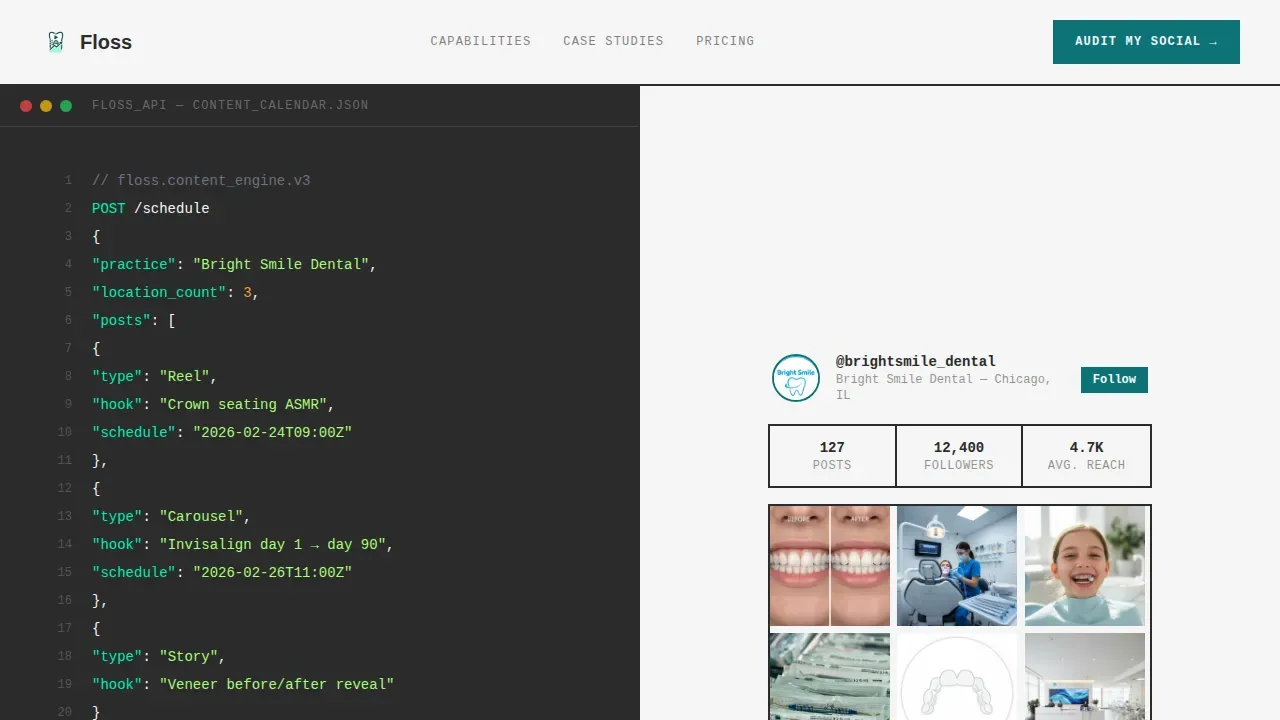
This template delivers a complete, single landing page layout structured around a Feature Matrix creative direction. Each scroll section is a self-contained capability statement. The hero section immediately establishes authority with a split-screen code snippet and Instagram mockup juxtaposition. The landing continues through four capability rows, and closes with a high-contrast lead capture form designed to convert hesitant practice owners into booked audits.
- A 50/50 split-screen hero with a live-styled content calendar code block on the left and a polished dental Instagram grid mockup with ticking engagement metrics on the right
- Four Feature Matrix rows showcasing content creation, reputation management, paid social, and analytics, each pairing a brutalist capability label with a deliverable visualization
- A sticky call-to-action bar, a primary audit capture form, and a secondary sample content grid download path for practices not ready to book
Feature list
This landing page template is crafted with precision across six core capability areas. Every design element, section layout, and interactive component is grounded in the source brief.
Split-Screen Hero with Code Snippet Concept
The hero section divides the viewport into two equal halves. The left side displays a styled content calendar application programming interface call rendered in monospaced font against charcoal, complete with practice name, post types including Reels, carousels, and stories, caption hooks, and scheduled timestamps. A blinking cursor signals live activity. The right side shows the output: a phone mockup of a polished dental Instagram grid with engagement metrics floating beside it and likes ticking upward. The juxtaposition communicates that this agency engineers dental content like infrastructure, not inspiration.
Feature Matrix Capability Rows
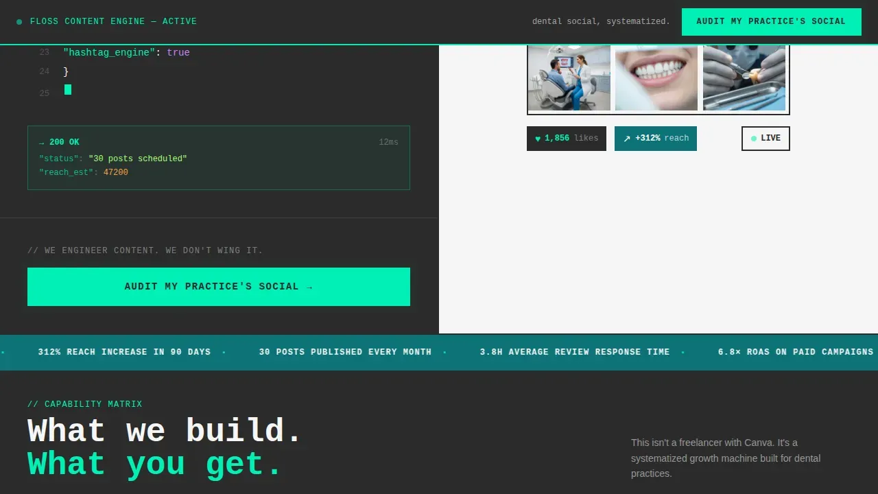
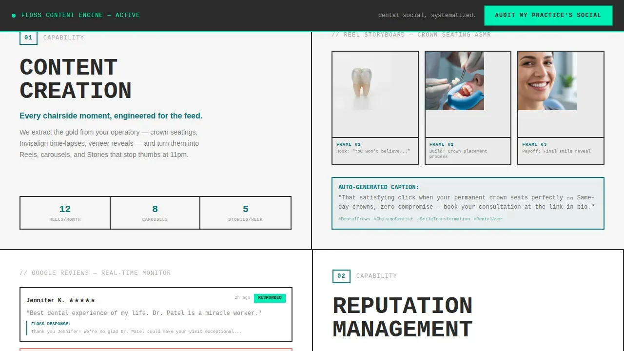
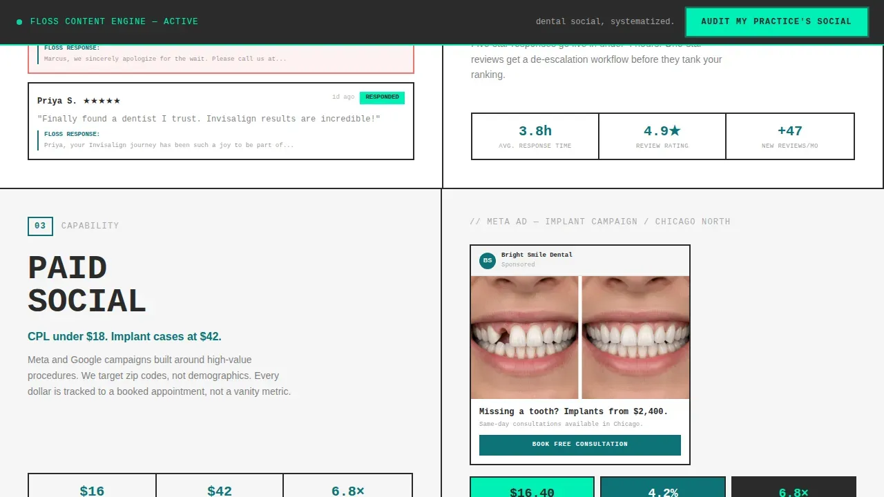
After the hero, the landing page unfolds as a vertically scrolling Feature Matrix. Each row splits the screen between a brutalist-labeled capability block on the left and a deliverable visualization on the right. The four rows cover content creation paired with a Reel storyboard, reputation management paired with a Google review response workflow, paid social paired with a Facebook ad mockup showing cost-per-lead metrics, and analytics paired with a monthly report dashboard. Each row escalates scope, building a cumulative case for the agency's depth across all stages of dental social media growth.
High-Contrast Lead Capture Form
The landing page concludes with a focused audit capture form set against charcoal. The form captures practice name, Instagram handle, number of locations, and biggest frustration via a dropdown with options including no time to post, posts get no engagement, no strategy, and managing multiple locations. The Instagram handle field implies a real, personalized audit rather than a generic deliverable. A secondary path offers a downloadable sample content grid for practices not yet ready to book, keeping every visitor engaged regardless of where they are in their decision journey.
Sticky Call-to-Action Bar
A sticky top bar carries the primary call-to-action throughout the entire landing page scroll experience. The call-to-action reads "Audit My Practice's Social" and is rendered in neon mint against charcoal. This ensures dentists always have a clear, visible action to take, no matter how deep into the landing page they scroll. The neon pulse animation on the call-to-action button reinforces urgency without interrupting the reading flow.
Bold Brutalist Design System
The landing page is built on a blocky, grid-based structure with visible borders and raw design elements. There are no soft gradients or rounded corners. Oversized, heavy sans-serif and monospaced fonts are used for headlines and functional blocks, creating immediate visual impact. The design prioritizes functionality over decorative elements. Every typographic choice, from the oversized Manrope headlines slammed edge-to-edge against containers to the JetBrains Mono code blocks, makes a bold visual statement that breaks away from conventional dental clinic aesthetics.
Teal Catalyst Color System
The color palette is built around four values: deep surgical teal as the dominant brand anchor, exposed-concrete charcoal for heavy typographic blocks, sterile bright white for breathing room, and reactive neon mint that fires on hover states and call-to-action pulses. This high-contrast color scheme feels like a brutalist clinic lobby interrupted by a single living plant under a skylight. The palette is fully intentional: it signals clinical precision while standing apart from the soft pastel design language most dental landing pages rely on.
Page sections overview
| Section | Purpose |
|---|---|
| Sticky call to action Bar | Keeps audit action visible throughout scroll |
| Hero Split Screen | Establishes agency authority via code and content mockup |
| Feature Row: Content | Showcases Reel storyboard and content creation capability |
| Feature Row: Reputation | Displays Google review response workflow visualization |
| Feature Row: Paid Social | Shows Facebook ad mockup with cost-per-lead metrics |
| Feature Row: Analytics | Presents monthly report dashboard and data depth |
| Lead Capture Form | Converts practice owners into audit leads |
| Secondary Download Path | Offers sample content grid for undecided visitors |
| Footer | Linear single-row footer with brand anchor |
Design & branding system
The design system behind this landing page template is a deliberate collision of clinical precision and brutalist visual confidence. The Bold Brutalist theme prioritizes raw, unapologetic surfaces over polished softness. Every design decision, from the hard-edged containers to the monospaced code blocks, reflects the agency's positioning: systematized, expert, and unafraid to stand out in the dental healthcare marketing world.
- Typography uses Manrope for oversized display headlines and JetBrains Mono for all functional code and data blocks, with type slammed edge-to-edge against containers and zero decorative padding
- Colors follow the Teal Catalyst system: deep surgical teal at the dominant brand level, charcoal for heavy typographic backgrounds, sterile white for contrast and breathing room, and neon mint reserved for hover states and call-to-action pulses
- The modular grid layout uses visible borders and hard-edged blocks to organize services and capability rows, avoiding soft gradients or rounded corners throughout the entire landing page
Mobile & speed optimization
This landing page is designed desktop-first to honor the split-screen 50/50 layout concept, with a responsive mobile stack that transitions the two-column Feature Matrix rows into a clean vertical scroll. The brutalist grid scales for vertical scrolling in a mobile-first approach without losing visual impact. Animations are handled with CSS-first implementation to keep interactions smooth.
- The split-screen hero collapses into a stacked mobile layout, presenting the code snippet block above the Instagram mockup for clear, logical reading order on smaller screens
- Scroll-linked section reveals, the blinking cursor animation, and the ticking like counter are powered by CSS animations with minimal JavaScript dependencies for counters and interactive elements
- The sticky call-to-action bar persists across all screen sizes, ensuring the audit capture action is always reachable whether users are navigating on desktop or mobile
How this template helps you convert
This landing page is engineered around a single conversion goal: turning dental practice owners into booked audit leads. Every section of the landing page is sequenced to build confidence and reduce friction. The Feature Matrix format lets dentists self-identify which capability gap they are experiencing before they reach the form, which means they arrive at the call-to-action already convinced they need the service.
- The split-screen hero immediately separates this agency from generic freelancers by showcasing a real content calendar process, ticking engagement metrics, and a polished dental Instagram output, establishing authority before a single word of body copy is read
- The Feature Matrix rows escalate the scope of services row by row, letting practice owners connect each capability to a specific frustration they recognize from their own dental clinic experience, so the audit form feels like a natural next step rather than a sales push
- The high-contrast audit form with a dropdown frustration selector and an Instagram handle field personalizes the commitment, while the secondary sample content grid download captures undecided visitors who are not ready to book, keeping every landing page visitor on a conversion path
Other information about this template
The Floss bold brutalist dental social media management landing page template is a flexible starting point for any dental social media agency ready to deliver a modern, high-impact pitch to practice owners and dental service organization directors. This template can be adapted to tailor messaging for solo dentists, group practices, or multi-location organizations without requiring any custom code. Users across no-code platforms can build a production-ready landing page from this template using natural-language prompts and visual editors, making it accessible for product managers, solopreneurs, and boutique agencies alike.
- The template's design philosophy mirrors the brutalist principle that design is a statement of disruption and individuality, making it a perfect choice for agencies that want to stand out in a world of soft, predictable dental clinic landing pages
- The landing page is crafted to showcase specialized dental social media services including behind-the-scenes team photos, educational dental infographics, community engagement strategies, video Reels for teeth whitening and Invisalign journeys, before-and-after veneer transformations, and raw social growth data visualizations
- Users can introduce raw, unedited patient before-and-after social post examples, direct quotes from dentists, and high-contrast testimonials to highlight real engagement growth and build trust signals that connect with skeptical practice owners
- The template supports consistent posting visualization, paid social advertising mockups targeting specific demographics for patient acquisition, and Google review response workflow displays so landing page visitors can navigate every stage of a dental social media management offering in a single scroll
- The design background is grounded in brutalist web design principles: blocky grids, visible borders, oversized fonts, and a high-contrast color scheme that opts for neon accents against neutral tones to break standard dental landing page conventions
- This landing page is a perfect choice for agencies seeking inspiration from both modern healthcare marketing and brutalist digital aesthetics, combining the beauty of raw confidence with the precision required to deliver real dental care results
- The template can support the addition of social proof elements such as raw social media growth graphs, curated feed grids managed for other dentists, and CPL (cost-per-lead) metric displays to elevate the credibility of the services pitch
- The luxury of this template's design is its ability to feel edgy and confident while remaining a powerful sales tool, keeping the focus on delivering search-driven lead results for dentists who want more patients through smarter dental social media content
- Keywords and search intent are naturally woven into the landing page copy structure, allowing dental care agencies to connect their services with the specific language practice owners use when looking for social media help
- The template is flexible enough to accommodate additional sections, updated brand colors, or new service offerings as agencies grow, without losing the core brutalist tone and visual confidence that makes the landing page stand out from the outset
Theme
Bold Brutalist
Creative direction
Feature Matrix
Color system
Teal Catalyst
Style
Split Screen (50/50)
Direction
Lead Generation
Page Sections
Split-screen Hero with Code Snippet
Feature Matrix Capability Rows
High-contrast Audit Capture Form
Sticky Neon Mint Call-to-action Bar
Bold Brutalist Typography System
Teal Catalyst Color Architecture
Related questions
Can I use this template without coding skills?
Is this template suitable for a solo practice owner or only for agencies?
What lead capture fields does the audit form include?
Does the template include a mobile-responsive layout?
Can I adapt the Feature Matrix rows for different dental social media services?


