House Cleaning Booking App Landing Page Template
Sparkle is a scroll-reveal landing page template built for a house cleaning booking app. It guides visitors through an emotional arc, from frustration to relief to trust, using animated stats, a two-tap app walkthrough, live-feed style reviews, and a frictionless zip-code form. The primary goal is freemium conversion with a single clear call to action: Book Your First Clean Free.
by Rocket studio
Quick summary
Sparkle is a single-page, scroll-reveal landing page template designed for a house cleaning booking app. It opens with three animated metric counters, walks visitors through a problem-to-solution story arc, and closes with a low-friction zip-code form. Every section builds emotional momentum toward one action: booking a first free clean.
Who this template is for
This template is built for founders and product teams launching or marketing a home cleaning booking app. It speaks directly to the people most likely to convert: time-pressed households who want a fast, trustworthy solution.
- Startup teams building a vetted house cleaning booking service
- App marketers targeting dual-income households, remote workers, and short-term rental hosts
- Growth teams running a freemium or free-trial acquisition campaign
What problem this template solves
Finding a reliable cleaner is still a word-of-mouth problem. Most homeowners rely on group chats, only to face last-minute cancellations and no-shows. This template addresses that frustration head-on before presenting the app as the fix.
- Visitors arrive skeptical; the problem sequence validates that frustration immediately
- No structured trust signals means visitors leave before the booking form ever appears
- A cluttered or multi-step form kills conversions before visitors commit
What you get with this template
You get a fully structured, section-led landing page with a clear narrative flow and a conversion-focused layout. Every element is scoped to move a visitor from doubt to action within a single scroll session.
- A stats header, animated app walkthrough, review mosaic, and trust badges, all in sequence
- Three strategically placed calls to action, including a sticky bottom bar that activates mid-scroll
- A single-field zip-code form that confirms availability before asking for any personal details
Feature list
This template delivers a tightly engineered set of visual and structural components, each serving a specific role in the conversion journey.
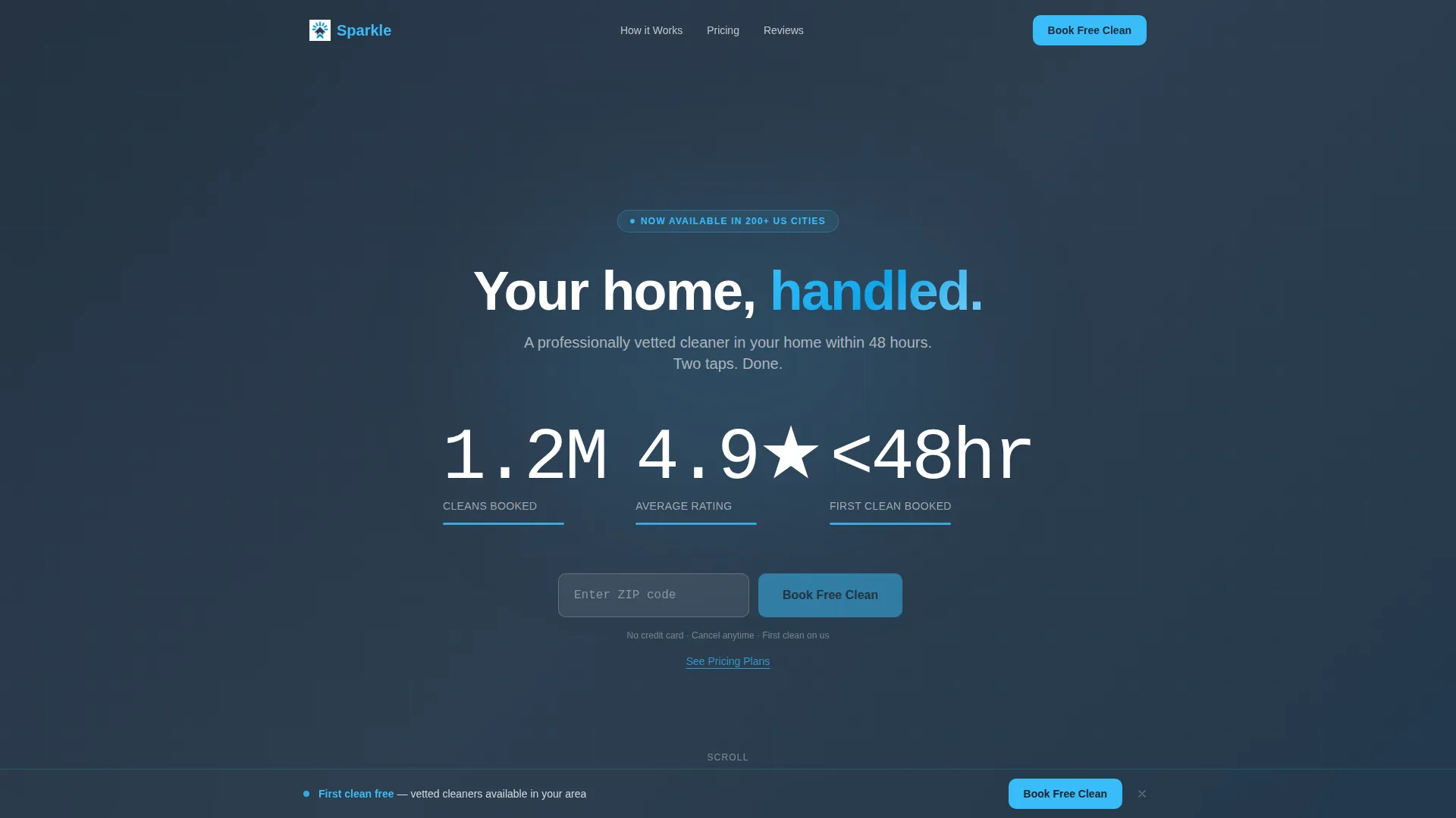
Animated Stats Header
Three oversized counters animate upward on page load: "1.2M Cleans Booked," "4.9 ★ Average Rating," and "Under 48hr First Clean." Each number is set in a bold mono typeface against deep slate. A sky-blue underline pulses once beneath each counter when the animation completes, drawing the eye without distraction.
Scroll-Triggered Problem Sequence
The first content reveal shows a short animated sequence of unanswered texts, calendar conflicts, and a "your cleaner cancelled" notification. These are rendered as realistic phone user interface mockups. The sequence makes the visitor feel understood before the solution is introduced.
Two-Tap App Walkthrough
The second reveal presents the app interface itself. Each screen of the two-tap booking flow slides in as the visitor scrolls, demonstrating how fast and simple the experience is. The walkthrough replaces static screenshots with a live, paced demonstration.
Live-Feed Review Mosaic
The third reveal loads five-star micro-reviews one by one, mimicking a live social feed. The staggered appearance creates a sense of ongoing activity and social proof without overwhelming the layout with a static grid.
Trust and Safety Section
The fourth reveal fades in background check confirmation, insurance badges, and a satisfaction guarantee. Each element appears with quiet authority, giving hesitant visitors the reassurance they need just before the final call to action.
Sticky Conversion Bar
A bottom bar containing the primary call to action activates after the visitor has scrolled 40 percent of the page. It stays visible without interrupting the reading flow, keeping the booking option within reach at the exact moment trust has built.
Page sections overview
| Section | Purpose |
|---|---|
| Stats Metrics Header | Opens with three animated counters to establish scale and credibility immediately |
| Problem Reveal Sequence | Animated phone mockups that mirror common cleaner-finding frustrations |
| App Flow Walkthrough | Screen-by-screen scroll demonstration of the two-tap booking process |
| Review Feed Mosaic | Staggered five-star micro-reviews that load like a live social feed |
| Trust and Safety | Background checks, insurance badges, and satisfaction guarantee fade in |
| Zip Code Form | Single-field availability check that reduces commitment to one step |
| Sticky Bottom Bar | Persistent call-to-action bar activating at 40 percent scroll depth |
Design & branding system
The template uses a Startup Velocity theme with a Slate & Sky color palette. The visual language is clean and purposeful, evoking the feeling of a clear morning after rain, fresh, settled, and calm.
- Deep charcoal slate (#1E2A38) for primary backgrounds, mid-tone graphite (#4A5568) for secondary text, and clean cloud white (#F8FAFC) for card surfaces
- Open-sky blue (#38BDF8) is reserved exclusively for interactive elements: buttons, progress indicators, and animated underlines
- No stock photography or illustrated characters; the design relies on bold numbers, phone user interface mockups, and whitespace to communicate
Mobile & speed optimization
The scroll-reveal structure is designed to work smoothly on smaller screens. Sections stack cleanly in mobile viewports, and the sticky bottom bar remains accessible without covering key content.
- Progressive reveals are timed to scroll position, keeping the page load light at the start
- The single-field zip code form is thumb-friendly and quick to complete on a mobile device
- Alternating slate and white backgrounds maintain visual rhythm without relying on image-heavy layouts
How this template helps you convert
The entire page is structured as an emotional arc that tightens with every scroll, moving the visitor from recognition to relief to action.
- The stats header establishes immediate credibility before a visitor reads a single word of copy, reducing bounce intent at the top of the page.
- The problem-to-solution sequence earns trust by showing visitors you understand their frustration, making the free trial feel like a natural next step rather than a sales pitch.
- Three placements of "Book Your First Clean Free", beneath the header, after the walkthrough, and in the sticky bar, ensure the call to action is always within reach regardless of where a visitor pauses.
Other information about this template
This template is built within the Scroll Reveal (Progressive) template style, meaning each section appears as the visitor scrolls rather than loading all at once. The approach keeps the narrative tight and the emotional pacing intentional.
- The secondary conversion path, a "See Pricing Plans" text link, serves comparison shoppers who need to evaluate subscription tiers before committing to the free trial
- The page uses no illustrated characters or stock photography, keeping the focus on data, interface mockups, and social proof
- The Startup Velocity theme is suited to early-stage app launches where building rapid trust with a new audience is the primary challenge
- The template is designed for the house cleaning booking app niche but the section architecture and scroll-reveal pattern can be adapted for similar home-services booking products


Theme
Startup Velocity
Creative direction
Problem→Solution Arc
Color system
Slate & Sky
Style
Scroll Reveal (Progressive)
Direction
Freemium/Trial
Page Sections
Animated Stats Header with Counter Motion
Scroll-triggered Problem Sequence
Two-tap App Walkthrough
Staggered Review Mosaic
Trust and Safety Reveal
Sticky Conversion Bottom Bar
Related questions
How many calls to action does this template include?
What does the zip code form do?
Does the template use photography or illustrations?
Who is the intended audience for this landing page?
Can this template be adapted for a different home-services booking app?


