Spatial - Immersive Newsletter Landing Page Template
Spatial is a dashboard-style landing page template built for spatial computing newsletters and communities. It uses a dark, iridescent visual system with staggered glass panels, a comparative feature matrix, and a pinned subscription bar to turn curious visitors into committed subscribers. The design feels dense, luminous, and technical, exactly right for an XR-native audience.
by Rocket studio
Quick summary
Spatial is a single-page, dashboard-style landing page template designed for spatial computing newsletters. It pairs a Dark Glass Panels header with a Feature Matrix scroll experience and a pinned click-through call to action. The template targets technically literate readers and converts them through density and clarity rather than flashy visuals.
Who this template is for
This template is built for newsletter creators and community builders operating at the intersection of extended reality (XR), spatial computing, and emerging hardware. It suits people who publish regularly for a technically fluent audience and need a landing page that signals depth and credibility from the first scroll.
- XR engineers, product leads, and indie developers who publish a weekly dispatch covering software development kits (SDKs), hardware teardowns, and industry funding rounds
- Spatial computing community builders running tiered membership models with weekly briefs, deep dives, and community access perks
- Newsletter operators who want a click-through funnel to a third-party subscription page rather than an on-page sign-up form
What problem this template solves
Spatial computing newsletters struggle to stand out in a hype-saturated industry. Generic landing pages with hero images and bullet-point promises do not resonate with engineers and product professionals who can spot surface-level marketing immediately. This template solves that credibility gap.
- It replaces soft lifestyle imagery with live-feeling data panels that communicate expertise and signal before a single paragraph is read
- It organizes newsletter value into a scannable spec-sheet grid so technically minded visitors can evaluate the offering on their own terms
- It removes friction from the conversion path by directing all intent to a single external subscription click rather than asking visitors to fill out forms
What you get with this template
You get a fully structured, single-page landing page layout built around a dashboard and data grid visual style. Every section is designed to serve the click-through funnel, guiding visitors from first impression to subscription without detours.
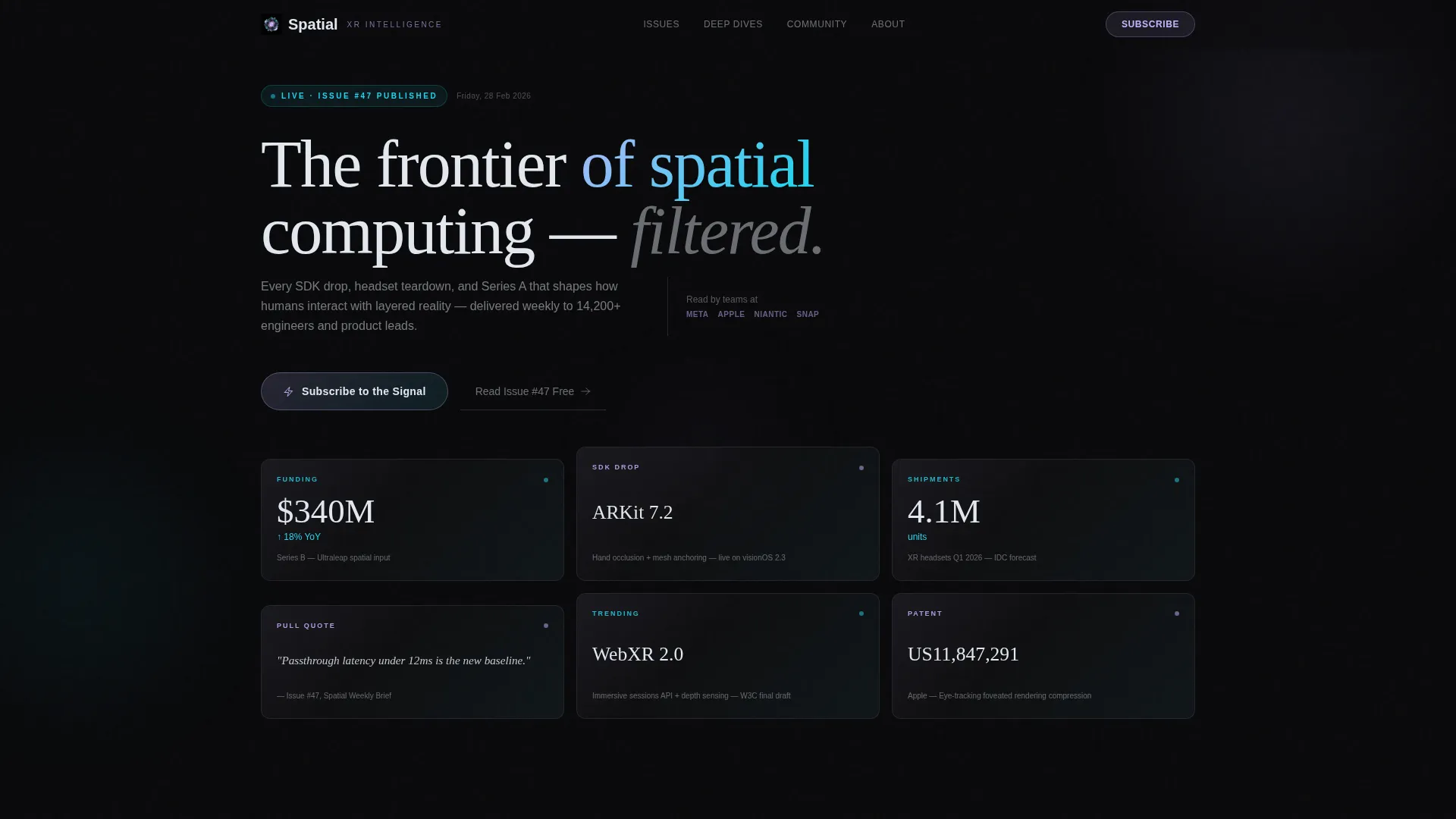
- A staggered Dark Glass Panels header holding live-feeling data fragments such as trending SDK names, funding figures, headset shipment stats, and pull quotes
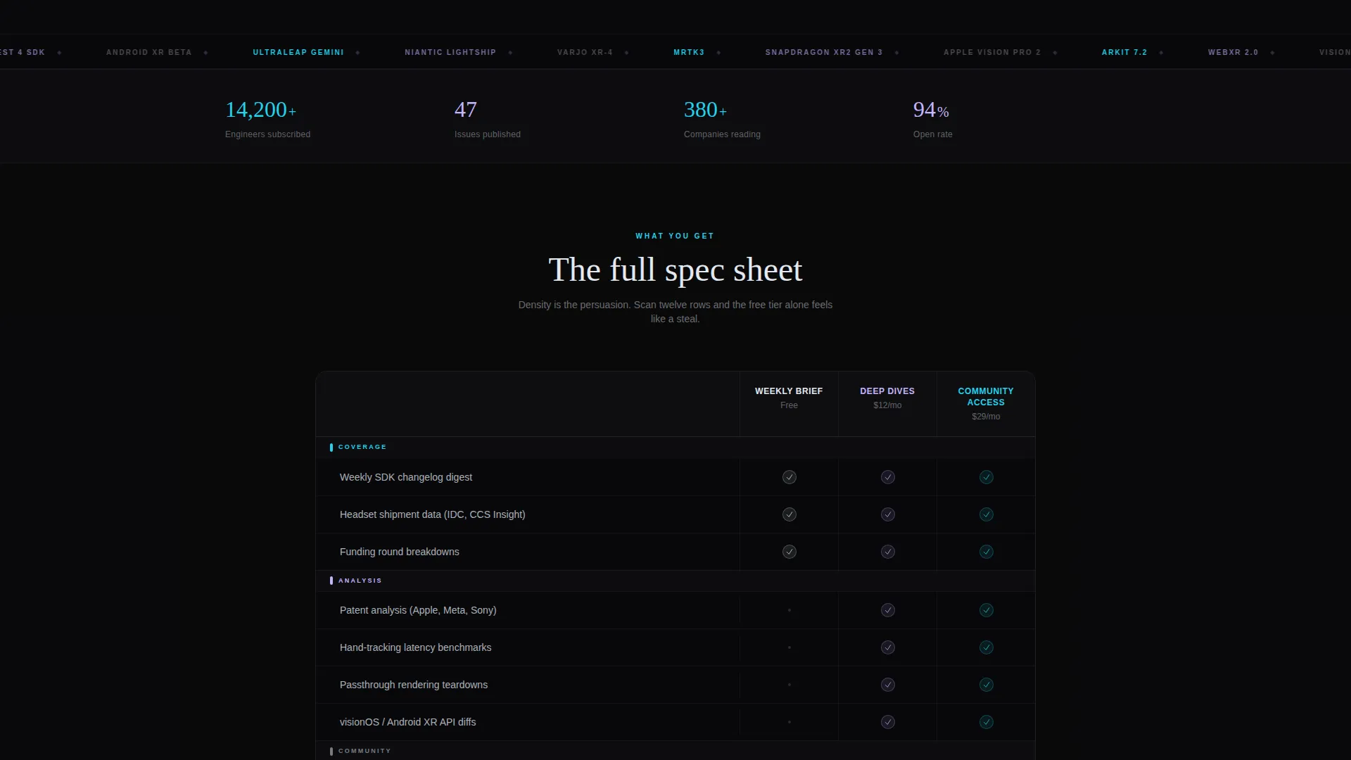
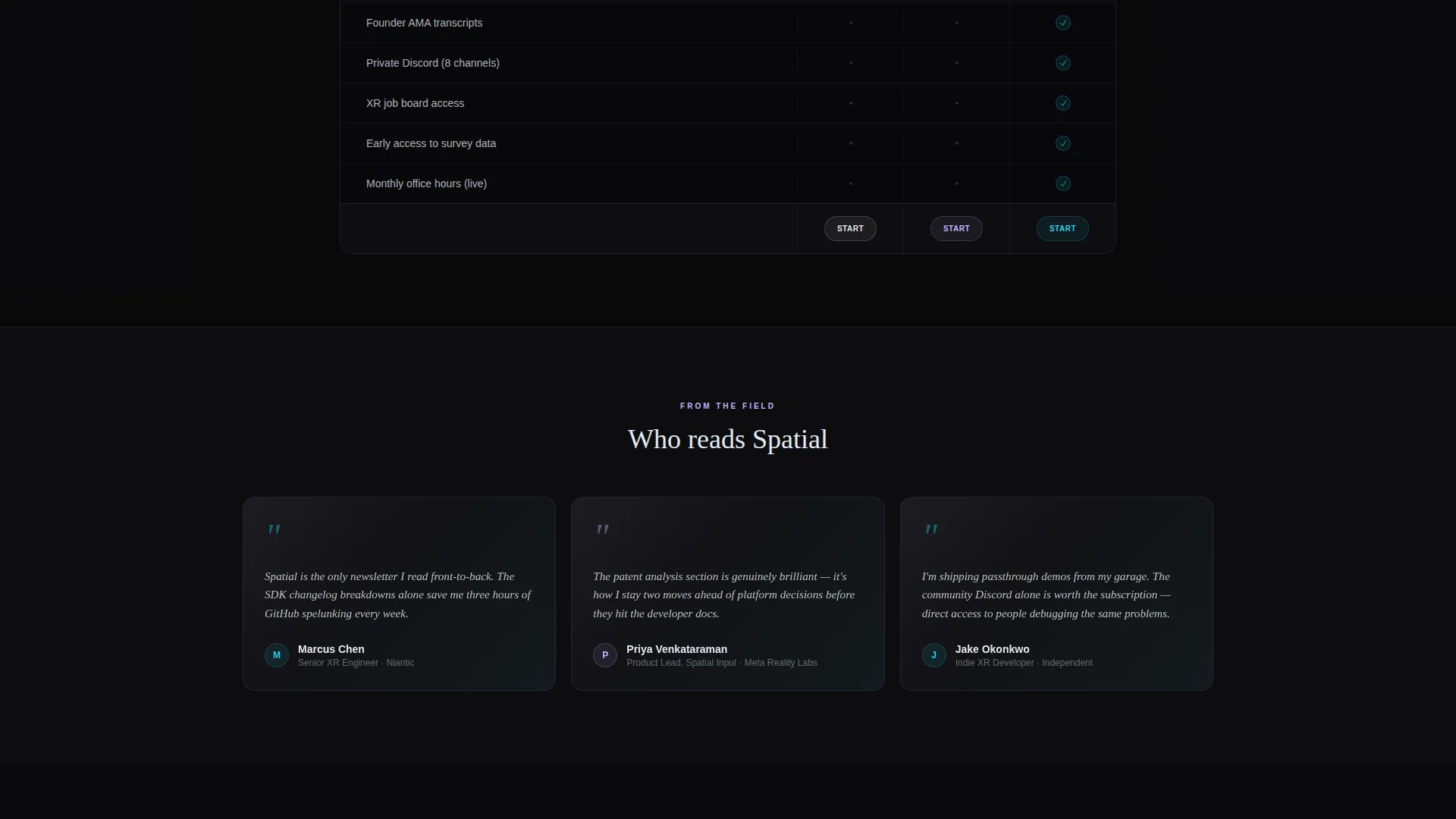
- A Feature Matrix section organized into columns for "Weekly Brief," "Deep Dives," and "Community Access," with rows covering patent analyses, founder AMAs, SDK changelogs, job board access, and Discord channels
- A pinned glass subscription bar fixed at the viewport bottom and a secondary call to action ("Read Issue #47 Free") for visitors who want to sample content before committing
Feature list
This template delivers a focused set of layout components, each chosen to serve a technically fluent, signal-seeking audience.
Dark Glass Panels Header
The header is a staggered grid of translucent cards, each displaying a live-feeling data fragment. Panels carry a faint iridescent sheen along their edges. There is no hero image and no illustration. The information itself is the visual spectacle, dense and luminous against a void-black background.
Comparative Feature Matrix
The Feature Matrix organizes the newsletter's value across three columns: "Weekly Brief," "Deep Dives," and "Community Access." Rows tick off specific deliverables row by row, and each row animates in with a subtle cyan pulse. The layout reads like a product spec sheet rather than a sales pitch.
Pinned Subscription Bar
A slim glass bar stays fixed at the bottom of the viewport throughout the scroll. It carries the primary call to action, "Subscribe to the Signal," so the conversion path is always one click away regardless of scroll position.
Secondary Free-Issue Path
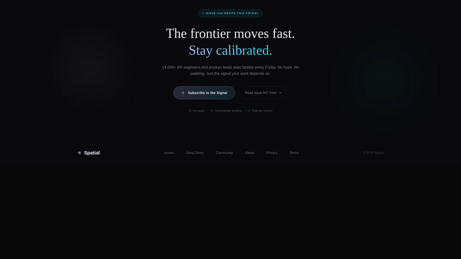
A secondary call to action, "Read Issue #47 Free," gives skeptical visitors a low-commitment entry point. It lets prospects sample content depth before deciding to subscribe, reducing the barrier to first engagement.
Iridescent Hover States
Interactive elements fire refracted cyan on hover, simulating a cursor-tracking gaze effect. Card borders glow with holographic lilac at low opacity. The result is a dark, clinical aesthetic that goes prismatic exactly where interaction happens.
No On-Page Form Fields
The template is intentionally form-free. All conversion intent is carried by click rather than data entry. This streamlines the visitor experience and directs all momentum toward the external subscription destination.
Page sections overview
| Section | Purpose |
|---|---|
| Dark Glass Header | Display live-feeling data fragments in a staggered translucent grid |
| Feature Matrix Grid | Compare newsletter tiers across deliverables in a scannable spec-sheet layout |
| Matrix call to action Block | Repeat the primary subscription call to action directly after the feature matrix |
| Pinned Subscribe Bar | Keep the conversion action visible at the viewport bottom throughout scroll |
| Free Issue Path | Offer a secondary low-commitment entry point for undecided visitors |
Design & branding system
The visual identity runs on an AI Iridescent color system applied over a Startup Velocity theme. The palette feels like light bending through a prism onto a matte-black lab bench: dark and clinical until it goes suddenly prismatic at points of interaction and emphasis.
- Core colors: void black (#09090B) for backgrounds, holographic lilac (#C4B5FD) for card borders at 12% opacity, refracted cyan (#22D3EE) for hover states and live data accents, and iridescent pearl (#E2E8F0) for surface text
- Cards float on barely visible lilac borders, creating depth without heavy shadows, while cyan activates on hover to simulate an attention-tracking gaze
- The overall aesthetic is dense and luminous, no illustrations, no photography, only structured data presented as spectacle against the void
Mobile & speed optimization
The dashboard-style layout is designed to translate its grid density into a readable single-column flow on smaller screens. The template keeps the experience coherent whether a visitor lands on a phone during a commute or at a desktop workstation at 2 a.m.
- The staggered glass panel grid collapses gracefully so data fragments remain legible and individually scannable on narrow viewports
- The pinned subscription bar remains fixed at the viewport bottom on mobile, keeping the primary call to action reachable without scrolling back up
- The form-free, click-only conversion path reduces page weight and keeps the interaction model simple across all device types
How this template helps you convert
The conversion strategy is built on earned persuasion. By the time a visitor has scanned the Feature Matrix, the free tier alone feels like a steal, and the paid tiers feel like the obvious next step.
- The Dark Glass Panels header delivers immediate credibility. Data fragments, funding rounds, SDK names, headset stats, signal that this newsletter covers real, specific, technical ground before any body copy is read.
- The Feature Matrix earns the click through density. Twelve rows of deliverables prove breadth without requiring the visitor to trust a tagline. The spec-sheet format speaks directly to engineers and product professionals who evaluate tools on facts.
- The pinned subscription bar and post-matrix call to action create two natural conversion moments. Visitors ready to commit never have to scroll back. Visitors still evaluating can take the free issue path and return when ready.
Other information about this template
This template is a strong fit for operators building paid newsletter communities on platforms like Substack, where the subscription page lives off-site and the landing page's only job is to earn the click.
- The click-through funnel structure means no subscription logic needs to live on the page itself, making it straightforward to point the call to action at any external subscription URL
- The Feature Matrix layout can be adapted to reflect different tier names or deliverable sets as a newsletter's offering evolves over time
- The template sits within the Technology category under the Spatial Computing Technology subcategory, making it a focused tool for a specific, technically demanding niche rather than a general-purpose newsletter template
- The Dashboard and Data Grid template style is well suited to any information-dense publication where the content itself is the brand, not a personality or lifestyle aesthetic
Theme
Startup Velocity
Creative direction
Feature Matrix
Color system
AI Iridescent
Style
Dashboard/Data Grid
Direction
Click-Through
Page Sections
Dark Glass Panels Header
Comparative Feature Matrix
Pinned Viewport Subscription Bar
Secondary Free-issue Entry Path
AI Iridescent Color System
Form-free Click-through Funnel
Related questions
Does this template include a sign-up form?
Can I update the Feature Matrix to reflect my newsletter's actual tiers?
Is this template only suited to spatial computing newsletters?
Where does the primary call to action link to?
Is the secondary free-issue call to action included in the template?



