Electronics Landing Page Template | Data-First Split Screen
Spec is a split-screen electronics landing page template built around a live comparison engine. It pairs a Dark Glass Panels header with an interactive spec-versus-spec layout, electric cyan data highlights, and a "Build Your Spec Sheet" call to action. Designed for consumer electronics brands, it turns raw numbers into decisions before the visitor scrolls past the fold.
by Rocket studio
Quick summary
Spec is a single-page template for consumer electronics brands that need to sell through data, not hype. The layout splits 50/50 down the center, puts two devices side by side, and lets the numbers do the talking. Every section earns scroll depth through interactive spec rows, animated benchmarks, and a comparison export flow that converts curiosity into a confirmed decision.
Who this template is for
This template is built for brands that compete on specifications and want visitors to feel the difference before they buy. It suits teams that trust their product data enough to put it front and center.
- Consumer electronics brands launching or comparing flagship devices
- Direct-to-consumer hardware companies targeting spec-savvy upgraders
- Content creators and remote-work audiences who treat device performance as a professional requirement
What problem this template solves
Most product landing pages bury the technical proof under lifestyle photography and vague taglines. Visitors who already know what they want leave when they cannot find the numbers quickly. Spec solves that gap directly.
- It replaces passive marketing copy with an interactive comparison engine the visitor controls
- It surfaces processor benchmarks, display refresh rates, charge times, and sensor sizes at the scroll rather than at the end of a long scroll
- It removes friction from the decision by letting buyers build and export their own spec sheet before any commitment is required
What you get with this template
You get a fully structured single-page layout engineered for side-by-side device comparisons. Every section has a defined role, and the visual system is ready to receive your product data without redesign.
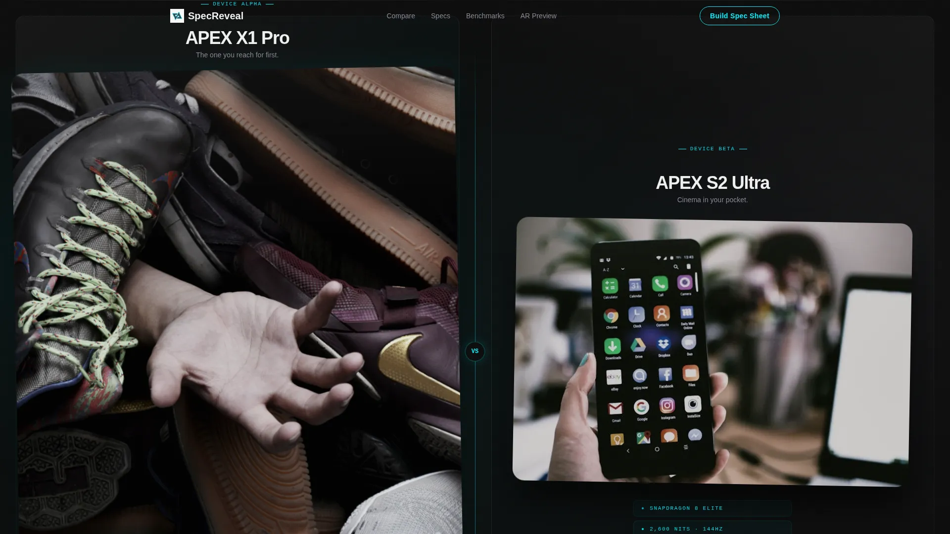
- A Dark Glass Panels header that suspends two devices on pure black with etched cyan spec callouts visible before the visitor interacts
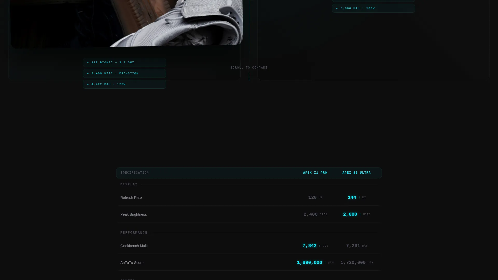
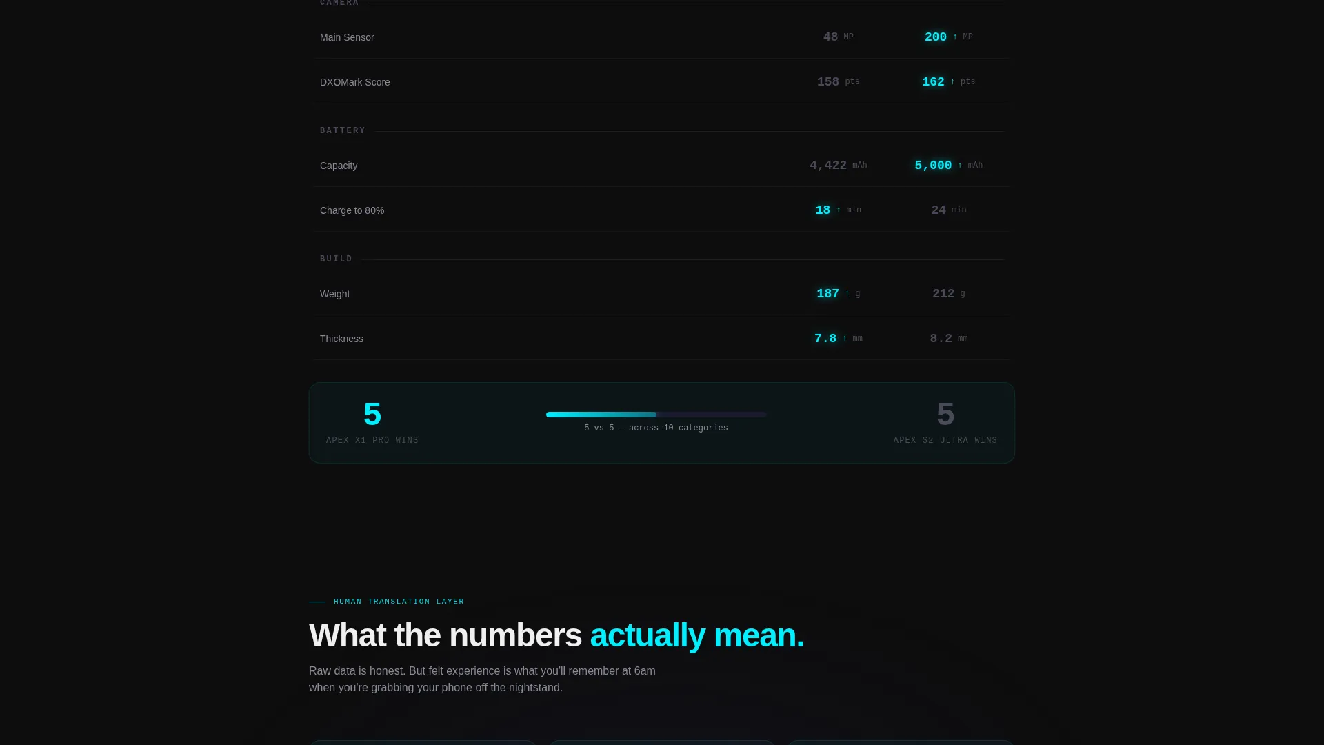
- An interactive comparison engine with animated row entries, winning-spec cyan highlights, and dimmed carbon gray for the lesser value
- A gated "Build Your Spec Sheet" export flow and a secondary "See It In Your Hand" augmented reality preview link
Feature list
This template ships with six core components that work together to move a technically minded visitor from curiosity to conversion.
Split-Screen Header with Etched Spec Callouts
Two devices sit in separate frosted dark-glass panes on a pure black field, divided by a hairline rule. Each pane carries the device's key spec, processor, display nit count, and battery capacity, etched in electric cyan before the visitor touches anything. A faint parallax depth effect activates on scroll to reinforce the premium, prototype feel.
Live Spec Comparison Engine
Immediately below the header, two columns populate with matching spec rows: display refresh rate, camera sensor size, Geekbench score, charge time to 80 percent, and weight in grams. Numbers animate in as each row enters the viewport. The winning value in each row pulses cyan; the lesser value dims to carbon gray. The visitor reads the result without any interpretation required.
Real-World Spec Translation Layer
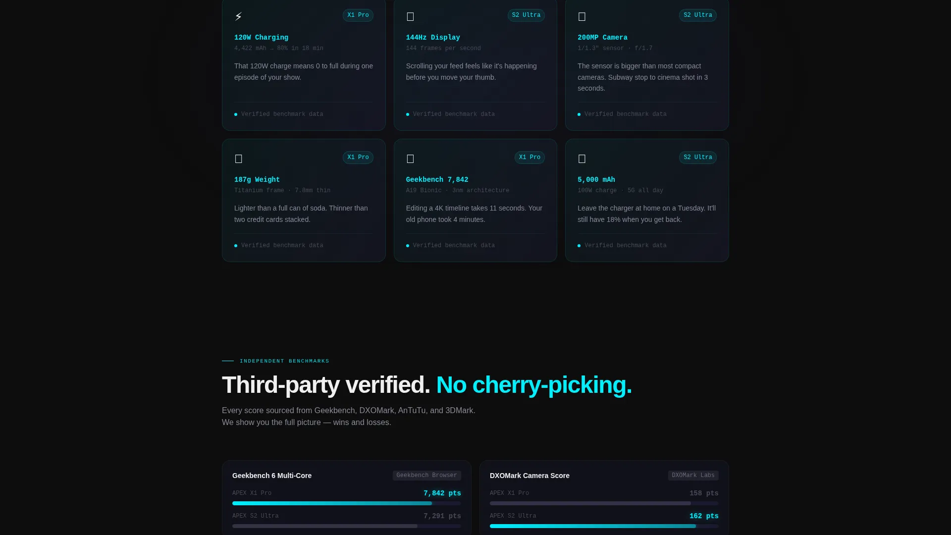
Below the raw data rows, each benchmark gets a plain-language equivalent. A charge time figure becomes "0 to full during one episode of your show." These translations are not marketing softeners; they are felt-experience anchors that make abstract numbers land with personal relevance.
Build Your Spec Sheet Export Flow
The primary call to action invites visitors to toggle between device matchups and assemble a personalized comparison. The export is gated behind an email field, creating a natural lead-capture moment that the visitor opts into willingly because they have already invested in building their sheet.
AR Preview Secondary Path
A secondary call to action, "See It In Your Hand," links to an augmented reality preview experience. It gives visitors who need a physical sense of the device a direct path without pulling them away from the comparison flow prematurely.
Data Command Visual System
The Carbon Fiber palette applies deep cockpit black, woven carbon gray, and titanium mid-tone as surface colors. Electric cyan is reserved exclusively for data points, active states, and benchmark numbers that need to read like headlines. The result feels like a stealth jet's instrument panel: every surface absorbs light except the information that matters.
Page sections overview
| Section | Purpose |
|---|---|
| Dark Glass Header | Introduce devices with etched cyan specs and parallax depth |
| Spec Comparison Engine | Display animated side-by-side rows with winning-value highlights |
| Real-World Translations | Convert raw benchmark data into felt, personal experiences |
| Build Your Spec Sheet | Primary call to action with device toggle and email-gated PDF export |
| AR Preview Link | Secondary call to action directing visitors to an augmented reality device preview |
Design & branding system
The visual identity follows a Data Command theme executed through a Carbon Fiber palette. Every color has a specific role, and deviation from that role would break the system's logic.
- Surface colors: deep cockpit black (#0D0D0D) and woven carbon gray (#1A1A2E) absorb light and keep focus on content; titanium mid-tone (#4A4A5A) handles secondary user interface elements
- Accent color: electric cyan (#00F0FF) appears only on data points, active comparison states, and benchmark callouts that need to read as headlines
- Header treatment: frosted dark-glass panes with hairline dividers and ambient light reflection give the layout a classified-prototype atmosphere with no lifestyle photography
Mobile & speed optimization
The template's layout decisions support a clean mobile experience without sacrificing the comparison engine's core function. The 50/50 split reflows into a stacked single-column layout on smaller viewports.
- Spec rows remain individually readable on narrow screens with clear winning-value highlights preserved in electric cyan
- Parallax depth and viewport-triggered number animations are scoped to the comparison section so they do not disrupt the overall scroll experience on mobile
- The "Build Your Spec Sheet" export flow and the "See It In Your Hand" link remain accessible as distinct tap targets throughout the mobile layout
How this template helps you convert
The conversion logic in Spec is sequential. Each section does one job, and those jobs compound by the time the visitor reaches the call to action.
- The header lands the product immediately with zero context required: two devices, their top specs in cyan, nothing else competing for attention.
- The comparison engine lets visitors process the data at their own pace, row by row, so by the time they reach the "Build Your Spec Sheet" button they have already formed a preference.
- The email-gated export turns that preference into an action the visitor is motivated to complete, because the output is something they built themselves and want to keep.
Other information about this template
This template is designed for a consumer electronics context where the buyer already understands the category and arrives with specific questions. The layout respects that intelligence by skipping preamble and opening directly on the evidence.
- The template style is Split Screen (50/50), suited to any brand that sells two comparable flagship products simultaneously
- The creative direction, Calculator/Tool First, makes the interactive comparison engine the true homepage hero rather than a secondary feature
- The Comparison/Versus landing page direction means the layout is optimized for visitors who are already in a shortlist mindset and need one final, data-backed push
- The Data Command theme and Carbon Fiber palette are transferable to any hardware product line that wants to signal precision and performance through visual restraint
Theme
Data Command
Creative direction
Calculator/Tool First
Color system
Carbon Fiber
Style
Split Screen (50/50)
Direction
Comparison/Versus
Page Sections
Split-screen Header with Etched Specs
Live Animated Comparison Engine
Real-world Spec Translation Layer
Build Your Spec Sheet Export Flow
AR Preview Secondary Call to Action
Data Command Carbon Fiber Visual System
Related questions
Can I use this template for a single device instead of two?
How does the email-gated export flow work?
Is the augmented reality preview included in the template?
Can I customize the spec row categories and values?
What kind of audience does this template perform best with?



