Species Engine - Powerful White-Label Landing Page Template
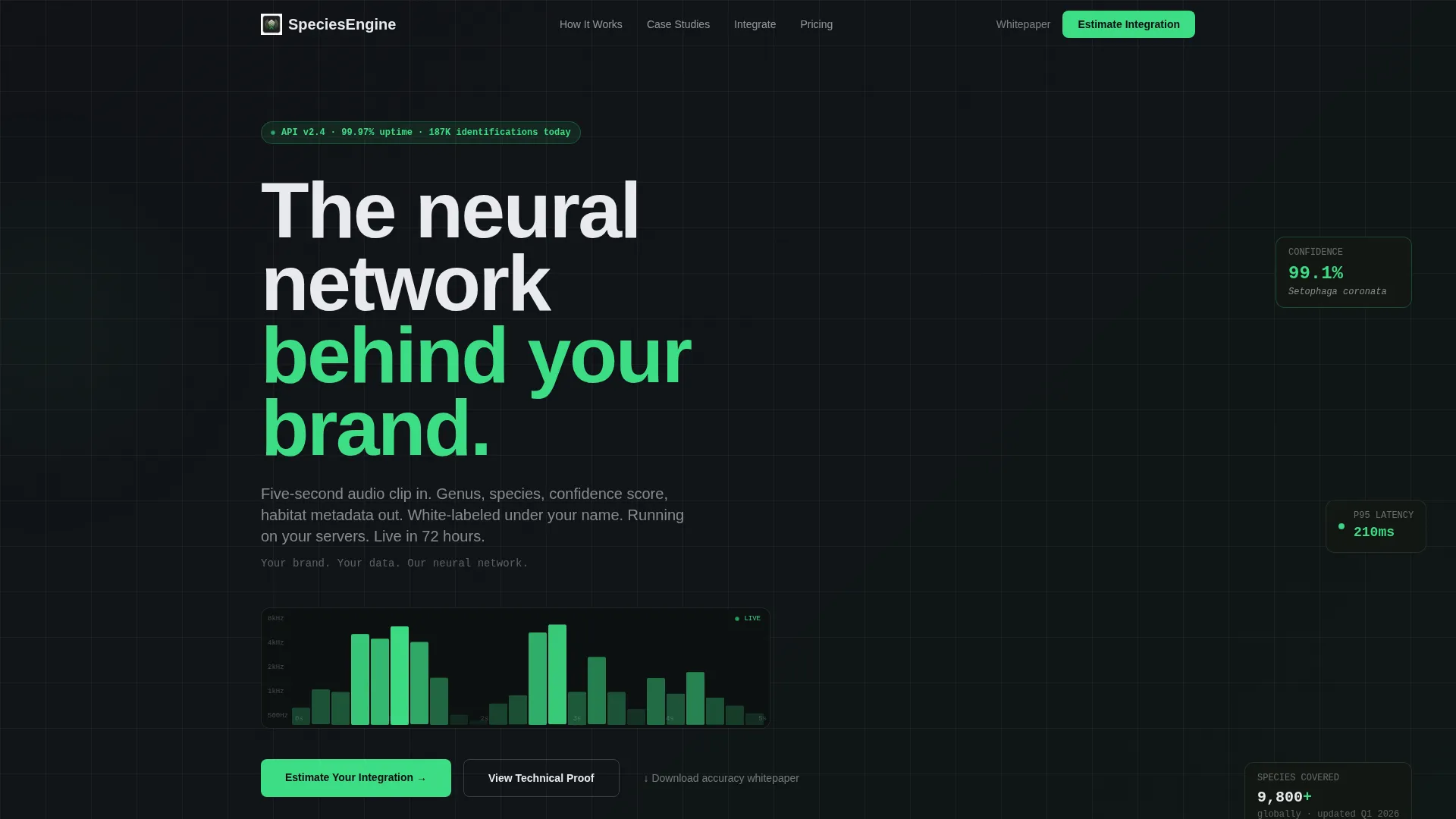
Speciesengine is a white-label bird identification landing page template built for technology companies, conservation organizations, and edtech platforms. It features a live API cost simulator, a Problem-to-Solution data grid, technical proof sections, and a three-step lead capture form. The Carbon Fiber color system and Data Command visual theme make complex identification data feel clear and immediate.
by Rocket studio
Quick summary
Speciesengine is a single-page, dashboard-style landing page template for white-label bird identification technology. It opens with a working API cost simulator, escalates through technical and business proof sections, and closes with a progressive lead capture form. The design uses a Carbon Fiber palette built to present live data clearly and drive qualified integration inquiries.
Who this template is for
This template is built for companies and organizations that want to license or resell a bird identification engine under their own brand. It speaks directly to decision-makers who need to justify a technical integration before committing budget.
- National park services and conservation NGOs building visitor or population-tracking tools
- Edtech companies adding field biology or citizen science modules to existing platforms
- Outdoor lifestyle brands and consumer app teams who want audio-based species identification without an in-house machine learning team
What problem this template solves
Building a bird identification engine from scratch is expensive, slow, and uncertain. Potential clients often arrive at a white-label solution after realizing the true cost of custom development. This template surfaces that painful reality early and then resolves it with a clear alternative.
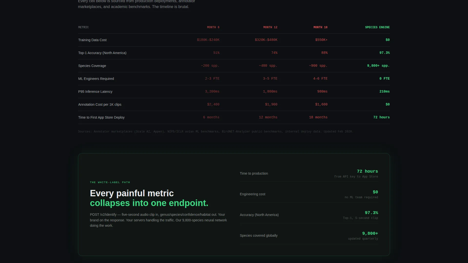
- Visitors see a side-by-side data grid comparing build-from-scratch costs against the white-label path
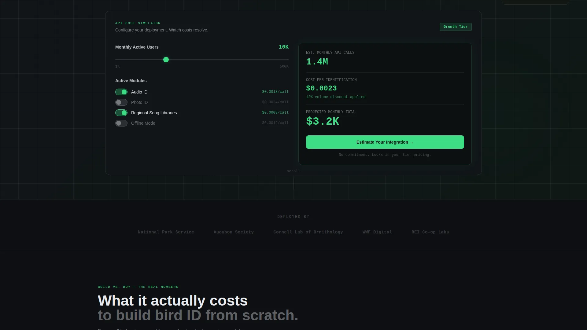
- The cost simulator lets buyers configure their own scenario before they ever speak to sales
- The progressive form captures qualified leads at different stages of research, not just ready-to-buy visitors
What you get with this template
The template delivers a complete, section-led landing page structured to move a technically informed buyer from discovery to conversion. Every section is purposeful and sequenced to build confidence before asking for commitment.
- A live API cost simulator with a monthly active user slider, module toggles, and real-time cost output
- A Problem-to-Solution data grid, spectrogram visuals, accuracy tables, latency benchmarks, and case study cards
- A three-step progressive lead form plus a secondary email-gated whitepaper download path
Feature list
This template packs several purposeful components into a single high-converting landing page. Each one is described below.
Live API Cost Simulator
An embedded calculator above the fold lets visitors select monthly active users (ranging from 1,000 to 500,000) and toggle modules including audio identification, photo identification, regional song libraries, and offline mode. A dashboard card updates in real time to show estimated API calls, per-identification cost at their tier, and a projected monthly total displayed in telemetry green.
Problem-to-Solution Data Grid
A three-column data grid opens the page's core argument by showing the true cost of building bird identification in-house. It covers training data acquisition, model accuracy benchmarks at six, twelve, and eighteen months, and team headcount. The grid then restructures to show how each painful metric collapses into a single API endpoint.
Technical Proof Section
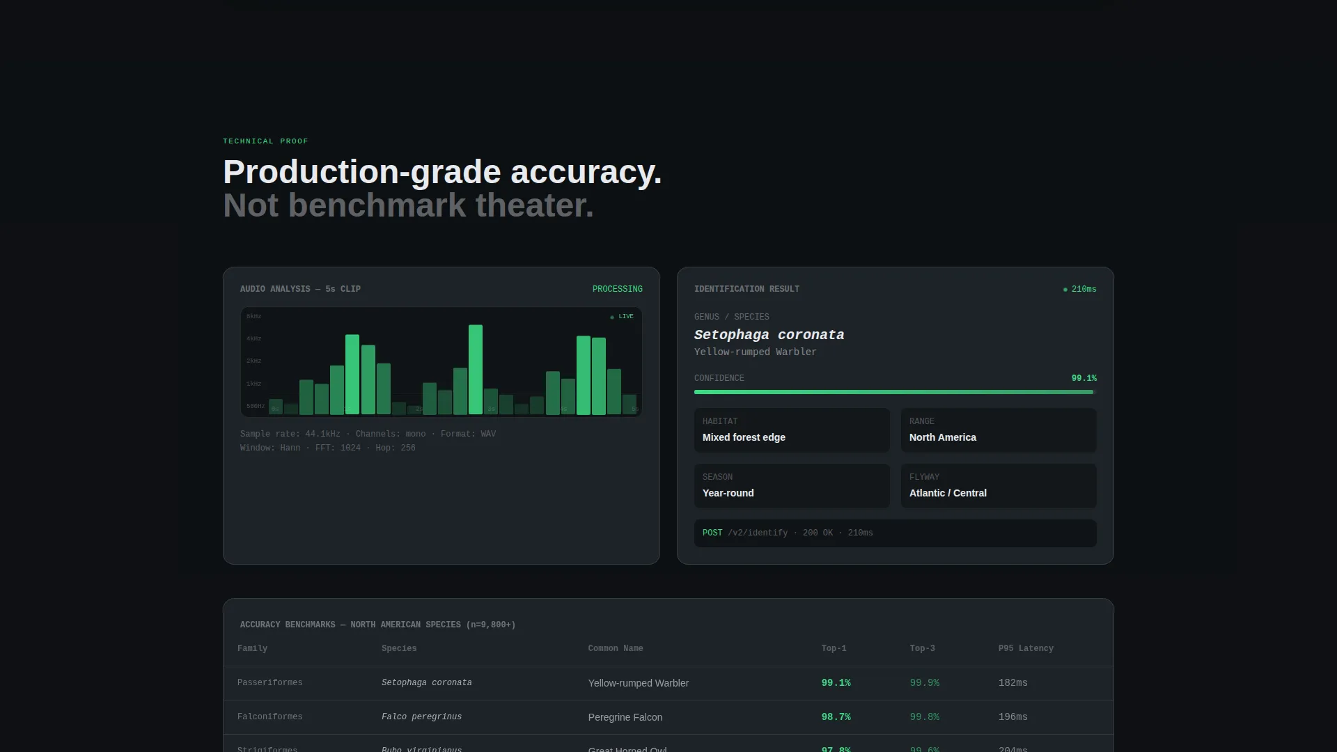
Below the data grid, the page presents spectrogram visualizations, confusion matrix accuracy tables, and latency benchmarks by region. These components give technically oriented buyers the evidence they need to trust the underlying model before committing to an integration.
Business Proof Case Study Cards
Case study cards highlight real-world deployments with park services and edtech platforms. Each card surfaces daily active user growth curves to demonstrate measurable business outcomes alongside the technical claims.
Integration Proof Block
A dedicated section shows code snippets in dark-mode blocks, SDK size comparisons, and a deploy timeline marked "72 hours to App Store." This section answers the integration team's questions without requiring a separate technical document.
Three-Step Progressive Lead Form
The primary conversion path uses a multi-step form. Step one captures company name and use case from a dropdown. Step two collects estimated monthly active user range and preferred platform. Step three asks for email and an optional phone number, reducing early friction while still qualifying each lead.
Page sections overview
| Section | Purpose |
|---|---|
| API Cost Simulator | Let visitors model their own pricing scenario above the fold |
| Hero Tagline Bar | Anchor brand promise with a single line of sensor white text |
| Build-versus-License Grid | Show the real cost of building identification from scratch |
| White-Label Solution Grid | Restructure same metrics to show the API alternative |
| Spectrogram Visuals | Provide visual technical proof of the identification engine |
| Accuracy and Latency Tables | Present confusion matrix and regional latency benchmarks |
| Case Study Cards | Demonstrate business outcomes from live deployments |
| Integration Proof Block | Show code snippets, SDK size, and deploy timeline |
| Primary Lead Form | Capture qualified leads through a three-step progressive form |
| Whitepaper Download Gate | Offer research-stage visitors an email-gated accuracy report |
Design & branding system
The visual identity follows a Data Command theme. Every color and layout decision is built to make numerical data readable at a glance, the same way an instrument panel is designed for rapid interpretation under variable conditions.
- Carbon Fiber color system: cockpit black (#0D0F12) and woven graphite (#1E2328) for backgrounds, cool sensor white (#E8EAED) for typography and grid lines, and telemetry green (#3DDC84) reserved exclusively for live values and interactive states
- Data cards float on subtle one-pixel borders of sensor white at 12% opacity, keeping the grid structure visible without competing with the data itself
- No stock imagery appears on the page; the numbers, grids, and visualizations are the entire visual hero
Mobile & speed optimization
The template is structured as a single-page, section-led layout designed to render the dashboard grid and cost simulator cleanly across screen sizes. The dark, matte Carbon Fiber palette is chosen specifically to remain readable in varying light conditions.
- The cost simulator slider and module toggles are built for touch interaction on mobile devices
- Data cards and grid layouts reflow to single-column presentation on smaller screens without losing the visual hierarchy of the dashboard theme
How this template helps you convert
The page is sequenced so that visitors sell themselves before any explicit pitch arrives. The cost simulator does the heavy lifting early, and the form appears only after the buyer has already modeled their own scenario.
- The API cost simulator creates a personalized pricing estimate that anchors the visitor's thinking before they read a single sales claim, making the primary call to action feel like a natural next step rather than a cold ask.
- The secondary whitepaper download path captures research-stage visitors who are not yet ready to request an integration estimate, keeping them in the pipeline with a lower-commitment conversion.
Other information about this template
This template is designed for a specific commercial context: selling access to a white-label neural network for audio-based species identification. A few additional details are worth noting for teams evaluating it.
- The primary call to action reads "Estimate Your Integration" and anchors directly to the three-step progressive form
- The tagline "Your brand. Your data. Our neural network." appears as a single line of sensor white text beneath the cost simulator
- The template is positioned for pre-migration-season deployment, meaning it is built to move fast from customization to app store listing
- The page style is a Dashboard/Data Grid layout, which means the visual language of data tables and live indicators is structural, not decorative
Theme
Data Command
Creative direction
Problem→Solution Arc
Color system
Carbon Fiber
Style
Dashboard/Data Grid
Direction
Lead Generation
Page Sections
Live API Cost Simulator
Problem-to-solution Data Grid
Technical Proof Section
Business Proof Case Study Cards
Integration Proof Block
Three-step Progressive Lead Form
Related questions
What industries is this landing page template designed for?
Does the cost simulator calculate real API pricing?
Can this template be adapted for a product other than bird identification?
How does the two-path conversion system work?
What does the deploy timeline section show?



