AI Insurance Image Generator Landing Page Template
Spectra is a photorealistic insurance AI image generator landing page built for marketing directors, claims teams, and insurtech startups. It uses a dark Tech Glass visual identity with iridescent accents and a structured comparison table layout. The page drives freemium signups by letting visitors compare Spectra against stock photography across twelve dimensions before ever asking for credentials.
by Rocket studio
Quick summary
Spectra is a single-page, comparison-driven landing page for an AI-powered insurance image generator. It opens with a live metrics wall, flows into a detailed feature comparison table, and closes with a low-friction freemium signup. The design pairs a deep obsidian background with holographic violet and electric cyan accents for a sharp, modern feel.
Who this template is for
This template is built for teams that need on-demand, photorealistic insurance imagery at scale. It speaks directly to the people who have outgrown generic stock photo libraries and need visuals that match real-world insurance scenarios.
- Insurance marketing directors building campaign assets quickly
- Claims teams needing scenario visualizations for training materials
- Insurtech startups that require large volumes of unique policy illustrations on a limited budget
What problem this template solves
Stock photo libraries recycle the same tired images. Insurance professionals need scenario-specific visuals, from cracked windshields to flooded basements to hail-damaged roofs, that feel real and on-brand. This template presents a clear, credible case for why an AI image generator solves that problem better than any existing alternative.
- It closes the gap between generic stock photography and scene-accurate insurance imagery
- It shows three pricing tiers transparently so visitors can self-select without confusion
- It removes friction from the signup flow so the product experience becomes the sales pitch
What you get with this template
You get a fully structured, scroll-driven landing page that earns trust through specificity. Every section is designed to move a skeptical insurance professional from awareness to free trial without pressure.
- A live stats header with real-time counters and a mosaic grid of AI-generated insurance images
- Two comparison tables covering feature dimensions and Free, Pro, and Enterprise pricing tiers
- A floating freemium call-to-action button and a minimal two-field signup form
Feature list
This template ships with six purposefully designed components, each matched to a stage in the buyer journey.
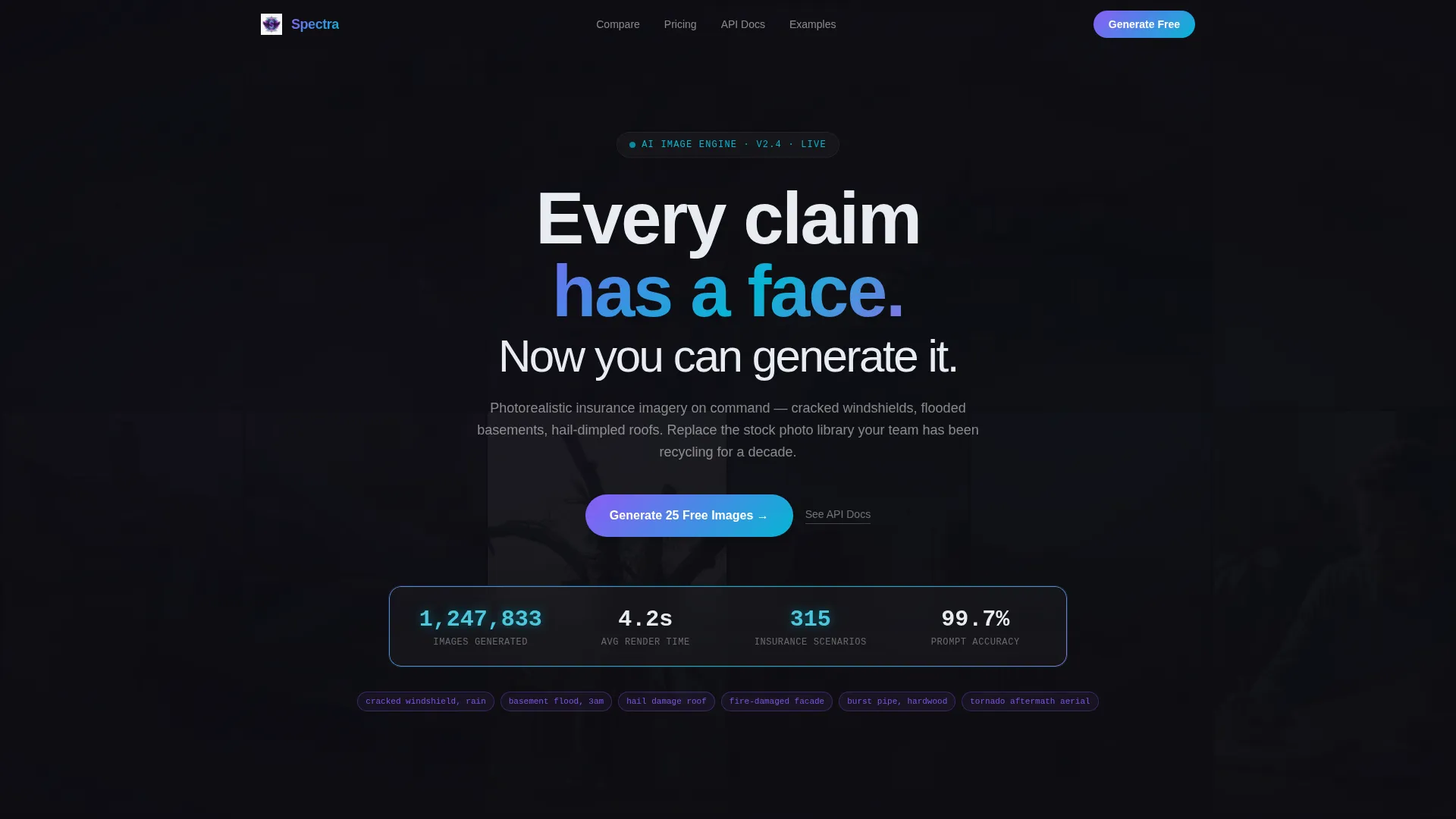
Live Metrics Header Wall
A dark glass panel displays four real-time counters: images generated, average render time, available insurance scenarios, and prompt accuracy. Numbers tick upward with an iridescent shimmer on each digit change, building immediate credibility before a visitor reads a single line of copy.
Mosaic Background Image Grid
Behind the header metrics, a slow-cycling grid of AI-generated insurance images fades in and out. Each image carries a barely visible prompt caption beneath it. The grid makes the product's output tangible without requiring a separate demo section.
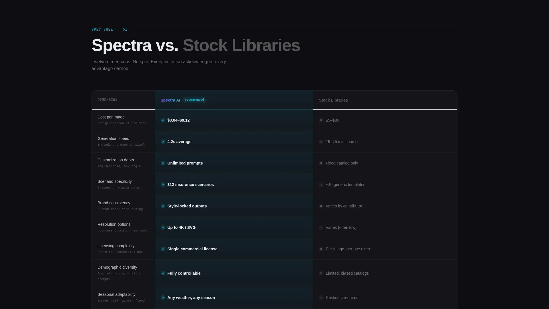
Twelve-Dimension Comparison Table
The first table benchmarks the generator against stock photography libraries across twelve rows: cost per image, generation speed, customization depth, scenario specificity, brand consistency, resolution options, licensing complexity, demographic diversity, seasonal adaptability, batch generation, API access, and training data compliance. Each row animates on scroll, and the winning column glows with an iridescent pulse.
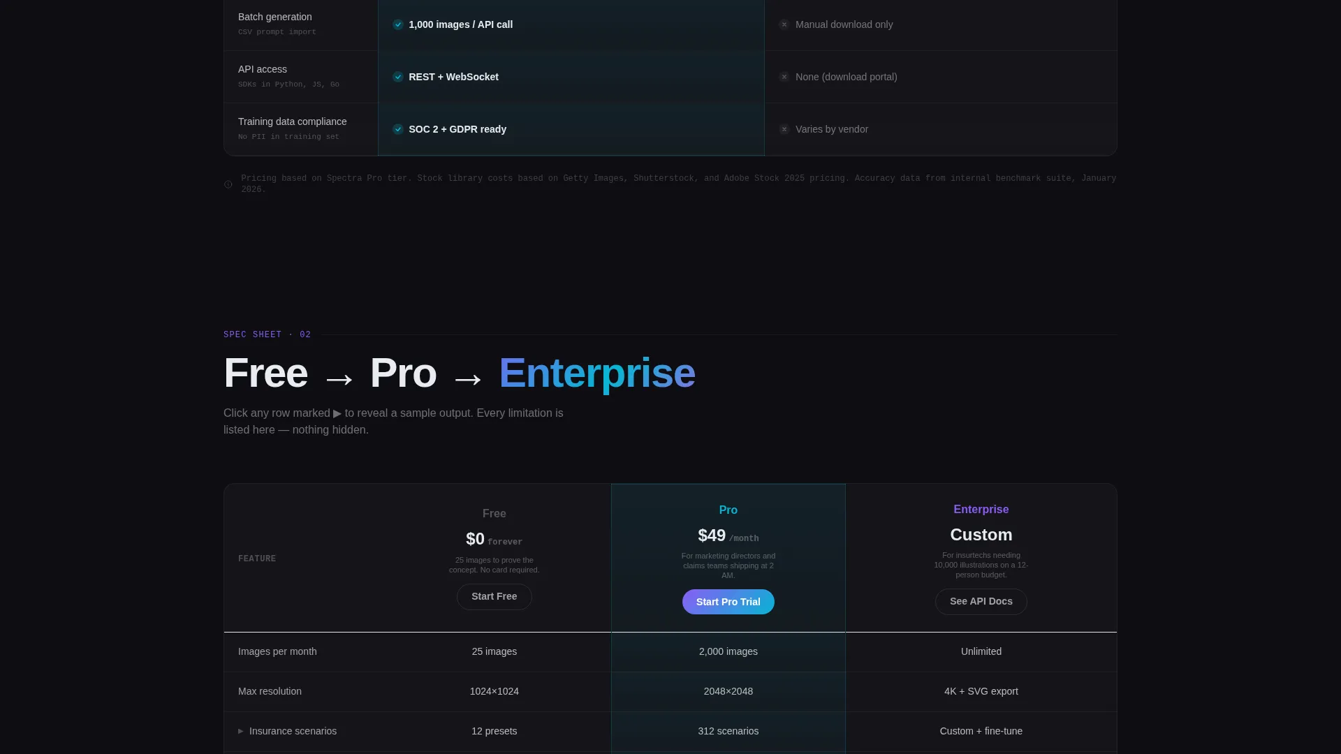
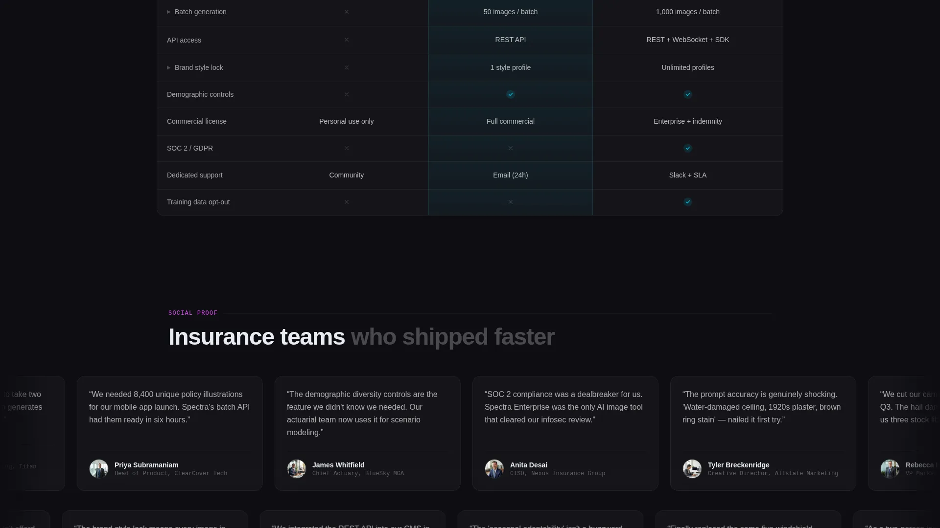
Tiered Pricing Comparison Grid
A second comparison grid lays out Free, Pro, and Enterprise tiers side by side. Feature rows are expandable and reveal sample output images when clicked, letting the product speak for itself at every price point.
Floating Freemium Call-to-Action Button
The "Generate 25 Free Images" button appears both beneath the header metrics and as a persistent floating glass button during scroll. It keeps the primary conversion action visible without disrupting the reading flow of the comparison tables.
Minimal Two-Step Signup Form
The first step asks only for a work email and company type. After that single step, the visitor lands directly inside a prompt interface pre-loaded with insurance scenarios. The reduced friction makes the first session feel like exploration, not onboarding.
Page sections overview
| Section | Purpose |
|---|---|
| Stats metrics header | Establish credibility with live counters and mosaic imagery |
| Headline copy block | Anchor the product promise with a single focused statement |
| Feature comparison table | Compare generator against stock photography across twelve dimensions |
| Tier pricing grid | Show Free, Pro, and Enterprise differences with expandable rows |
| Primary call to action block | Drive freemium signups with the "Generate 25 Free Images" prompt |
| Floating scroll button | Keep the conversion action visible throughout the full page scroll |
| Two-step signup form | Capture work email and company type before entering the product |
| API developer link | Route enterprise and developer visitors toward API documentation |
Design & branding system
The visual identity follows a Tech Glass theme that makes a utilitarian insurance product feel genuinely premium. The palette draws from a shifting, light-refracting color system that feels alive without ever feeling loud.
- Deep obsidian (#0D0D12) forms the primary background; frosted glass white (#E8ECF1) handles all body text for sharp legibility
- Holographic violet (#8B5CF6) and electric cyan (#06B6D4) run as gradient accents across card edges and table borders, shifting like light through a rain-streaked window
- Hot iridescent pink (#D946EF) is reserved exclusively for hover states and active toggle elements, providing clear interactive feedback
Mobile & speed optimization
The layout is structured for clarity on any screen size. Scroll-triggered animations and the floating button are designed to remain functional and unobtrusive across device types.
- The comparison tables use horizontal scroll behavior on smaller screens to preserve column integrity
- The floating call-to-action button is positioned to stay accessible without covering critical table content on mobile viewports
- Mosaic grid transitions use fade-in and fade-out timing that keeps the header legible regardless of background activity
How this template helps you convert
The page is structured so the comparison tables do the selling before the signup form ever appears. By the time a visitor reaches the call to action, they have already seen the value gap in concrete, measurable terms.
- The live metrics wall creates immediate social proof with real numbers, setting a confident tone before any feature claim is made.
- The twelve-dimension comparison table removes doubt by acknowledging limitations alongside strengths, which signals transparency and builds genuine trust.
- The minimal two-field signup form and pre-loaded prompt interface make the free tier feel like an instant product experience rather than a registration hurdle.
Other information about this template
This template is built specifically for the insurance technology niche, where visual content needs are highly specific and rarely served well by general-purpose tools.
- The template style is a Comparison Table layout, designed to communicate structured product differentiation at a glance
- The creative direction follows a Spec Sheet approach: every claim is shown in context, every limitation is visible, and the reader is treated as technically literate
- The header concept is a Stats and Metrics wall, a format that works particularly well for AI products where volume and accuracy numbers carry persuasive weight
- The landing page direction is Freemium and Trial conversion, meaning the entire page architecture prioritizes getting a first session started over capturing long-form lead data
- A secondary developer path, labeled "See API Docs," is embedded as a text link inside the Enterprise pricing column for developer and technical buyer audiences
Theme
Tech Glass
Creative direction
Spec Sheet
Color system
AI Iridescent
Style
Comparison Table
Direction
Freemium/Trial
Page Sections
Live Real-time Metrics Header
AI Mosaic Image Background
Twelve-dimension Feature Table
Expandable Tiered Pricing Grid
Persistent Floating Call to Action Button
Minimal Two-step Signup Flow
Related questions
Who is this landing page template designed for?
What conversion actions does the template support?
Can the comparison table rows be customized?
How does the floating button work during scroll?
Does the template include a pre-built signup form?


