Certified Optometry Software Professional Website Template
Optic is a bold, brutalist-styled landing page template built for optometry membership management platforms. It combines live metric panels, anchor-nav hub-and-spoke structure, and a dark glass visual system to present your practice software with clinical confidence. The template targets practice owners, office managers, and multi-location groups ready to move beyond spreadsheets and phone-based recall.
by Rocket studio
Quick summary
Optic is a single-page, hub-and-spoke landing page template designed for optometry membership management platforms. It leads with glowing live-data panels, a sticky anchor navigation, and a spec-sheet scroll structure. The goal is to make independent practice owners and office managers feel the gap between where they are and where this platform can take them.
Who this template is for
This template is built for software companies and platform founders serving the independent optometry market. It speaks directly to the people running those practices every day.
- Independent optometry practice owners managing insurance panels alongside a growing direct-pay patient base
- Office managers spending hours each week chasing lapsed patients and manually tracking recall schedules
- Multi-location optometry groups that need standardized membership tiers without losing the personal feel of each clinic
What problem this template solves
Many optometry practices still rely on filing cabinets, scattered spreadsheets, and forgotten recall cards to manage patient memberships and benefits. That fragmentation costs time and revenue. This template gives platforms a way to show, not just tell, why that approach fails.
- No clear system to display the difference between current chaos and a unified membership engine
- No conversion path that captures both decision-ready buyers and slower-moving researchers in the same scroll
- No visual language that signals clinical credibility without relying on stock photography or generic hero images
What you get with this template
You get a fully structured, design-ready landing page that inventories your platform's capabilities the way a product data sheet inventories medical equipment. Every section earns trust before asking for anything.
- A sticky anchor navigation linking five core feature hubs: Enrollment, Benefits Engine, Recall Automation, Revenue Dashboard, and Multi-Location Sync
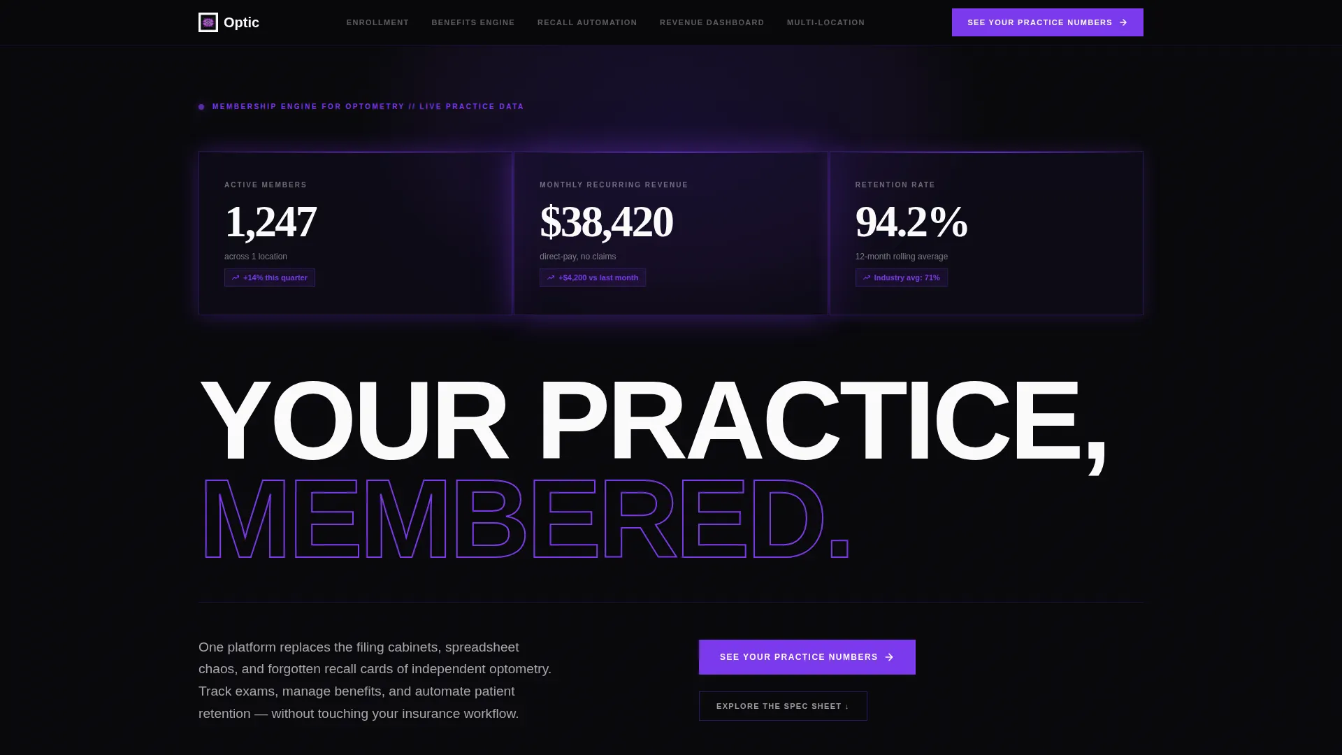
- Three dark glass metric panels in the header showing active members, monthly recurring revenue, and retention rate as live proof points
- Two distinct conversion paths: a detailed lead form after the Revenue Dashboard section and a lightweight email capture at the bottom for visitors not yet ready to book
Feature list
This template is built around a set of intentional components. Each one serves a specific job in the conversion flow.
Dark Glass Header Panels
Three frosted-glass metric cards open the page above the headline. Each panel displays a different live data point: 1,247 active members, $38,420 in monthly recurring revenue, and a 94.2% retention rate. The panels are edged in violet light, making the product's output the very first thing a visitor reads.
Sticky Anchor Navigation
A persistent navigation bar keeps all five hub sections reachable at any scroll depth. It also surfaces the primary call to action, "See Your Practice Numbers," so the lead form is never more than one click away regardless of where the visitor is on the page.
Spec Sheet Section Structure
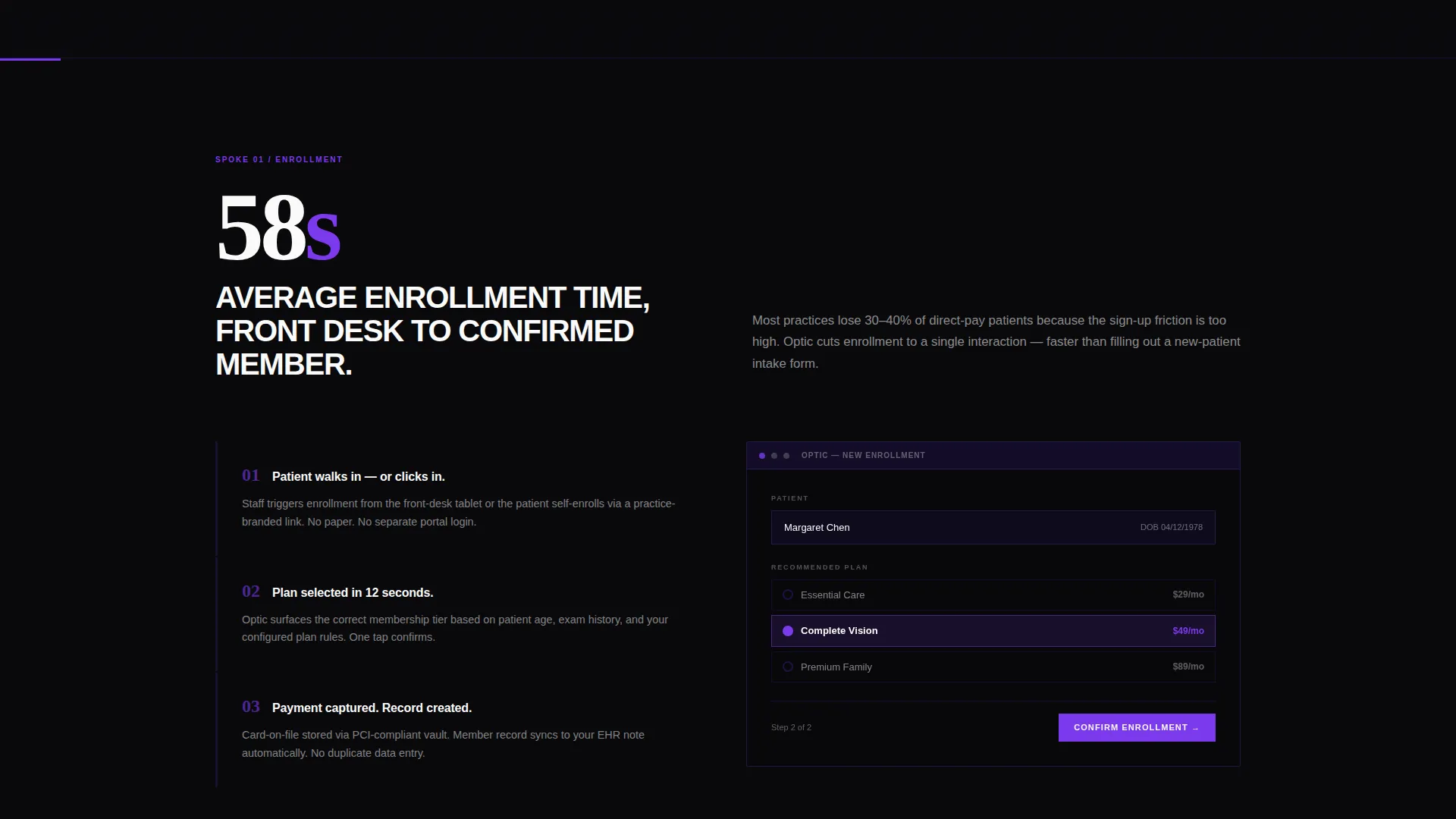
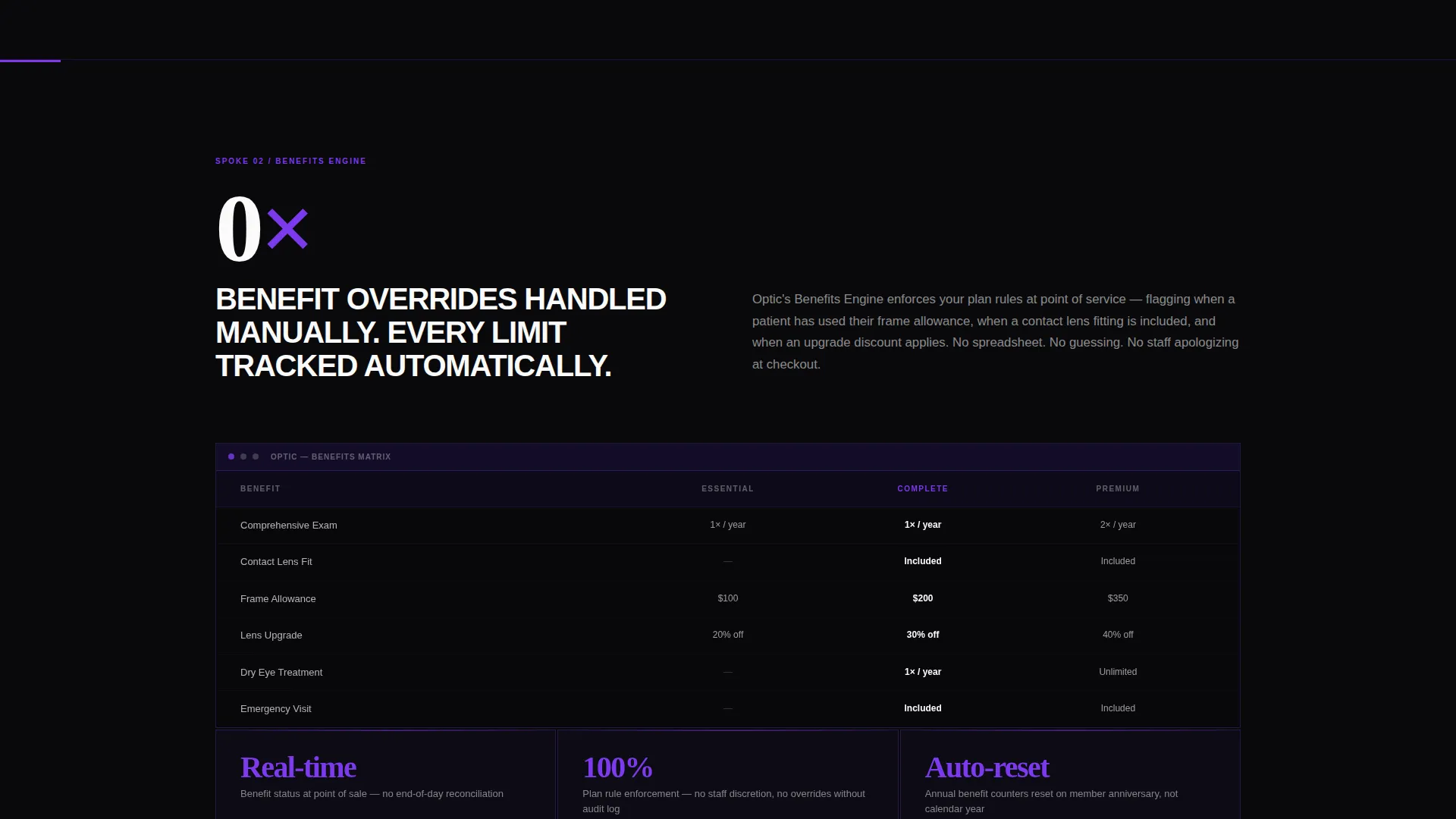
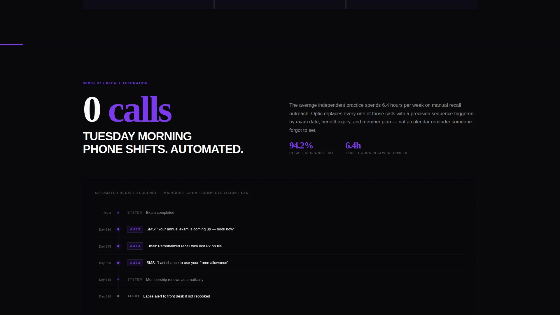
Each of the five hub sections opens with a single oversized metric or specification number. Short, clinical paragraphs sit beside interface screenshots rendered as dark glass panels. The layout reads like a technical manual, building confidence through completeness rather than emotional appeals.
Dual Conversion Path Design
The primary lead form collects practice name, number of locations, patient volume range, and work email. A secondary path at the bottom captures email only for the "Download the Membership Playbook" offer. Both paths are structured to meet visitors at different stages of readiness.
Brutalist Typography System
Headlines use heavy slab type set oversized against void black backgrounds, echoing projected Snellen letters on a darkened exam room wall. The visual hierarchy is stark and immediate. There is no ambiguity about what to read first.
Page sections overview
| Section | Purpose |
|---|---|
| Header Metric Panels | Open with live output data before any copy |
| Sticky Anchor Nav | Keep all hubs and primary call to action reachable |
| Enrollment Hub | Explain member onboarding and tracking |
| Benefits Engine Hub | Detail how benefits are managed per member |
| Recall Automation Hub | Show how lapsed-patient follow-up is handled |
| Revenue Dashboard Hub | Present revenue metrics and the lead form call to action |
| Multi-Location Sync Hub | Address multi-clinic standardization needs |
| Membership Playbook call to action | Capture emails from visitors not ready to talk |
Design & branding system
The Void and Violet color system is the backbone of this template's visual identity. Every color decision has a functional purpose, not just an aesthetic one.
- Core palette: absolute void black (#09090B) for backgrounds, deep ultraviolet (#2D1B69) for brutalist slab borders, electric violet (#7C3AED) for hover states and active nav anchors, and clinical white (#FAFAFA) for body text and data figures
- Typography style: heavy oversized slab type for headlines, clean clinical weight for body paragraphs, creating a strong contrast hierarchy that guides the eye without visual clutter
- Dark glass panel treatment: frosted-glass card surfaces with violet edge lighting used for both the header metrics and the in-section interface screenshots, keeping the aesthetic consistent across the full scroll
Mobile & speed optimization
The template's layout is built to hold its visual weight across screen sizes. The brutalist grid and large type scale were chosen with responsive clarity in mind.
- The sticky anchor navigation collapses cleanly for smaller viewports, keeping all five hubs and the primary call to action accessible without crowding the screen
- Dark glass panels and oversized metric figures reflow naturally at mobile breakpoints, maintaining legibility and visual impact at any screen width
How this template helps you convert
The conversion strategy here is built on earned trust, not pressure tactics. Every design decision moves a skeptical practice buyer one step closer to submitting their information.
- The header panels lead with real output numbers before any product claim is made, making the visitor feel the cost of not having this data for their own practice
- The spec-sheet scroll structure lets a technically minded buyer, whether a practice owner or an office manager, read through the full capability inventory at their own pace before committing to the lead form
- Two distinct calls to action meet visitors at different readiness levels, capturing both the decision-ready buyer with the full form and the curious researcher with the lightweight email download
Other information about this template
This template was designed specifically for the optometry membership management niche, where the typical buyer is a skeptical, detail-oriented practice professional rather than a general consumer.
- The hub-and-spoke structure with anchor navigation is well suited to platforms that need to explain several distinct feature areas without fragmenting the visitor across multiple pages
- The "See Your Practice Numbers" call to action is positioned in both the sticky nav and the post-Revenue-Dashboard section, giving it two high-visibility placements within a single-page flow
- The secondary "Download the Membership Playbook" path is designed as a low-friction email-only capture, making it an effective tool for nurturing visitors who are still in a research phase
- This template fits within the Bold Brutalist design category, which prioritizes stark contrast, heavy type, and unapologetic data-forward layouts over softer illustrative approaches
Theme
Bold Brutalist
Creative direction
Spec Sheet
Color system
Void & Violet
Style
Hub & Spoke (Anchor Nav)
Direction
Lead Generation
Page Sections
Dark Glass Header Metric Panels
Sticky Anchor Navigation Bar
Spec Sheet Scroll Structure
Dual Conversion Path Layout
Brutalist Slab Typography System
Related questions
Who is this landing page template designed for?
Can the metric numbers in the header panels be customized?
What are the two conversion paths included in this template?
Does this template use a single page or multiple pages?
Is the Multi-Location Sync section relevant for group practices?



