Onboarding & User Guide Professional Website Template
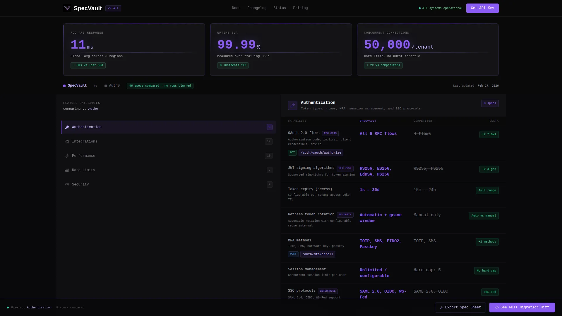
Specvault is a split-screen feature discovery landing page built for technical buyers who need hard numbers before signing anything. It pairs a persistent spec navigation panel with a scrollable side-by-side comparison view, dark-glass metric cards at the top, and two clear conversion paths, all wrapped in a void-black, electric-violet visual identity that feels like a premium developer tool.
by Rocket studio
Quick summary
Specvault is a single-page feature discovery template designed for developer tools and technical SaaS products. It presents every capability in a structured, comparison-first layout that respects the intelligence of the buyer. The page earns trust before asking for anything, using hard metrics and transparent spec rows instead of persuasion copy.
Who this template is for
This template is built for technical product teams that sell to engineers, product managers, and technical decision-makers. If your buyers evaluate tooling with spreadsheets and procurement checklists, this page speaks their language directly.
- Engineering leads comparing a new tool against their current stack
- Product managers building internal business cases for procurement approvals
- CTOs who need quantifiable deltas to justify a platform switch to stakeholders
What problem this template solves
Most feature pages hide the details. They blur rows, gate comparisons, and make buyers work to find the numbers they actually need. That friction kills momentum for technical evaluations.
- Buyers arrive at 2 a.m. looking for rate limits, endpoints, and uptime figures and find nothing useful
- Comparison spreadsheets get built without your product's data because it was never presented clearly
- Gated content pushes serious evaluators toward competitors who publish their specs openly
What you get with this template
You get a fully structured, single-page spec layout that shows every capability row without gating or blurring. The template is designed to serve the evaluation process completely before asking for a conversion action.
- A split-screen layout with a locked left navigation panel and a scrollable right spec panel
- Three dark-glass metric cards in the header displaying key performance figures in large monospaced type
- Two distinct conversion paths: a full migration comparison form and a PDF spec export capture field
Feature list
This template is built around a core set of purposeful components. Each one earns its place in the layout.
Dark Glass Header Metrics
Three frosted-glass cards float over the void-black background at the top of the page. Each card holds a single key metric, API response time, uptime percentage, and concurrent connection limit, rendered in large monospaced violet type. The effect is minimal and precise, presenting performance data with the confidence of a system that knows its numbers.
Persistent Category Navigation
The left panel of the split-screen layout locks in place as the visitor scrolls. It displays five feature categories: Authentication, Integrations, Performance, Limits, and Security. This gives evaluators direct access to any section without losing their place in the comparison.
Side-by-Side Spec Comparison Rows
The right panel scrolls through detailed spec rows organized by category. Every row splits your product on the left in electric violet against a competitor value on the right in muted gray, with a delta indicator showing the difference. The comparison builds cumulatively as the visitor scrolls.
Dual Conversion Path Design
At the end of each category section and fixed in the bottom rail, the primary call to action invites visitors to see the full migration diff. A two-field form captures current platform and work email. A secondary path offers a spec sheet export requiring only an email address, catching top-of-funnel leads building their internal case.
Ungated Spec Disclosure
Every comparison row is visible from the first scroll. No rows are blurred or locked behind a form. By the time a visitor reaches the call to action, they have already completed their evaluation using your data, which means the conversion click carries genuine intent.
Page sections overview
| Section | Purpose |
|---|---|
| Dark Glass Header | Display three key performance metrics in frosted-glass cards |
| Category Nav Panel | Lock feature category links on the left for persistent access |
| Authentication Specs | Compare authentication capabilities row by row with deltas |
| Integrations Specs | Show integration breadth against competitor values |
| Performance Specs | Present speed and throughput figures with violet highlights |
| Limits Specs | Detail rate limits and connection caps with clear deltas |
| Security Specs | Lay out security features in the side-by-side comparison format |
| Migration Diff call to action | Capture platform and email via a two-field form per section |
| PDF Export Path | Collect email from early-stage buyers building a business case |
| Fixed Bottom Rail | Persist the primary call to action across the full scroll depth |
Design & branding system
The visual identity is built around a Void and Violet color system that feels like a premium developer tool on an OLED display. Every color choice is functional, not decorative.
- Core palette: absolute void black (#09090B) for backgrounds, deep panel charcoal (#18181B) for card surfaces, electric violet (#8B5CF6) for active states and data highlights, and muted lavender (#C4B5FD) for secondary labels
- Card borders appear as a 1-pixel violet stroke on hover, and interactive elements carry a subtle violet bloom to indicate state without animation noise
- Typography uses monospaced numerals for metric displays, keeping the visual language consistent with a developer dashboard rather than a marketing page
Mobile & speed optimization
The template is structured for fast rendering and practical usability across screen sizes. The layout choices reflect how technical buyers actually browse during evaluations.
- The split-screen layout adapts so the category navigation collapses into a sticky tab row on smaller viewports, keeping spec rows fully readable
- Metric cards in the header stack vertically on mobile without losing the visual weight that makes them effective
- The fixed bottom rail call to action remains accessible throughout the scroll on all device sizes
How this template helps you convert
This template is built around a specific conversion philosophy: show everything first, then ask. That sequence matters for technical buyers because trust is built through transparency, not persuasion.
- Visitors consume the full spec comparison without hitting any gate, which means their intent is validated before they ever see a form field
- The dual conversion paths match two real buyer stages: the ready-to-migrate lead who wants a detailed diff, and the researcher who needs a shareable PDF to build their internal case
Other information about this template
This template sits in the Documentation and Support category under the Onboarding and User Guide subcategory, with a specific focus on the feature discovery page niche. It is built on a Dashboard Pro theme and pairs well with developer tool products, API platforms, infrastructure services, and technical SaaS offerings where buyers evaluate on specification depth rather than visual appeal. The template style is a 50/50 split screen, and the creative direction follows a Spec Sheet architecture. The header concept uses Dark Glass Panels, and the landing page direction is Comparison and Versus conversion.
- Suitable for any technical product where the evaluation process involves direct feature-to-feature comparison against named alternatives
- The color system and layout vocabulary are consistent with developer-facing tools, making it credible to engineering audiences on first impression
- The PDF export path makes this template useful not just for direct conversions but for influencing procurement decisions made in committee



Theme
Dashboard Pro
Creative direction
Spec Sheet
Color system
Void & Violet
Style
Split Screen (50/50)
Direction
Comparison/Versus
Page Sections
Dark Glass Header Metric Cards
Persistent Left Navigation Panel
Side-by-side Spec Comparison Rows
Dual Conversion Path System
Ungated Full Spec Disclosure
Fixed Bottom Rail Call to Action
Related questions
Who is this feature discovery landing page designed for?
Does this template gate any of the comparison rows?
What are the two conversion paths included in this template?
Can I adapt the five spec categories to match my product?
What visual style does this template use?



