Punk Lifestyle Blog Landing Page Template
Spike is a full-width immersive landing page template built for a punk lifestyle blog. It pairs a Luxe Minimal theme with a Neon Shock color system to create a visceral first impression. The layout moves through a cinematic unboxing sequence, guiding visitors from a dramatic hero image to editorial content categories, before delivering a single bold call to action.
by Rocket studio
Quick summary
Spike is a single-page, full-width landing page template designed for a punk lifestyle blog covering underground music, DIY fashion, and protest art. It uses a void-black canvas lit by hot magenta and electric chartreuse to command attention. Every section is staged like an unboxing, building tension until the visitor is ready to click through to the blog itself.
Who this template is for
This template suits creators and editors who want their punk lifestyle blog to feel like a premium editorial object rather than a generic site. It is built for people who care about visual tension and cultural credibility in equal measure.
- Independent zine publishers and blog editors launching a punk or underground culture platform
- Creative directors and designers who need a striking, opinionated landing page to introduce a new editorial identity
- DIY fashion, underground music, and protest art communities looking for a digital home that reflects their aesthetic values
What problem this template solves
Most blog landing pages either look too corporate or too amateur. Neither works for a punk editorial brand that wants to be taken seriously without selling out. Spike closes that gap.
- Generic templates flatten cultural identity and make distinct subcultures look interchangeable
- Standard layouts demand too much from visitors too fast, with navigation, forms, and competing calls to action cluttering the first screen
- The template replaces that noise with a deliberate, staged reveal that earns attention before asking for a click
What you get with this template
You get a complete, ready-to-customize single-page layout that moves through five distinct visual stages. The structure is cinematic and intentional, designed to make every scroll feel like a discovery.
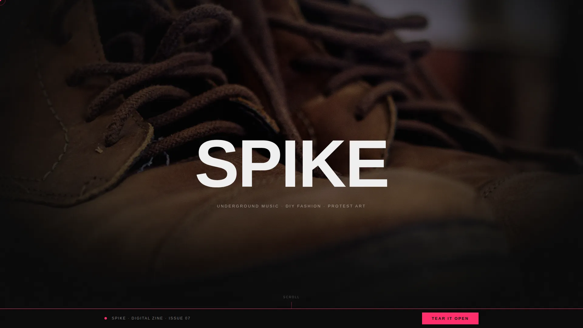
- A full-viewport spotlight header featuring a single dramatic object centered on absolute black, with the brand name appearing in 200-point condensed white type
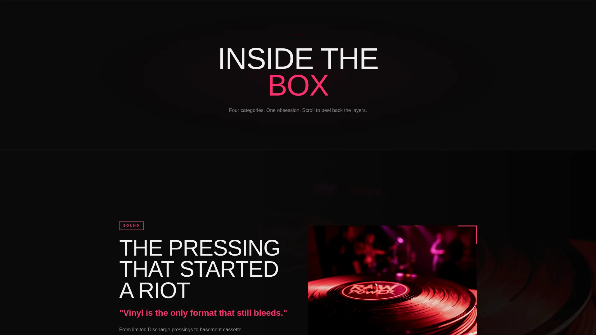
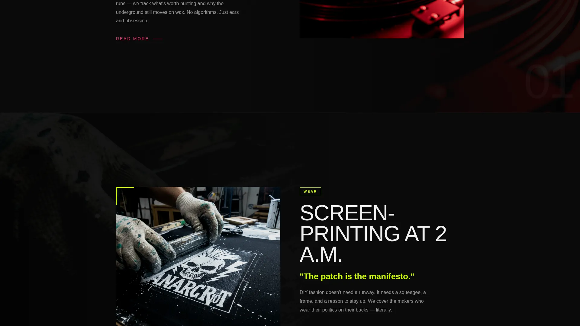
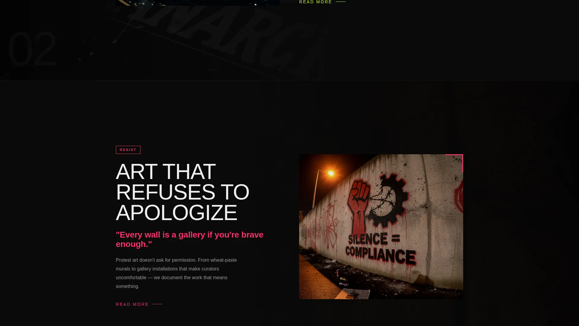
- Four editorial content category sections (Sound, Wear, Resist, Make) each revealed through a full-bleed photography scroll sequence with tight editorial typography
- A rotating preview carousel of three latest article cards, a primary "Tear It Open" call-to-action button, and a fixed magenta bottom bar that persists after the third section
Feature list
Spike delivers a focused set of design and layout features drawn directly from its punk editorial brief. Each feature serves the overall goal of building anticipation and delivering a decisive click-through.
Spotlight Hero Header
The header places a single object, a pair of battered leather boots, centered on an absolute black background, lit with precision. The brand name SPIKE appears in 200-point condensed white type across the full viewport, creating immediate visual tension between punk artifact and luxury presentation.
Scroll-Staged Unboxing Layout
The page unfolds in layers as the visitor scrolls. Each stage reveals a content category (Sound, Wear, Resist, Make) with full-bleed photography sliding in from the edges and editorial text appearing in tight, deliberate typography, replicating the tactile experience of opening a subscription box.
Rotating Article Preview Carousel
A three-card carousel shows the latest articles from the blog, each card displaying a headline, hero image, and category tag. This section proves the content is worth entering before the visitor ever clicks through.
Fixed Magenta Call-to-Action Bar
After the third scroll section, a persistent bottom bar appears in hot magenta against black. It keeps the primary call to action ("Tear It Open") visible without interrupting the editorial flow, reinforcing the click-through goal throughout the rest of the page.
Neon Shock Color System
The palette uses void black (#0A0A0A) as the dominant background with hot magenta (#FF2D6B) for headlines and hover states, electric chartreuse (#CCFF00) for accent tags and pull-quotes, and cool surgical white (#F0F0F0) for body text. Color is used sparingly so every appearance carries weight.
Editorial Typography System
The template uses condensed, high-contrast type at extreme scales. Headlines and brand marks appear at display sizes while body text floats clean and legible in white against dark backgrounds, reflecting the visual language of printed zines and underground editorial design.
Page sections overview
| Section | Purpose |
|---|---|
| Spotlight Hero | Introduces the brand with a dramatic full-viewport image and oversized type |
| Sound Category | Reveals underground music editorial content through full-bleed photography |
| Wear Category | Presents DIY fashion content with scroll-triggered photography and typography |
| Resist Category | Surfaces protest art and activism editorial content in a staged reveal |
| Make Category | Showcases creative process content as the final unboxing layer |
| Article Preview Carousel | Displays three latest article cards to prove content quality before the click |
| Primary call to action Block | Delivers the "Tear It Open" button at the end of the unboxing sequence |
| Fixed Bottom Bar | Keeps the magenta call-to-action persistent after the third scroll section |
Design & branding system
The visual identity is built around a Luxe Minimal theme that uses extreme restraint to make color feel electric. Black owns ninety percent of the canvas. When magenta or chartreuse appears, it is always intentional and always jarring in the best possible way.
- Color system: void black (#0A0A0A) background, hot magenta (#FF2D6B) for headlines and hover states, electric chartreuse (#CCFF00) for accent tags and pull-quotes, cool surgical white (#F0F0F0) for body text
- Typography: condensed display type at extreme scales for headlines and brand marks, with clean white body text that reads like a well-printed zine page
- Photography direction: full-bleed, high-contrast editorial imagery sliding in from the edges of the viewport, paced to feel like lifting tissue paper from a matte-black box
Mobile & speed optimization
The full-width immersive layout is structured to maintain its visual hierarchy and scroll pacing across screen sizes. The staged reveal approach keeps individual sections focused and lightweight.
- Each scroll stage is isolated, meaning only one content layer is in view at a time, which keeps the visual experience clean on smaller screens
- Full-bleed photography and large type scale proportionally, preserving the tension between dark backgrounds and bright accent colors on mobile displays
- The fixed magenta bottom bar is designed to sit unobtrusively at the base of the screen without obscuring editorial content on any viewport size
How this template helps you convert
Spike is built as a click-through landing page with a single conversion goal: get the visitor to enter the blog. Every design and structural decision supports that outcome.
- The unboxing sequence builds anticipation across multiple scroll stages, so by the time the "Tear It Open" button appears, the visitor already feels invested in what comes next
- The article preview carousel gives concrete proof of content quality before the click, reducing hesitation by showing real headlines, images, and category tags
- The fixed magenta bottom bar ensures the primary call to action stays visible throughout the lower half of the page without requiring the visitor to scroll back up
Other information about this template
Spike sits at the intersection of punk fashion, underground music culture, and high-concept editorial design. It is built for a specific kind of reader and a specific kind of brand.
- The target audience spans vinyl collectors, non-binary DIY fashion creators, and creative professionals who hold both underground credibility and refined visual taste
- The content categories (Sound, Wear, Resist, Make) are structured as editorial pillars, making the template adaptable to any punk lifestyle blog with multiple content verticals
- The template style is Full-Width Immersive with a Luxe Minimal theme, a Neon Shock color system, a Spotlight header concept, an Unboxing Experience creative direction, and a Click-Through landing page direction
- No forms, fields, or sign-up flows are included; the only conversion action is a single click, keeping the experience frictionless and editorially pure
- The matte-black box metaphor runs through every design decision, from the initial hero reveal to the persistent call to action bar, giving the page a coherent conceptual identity from first scroll to last
Theme
Luxe Minimal
Creative direction
Unboxing Experience
Color system
Neon Shock
Style
Full-Width Immersive
Direction
Click-Through
Page Sections
Spotlight Hero Header
Scroll-staged Unboxing Layout
Rotating Article Preview Carousel
Fixed Magenta Call-to-action Bar
Neon Shock Color System
Editorial Display Typography
Related questions
What kind of blog is this template designed for?
Does this template include a sign-up form or email capture?
Can I adapt the content categories to fit my own editorial pillars?
Who is the intended audience for this template?
What makes this different from a standard blog landing page?



