Software & SaaS Cost Estimator Website Template
Splice is a dark-themed bento grid landing page built for browser-based video editing software. It features a cinematic full-bleed header, an interactive render-time estimator, and a frosted glass card layout that demonstrates the product before asking for a sign-up. The design runs on a Carbon Fiber color system with electric violet accents and converts visitors through a zero-field freemium entry point.
by Rocket studio
Quick summary
Splice is a single-page bento grid landing page template built for a browser-based video editing SaaS. The design uses a dark Carbon Fiber palette with frosted glass cards and electric violet glows. A tool-first layout leads with an interactive render-time estimator, then cascades through live demo cells that prove the product before the visitor reaches the call-to-action.
Who this template is for
This template is designed for video editing SaaS founders and product teams who need a high-converting landing page that speaks directly to working creators. It suits teams launching a browser-based editing tool and wanting to lead with product capability rather than marketing copy.
- Solo content creators and YouTubers who upload on tight weekly schedules
- Freelance video editors managing multiple client projects at the same time
- Social media managers who need to resize and reformat footage for several platforms quickly
What problem this template solves
Most video editing software landing pages rely on feature lists and screenshots. Visitors leave without ever feeling the product. Splice flips that pattern by making the landing page itself an interactive proof of capability.
- Visitors use a render-time estimator before reading a single headline, so trust is earned through action
- The bento grid removes the need to scroll through long paragraphs to understand what the tool does
- A zero-field sign-up flow eliminates friction at the final conversion step, reducing drop-off at the moment of intent
What you get with this template
You get a fully designed, single-page bento grid layout built around the visual identity and conversion flow described in the brief. Every section is ready to customize with your own copy, colors, and interactive logic.
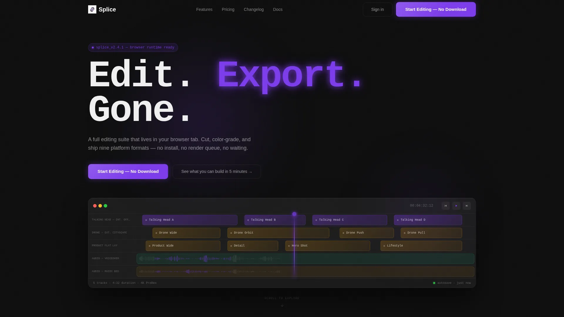
- A cinematic dark full-bleed header with a glowing timeline interface as the hero visual
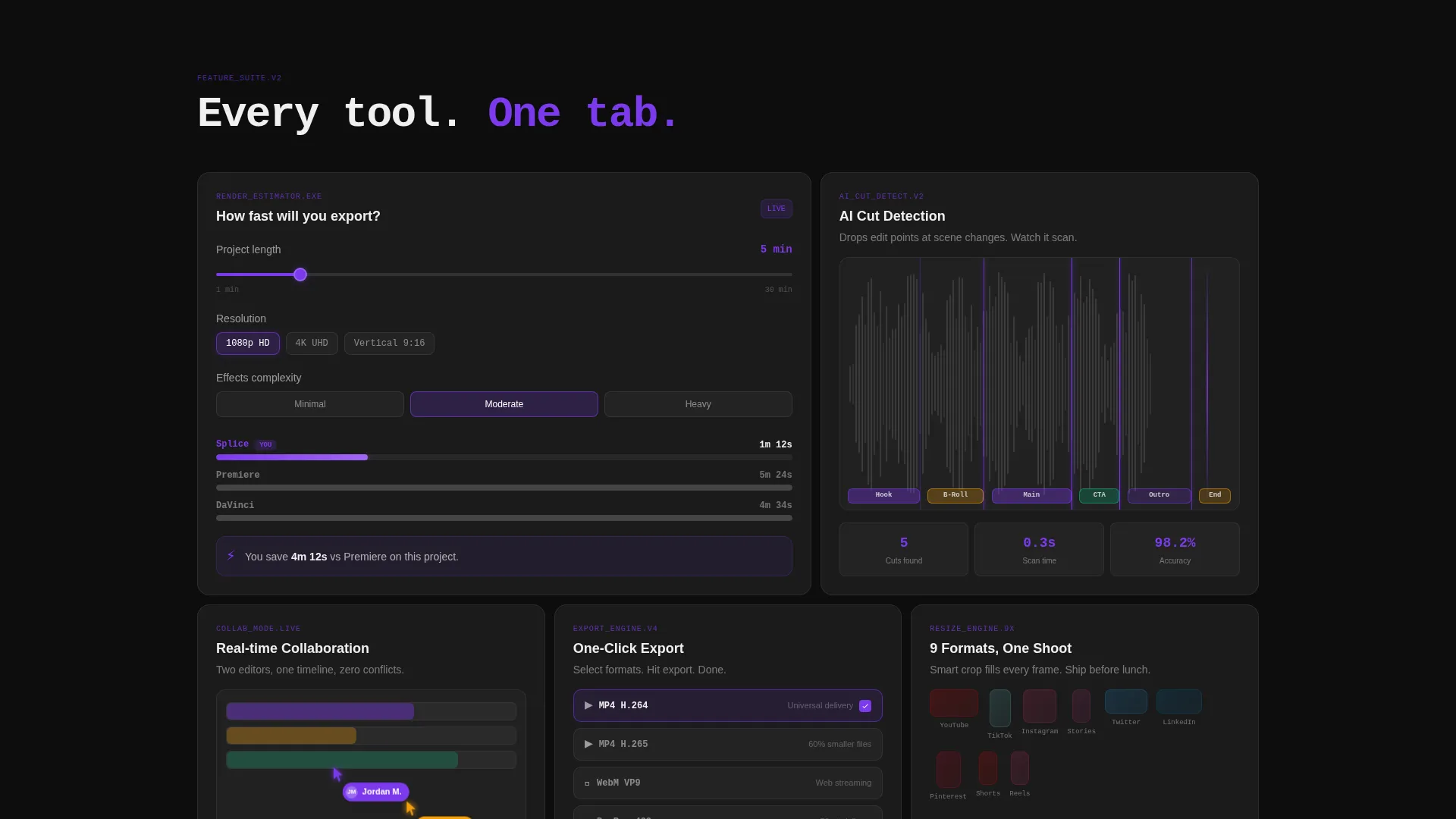
- A bento grid body with individual frosted glass cells for the estimator, demo loops, collaboration preview, and export formats
- Two strategically placed calls-to-action using freemium copy and a secondary ghost-button for a sample project entry point
Feature list
This template is built around a small set of high-impact components. Each one serves a specific role in the conversion flow.
Interactive Render-Time Estimator Cell
The first bento cell below the fold holds a live estimation tool. Visitors drag a slider for project length, pick a resolution (1080p, 4 K, or vertical), and toggle effects complexity. The cell instantly displays an estimated export time so the speed advantage is felt before any copy makes the claim.
Cinematic Timeline Hero Header
The header fills the full viewport with a pure dark canvas. A cinematic timeline interface materializes from the background, with violet luminance bleeding through frosted glass panels. The playhead glows and pulses. Waveforms animate. Thumbnail strips on the timeline show a talking head, a drone shot, and a product flat lay so every visitor type sees their own workflow reflected.
Bento Grid Demo Cell Layout
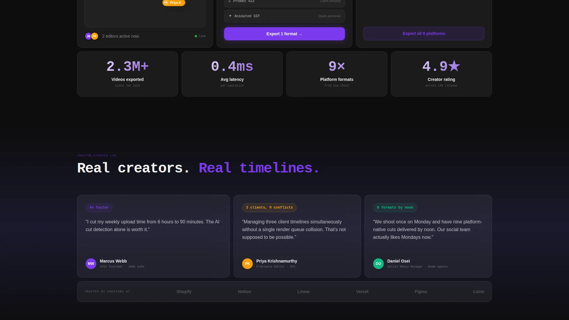
The remaining bento cells each carry one proof point. One cell auto-plays a six-second looping demo of AI-powered cut detection. Another shows a real-time collaboration cursor with two editor avatars on the same timeline. A third stacks five export-format icons with a single-click badge. Each cell is a frosted glass card with a violet edge-glow on hover.
Dual-Placement Freemium Call-to-Action
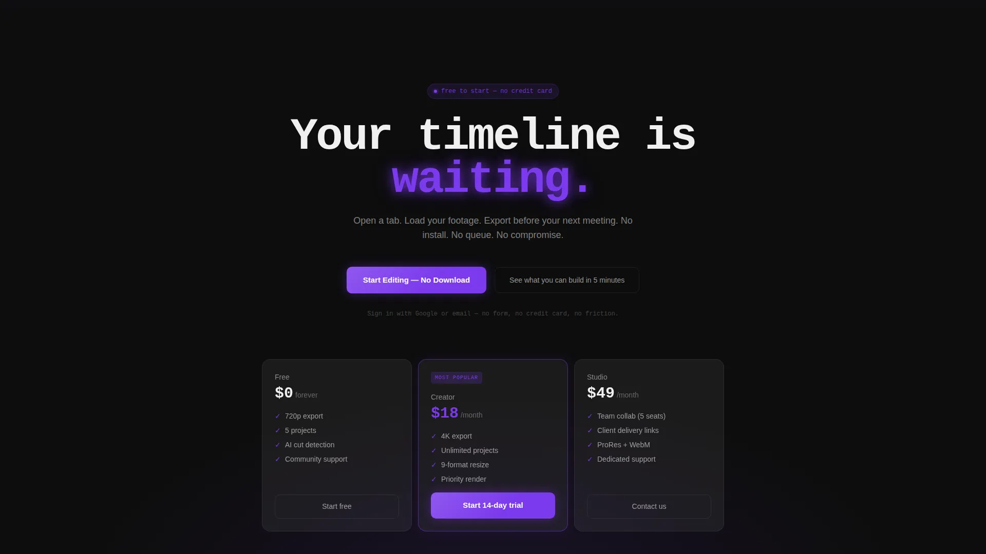
The primary call-to-action reads "Start Editing - No Download" and appears twice: once floating inside the header after a two-second delay, and once anchored at the bottom of the bento grid. A secondary ghost-button beneath reads "See what you can build in 5 minutes" and links to a pre-loaded sample project in the editor.
Zero-Field Sign-Up Entry Point
Clicking the primary call-to-action opens a zero-field entry point. Sign-in uses Google or email single sign-on only. There is no form to fill out and no credit card required. The estimator has already done the persuasion work; this step just removes the last barrier.
Tech Glass Frosted Card System
Every bento cell uses a frosted glass panel built with a white fill at six percent opacity and backdrop blur. Violet edge-glow activates on hover. The card system creates a tactile, premium feel that matches the flagship-device aesthetic described in the visual brief.
Page sections overview
| Section | Purpose |
|---|---|
| Full-Bleed Header | Cinematic timeline hero with glowing playhead and delayed call to action appearance |
| Render-Time Estimator | Interactive tool cell that proves export speed before the pitch begins |
| AI Cut Detection | Looping demo cell showing automated cut detection in action |
| Collaboration Preview | Real-time cursor cell showing two editors working on one timeline |
| Export Formats Cell | Single-click export badge stacking five platform-native format icons |
| Bottom call to action Block | Anchored freemium call to action with ghost-button link to a sample project |
Design & branding system
The visual identity runs on a Carbon Fiber color system built for dark environments. Every surface, glow, and transition is intentional and tied to a specific role in the interface.
- Core palette: deep matte black (#0D0D0D) for the canvas, woven carbon gray (#1A1A2E) for structural surfaces, frosted glass panels at six percent white opacity with backdrop blur, and electric violet (#7C3AED) reserved for glowing accents, active states, and call-to-action pulses
- Typography uses a monospaced weight for the hero headline, giving the interface a terminal-output feel that matches the dark-screen aesthetic
- Hover states on every bento card activate a violet edge-glow, making the layout feel responsive and alive without requiring any clicks
Mobile & speed optimization
The bento grid layout is designed to reflow cleanly on smaller screens. Each frosted glass card is a self-contained block, which makes responsive stacking straightforward without breaking the visual hierarchy.
- Individual bento cells stack vertically on mobile so the estimator and demo cells remain usable on touch devices
- The dark background and minimal asset count keep the layout visually coherent even on lower-brightness mobile screens
- Backdrop blur and opacity-based glass effects are handled through CSS, keeping the component count low
How this template helps you convert
The conversion strategy in this template is built around proof before pitch. Every layout decision reduces the distance between arriving on the page and deciding to sign up.
- The render-time estimator is the first interactive element a visitor encounters, making the product's speed advantage tangible before any marketing claim appears
- The bento grid sequences proof points cell by cell, so the visitor has mentally used the product before reaching the call-to-action at the bottom
- The zero-field sign-up flow means that when a visitor is ready to act, there is nothing in the way, no form, no credit card prompt, just immediate access
Other information about this template
This template is part of a broader set of Tech Glass themed SaaS landing page designs built for dark-interface software products. A few additional context points are worth noting for teams evaluating this template.
- The template style is Bento Grid, which is well suited to SaaS tools that have multiple distinct capabilities to showcase without requiring long scrolling copy
- The header concept is Dark Full-Bleed with a Glow treatment, a pattern that works particularly well for video, audio, and creative-tool products where the interface itself is the most compelling visual asset
- The creative direction is Calculator/Tool First, meaning the interactive estimator is not decorative, it is the lead conversion mechanism and should be wired to real data when the template goes live
- The freemium and trial conversion direction means the template is optimized for sign-up volume over revenue capture at the first touch, which aligns with product-led growth models common in video editing SaaS
Theme
Tech Glass
Creative direction
Calculator/Tool First
Color system
Carbon Fiber
Style
Bento Grid
Direction
Freemium/Trial
Page Sections
Interactive Render-time Estimator
Cinematic Full-bleed Header
Bento Grid Proof Cell Layout
Dual-placement Freemium Call to Action
Zero-field Sign-up Entry Point
Tech Glass Frosted Card System
Related questions
Is this template designed for a single page or multiple pages?
Can I customize the bento grid cell layout?
Does the render-time estimator come with working logic built in?
What sign-up flow does this template support?
Who is the ideal user for this template?



