Micro-SaaS & Developer Tools Specialist Professional Website Template
Split is a modular card grid landing page built for A/B testing tools. It opens with a live-rendered code snippet that sets the tone instantly, then unfolds a browsable grid of experiment archetypes and integration cards. Every interaction builds visitor confidence. The page drives one action: a free-tier signup click, with zero form fields in the way.
by Rocket studio
Quick summary
Split is a single-page, click-through landing page template designed for A/B testing platforms. The header leads with a syntax-highlighted code snippet, and the modular card grid below lets visitors explore experiment types and integrations by hovering and flipping cards. No hero image, no long pitch, just immediate, interactive proof that the product works.
Who this template is for
This template is built for product and growth teams who need to sell the concept of experimentation before asking for a signup. It suits technically fluent audiences who respond to code over copy.
- Growth leads at Series B software-as-a-service companies running multiple experiments per month
- E-commerce managers concerned about cart abandonment and conversion rate drop-off
- Solo founders who need data to make product decisions without a large team or budget
What problem this template solves
Most landing pages for developer tools bury the product behind marketing language. Visitors arrive skeptical and leave unconvinced. This template solves that by putting the actual product experience front and center from line one.
- It removes the gap between "reading about the tool" and "seeing the tool in action"
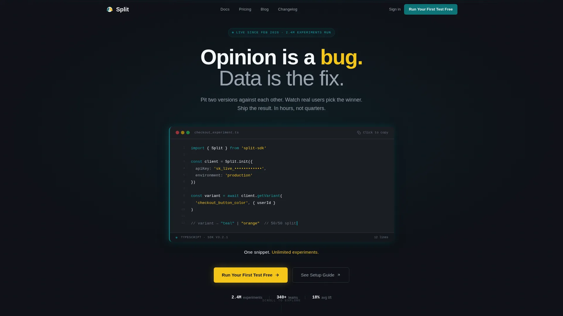
- It gives technically cautious visitors a low-commitment path through the "See Setup Guide" ghost button
- It eliminates friction by keeping the page entirely form-free until the final signup click
What you get with this template
You get a fully structured, single-page layout built around interactive discovery. The design system is ready to apply, and every section has a defined purpose tied directly to conversion.
- A code snippet header with syntax highlighting, a blinking cursor, and a "Copied" toast animation on click
- A modular card grid with flip animations showing experiment archetypes and integration code snippets
- A floating call-to-action bar that pins after the first scroll, reading "Run Your First Test Free"
Feature list
This template ships with a set of purpose-built components that work together to move a skeptical technical visitor toward a confident signup click.
Live Code Snippet Header
The header renders a twelve-line maximum syntax-highlighted code block showing the software development kit initializing a real experiment called checkout_button_color. A soft teal glow runs along the left border, a blinking cursor sits at the end of the last line, and clicking the block fires a "Copied" toast animation. The single line beneath it reads: "One snippet. Unlimited experiments."
Flip Card Experiment Grid
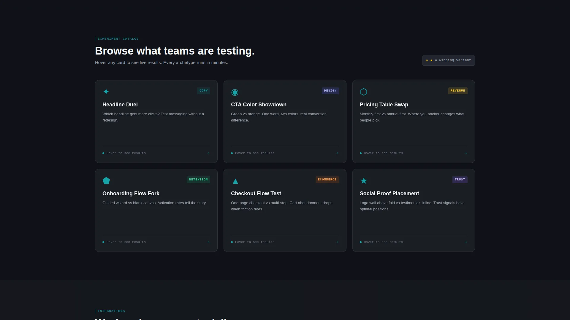
Each card in the primary grid represents a real experiment archetype: Headline Duel, Pricing Table Swap, Call-to-Action Color Showdown, and Onboarding Flow Fork. Hovering any card flips it to reveal a miniature live bar chart with two variants and percentages ticking upward. This turns browsing into a hands-on preview of what running experiments actually feels like.
Integration Card Section
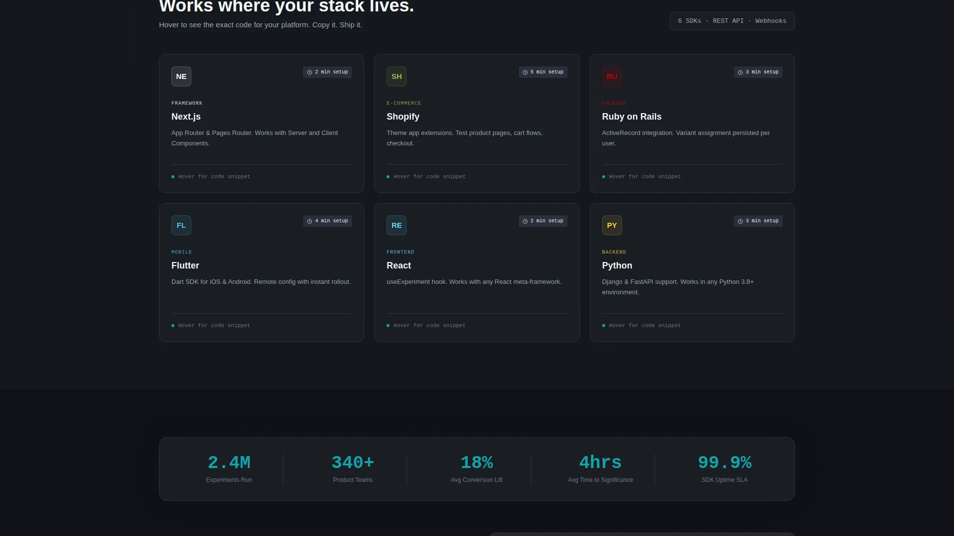
As visitors scroll deeper, the card grid transitions from experiment archetypes to integration cards covering frameworks and platforms named in the brief. Each integration card shows its own code snippet on flip, letting developers validate compatibility quickly without leaving the page.
Floating call to action Bar
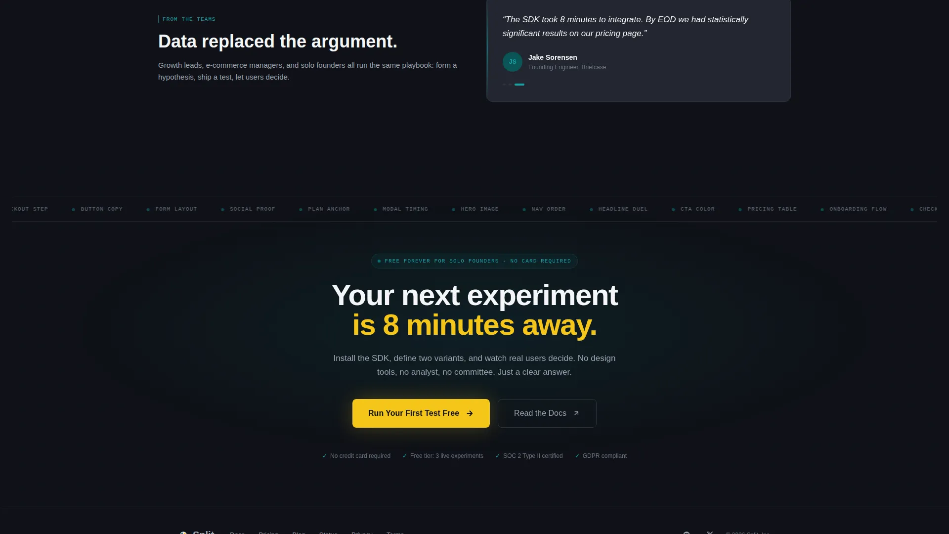
After the first scroll, a sticky call-to-action bar pins to the page. The primary button reads "Run Your First Test Free" in spark yellow on teal. It stays visible throughout the entire browsing experience, so the next step is always one click away regardless of scroll depth.
Ghost Button Secondary Path
Every card flip-side carries a ghost button reading "See Setup Guide" that routes to the documentation. This gives technically cautious visitors a zero-pressure way to go deeper before committing to signup, reducing the risk of losing them entirely.
No-Form Click-Through Flow
There are no form fields anywhere on this page. The entire conversion strategy is built around accumulated interactive discovery leading to a single click. Visitors interact with a dozen mini-experiments before they ever see a signup screen, arriving there already convinced.
Page sections overview
| Section | Purpose |
|---|---|
| Code Snippet Header | Immediate product proof via live-rendered integration code |
| Experiment Archetype Grid | Browsable flip cards showing real test categories |
| Integration Cards Section | Framework-specific code snippets revealed on hover |
| Floating call to action Bar | Persistent signup prompt pinned after first scroll |
| Ghost Button Layer | Low-commitment documentation path on every card |
Design & branding system
The visual identity follows a Directory and Discovery theme powered by the Teal Catalyst color system. Every color choice has a functional role, not just a decorative one.
- Deep lab teal (#0D7377) is the primary action color used for borders, buttons, and telemetry-style accents
- Reactor-core charcoal (#1A1D23) forms the card backgrounds and main canvas, creating a mission control aesthetic
- Clinical white (#F4F6F8) handles all typography and data readouts for maximum legibility on dark surfaces
- Spark yellow (#F5C518) appears exclusively on winning-variant indicators and hover states, making significance visually unmistakable
Mobile & speed optimization
The modular card grid layout is structured to adapt cleanly to smaller viewports. Flip interactions and the floating call-to-action bar are designed to function on touch-based devices.
- Card grid columns reflow for tablet and mobile screen widths without breaking the flip animation logic
- The floating call to action bar remains accessible at the bottom of the viewport on mobile, keeping the primary action always reachable
- The code snippet header is contained within a scrollable block on narrow screens so it does not break the page layout
How this template helps you convert
This template earns the click through progressive interaction rather than persuasion copy. By the time a visitor reaches the bottom, they have already experienced the product mentally.
- The code snippet header creates immediate credibility with a technical audience, replacing a hero image with actual product output
- The card grid builds conviction through accumulated discovery, with each flip reinforcing that the tool covers their specific use case
- The floating call to action bar and zero-form-field policy remove every possible friction point between intent and action
Other information about this template
This template is built specifically for the A/B testing tool niche within the Micro-SaaS and Developer Tools subcategory. It is designed to sit at the intersection of technical credibility and conversion-focused design.
- The Interactive Explorer creative direction means the page functions more like a product catalog than a traditional landing page
- The Click-Through landing page direction keeps all conversion momentum pointed at a single off-page signup, with no distractions
- The template style is Card Grid (modular), making it straightforward to add, remove, or reorder cards as an experiment library grows
- The Teal Catalyst color system is purpose-built for data-heavy interfaces where users need to parse information quickly
Theme
Directory & Discovery
Creative direction
Interactive Explorer
Color system
Teal Catalyst
Style
Card Grid (Modular)
Direction
Click-Through
Page Sections
Live Code Snippet Header
Flip Card Experiment Grid
Integration Cards with Code Snippets
Floating Call to Action Bar After Scroll
Ghost Button Secondary Path
Zero-form Click-through Layout
Related questions
Does this template require any form fields on the page?
Can I change the experiment archetypes shown in the card grid?
What does the ghost button on each card do?
Is the code snippet in the header functional or purely visual?
Who is this template designed for?



