Cleaning Service Email Newsletter Landing Page
Spotless is a comparison table landing page built for cleaning service owners who need a ready-to-send email newsletter toolkit. It comes with written subject lines, seasonal promotions, before-and-after photo blocks, and rebooking nudges. A Monochrome Steel visual system and live feature matrix help solo operators, office managers, and franchise owners choose the right plan fast.
by Rocket studio
Quick summary
Spotless hands cleaning service owners a complete email newsletter toolkit before they send a single message. Subject lines, seasonal promotions, before-and-after photo blocks, and rebooking nudges are already written and designed. The landing page uses a comparison table format with a live feature matrix, so buyers can evaluate tiers and pick a plan in one focused visit.
Who this template is for
This template was built for three distinct cleaning business profiles. Each one loses clients between appointments because follow-up emails never get written, designed, or sent.
- Solo operators running a small crew who need professional newsletters without a marketing budget
- Office managers at mid-size janitorial companies handling multiple commercial contracts at once
- Franchise owners who need brand-consistent email campaigns across many territories without a dedicated marketing team
What problem this template solves
Cleaning businesses often do strong work but fail to stay in touch between jobs. Clients quietly drift to competitors because no one sent a timely reminder, a seasonal offer, or a simple rebooking prompt.
- Ready-written content removes the blank-page problem that stops most operators from emailing clients at all
- A structured comparison table helps buyers match the right template tier to their business size and needs
- Pre-designed photo blocks and nudge copy mean newsletters go out consistently, not just when there is spare time
What you get with this template
The page delivers a full evaluation experience alongside the toolkit preview. Visitors see what each tier includes before they ever click a buy button.
- A sticky stats header with live counters showing real sending volume, rebooking rate lift, and average setup time
- A toggling comparison table covering three collections: Residential, Commercial, and Franchise
- Animated email preview cards that render each template in a mock inbox beside its feature explanation
- A secondary demo path that sends a live sample email to the visitor within sixty seconds, requiring only an email address
Feature list
This section describes the core functional components included in the Spotless landing page template.
Stats and Metrics Header Wall
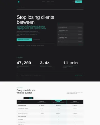
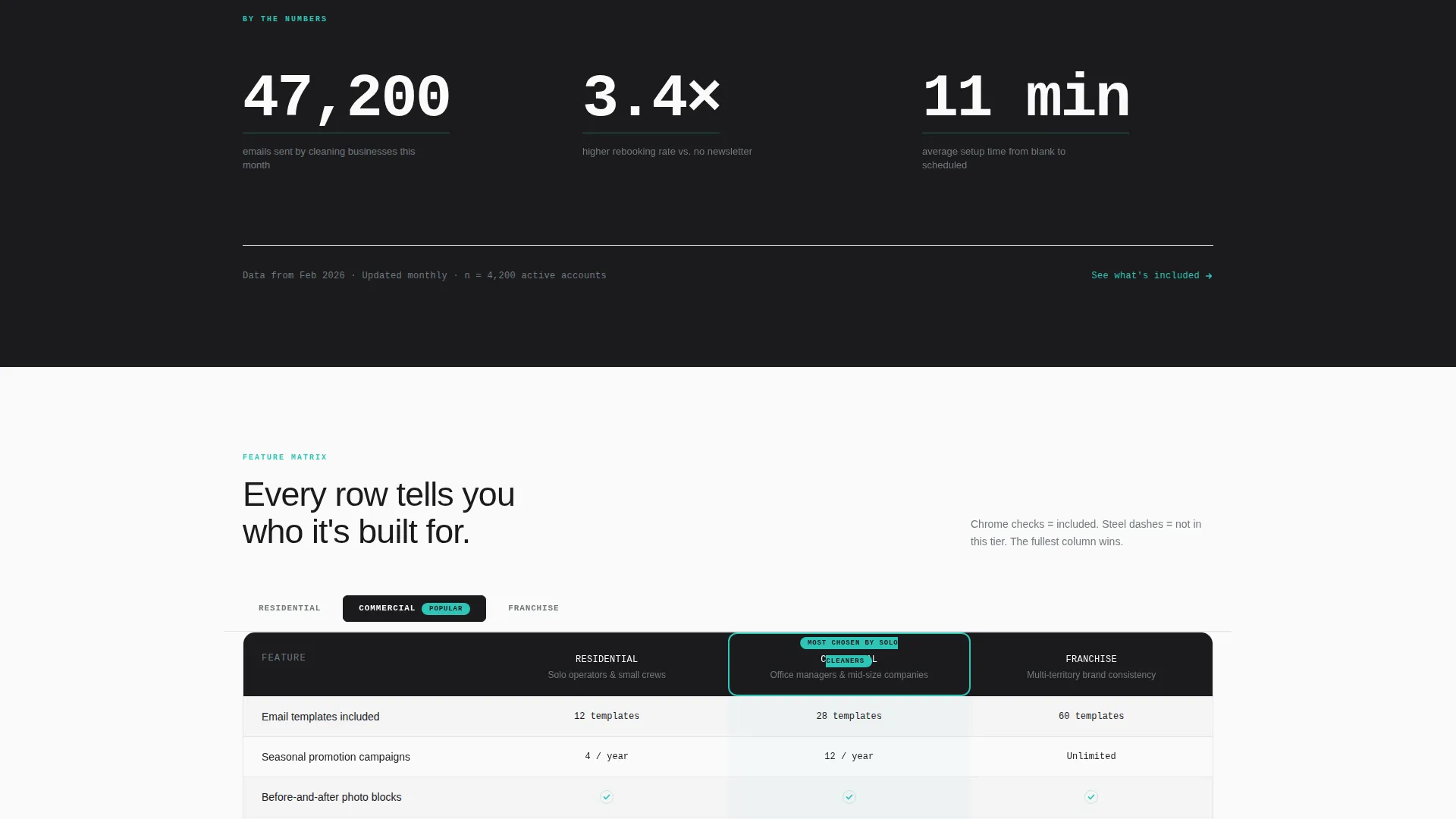
Three oversized counters open the page against a forge black background. Each counter displays a live-updating number tied to real sending behavior, rebooking outcomes, and setup speed. The monospaced typeface and teal accent pulse give the header the feel of a real-time dashboard.
Toggling Comparison Table
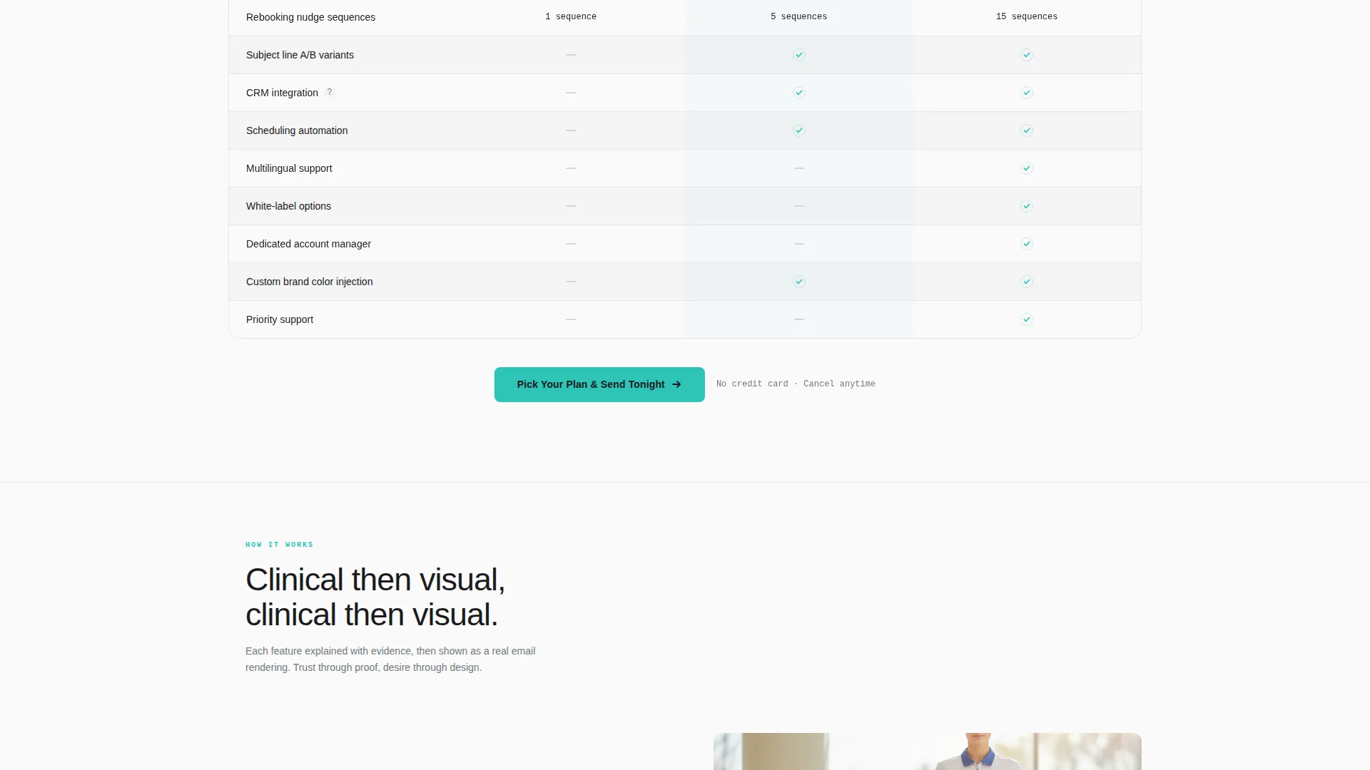
A sticky horizontal navigation bar lets visitors switch between Residential, Commercial, and Franchise collections. The comparison table below updates row by row to reflect each collection's feature set. Chrome checkmarks and steel dashes make differences immediately readable at a glance.
Animated Email Preview Cards
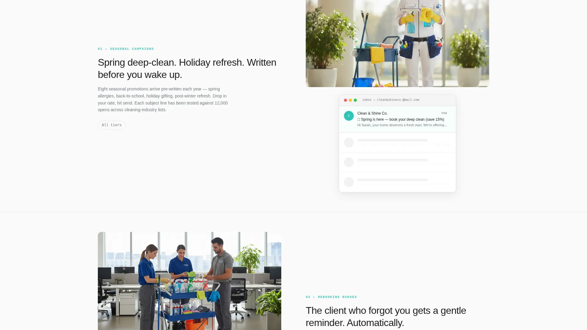
As visitors scroll past each comparison row, an animated email preview slides in beside the feature explanation. The preview renders the actual template design inside a mock inbox frame. This rhythm of evidence followed by visual design builds trust before triggering a buying decision.
Sticky Bottom Bar with Primary call to action
A persistent bottom bar appears after the visitor scrolls past the first comparison table. It carries the primary call to action and stays visible throughout the rest of the page. This keeps the conversion path accessible without interrupting the reading flow.
Friction-Free Demo Email Path
A secondary conversion path lets visitors receive a live sample email within sixty seconds. The form requires only an email address, no name, no company, no additional fields. This low-commitment option serves buyers who are not yet ready to choose a plan.
Most Chosen Badge and Pre-Selection Logic
The most popular tier is visually heavier, pre-selected in the table, and annotated with a contextual badge. The badge text speaks directly to solo operators who recognize themselves in that column. This gentle visual hierarchy guides hesitant buyers toward the most relevant choice.
Page sections overview
| Section | Purpose |
|---|---|
| Stats Metrics Header | Open with three live counters that establish credibility through sending data and rebooking outcomes |
| Collection Toggle Nav | Let visitors switch between Residential, Commercial, and Franchise template collections |
| Comparison Feature Table | Display tier-by-tier feature rows using chrome checkmarks and steel dashes for instant clarity |
| Animated Preview Cards | Show actual template designs rendering in a mock inbox beside each feature explanation |
| Sticky Bottom Bar | Keep the primary call to action visible after the visitor scrolls past the first table |
| Demo Email Capture | Offer a one-field form that delivers a live sample email within sixty seconds |
| Popular Tier Callout | Highlight the most chosen plan with a pre-selection state and a recognizable audience badge |
Design & branding system
The visual identity follows a Directory and Discovery theme built on a Monochrome Steel color system. Every color choice reinforces the idea of a clean, streak-free professional surface.
- Forge black (#1B1B1E) and clinical white (#FAFAFA) anchor the page in high contrast and structured clarity
- Brushed steel (#71797E) and bright chrome (#D4D4D8) provide secondary tones for table rows, dashes, and supporting text
- Antiseptic teal (#2EC4B6) is reserved exclusively for call-to-action buttons and checkmarks, drawing the eye to decisive moments
Mobile & speed optimization
The layout is designed to translate the full comparison experience to smaller screens without losing the structure that makes it persuasive.
- The sticky bottom bar and toggle navigation remain functional and visible on mobile viewports
- Table rows condense cleanly so checkmarks and dashes remain legible without horizontal scrolling
How this template helps you convert
Every section of the page is sequenced to move a skeptical buyer from curiosity to commitment. The flow is deliberate and evidence-led.
- The stats header establishes credibility immediately, so visitors arrive with confidence rather than doubt
- The comparison table converts passive browsing into active evaluation by making tier differences visible and concrete
- The demo email path removes the final hesitation by letting buyers experience the product before purchasing
Other information about this template
This template is well suited for cleaning service owners who want to start sending newsletters the same day they buy. It is built around a Feature Matrix creative direction paired with a Comparison and Versus conversion strategy, making it one of the few cleaning service digital presence templates that leads with data before leading with design.
- The template style is a Comparison Table, matched to buyers who need to evaluate options before committing
- The header concept uses a Stats and Metrics wall, a format borrowed from software dashboards rather than traditional service marketing
- The page is designed as a single-page landing experience with a clear scroll path from data to decision
- It fits the Technology category within the Cleaning Service Digital Presence subcategory, meaning it is positioned for digitally aware operators rather than first-time website builders
Theme
Directory & Discovery
Creative direction
Feature Matrix
Color system
Monochrome Steel
Style
Comparison Table
Direction
Comparison/Versus
Page Sections
Stats and Metrics Header Wall
Toggling Comparison Table
Animated Email Preview Cards
Sticky Bottom Bar with Primary Call to Action
Friction-free Demo Email Path
Popular Tier Pre-selection Badge
Related questions
Who is this landing page template built for?
Does this template include written email content?
What are the three template collections available?
How does the demo email feature work?
Can franchise owners use this across multiple territories?



