Micro-SaaS & Developer Tools Professional Website Template
The Tick Startup Velocity to-do list app landing page template is a scroll-reveal, single-page experience built for indie founders, freelance developers, and design leads who need a fast, visually electric app landing page. It uses a glassmorphic void-black and electric-indigo design system, GSAP-powered progressive animations, and a brutally minimal lead-gen form to turn landing page visitors into early-access signups.
by Rocket studio
Quick summary
Tick is a productivity app landing page template built for speed and early-access lead generation. It delivers a dark, glassmorphic scroll-reveal experience where each section assembles itself on screen as the visitor scrolls. The app landing page captures email signups through a single-field form and a floating call to action bar that locks in place after the first scroll. Every design decision prioritizes clarity, velocity, and conversion.
Who this template is for
This app landing page is purpose-built for a very specific kind of builder. If you are shipping a productivity tool, a task manager, or any developer-facing mobile application and you need a professional landing page that earns trust before asking for anything, this template is built exactly for you.
The target audience for this template includes:
- Indie founders and solo developers launching a new app or early-access product who need a compelling pitch without weeks of design work
- Design leads managing multiple sprints who want a visually appealing, high-converting landing page they can deploy fast
- Micro-SaaS teams building web apps or mobile apps and running an early-access marketing campaign to validate demand before a full launch
What problem this template solves
Most startup landing pages fail because they bury the value proposition, overwhelm visitors with navigation options, and ask for too much information upfront. Potential users leave before they understand what the app offers or why it matters. A scattered layout creates a poor first impression that kills conversions before the call to action ever appears.
This template solves the core problems that kill startup landing page performance:
- It keeps the entire page focused on a single action, avoiding overwhelming visitors with multiple choices or a multi step form
- It demonstrates the app's interface and key features through progressive scroll animations before asking for any commitment, so potential customers already feel the product before they sign up
- It uses a floating call to action bar and a brutally minimal one-field email form so landing page visitors face zero friction when they are ready to convert
What you get with this template
You get a complete, code-ready scroll-reveal landing page template designed to demonstrate a productivity app and generate early-access email signups. The template is structured as a single-page flow with five animated sections and a footer, all driven by GSAP ScrollTrigger animations and a glassmorphic visual system.
Everything included in this template:
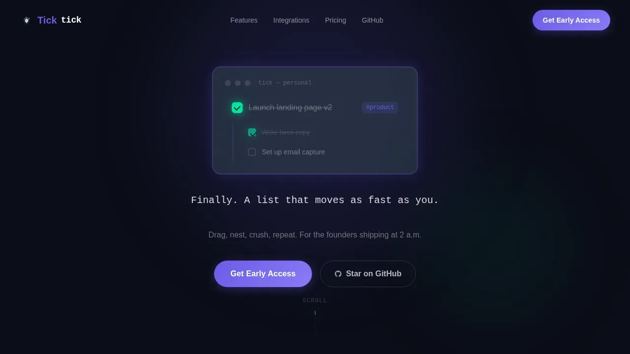
- A full-bleed hero section with an auto-completing task card, typewriter headline, and above-the-fold call to action in a frosted indigo pill button
- Four progressively revealed content sections covering nested project boards, keyboard shortcut demonstrations, an integrations dock, and a live animated task counter
- A floating bottom call to action bar that locks to the screen after the first scroll, a one-field email input, a ghost-outline secondary button, and a footer in the Vercel horizontal flow pattern
Feature list
The following section covers the key features built into this app landing page template. Each feature is grounded in the template brief and reflects what is actually delivered in the design and interaction layer.
Glassmorphic Void-Black Design System
The entire page runs on a cockpit-at-night visual identity. Backgrounds hold a deep void black at #0B0D17. Frosted glass panels float over that darkness at 12% white opacity. Electric indigo (#6C5CE7) drives all glowing accents and active hover states. Hot mint (#00E5A0) appears exclusively on completion checkmarks and success micro-animations. Every interactive element pulses with a soft indigo halo on hover. This is a visually appealing, cohesive system that makes the app's interface feel alive from the first scroll.
GSAP ScrollTrigger Progressive Reveal
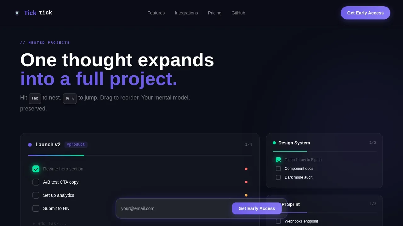
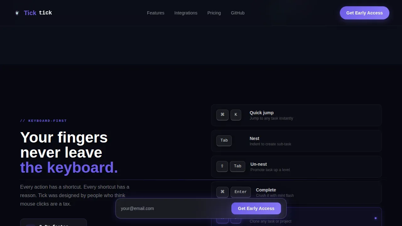
The scroll reveal is the core interaction model of this landing page. Each downward scroll reveals the next product layer like a rocket shedding a stage. The first scroll expands a single task into a nested project board with glass panels sliding in from the edges. The second scroll sends keyboard shortcuts flying across the screen in real time. The third scroll docks integration cards one by one with a glow ripple effect. The fourth scroll animates a live counter from zero to 1.4 million tasks completed. The entire page assembles itself in front of the visitor, making the product feel fast and confident.
Typewriter Hero with Auto-Complete Task Card
The hero section opens on a full-bleed void-black viewport with a single frosted glass task card fading in at center screen. Three seconds after load, the checkbox on "Launch landing page v2" auto-completes with a mint-colored flash and a particle burst. The headline then types itself below in monospace: "Finally. A list that moves as fast as you." This sequence communicates the app's unique value proposition through a live product demonstration before a single word of body copy is read, capturing the visitor's attention in just a few seconds.
Floating Locked Call to Action Bar
The primary call to action reads "Get Early Access" and appears first in the hero section. After the first scroll, it locks to a floating bottom bar that stays visible across the entire page. This is strategic placement of the conversion trigger, ensuring the call to action is always one click away. The form is one email field and one button, with zero additional inputs. A secondary "Star us on GitHub" ghost-outline button sits beside it for the open-source-curious visitor.
Integrations Dock Animation
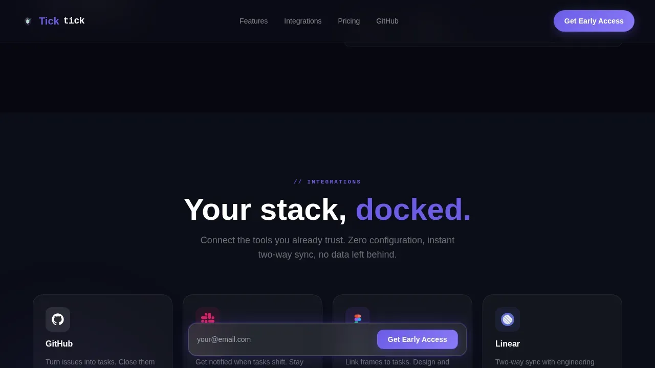
The third scroll section reveals integration cards for GitHub, Slack, and Figma. Each card lands on screen individually with a soft glass thud animation and a glow ripple effect. This section communicates tool compatibility through motion rather than a static list. The dock builds trust with the target audience by showing the app connects with the tools they already use daily.
Live Animated Task Counter
The fourth section features a counter that animates from zero to 1,400,000, representing tasks completed that week. This social proof element uses motion to build credibility with landing page visitors. The counter acts as a trust signal without requiring written customer testimonials or logos. It answers the question every potential user has: "Does anyone actually use this?"
Page sections overview
| Section | Purpose |
|---|---|
| Hero Full-Bleed | Opens viewport with auto-completing task card, typewriter headline, and above-the-fold call to action |
| Nested Project Board | Reveals drag-and-nest depth through glass panels sliding in from screen edges on first scroll |
| Keyboard Speed Showcase | Keyboard shortcuts animate across screen in real time to demonstrate speed and power-user features |
| Integrations Dock | GitHub, Slack, and Figma cards land one by one with glow ripple effects showing tool compatibility |
| Live Counter and Call to Action | Animated 1.4M task counter builds social proof; floating bottom bar locks in the email signup |
| Footer Flow | Vercel horizontal flow pattern provides clean page close with secondary navigation and links |
Design & branding system
This template runs a tight, intentional design language that reflects startup velocity through visual restraint and neon precision. The typography pairing of JetBrains Mono for headlines and code elements with Manrope for body copy creates a clear hierarchy between technical identity and readable explanation. White space is used deliberately throughout, keeping the layout open so each animated section lands with full visual impact. The hero image equivalent here is the auto-completing task card, which acts as the product demo and visual anchor of the entire page.
The design and branding system includes:
- Color palette: void black (#0B0D17) for backgrounds, frosted panel white at 12% opacity for glass cards, electric indigo (#6C5CE7) for accents and hovers, and hot mint (#00E5A0) reserved exclusively for completion states and success animations
- Typography: JetBrains Mono for headlines and interactive code-style text; Manrope for body paragraphs, creating contrast between the product's technical character and its human-readable explanations
- Interaction language: GPU-accelerated transforms, CSS smooth scroll, soft indigo halo on hover, particle burst on checkbox complete, and glass thud animations on integration card entry
Mobile & speed optimization
The template is designed desktop-first for power users at a keyboard. That said, the layout is built to be responsive across mobile devices so that mobile users accessing the page from a phone or tablet receive a coherent experience. Mobile optimization is a real consideration here because even developer-focused landing pages see significant traffic from mobile devices. The floating call to action bar, the single-field form, and the minimal layout all support usability on smaller screens without requiring layout restructuring.
Key mobile and speed considerations for this template:
- GPU-accelerated CSS transforms drive all animations, keeping scroll performance smooth on both the desktop version and mobile layouts without relying on heavy JavaScript repaints
- The single-field email form avoids a multi step form pattern entirely, which reduces friction for mobile users who find long forms tedious on small screens
- CSS smooth scroll is baked in, and the progressive reveal structure means content loads in visible stages rather than all at once, supporting perceived speed across mobile devices
How this template helps you convert
This template is built around the principle that a landing page should earn the click before it asks for it. By the time the floating call to action bar locks to the bottom of the screen, the visitor has watched the app complete a task, organize a project, display keyboard speed, and connect their favorite tools. The value proposition is demonstrated through motion, not claimed through copy alone.
Here is how the template's structure drives conversions:
- The hero section places a compelling headline and a prominent call to action above the fold, so landing page visitors can act immediately without scrolling. The auto-completing task card demonstrates the app's features in real time, giving potential customers a reason to stay and keep scrolling.
- Each subsequent section adds a new layer of social proof and product credibility through progressive animation, culminating in the live counter that shows 1.4 million tasks completed. By the time encouraging visitors to sign up feels natural, the case for the product has already been made visually.
- The floating bottom call to action bar removes the need for visitors to scroll back up to convert, and the one-field form keeps the commitment small, which is a proven pattern for increasing email list signups and reducing abandonment.
Other information about this template
This template sits inside the Micro-SaaS and developer tools niche, where the target audience is deeply skeptical of marketing copy and responds better to product demonstration than to written claims. The design philosophy here aligns with how the best-known app landing page examples in the productivity and SaaS space earn trust. Landing pages like those from productivity tools and developer utilities succeed by showing the app's unique features in context rather than listing them in bullet points.
Landing page templates like this one are a crucial tool for early-stage products because they provide a conversion-focused structure without requiring a full engineering sprint. Using a landing page template saves meaningful time during the critical window when a startup needs to validate demand, run a marketing campaign, and capture potential customers before the product ships.
Here are additional details worth knowing about this template:
- It is classified as a professional landing page template designed for a lead-generation objective, not a download or app store redirect flow. If your marketing strategy includes directing traffic toward the Apple App Store or Google Play, you can add app store badges to the footer section and link them to your app downloads page. The template structure supports that addition without layout changes.
- The template is not tied to a specific landing page builder platform. Teams using no-code tools or code-based workflows can both adapt the template. No-code builders can be used alongside high-converting landing page templates like this one, and the source structure is clean enough to port into most environments.
- Social proof elements in this template take the form of the animated live counter rather than written customer testimonials or logos. If you want to add customer testimonials or app store ratings for additional credibility, the glassmorphic card system provides a ready visual pattern for that expansion.
- The template uses device mockups only implicitly through the task card and nested project board panels. If your marketing campaign requires explicit device mockups showing the app in a phone or tablet frame, those can be inserted into the nested project board section using the existing glass card visual system.
- The tick startup velocity to do list app landing page template is optimized for early-access lead generation and is well-suited as the central link for any marketing campaign or marketing strategy targeting indie developers, design leads, and early-adopter founders.
- App landing page design best practices recommend using analytics tools to track user behavior over time. Connecting the page to analytics tools such as your preferred tracking platform will let you measure which sections hold the visitor's attention longest and where drop-off occurs, giving you data to improve conversion rates.
- Opal's landing page frames its features as lifestyle upgrades, making productivity feel personal and relatable. This template takes a similar approach by making speed feel visceral and immediate rather than abstract.
- Slack's landing page effectively conveys user-friendly design through clean visuals and straightforward messaging. The Tick template uses a comparable clarity-first structure while adding a significantly higher animation depth for a developer-native audience.
- Netflix's landing page reinforces its value proposition with a simple design that highlights benefits above everything else. This template mirrors that principle in the hero section, where the typewriter headline and auto-complete animation communicate the app's value proposition before any descriptive copy appears.
- No-code builders like Carrd or Unbounce can be used for high-converting landing page templates, and the structure of this template is compatible with that kind of landing page creation workflow for teams that prefer visual editors.
- The Apple App Store and similar distribution channels require a strong app landing page to warm up potential users before they reach the download page. This template can serve as that warm-up page, building intent before visitors are directed to app store badges or app downloads pages.
- The template's web design uses high quality images implicitly through animation rather than custom photography, keeping the visual system fast and coherent without relying on a custom photography budget.
- A/B testing is an essential practice for any high converting landing page. The minimal structure of this template, with its single call to action and one-field form, makes it straightforward to run A/B tests on the headline copy, button color, or counter placement to discover what resonates best with your specific target audience.
- The compelling headline approach used in this template answers "Why should I care?" in just a few seconds, which is a core requirement for any well designed landing page in the developer-tool niche.
- Web apps and mobile apps both benefit from a dedicated startup landing page rather than relying on a homepage to carry the full conversion load. This template gives web apps and mobile application products a standalone page that speaks directly and efficiently to the most likely early adopters.
Theme
Startup Velocity
Creative direction
Launch Energy
Color system
Glassmorphic
Style
Scroll Reveal (Progressive)
Direction
Lead Generation
Page Sections
Glassmorphic Void-black Visual System
GSAP Scrolltrigger Progressive Reveal
Typewriter Hero with Auto-complete Demo
Floating Locked Call to Action Bar
Integrations Dock with Glow Animations
Live Animated Social Proof Counter
Related questions
Can I change the color palette or typography in this template?
Does the template include the GSAP animations or do I need to add them separately?
Is this template suitable for a mobile application that distributes through the Apple App Store?
How does the floating call to action bar work on smaller screens?
Can I add customer testimonials or additional social proof to this template?



