Coaching Digital Presence Reviews Website Template
The Accelerate landing page template is built for sprint-based startup coaching platforms. It combines a Feature Tab Switcher header, head-to-head comparison tables, stat callout cards, a testimonial slider, and an app-download call to action. The Electric Indigo color system and dark IDE aesthetic give it a war-room intensity that resonates instantly with first-time founders and growth-focused professionals.
by Rocket studio
Quick summary
Accelerate is a single-page landing page template designed for sprint-based startup coaching platforms. It guides visitors through a structured Spec Sheet creative direction, pitting the platform against alternatives in head-to-head comparison tables. The result is a high-converting landing page that lets the data do the persuading before the app-download call to action ever appears.
Who this template is for
This template speaks directly to the people who are building something real, often alone, often late at night. It is engineered for coaching platform founders and course creators who need to convert skeptical, data-driven visitors into app users. Startups, agile teams, and growth-stage companies in the EdTech space will find the layout immediately familiar and credible.
- First-time founders bootstrapping early stage startups from personal savings and bedroom offices
- Mid-career professionals building side ventures before leaving stable employment, plus small agency owners at a revenue ceiling who need a structured plan to scale
- Course creators, coaching platform operators, and marketing professionals who want a landing page that earns the download tap through transparent, spec-by-spec proof
What problem this template solves
Most founders waste months on scattered resources. They test free content, purchase self-paced courses, and talk to coaches who never follow up. The core pain points are the same: no accountability, no peer context, no clear framework for the next stage of growth. A generic landing page cannot communicate the difference between yet another course and a genuinely structured coaching system.
This template solves that credibility gap. It uses hard data and side-by-side comparisons so visitors can do the math themselves. By the time a user reaches the call to action, the value proposition is already undeniable.
- Eliminates vague promises by replacing them with concrete specs: hours of live instruction, peer accountability frequency, mentor response time, and cost per quarter
- Removes the friction that causes visitors to bounce before converting, using a logical scroll flow that builds trust incrementally from hero to download button
- Addresses the specific pain points of early stage teams who are tired of vanity metrics and want measurable growth outcomes instead
What you get with this template
This template delivers a fully structured, single-page landing page with every section mapped to a specific conversion purpose. Each block is designed to advance the visitor's confidence and reduce hesitation. The intuitive layout keeps users focused on one goal: downloading the sprint app or previewing the first sprint free.
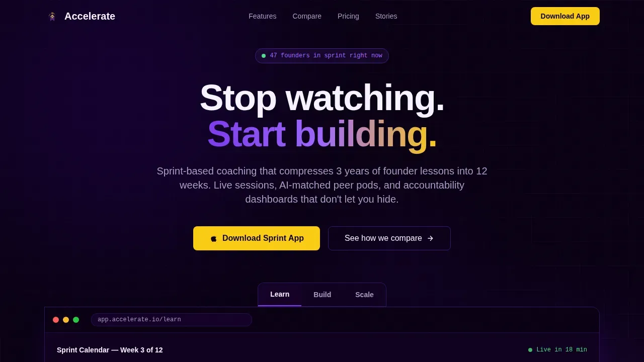
- Feature Tab Switcher header with three tabs (Learn, Build, Scale), each revealing a distinct live interface mockup showing a sprint calendar, a milestone tracker, and a revenue dashboard
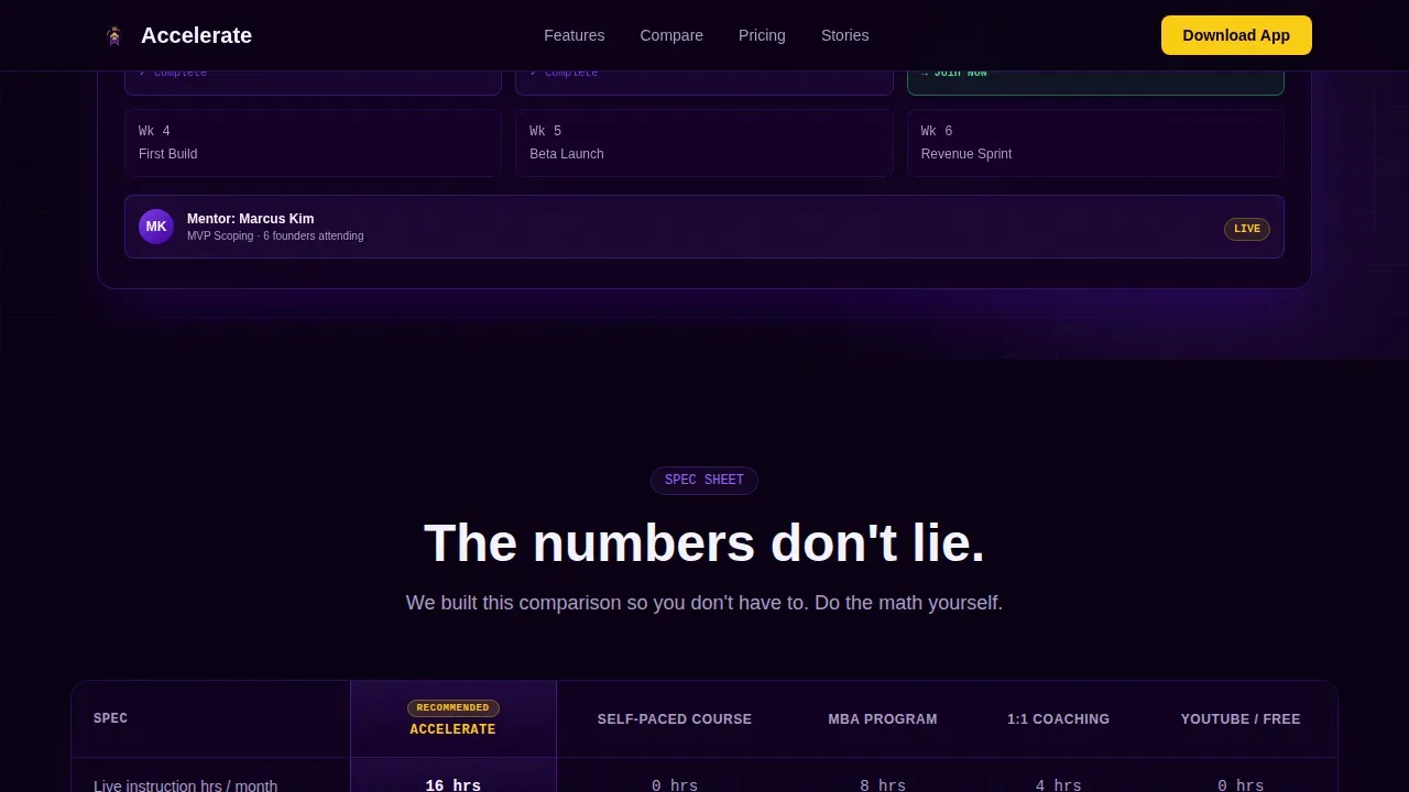
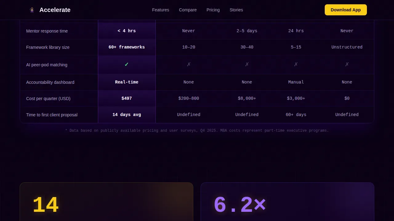
- Head-to-head Spec Sheet comparison tables pitting the platform against self-paced courses, traditional MBA programs, one-on-one coaching, and free YouTube content, with single-stat callout cards between each block
- App-download call to action section with App Store and Google Play badges, a phone-number field for SMS install links, and a secondary path offering a free sprint preview requiring only an email via a lightweight signup form
Feature list
This landing page template is built around six core features. Each one serves a specific role in the visitor journey, from first impression to final tap.
Feature Tab Switcher Header
The header uses three clickable tabs labeled Learn, Build, and Scale. Each tab snaps instantly to a different interface mockup: a sprint calendar with a live session indicator, a milestone tracker with drag-and-drop columns, and a revenue dashboard with an animating growth line. The transitions are immediate, with no fade, reinforcing the war-room speed the platform promises. This hero image approach answers the "Why should I care?" question within seconds and keeps user engagement high from the very first scroll position.
Head-to-Head Comparison Tables
The Spec Sheet creative direction places the platform beside four alternatives in structured comparison tables. Columns track concrete specs including hours of live instruction per month, peer accountability frequency, framework library size, mentor response time, and cost per quarter. This format removes vanity metrics from the conversation entirely. Visitors see the data, test the logic against their own situation, and arrive at the call to action already convinced. It is one of the best examples of letting numbers close the sale before the button appears.
Single-Stat Callout Cards
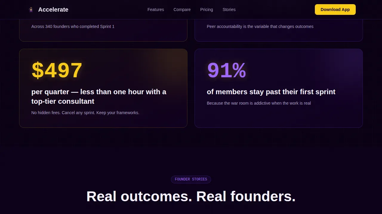
Between each comparison table, a full-width callout card surfaces one precise outcome stat, for example: "14-day average from signup to first client proposal." These cards maintain scroll momentum and give the reader a dopamine hit of specificity after absorbing a dense data table. They function as micro-proof points that reinforce the platform's value proposition without requiring the visitor to interpret a chart.
Testimonial Slider Section
A GSAP-powered testimonial slider presents outcome-specific quotes from founders with real company stages and revenue milestones. These are not generic praise statements. They are metric-heavy customer testimonials that highlight specific business results, following the principle that visible proof displayed prominently near the conversion zone is one of the most reliable ways to boost conversions. The slider format keeps the section compact while fitting multiple social proof data points into a single responsive block.
App Download Call to Action Section
The primary call to action reads "Download the Sprint App" and is paired with App Store and Google Play badges. A phone-number field lets mobile users request a direct install link via SMS. A secondary path labeled "Preview Your First Sprint Free" links to a web-based demo module that requires only an email address. The form fields are intentionally minimal, following the principle that reducing fields from six to three can increase conversions by up to 66 percent. The entire section uses the dark war-room aesthetic with ignition yellow reserved exclusively for actionable elements.
Scroll-Triggered Animation System
The template is built for high interactivity. GSAP ScrollTrigger powers section reveals, stat counter animations, and the testimonial slider. The tab switcher, comparison table highlights, and accordion-style elements all respond to user interaction without page reloads. This level of animation keeps user engagement sustained throughout the scroll and signals to early adopters that the platform itself is equally polished and purposeful.
Page sections overview
| Section | Purpose |
|---|---|
| Feature Tab Switcher | Hero with Learn/Build/Scale interface previews |
| Comparison Tables | Head-to-head specs versus. alternatives |
| Stat Callout Cards | Single-stat proof between data blocks |
| Testimonial Slider | Outcome-specific founder social proof |
| App Download call to action | Primary download + SMS + free preview path |
| Footer | Linear single-row navigation and links |
Design & branding system
The visual identity follows a Startup Velocity theme built on the Electric Indigo color system. The overall aesthetic feels like a coding IDE at midnight: deep, dark fields alive with luminous accents. Every bright element signals something actionable. Nothing is decorative. This design process is intentional, keeping the visitor's attention locked on the data and the call to action rather than ambient visual noise.
- Color palette: deep launch-night indigo (#3D0099) as the primary brand color, charged violet (#7C3AED) as the accent, reactor-core white (#F5F3FF) for body text on dark fields, background set to near-black (#0A0014), and ignition yellow (#FACC15) reserved exclusively for call-to-action elements and progress indicators
- Typography: DM Sans in bold weight for all headings to convey forward momentum, JetBrains Mono for all metrics, numbers, and stats to reinforce the data-first brand strategy and give numeric content a technical credibility that resonates with founders and engineering teams
- Visual direction: the hero image concept uses live-updating interface mockups inside the tab switcher, not static screenshots, which signals an active, functional platform rather than a polished but hollow web page
Mobile & speed optimization
Mobile-first design is essential here. Mobile devices account for 68 percent of coaching platform traffic, and an app-download landing page that performs poorly on phones defeats its own purpose. This template prioritizes the mobile experience throughout the responsive design system, from the tab switcher down to the app-download call to action section.
- Responsive design ensures the comparison tables, tab switcher, callout cards, and testimonial slider all reflow cleanly across screen sizes, giving mobile users the same clarity as desktop visitors without horizontal scrolling or truncated data
- Touch targets are sized for thumb-friendly navigation, consistent with mobile-first optimization standards that call for tap targets of at least 44 by 44 pixels, and the signup form is kept to the minimum number of form fields needed to capture a lead without creating friction
- Server Components handle static content sections for faster initial load, while Client Components manage the interactive tab switcher and testimonial slider, keeping the overall page optimization strategy focused on delivering the first meaningful content paint as quickly as possible
How this template helps you convert
A well-optimized landing page can boost conversion rates significantly when every section earns the next scroll. This template is structured to increase conversions through a logical sequence of evidence, proof, and action rather than relying on a single persuasive headline. The comparison table format makes the value gap undeniable before the button appears, which means visitors arrive at the download call to action already sold.
- The Feature Tab Switcher immediately demonstrates product functionality, addressing the startup instinct to verify claims fast. Visitors test the interface before they read a single line of copy, which reduces the skepticism that kills conversion rates on coaching landing pages. Outcome-driven headlines within each tab focus on the result rather than the process, following the principle that landing pages must communicate value within seconds of arrival.
- The Spec Sheet comparison tables replace vague promises with concrete, comparable data. This approach directly addresses the pain points of customers who have been burned by self-paced courses and one-on-one coaching that delivered no accountability. By the time a visitor finishes the tables, they have effectively made the buying decision themselves. The stat callout cards between tables then drive sales momentum by keeping the energy high between dense data blocks.
- The app-download call to action section closes the loop with the lowest possible friction. Two paths, the direct app download and the free sprint preview, meet visitors wherever they are in the decision journey. The SMS install option is specifically designed for mobile users who are already on their phones. Keeping the signup form short, pairing it with strong customer testimonials, and using ignition yellow for every actionable element creates a final screen that is built to increase conversions and drive sales from the very first live session.
Other information about this template
The Accelerate sprint based startup coaching platform landing page template sits at the intersection of EdTech, startup growth strategy, and high-converting landing page design. It is equally relevant for early stage startups finding their first customers and for growth-stage companies looking to scale acquisition channels efficiently. The template's Spec Sheet creative direction is one of the best examples of letting data do the persuading in a market crowded with feature-heavy competitors.
- Brand strategy alignment: a clear brand strategy connects positioning, messaging, and design to measurable business outcomes, and this template operationalizes that principle by making the value proposition visible and comparable from the first section to the last. A well-aligned brand strategy reduces customer acquisition costs and increases customer lifetime value, and the comparison table format is a direct expression of that positioning discipline. Messaging translates positioning into the words and story arcs used across web pages, ads, and sales decks, and this template gives platform operators a ready-made narrative structure to build from.
- The template supports product roadmaps thinking by separating the user journey into three clearly labeled growth stages, Learn, Build, and Scale, which mirrors how successful startups think about their own product backlog and sprint priorities. Teams building an MVP, for example, will recognize the minimum viable product (MVP) methodology baked into the sprint structure. As Eric Ries first articulated, an MVP is the simplest version of a product that allows teams to validate ideas and gather feedback with minimal effort, and the platform's sprint-based coaching model directly applies that philosophy to business growth. MVPs reduce risk, accelerate learning, and inform future development through real-world testing and iteration, which is exactly the promise the landing page makes visible.
- The template is well suited for agile teams, engineering teams, and hr managers who are evaluating coaching platforms for their entire team or for cohorts of employees at a revenue-ceiling stage. It is also a practical tool for marketing professionals and small businesses that need lead generation infrastructure without a custom build. Early adopters and early stage teams will find the free sprint preview path a low-risk first step, consistent with the principle that reducing risk for the visitor is one of the fastest ways to improve conversion rates. The signup form and SMS field together cover two distinct acquisition channels, app store and direct link, giving operators more ways to capture early adopters without increasing form complexity.
- Page optimization is built into the template structure. Each section is designed to test one hypothesis about what the visitor needs to see next. Teams that want to run A/B tests, also called split tests or b tests, can isolate individual sections, for example swapping a stat callout card for a customer testimonials block, without rebuilding the entire page. AI tools can also dynamically tailor headlines and call-to-action elements based on visitor behavior, improving relevance and helping to boost conversions further. Platforms that use AI to automatically test page variants and serve the highest-performing version to each visitor can integrate that layer on top of this template's static structure to drive additional conversion rate gains.
- This template is a strong fit for subscription service models where the goal is to move users from a free preview into a paid sprint cohort. The benefits section logic embedded in the comparison tables makes the subscription value clear without requiring a separate pricing page. Customer success data, such as the 14-day average from signup to first client proposal, functions as a success metric that reinforces the subscription's return on investment for prospective customers. Teams in San Francisco and other startup-dense markets will find the war-room aesthetic and data-forward layout immediately credible given the norms of their local startup culture.
- The design process prioritizes easy access to the most important information first. Visitors who land from acquisition channels like paid social, referral, or organic search will find the page loads with the highest-value content above the fold. The hero image tab switcher is visible without scrolling, and the comparison tables follow in a logical sequence that rewards users who read deeply. Product features are demonstrated, not just listed, which is all the difference between a landing page that informs and one that converts. The template is also adaptable for new features as the coaching platform evolves, since the tab switcher and comparison table structure can be updated independently of the rest of the page layout.
- Teams evaluating this template for product market fit validation will find the free sprint preview path particularly useful. It mirrors the logic of MVP testing: identify a beta group, let them evaluate the product, and refine based on what the data shows. The primary goal is to maximize learning about customers with the least effort, and a low-friction email-only signup form achieves exactly that for early adopters who are not yet ready to download the full app. Building a growth engine involves aligning product development, marketing efforts, and customer success around a unified strategy, and this landing page template is the front end of that engine.
Theme
Startup Velocity
Creative direction
Spec Sheet
Color system
Electric Indigo
Style
Comparison Table
Direction
App Download
Page Sections
Feature Tab Switcher Header
Head-to-head Comparison Tables
Single-stat Callout Cards
GSAP Testimonial Slider
App Download Call to Action Section
Scroll-triggered Animation System
Related questions
Who is this landing page template designed for?
Can I customize the comparison table content for my platform?
Does the template support both app download and email capture goals?
How does the Feature Tab Switcher work in the header?
Is this template suited for mobile users?



