Software & SaaS Pricing Website Template
Sprint is a hub-and-spoke project management landing page template built for B2B software-as-a-service products. It opens with a terminal typewriter animation, leads into an interactive Project Health Calculator, and guides visitors through integrations, timeline views, and pricing, all wrapped in a cockpit-dark glassmorphic design that converts through clarity, not hype.
by Rocket studio
Quick summary
Sprint is a single-page, anchor-nav landing page template for project management software-as-a-service products. It combines a live-styled terminal hero, an interactive calculator, and frosted glass section cards to build trust before asking for a signup. The freemium trial conversion path is baked into every spoke of the layout.
Who this template is for
This template is built for founders, product leads, and developers who are launching or repositioning a project management tool in a competitive market. It speaks directly to technically fluent buyers who are tired of vague marketing and want to see the product prove its value immediately.
- Series A engineering leads and ops managers at growing startups
- Freelance product managers who manage multiple client retainers at once
- Software-as-a-service teams positioning a project management tool for a freemium or trial-led go-to-market strategy
What problem this template solves
Most project management landing pages bury the product behind lifestyle photography and generic headlines. Buyers who actually evaluate tools need to see specifics fast. This template puts the product front and center from the first scroll, using a working calculator and a terminal demo instead of stock imagery.
- Visitors leave before they understand the value, because copy arrives before proof does
- Generic layouts cannot communicate technical depth to engineering-minded buyers
- Freemium funnels lose conversions when signup friction appears before personalized value is shown
What you get with this template
You get a fully structured, hub-and-spoke single-page layout with five content spokes connected by a persistent anchor navigation rail. Every section is a self-contained conversion moment, designed to move a skeptical technical buyer one step closer to starting a free trial.
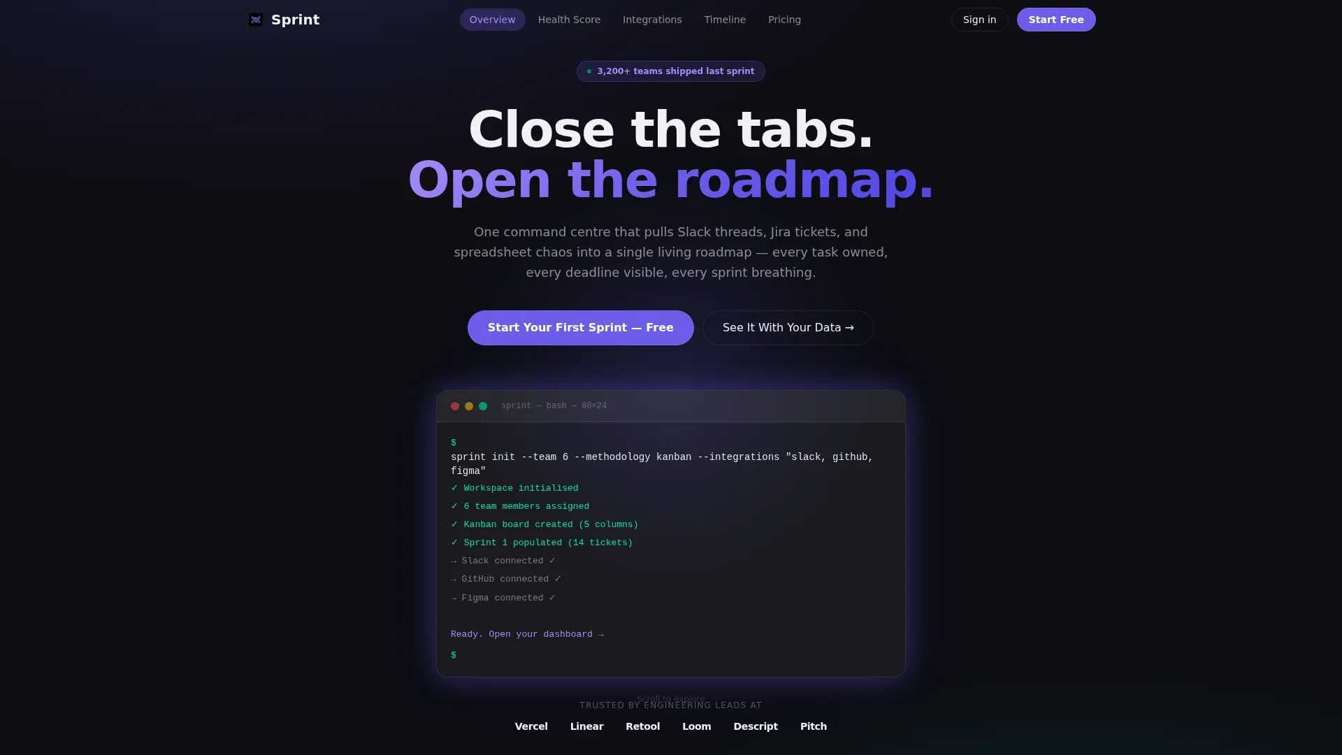
- A terminal-style animated hero section with glassmorphic panel and typewriter code output
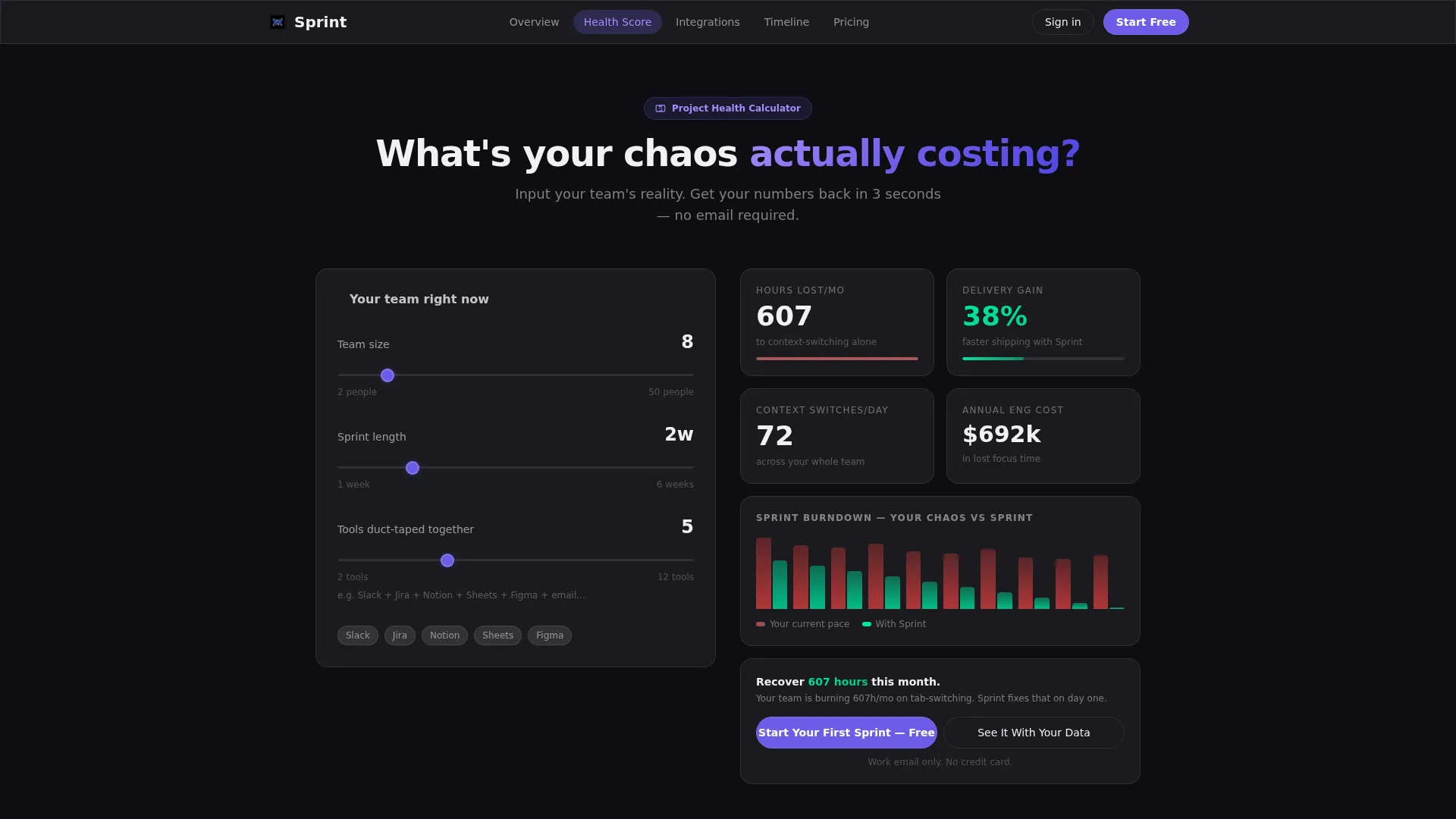
- An interactive Project Health Calculator that generates personalized output before any signup prompt appears
- Five distinct spoke sections covering the calculator, integrations, timeline view, pricing, and a footer following a horizontal flow pattern
Feature list
This section covers the core built-in capabilities included with the Sprint template.
Terminal Typewriter Hero
The header opens with a live-styled terminal block that types out a real API command character by character. The terminal then responds with a formatted project scaffold showing team assignments, sprint columns, and initial tasks. The glass panel floats on a void-black background with an indigo glow at its edges.
Interactive Project Health Calculator
Visitors enter their team size, average sprint length, and the number of tools they currently use. The calculator instantly returns hours lost per month to context-switching, a projected delivery improvement figure, and a visual burndown comparison. The primary call-to-action appears inside the results panel so the product earns the click before copy ever asks for it.
Persistent Anchor Navigation Rail
A fixed top navigation bar links to every spoke section by anchor. A ghost-button call-to-action for the free trial stays visible throughout the full scroll journey. Visitors can jump directly to integrations, timeline view, permissions, or pricing without losing context.
Integrations Logo Grid
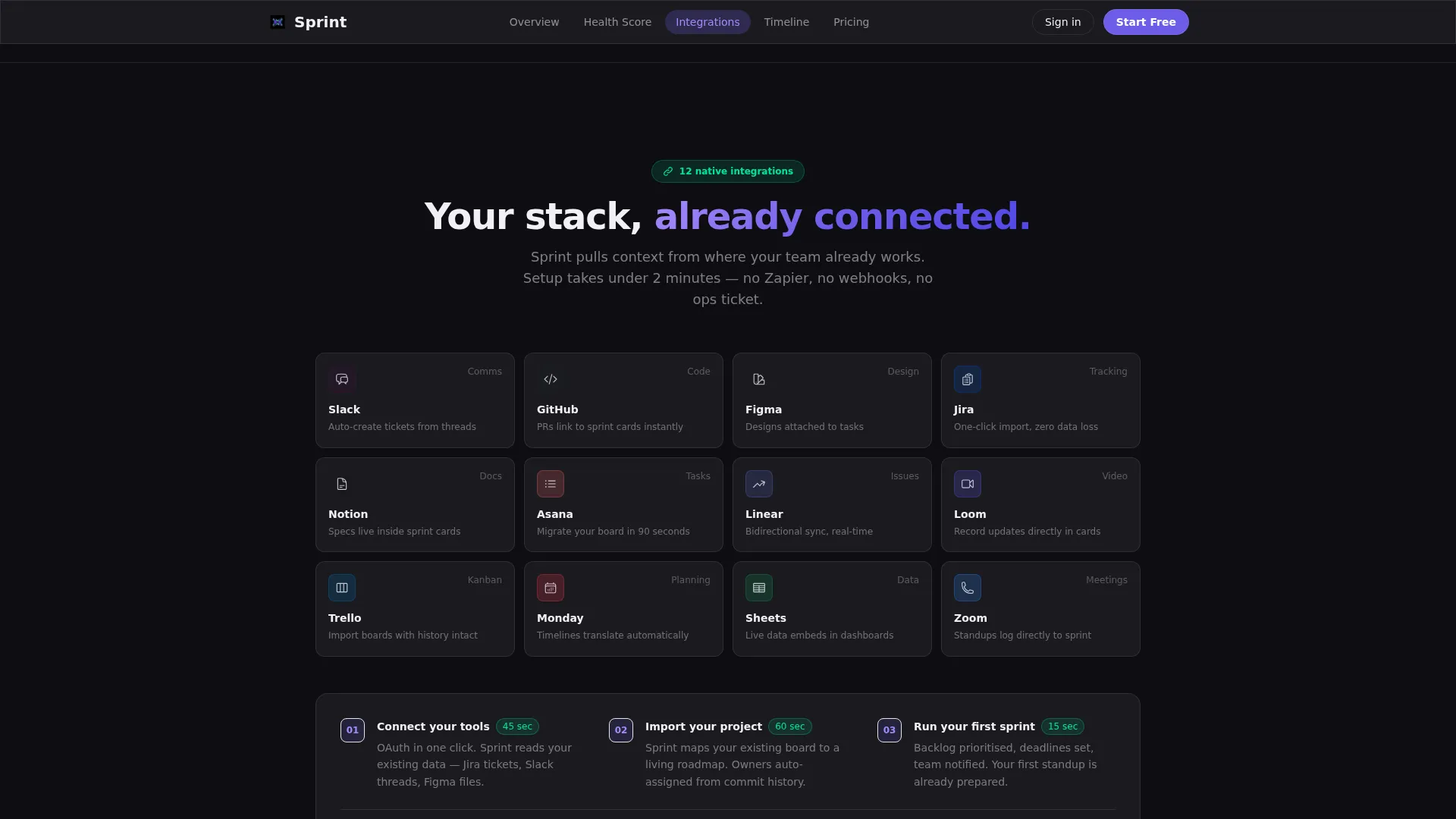
A dedicated integrations section displays a logo grid with a connection animation and a two-minute setup claim. This section provides visual proof of tool compatibility and reduces the friction of switching from an existing workflow.
Three-Tier Pricing Cards
The pricing section presents three plan tiers with the freemium option visually emphasized. A two-step signup flow collects only a work email first, then team size, then offers a one-click import path from common project management tools.
Scroll-Triggered Section Reveals
Each frosted glass card materializes as the visitor scrolls into view using scroll-triggered reveal animations. Parallax depth and blur layers create a layered cockpit-at-night aesthetic that feels data-dense without feeling cluttered.
Page sections overview
| Section | Purpose |
|---|---|
| Hero Terminal Block | Introduces the product through a live-coded typewriter animation inside a glassmorphic panel |
| Project Health Calculator | Lets visitors calculate their own hours lost and projected gains before any signup ask |
| Integrations Logo Grid | Shows tool compatibility with a connection animation and quick-setup social proof |
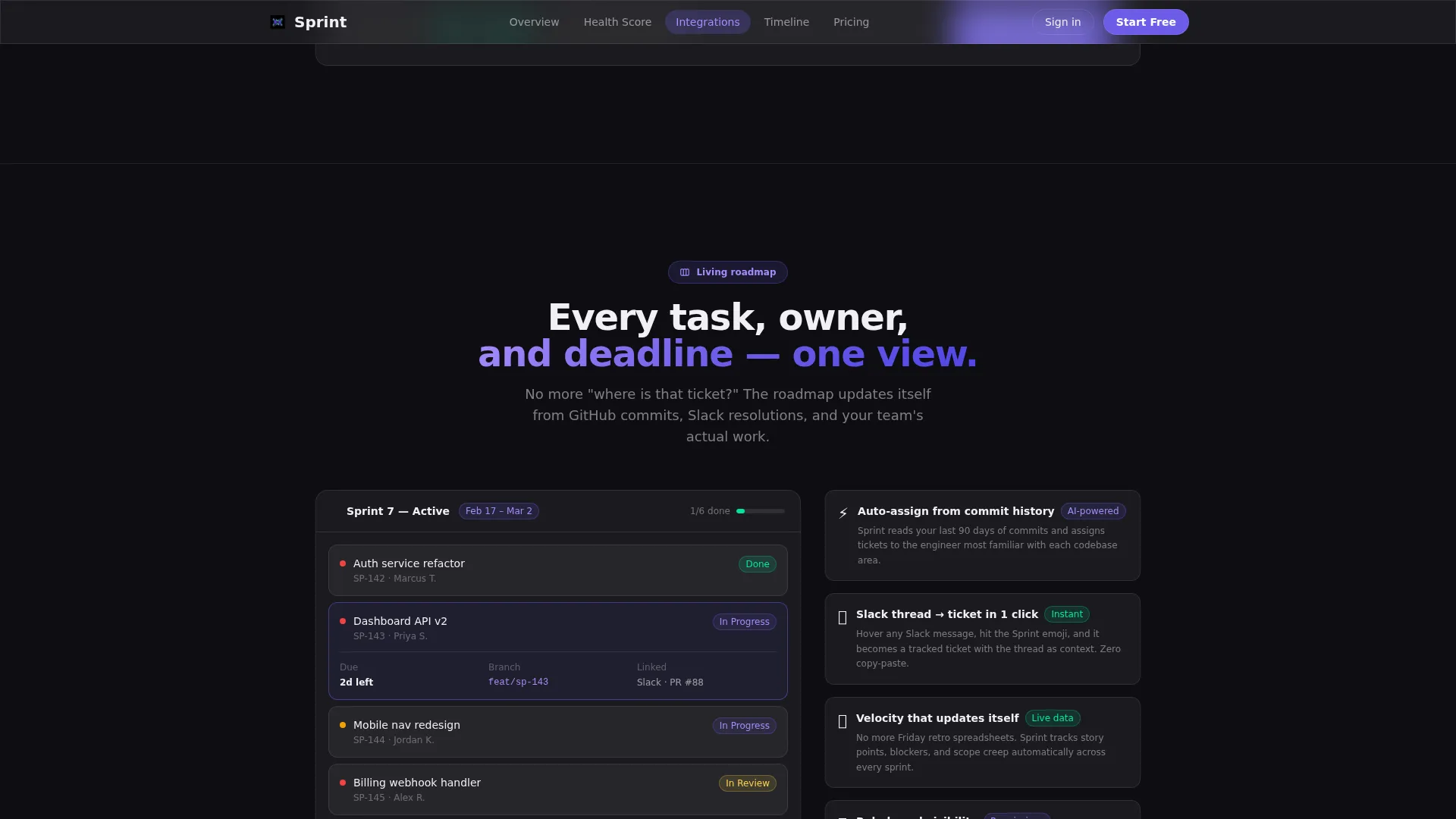
| Timeline View Showcase | Highlights the roadmap feature through a split layout with floating metric badges |
| Pricing Tier Cards | Presents three plan options with freemium emphasis and a two-step signup flow |
| Horizontal Footer | Closes the page with a structured Vercel-style horizontal flow pattern |
Design & branding system
The visual identity follows a Startup Velocity theme built entirely on glassmorphism. Deep void black forms the ambient background, while frosted translucent panels appear to float above it using blur and light rather than shadow and hard borders. The palette feels like a cockpit instrument panel at night.
- Void black (#0D0D12) as the full-page background, electric indigo (#6C5CE7) for active states and progress indicators, soft cloud white (#F0F0F5) at twelve percent opacity for glass card surfaces, and neon mint (#00E5A0) reserved for success states and completed milestones
- DM Sans for all user interface text, JetBrains Mono for terminal and code-style elements
- High animation density including typewriter reveals, scroll-triggered card materializations, calculator transitions, and parallax depth layering
Mobile & speed optimization
The template is designed desktop-first to serve engineering leads reviewing tools at their workstations. Mobile layout is included and structured for solid usability at smaller screen sizes without removing interactive elements.
- Server components handle static sections while client components power the calculator and animations separately
- Scroll-triggered reveals and parallax effects are scoped to client-side rendering to keep static content delivery fast
- The anchor navigation rail remains accessible across breakpoints so visitors can navigate to any spoke without excessive scrolling
How this template helps you convert
The Sprint template is built around a Calculator First creative strategy. Value is demonstrated through the visitor's own numbers before a single conversion ask is made. Every element of the page is sequenced to reduce skepticism and lower signup friction.
- The terminal hero signals product sophistication immediately, qualifying technically fluent buyers in the first five seconds of the visit
- The Project Health Calculator generates personalized proof using the visitor's own inputs, making the case for the product before any copy-led persuasion begins
- The two-step email-first signup, combined with a one-click import option and a guided demo path labeled "See It With Your Data," reduces the perceived risk of starting a free trial
Other information about this template
Sprint is structured as a hub-and-spoke landing page, meaning every section is reachable from the persistent top anchor rail without requiring a separate page load. The template is localized for English, uses United States dollar pricing, and follows United States date formatting conventions.
- Social proof is built into the layout through an inline team count metric, calculator-generated personalized output, and testimonial quote blocks with specific stated outcomes
- A secondary conversion path labeled "See It With Your Data" pre-populates a sample workspace using the inputs from the calculator, giving hesitant visitors a low-commitment way to experience the product
- The one-click import option during signup supports migration from commonly used project management tools, reducing the barrier for teams already invested in an existing workflow
Theme
Startup Velocity
Creative direction
Calculator/Tool First
Color system
Glassmorphic
Style
Hub & Spoke (Anchor Nav)
Direction
Freemium/Trial
Page Sections
Terminal Typewriter Hero Animation
Interactive Project Health Calculator
Persistent Hub-and-spoke Anchor Nav
Integrations Logo Grid with Animation
Three-tier Freemium Pricing Cards
Scroll-triggered Glassmorphic Reveals
Related questions
What type of product is this template designed for?
Does the calculator section require custom development to function?
Can I adjust the color system to match my own brand?
How does the two-step signup flow work?
Is this template suitable for a desktop-first audience?



