Early Childhood Careers Landing Page Template
Sprout is a split-screen early childhood careers landing page built for daycare and preschool recruiters who want to attract qualified educators fast. It shows pay ranges, benefits, and role specs upfront, then routes each visitor to an applicant tracking system listing with near-zero friction. The iridescent Dynamic Motion design feels playful and professional at once.
by Rocket studio
Quick Summary
The Sprout dynamic early childhood careers landing page template is a 50/50 split-screen landing page built to connect early childhood education centers with qualified educators at every career level. It leads with compensation transparency, moves visitors through escalating role cards, and routes each applicant to a job listing with a single coral-colored button click. No forms live on this page, so friction stays near zero.
Who This Template Is For
This landing page is built for early childhood education centers, daycare networks, and preschool groups that need to fill classrooms with confident, credentialed staff. If your hiring team is tired of wading through unqualified applicants, this page is your answer. It speaks directly to educators where they are in their career journey, from first placement to director level.
The people who land here include:
- Early childhood educators between jobs and teaching assistants exploring whether they are worth more
- Child Development Associate (CDA) credential holders seeking their first placement or a center that sponsors further training
- Career-changers and part-time aides who want a clear picture of pay, schedule, and growth before they commit
What Problem This Template Solves
Most recruitment landing pages bury compensation behind an application form. That is the core pain point this template directly addresses. Educators, especially those with relevant experience at the aide or assistant level, will not waste time on a page that disrespects them by hiding the numbers. This template flips the script. It shows the pay range, the schedule hours, the student-to-teacher ratio, and the benefits before it asks for anything in return.
The key problems this page removes:
- High drop-off caused by forcing visitors into a signup form before they see any role details or compensation
- Missed opportunities with undecided visitors who need a gentle nudge rather than a hard registration form push
- Low trust from job-seekers who cannot tell whether a center is accredited, stable, or worth their time
What You Get With This Template
This landing page delivers a full single-page recruitment experience with a consistent Dynamic Motion visual identity and a role-escalation scroll that guides each visitor from entry-level interest to director-level ambition. Every section is purposeful. Every clickable element is coral-colored so the eye always knows where to land.
Included in this template:
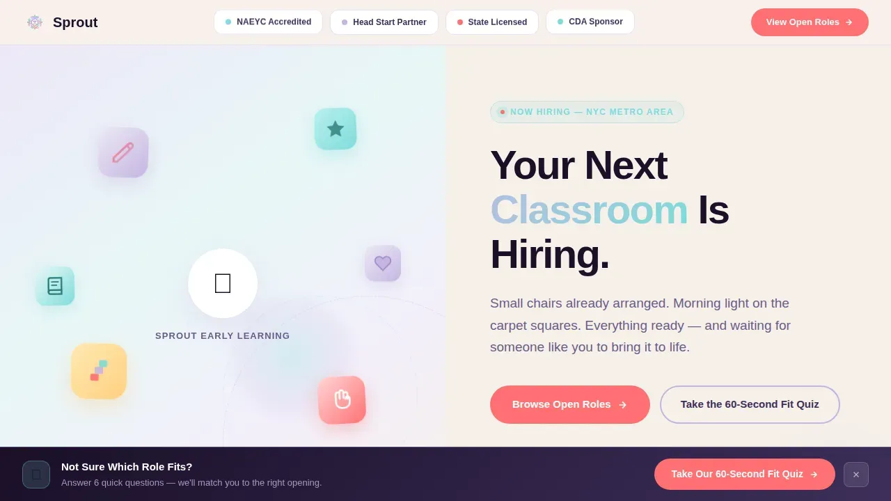
- A 50/50 split-screen hero with looping illustrated micro-animations on the left and a bold headline with accreditation trust badges on the right
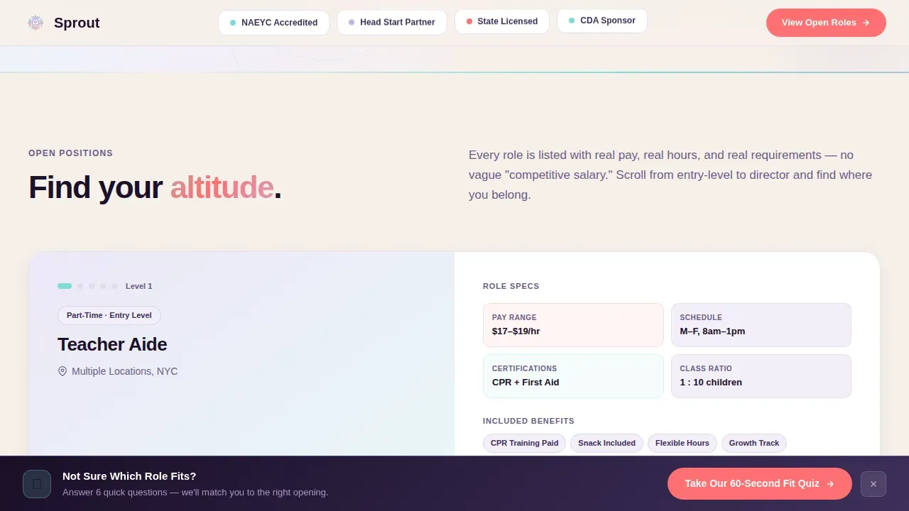
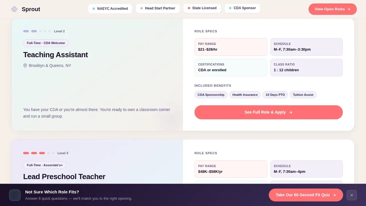
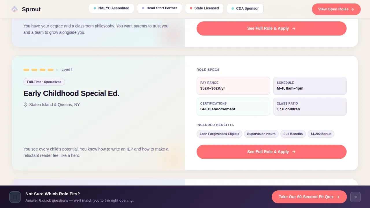
- Scrolling Role Spec Cards that reveal pay range, schedule, certifications required, student-to-teacher ratio, and benefits for each open position
- A sticky bottom bar secondary call to action that captures undecided visitors and routes them to a 60-second Fit Quiz email nurture sequence
Feature List
This landing page is built around five deliberate design and content choices. Each one supports the page's ultimate goal: turning a passive job-seeker into an active applicant.
Split-Screen Hero With Animated Illustrated Icons
The hero viewport divides 50/50. The left panel runs a looping micro-animation sequence, a crayon drawing itself, a block tower assembling, a tiny handprint appearing. These illustrated icons float and pulse using CSS keyframe animation rendered in iridescent gradients. The right panel carries the main headline, "Your Next Classroom Is Hiring," set in Plus Jakarta Sans and supported by NAEYC accreditation badges, state licensing seals, and Head Start logos pinned in a slim Logo Bar at the very top of the page. These trust badges establish institutional credibility in the first half-second before any visitor reads a single word of copy.
Scrolling Role Spec Cards With Elastic Bounce
As the visitor scrolls, the split-screen layout flips its allegiance. The left panel locks the role title and location while the right panel slides in a data card containing the pay range in USD, schedule hours, required certifications, student-to-teacher ratio, and a benefits summary that includes paid time off, tuition reimbursement, and CDA sponsorship. Each card enters with a subtle elastic bounce that keeps the Dynamic Motion theme alive throughout the scroll. The card order escalates deliberately, starting with part-time aide positions at the top and rising to lead teacher and director roles at the bottom, so every visitor can find their professional altitude without feeling lost.
Coral Call-to-Action Buttons on Every Role Card
Every role spec card ends with a coral button labeled "See Full Role and Apply." The coral (#FF6F72) is reserved exclusively for interactive elements across the entire page, so the desired action is always visually obvious. Guiding visitors toward a click is made effortless because the eye trains itself immediately to look for coral. These buttons route directly to the center's applicant tracking system job listing, removing any intermediate friction step.
Sticky Bottom Bar With Fit Quiz Capture
After the visitor scrolls past the second role card, a sticky bottom bar reappears carrying the secondary call to action: "Not Sure Which Role? Take Our 60-Second Fit Quiz." This bar captures undecided visitors before they leave the page and feeds them into an email nurture sequence. It is one of the most important conversion tools on the page because it handles the pain point of visitors who are curious but not yet committed. Creating urgency is not the only way to capture hesitant visitors; giving them a low-stakes next step works just as well.
Benefits Strip With Full Compensation Transparency
Between the role cards and the social proof section sits a dedicated Benefits Strip. It lays out compensation ranges, paid time off policies, CDA sponsorship details, and tuition reimbursement terms in plain language. Clearly outlining unique perks like professional development funds and detailing employee benefits such as health insurance and schedule flexibility is important for attracting candidates who weigh the full package, not just the hourly rate. This section delivers the clear value proposition that makes the rest of the page credible.
Social Proof and Trust Section
The page includes an educator testimonials section paired with NAEYC accreditation stats and job market data, such as 65,500 early childhood education openings per year. Social proof through real educator quotes can illustrate work-life balance and career growth in ways that no bullet list can replicate. Trust elements like staff testimonials and accreditation logos reassure visitors about the quality and stability of the center before they click through to apply. This section rounds out the page's credibility and makes the coral apply button feel like a logical next step rather than a leap of faith.
Page Sections Overview
| Section | Purpose |
|---|---|
| Logo Bar Header | Pins accreditation badges and partner logos at the top to establish instant trust |
| Split-Screen Hero | Delivers animated illustrated icons left and bold headline with trust badges right |
| Role Spec Cards | Reveals pay, schedule, certifications, ratio, and benefits per role in elastic-bounce cards |
| Benefits Strip | Presents compensation transparency and perks before asking for anything |
| Social Proof Block | Shares educator testimonials, NAEYC stats, and job market demand data |
| Fit Quiz Bar | Sticky bottom bar captures undecided visitors and routes them to email nurture |
| Page Footer | Closes with horizontal flow pattern and secondary navigation context |
Design & Branding System
The visual identity runs on the AI Iridescent color system, which feels like the surface of a soap bubble caught in sunlight: playful, shifting, and gently futuristic. The palette is specific and purposeful. Every color has a job.
Key design elements include:
- Soft holographic lavender (#C4B5E0) as the primary brand color, used in backgrounds and washes; shimmering aqua (#7FDBDA) traces animated divider lines that ripple on scroll; warm pearl white (#F6F0EA) alternates as the base background
- Electric coral (#FF6F72) owns every clickable element, every button, every interactive pulse, so the eye always knows where the desired action lives
- Plus Jakarta Sans is used for all headlines in a rounded, modern weight; DM Sans handles all body text for clean, high-readability copy at every screen size; white space is used generously throughout to keep the page skimmable and calm
Mobile & Speed Optimization
This landing page is built desktop-first but ships with a strong mobile fallback. The split-screen layout collapses gracefully to a stacked single-column view on smaller screens, so candidates searching for early childhood jobs on a phone get the same core experience. Creating a mobile friendly page with a compelling headline is essential for attracting early childhood candidates who browse on the go.
Performance choices built into the template include:
- Server Components power all static sections such as the Logo Bar, Benefits Strip, and Footer, keeping those areas fast on initial load
- Client Components handle all animated elements, including the micro-animation hero, elastic-bounce role cards, and the ripple aqua dividers, so interactivity loads only where it is needed
- All illustrated icons include alt text so screen readers can parse image content, and every image placeholder is sized to avoid layout shift on load
How This Template Helps You Convert
This landing page is engineered for conversion from the first pixel to the last scroll. The overall marketing strategy here is simple: earn trust with information, then make the click effortless.
- Compensation first, résumé second. The page shows pay ranges and benefits before it asks for anything. This directly addresses the biggest pain point in early childhood recruiting and keeps visitors on the page long enough to find a role worth applying for. Conversion rates improve when visitors feel respected rather than processed.
- Every call to action is coral and unmissable. The landing page design reserves coral exclusively for interactive elements. There is no visual competition for attention. Each role card ends with a clear, action-oriented button that drives the visitor to the applicant tracking system listing in one click, with no intermediate signup form or registration form step.
- The Fit Quiz bar rescues undecided visitors. After the second role card, the sticky bottom bar reappears. It offers a 60-second quiz that helps undecided visitors self-sort into the right role tier and enter an email nurture sequence. This secondary conversion path ensures that even visitors who are not ready to apply today stay connected and can be guided back to the page later.
Other Information About This Template
This section covers additional context that helps you understand how this template fits into a broader recruitment and marketing ecosystem.
This landing page is designed as a standalone conversion asset, not as a hub linking out to other pages within a larger website. It intentionally excludes navigation links to keep visitors focused on the conversion goal. Research consistently shows that landing pages without navigation outperform those with it because they remove the temptation to wander to other pages and leave the funnel.
When you build landing pages for specialized recruitment niches like early childhood education, the rules of good landing page design apply with extra weight. A well crafted landing page in this space needs to speak to a target audience that is emotionally invested in their work and skeptical of employers who do not respect their credentials. This template handles that trust-building through compensation transparency, accreditation badges, and educator testimonials before any sign up or registration form appears.
This template also functions effectively as part of a broader digital marketing and marketing strategy. You can drive traffic to it through social media posts, email campaigns, paid ads, and social media marketing across platforms. Sharing attention grabbing role highlights as social media posts on social media channels where early childhood educators gather, such as Facebook groups and education-focused communities, can generate leads quickly and cost-effectively. Email marketing to your existing candidate database or to professional development networks is another strong channel for sending potential attendees and job-seekers to this page.
From a content creation perspective, this page is designed so that updating role spec cards for new or upcoming openings is straightforward. You can treat each card like a product data card, plug in the new role details, and the design system does the rest. If your center runs informational sessions or an upcoming webinar for prospective candidates, a webinar landing page built on a similar iridescent template from the same design family would complement this careers page well. A well crafted webinar landing page and a careers landing page together create a stronger sales funnel for candidate acquisition than either could alone.
Understanding why webinar landing pages matter in the context of recruitment is useful here. A webinar landing page for an information session, say a live Q&A about working at your center, can warm up potential attendees before they ever hit the careers page. The webinar landing page should clearly explain what attendees will get from the session, keep the registration form simple, and use engaging visuals consistent with the careers page brand. When a webinar landing page and a careers landing page share the same visual identity, the combined experience builds trust faster than either page alone.
Sprout Social is a social media management platform that can help you schedule and track social media posts promoting this careers page across multiple channels. If your team uses Sprout Social, you can personalize outreach by segment, track which social media posts drive the most sign ups to the page, and use the data to refine your marketing strategy over time. AI marketing tools available through platforms like Sprout Social can automate marketing tasks, analyze customer data, and help you deliver personalized experiences to a larger audience without adding headcount.
Landing page builder platforms that support Next.js or React component libraries are the most compatible environment for this template, given its Client and Server Component architecture. Whether you use a purpose-built landing page builder or a custom development setup, the template's component structure makes it straightforward to extend. AI tools can assist in generating copy variations for role cards based on user input, run A/B testing on headline variants, and automate the process of analyzing landing page performance metrics so your team can make data-driven decisions quickly.
The template supports the following recruitment marketing functions in a practical, no-speculation sense:
- Keyword research informs which role titles and certification terms to feature most prominently in role card headlines, improving organic discoverability for this page
- Email marketing campaigns can use role-specific landing page URLs with dynamic text replacement in the main headline to match the specific role a candidate clicked from their email
- Data and analytics tools can provide valuable insights on which role cards drive the most click-throughs, helping you prioritize which positions to feature higher on the page over time
Building a landing page that truly works for recruitment means committing to a clear value proposition, reducing friction at every step, and giving visitors the relevant information they need to act quickly. This template does all three.
Theme
Dynamic Motion
Creative direction
Spec Sheet
Color system
AI Iridescent
Direction
Click-Through
Page Sections
Split-screen Hero with Micro-animations
Scrolling Role Spec Cards with Elastic Bounce
Coral Call-to-action Buttons with Zero-friction Routing
Sticky Fit Quiz Bottom Bar
Benefits Strip with Compensation Transparency
Social Proof and Educator Testimonial Block
Related questions
What should a landing page include to convert job-seekers effectively?
What are the three types of landing pages?
Can AI create a landing page like this one?
How do I build a landing page template for early childhood careers?
How does the Fit Quiz sticky bar help generate leads from undecided visitors?



