Daycare & Preschool Blog Landing Page Template
Sprout is a card-grid landing page template built for daycare owners, lead teachers, and preschool founders. It pairs a Monochrome Steel color system with Dynamic Motion animations to turn a blog resource hub into a conversion tool. A freemium-first sign-up flow, animated article cards, and a Problem-to-Solution scroll arc make the page feel purposeful from the first scroll to the final click.
by Rocket studio
Quick summary
Sprout is a single-page, card-grid landing page template designed for daycare and preschool blog pages. It uses a Dynamic Motion theme, a Monochrome Steel palette, and a Problem-to-Solution Arc to move visitors from frustration to action. The primary conversion goal is a free starter library sign-up, supported by locked premium content previews and a low-friction three-field form.
Who this template is for
This template speaks directly to people running or building early childhood education centers. It is built around their real daily pressures, not generic business copy.
- Daycare directors managing two-to-four-room centers who need a resource hub that earns parent and staff trust quickly
- Lead teachers writing curriculum between shifts who want fast access to practical, categorized articles
- Aspiring preschool founders researching how to start and license a childcare business
What problem this template solves
Daycare and preschool operators rarely have time to browse unfocused blog archives. They need answers fast and proof that the content is worth their email address. A generic blog layout does not build that trust.
- Visitors leave before signing up because the value of a content library is not obvious at a glance
- Enrollment gaps, parent communication issues, and licensing anxiety go unaddressed by most blog homepages
- Directors juggling paperwork, waitlists, and lesson plans need content organized by their actual pain points, not by publish date
What you get with this template
You get a fully structured, single-page layout built around a blog resource hub for childcare professionals. Every section has a defined role in moving the visitor toward sign-up.
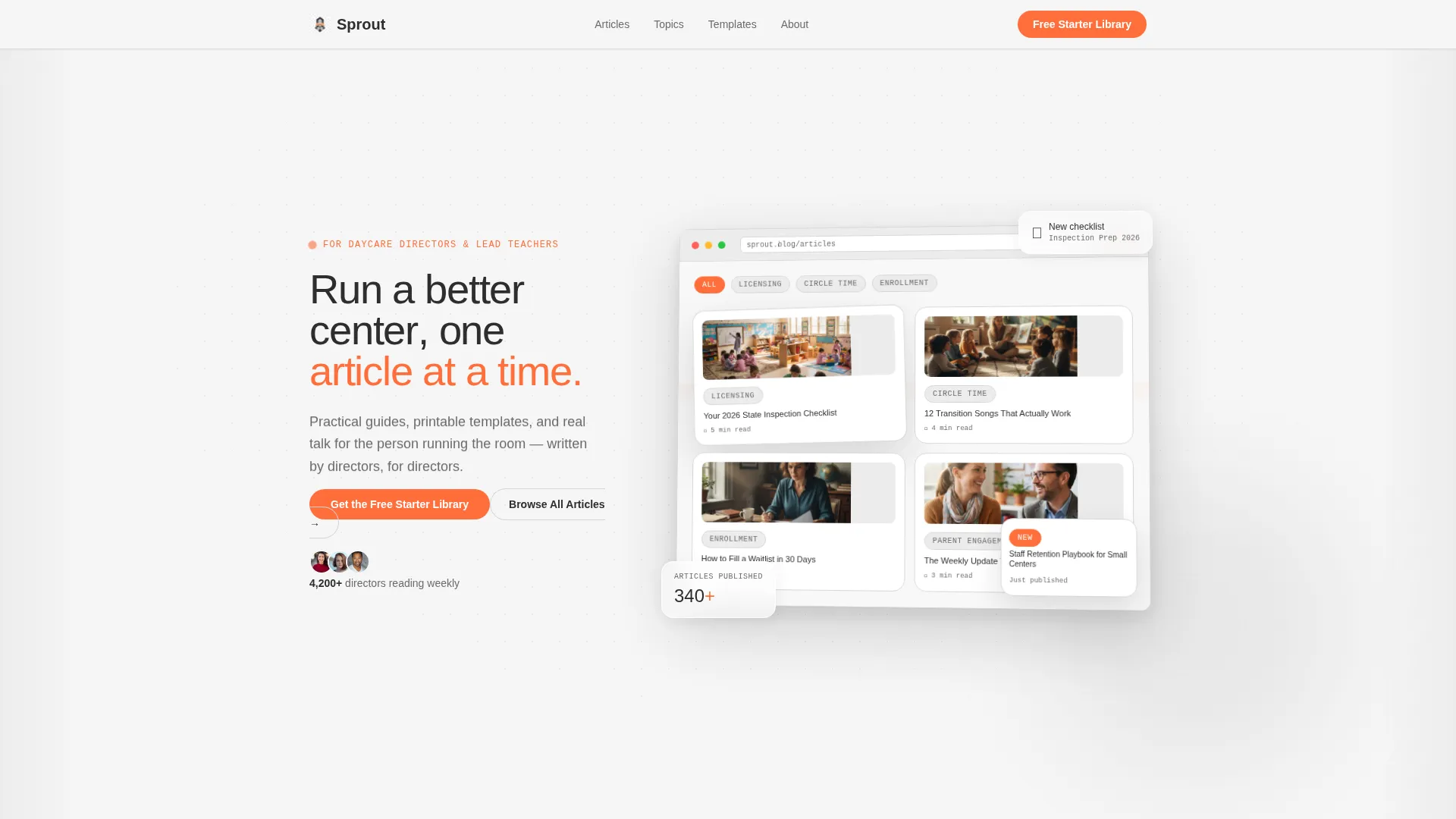
- An animated product screenshot header with a live-feeling blog dashboard mockup and parallax card tilt
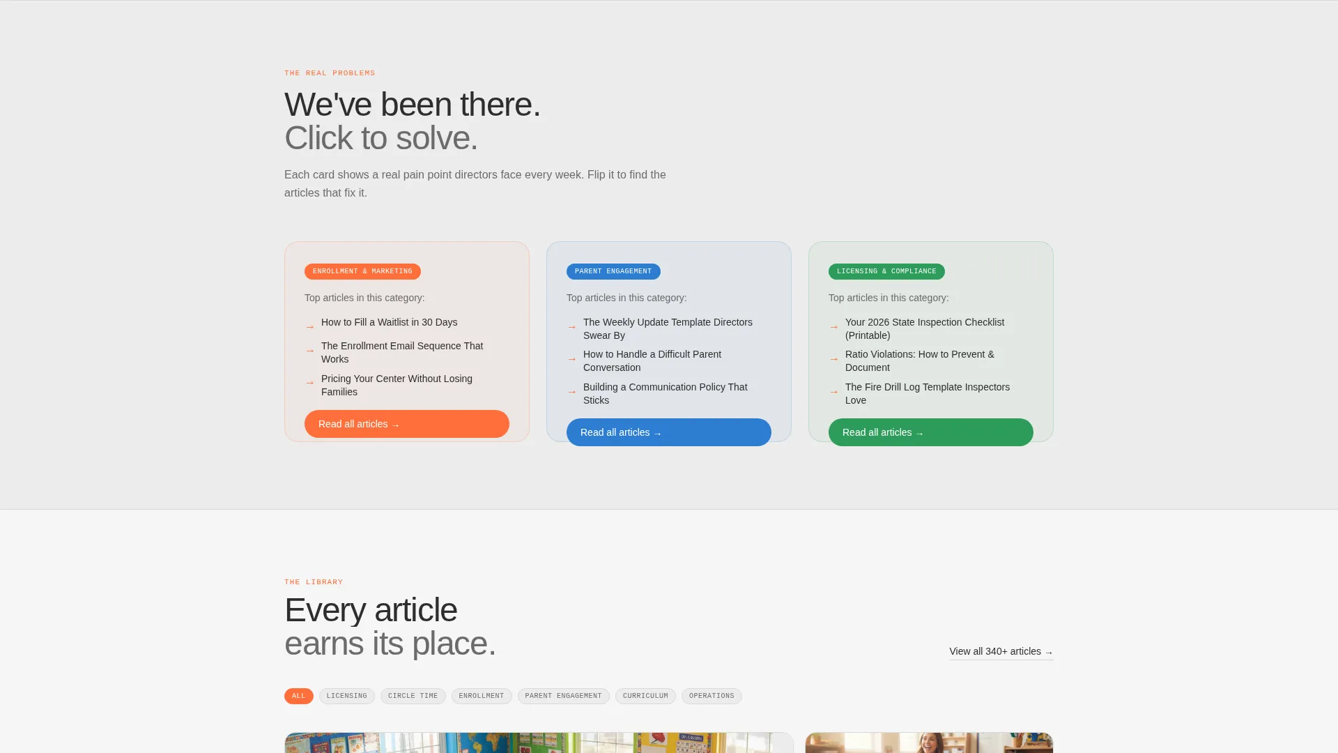
- A Problem-to-Solution scroll arc with three flipping pain-point cards that reveal matching blog categories and article titles
- A freemium sign-up form with three fields, locked premium content previews with blurred teasers, and a floating mobile call-to-action bar
Feature list
This template includes purpose-built components drawn directly from the brief. Each one serves a specific conversion or content role.
Animated Blog Dashboard Header
The header features an oversized browser mockup of the blog dashboard. Article cards are shown mid-scroll, category tags such as "Licensing," "Circle Time Ideas," and "Parent Engagement" are visible, and one card tilts forward with a subtle parallax effect. A micro-animation shows a new article card sliding into the grid, tags filtering, and a reading-time badge updating in real time.
Flip-and-Expand Pain Point Cards
Three cards below the fold each represent a core director pain point: enrollment gaps, parent complaints, and inspection anxiety. Each card carries a pulsing icon and a single supporting stat. On scroll, each card flips, slides, or expands to reveal its matching blog category and three top-performing article titles.
Staggered Card Grid Layout
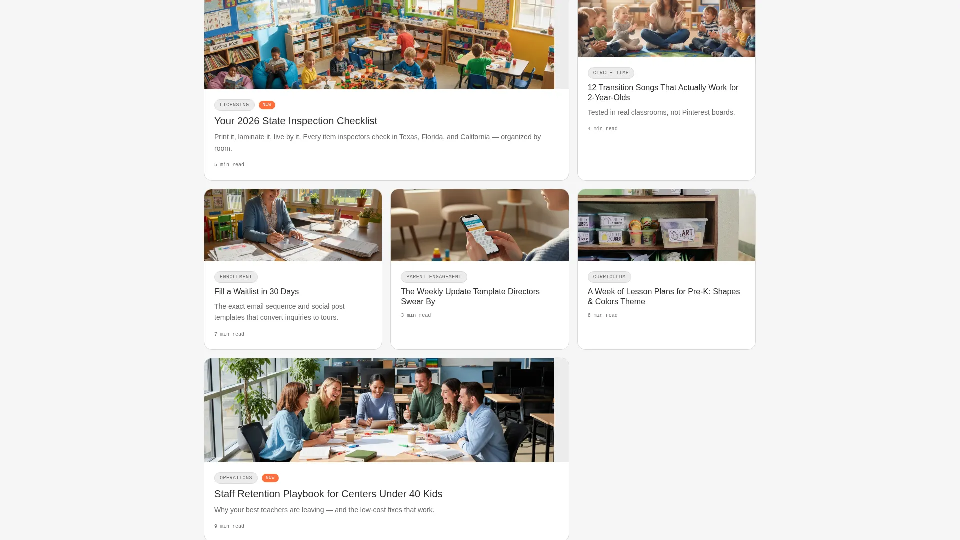
The modular card grid staggers article cards into view as the visitor scrolls. Cards arrive with purposeful motion, entering the layout like children finding seats at circle time. The grid deepens from broad operational advice to downloadable checklists and printable lesson templates as the visitor moves down the page.
Locked Premium Content Previews
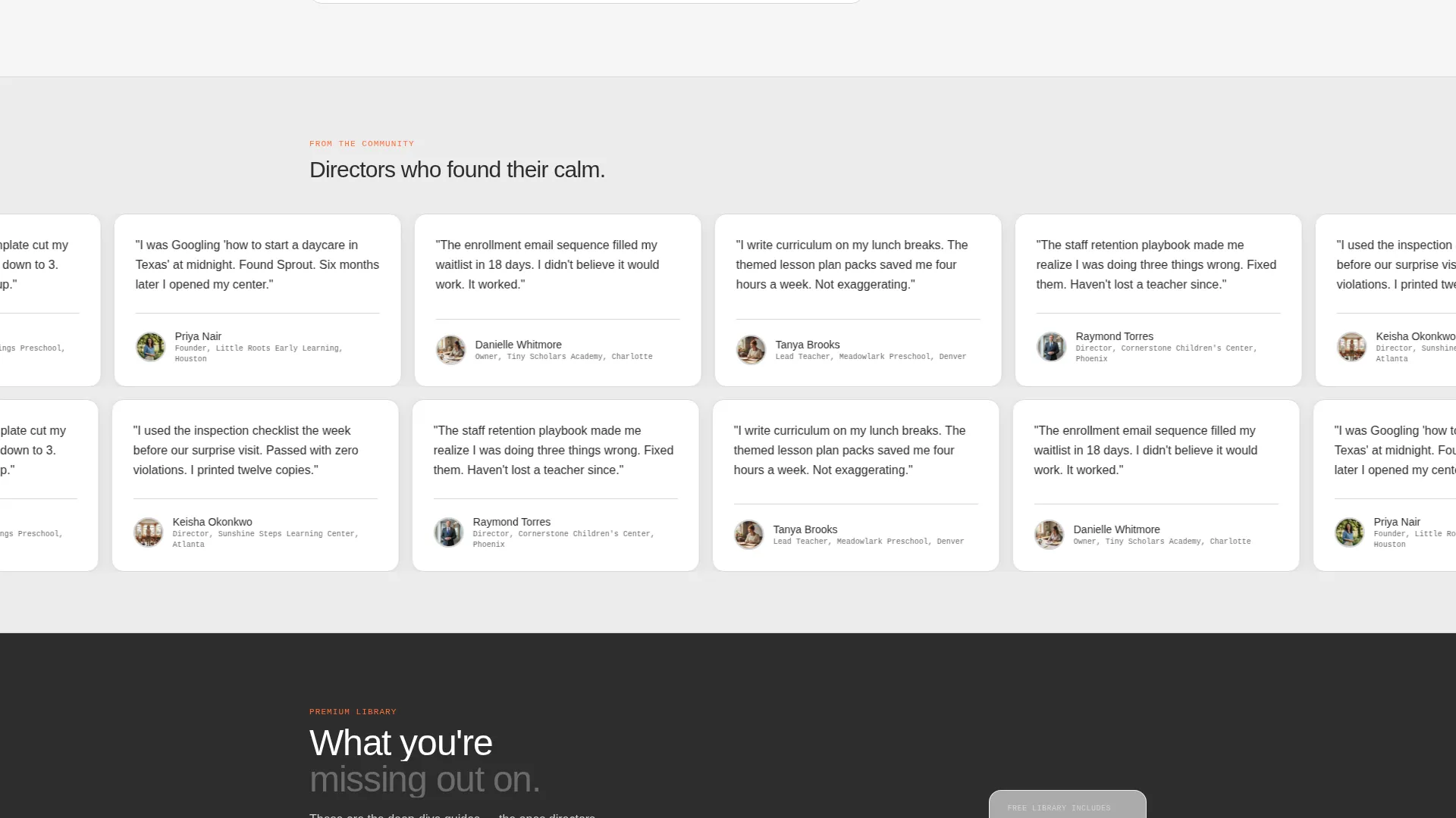
Three premium article previews appear with blurred body content and a single teaser sentence each. This approach makes the value of the free library tangible before the visitor fills in any form field.
Low-Friction Freemium Sign-Up Form
The primary sign-up form asks for first name, center name (optional), and email address. Nothing more. This keeps the barrier to entry low while still capturing the details needed to personalize the library experience.
Floating Mobile Call-to-Action Bar
On mobile, a persistent bottom bar carries the primary call-to-action: "Get the Free Starter Library." It stays visible as the visitor scrolls, ensuring the conversion path is never more than a tap away.
Page sections overview
| Section | Purpose |
|---|---|
| Hero Header | Introduces the blog dashboard with an animated product screenshot and the headline "Run a better center, one article at a time" |
| Pain Point Cards | Presents three director pain points with pulsing icons and supporting stats before the scroll transformation |
| Solution Reveal Grid | Flips each pain-point card to show the matching blog category and top article titles |
| Article Card Grid | Displays the modular blog content grid, staggered into view with Dynamic Motion animations |
| Locked Content Previews | Shows three blurred premium article previews with teaser sentences to communicate library value |
| Freemium Sign-Up Form | Captures first name, optional center name, and email with a clear primary call to action |
| Browse Without Sign-Up | Offers a secondary "Browse All Articles" path to reduce friction and build trust |
| Floating Mobile Bar | Keeps the primary call to action accessible on mobile via a persistent bottom action bar |
Design & branding system
The Monochrome Steel color system gives the template a clean, organized feel that mirrors a well-run classroom. The single accent color does all the emotional lifting without competing with the content.
- Core palette: foundational charcoal (#2D2D2D), mid-tone graphite (#6B6B6B), soft aluminum (#D4D4D4), and near-white cloud (#F5F5F5) for all structural and typographic elements
- Accent color: playground tangerine (#FF6F3C) appears exclusively on call-to-action buttons and hover states, making every actionable element immediately recognizable
- Dynamic Motion theme: card stagger animations, flip transitions, parallax tilt on the hero mockup, and micro-animations on the dashboard header bring the page to life without overwhelming the content
Mobile & speed optimization
The template is designed to work cleanly on mobile without losing the motion-driven experience that defines the desktop layout. Key interactions are adapted for smaller screens.
- The floating bottom bar replaces inline call-to-action placement on mobile, keeping the sign-up path visible throughout the entire scroll
- Card grid columns reflow into a single-column stacked layout on smaller viewports, preserving readability and tap target sizing
- Animations are scoped to entrance transitions and micro-interactions, keeping the layout responsive without relying on heavy continuous effects
How this template helps you convert
Every design and content decision in this template points toward one outcome: a visitor who trusts the resource library enough to share their email address.
- The Problem-to-Solution Arc qualifies visitors emotionally before asking for anything. By the time the sign-up form appears, the visitor has already seen their exact pain point reflected back at them with a specific stat and a matched content category.
- The locked premium previews make the value of the free library concrete. Seeing blurred content with a teaser sentence creates curiosity and answers the implicit question: "Is this worth my email?"
- The secondary "Browse All Articles" path removes the pressure to sign up immediately. Visitors who explore freely are more likely to return and convert later, building trust on their own timeline.
Other information about this template
This template is built specifically for the daycare and preschool niche within the broader early childhood education space. A few additional details are worth knowing before you start customizing.
- The card grid layout is modular, meaning individual article cards can be added, removed, or reordered without rebuilding the grid structure
- The template style and motion system are consistent with modern childcare website templates that prioritize clarity and calm over visual noise
- Category tags shown in the brief include "Licensing," "Circle Time Ideas," and "Parent Engagement," giving you a ready-made content taxonomy to build from
- The freemium model built into this template suits operators who are building a content-driven audience before offering paid resources or premium memberships
- This template sits within the Technology category of the marketplace, positioned for daycare and preschool website templates that serve content-first business models
Theme
Dynamic Motion
Creative direction
Problem→Solution Arc
Color system
Monochrome Steel
Style
Card Grid (Modular)
Direction
Freemium/Trial
Page Sections
Animated Blog Dashboard Header
Flip-and-expand Pain Point Cards
Staggered Modular Card Grid
Locked Premium Content Previews
Low-friction Freemium Sign-up Form
Floating Mobile Call-to-action Bar
Related questions
Can I use this template without any motion or animation?
Do I need a large article library before launching with this template?
Is the three-field sign-up form the only conversion path on the page?
Can I change the category tags shown in the blog dashboard header?
Who is this landing page template best suited for?



