Daycare Online Store Landing Page Template
Sprout is a split-screen landing page template built for daycare supply stores. It pairs a glassmorphic Data Command visual system with a Problem-to-Solution scroll arc, a Feature Tab Switcher header, and a coral-accented app download call to action. Designed for center owners, in-home providers, and preschool teachers, it turns a cluttered supply hunt into one clean, confident cart.
by Rocket studio
Quick summary
Sprout is a single-page daycare online store landing page built on a 50/50 split-screen layout. It guides providers from supply chaos to an organized cart through a structured Problem-to-Solution scroll arc. The glassmorphic Data Command design feels clinical enough to trust and warm enough to act on, with a coral app download call to action waiting at the end.
Who this template is for
This template is made for the people who keep daycare rooms running. Whether you manage one room or an entire center, Sprout speaks your daily language.
- Daycare center owners managing enrollment waitlists, state ratio requirements, and bulk supply orders
- In-home providers stretching tight budgets across craft supplies, safety gates, and licensing checklists
- Preschool teachers quietly funding their own classrooms and needing a faster way to restock essentials
What problem this template solves
Daycare supply sourcing is genuinely chaotic. Sticky notes, multiple browser tabs, out-of-stock alerts, and a licensing deadline blinking in red are a common Tuesday morning for most providers. This template gives that pain a face and then immediately resolves it.
- Providers arrive with no clear path to a complete, compliant supply list in one place
- The scattered multi-tab buying experience erodes trust and wastes time that providers do not have
- A plain product page cannot communicate urgency, value, or the relief of a pre-loaded curated cart
What you get with this template
You get a fully structured landing page that walks visitors through the problem and the solution side by side. Every section has a clear job, and every visual choice earns its place.
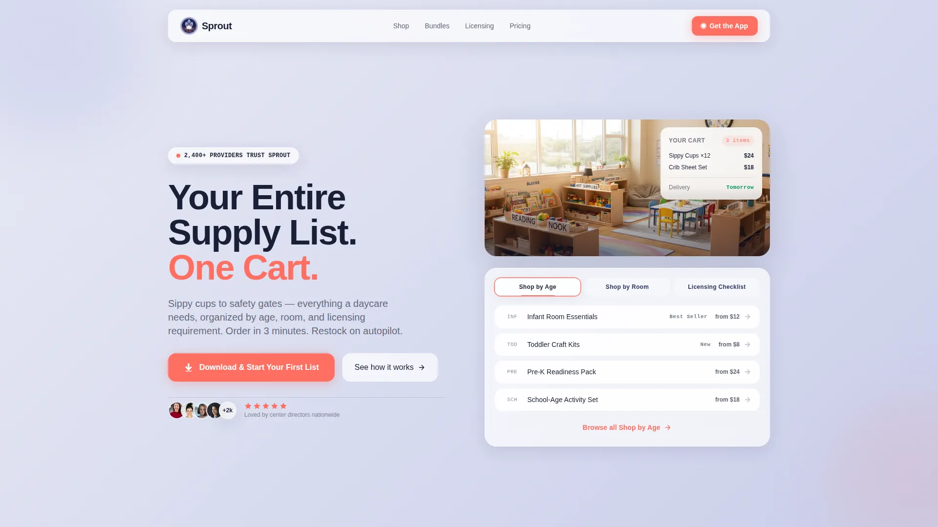
- A split-screen header with a three-tab Feature Tab Switcher and a bold left-panel headline over a blurred hero classroom image
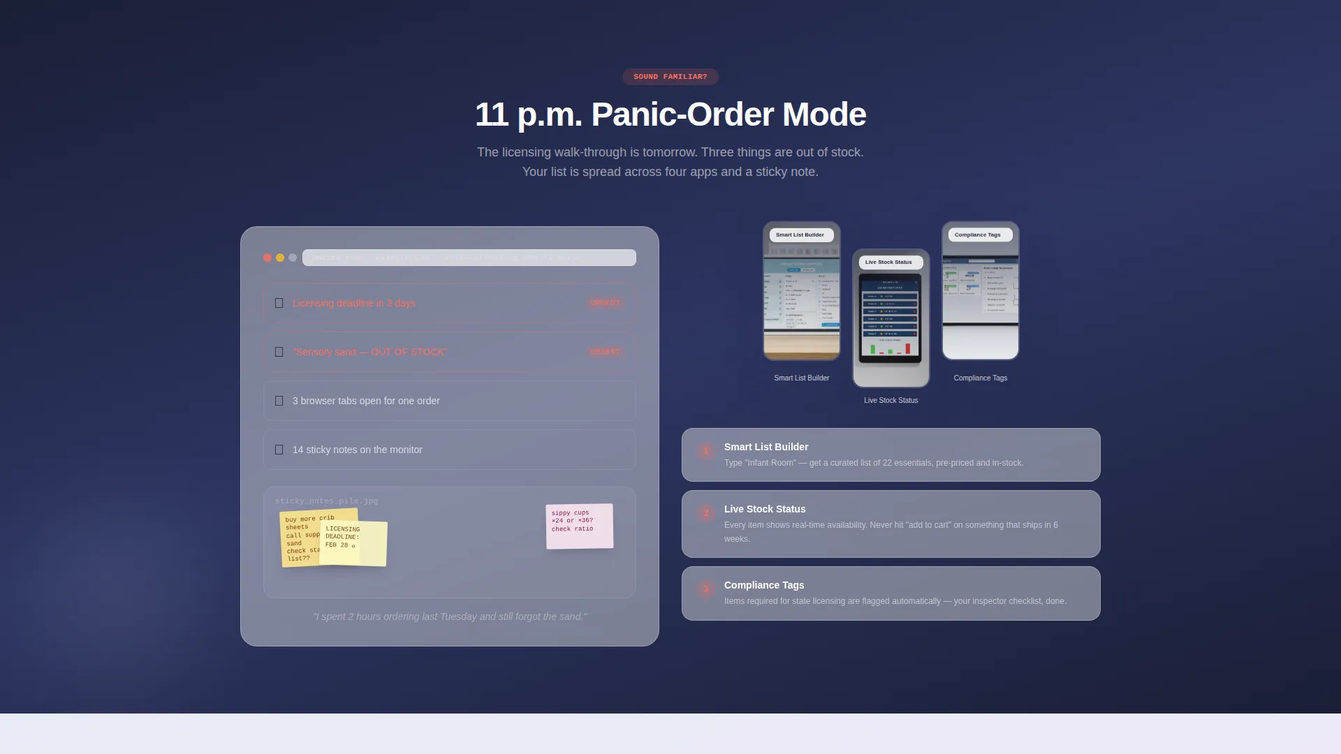
- A Problem-to-Solution scroll arc with real-pain framing, app interface screenshots, and escalating benefit sections
- A floating coral app download bar with iOS and Android badges, plus a "Text Me the Link" secondary path for desktop browsers
Feature list
This template is built around five tightly integrated components. Each one serves the single goal of getting a daycare provider from first scroll to first download.
Feature Tab Switcher Header
Three frosted-glass tabs sit across the top of the right panel. The tabs are labeled "Shop by Age," "Shop by Room," and "Licensing Checklist." The active tab glows coral at its edge while inactive tabs stay in muted navy. This makes the header feel like a live dashboard before the visitor scrolls at all.
Problem-to-Solution Scroll Arc
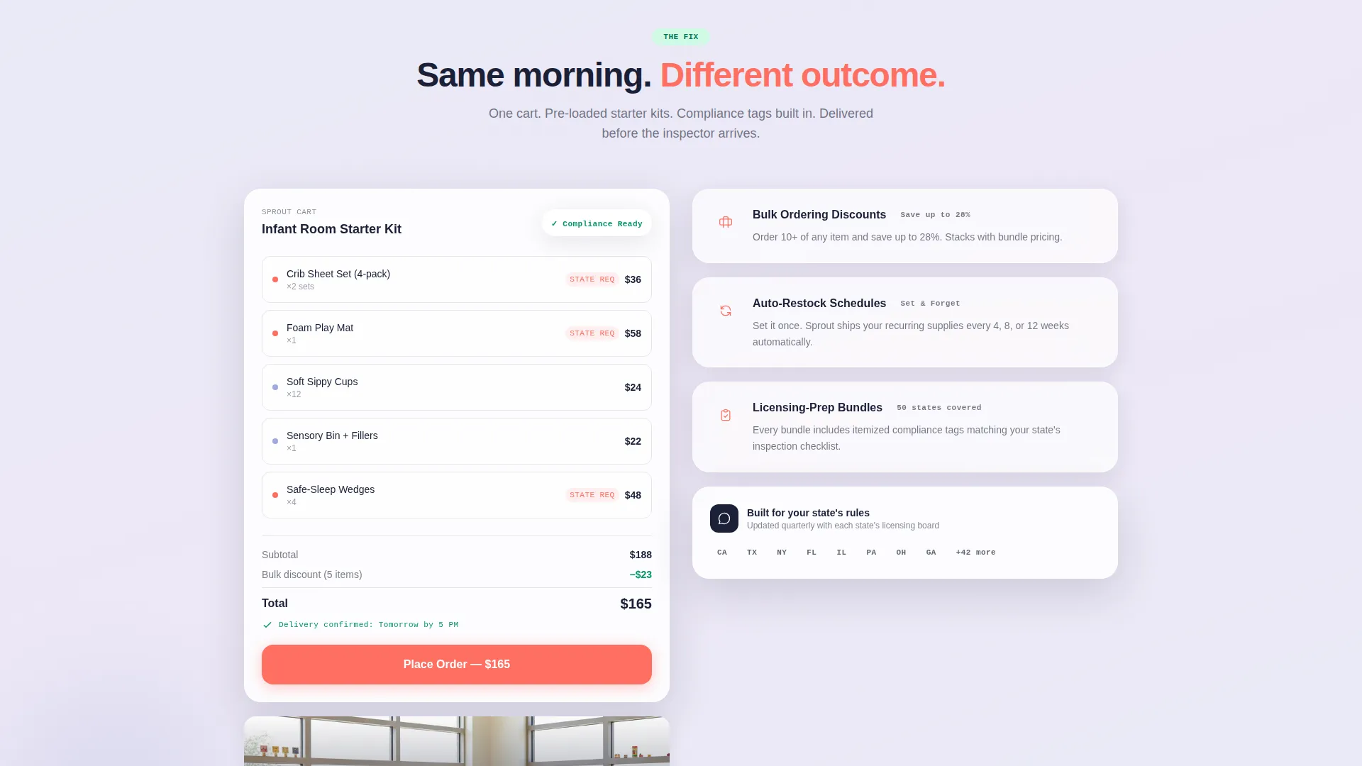
The scroll journey opens with the chaos frame: sticky notes, three open browser tabs, an out-of-stock alert, and a licensing deadline in red. The next split panel flips that frame completely, showing a pre-loaded "Infant Room Starter Kit" cart with prices visible and delivery confirmed. Each subsequent section escalates the solve, moving through bulk discounts, auto-restock schedules, and licensing-prep bundles.
Floating App Download Bar
After the second scroll, a coral-accented frosted-glass bar pins to the screen with the primary call to action: "Download & Start Your First List." App store badges for iOS and Android sit directly beneath. A secondary field offers a "Text Me the Link" option for providers browsing on desktop during nap time.
In-Arc App Screenshots
Three real screenshots of the app's smart-list builder appear inside the Problem-to-Solution arc. By the time the call to action appears, visitors have already mentally walked through the product. The screenshots are placed inside the solution panels, so they function as proof, not decoration.
Glassmorphic Split-Screen Layout
Every section uses the 50/50 split to hold tension between pain and relief, question and answer. Frosted-glass cards float over soft blurred gradients. Borders carry a faint 1-pixel white opacity glow. Shadows are soft and diffused. The coral accent appears only where a tap or click is expected.
Page sections overview
| Section | Purpose |
|---|---|
| Tab Switcher Header | Introduces the store with three browsable category tabs and a bold headline |
| Hero Left Panel | Anchors trust with a blurred daycare classroom image and the core value statement |
| Chaos Problem Frame | Shows the provider's morning pain: sticky notes, open tabs, and licensing stress |
| Solution Flip Panel | Flips the split to show the app interface with a pre-loaded curated cart |
| Bulk Ordering Section | Escalates the solve with bulk discount messaging and auto-restock scheduling |
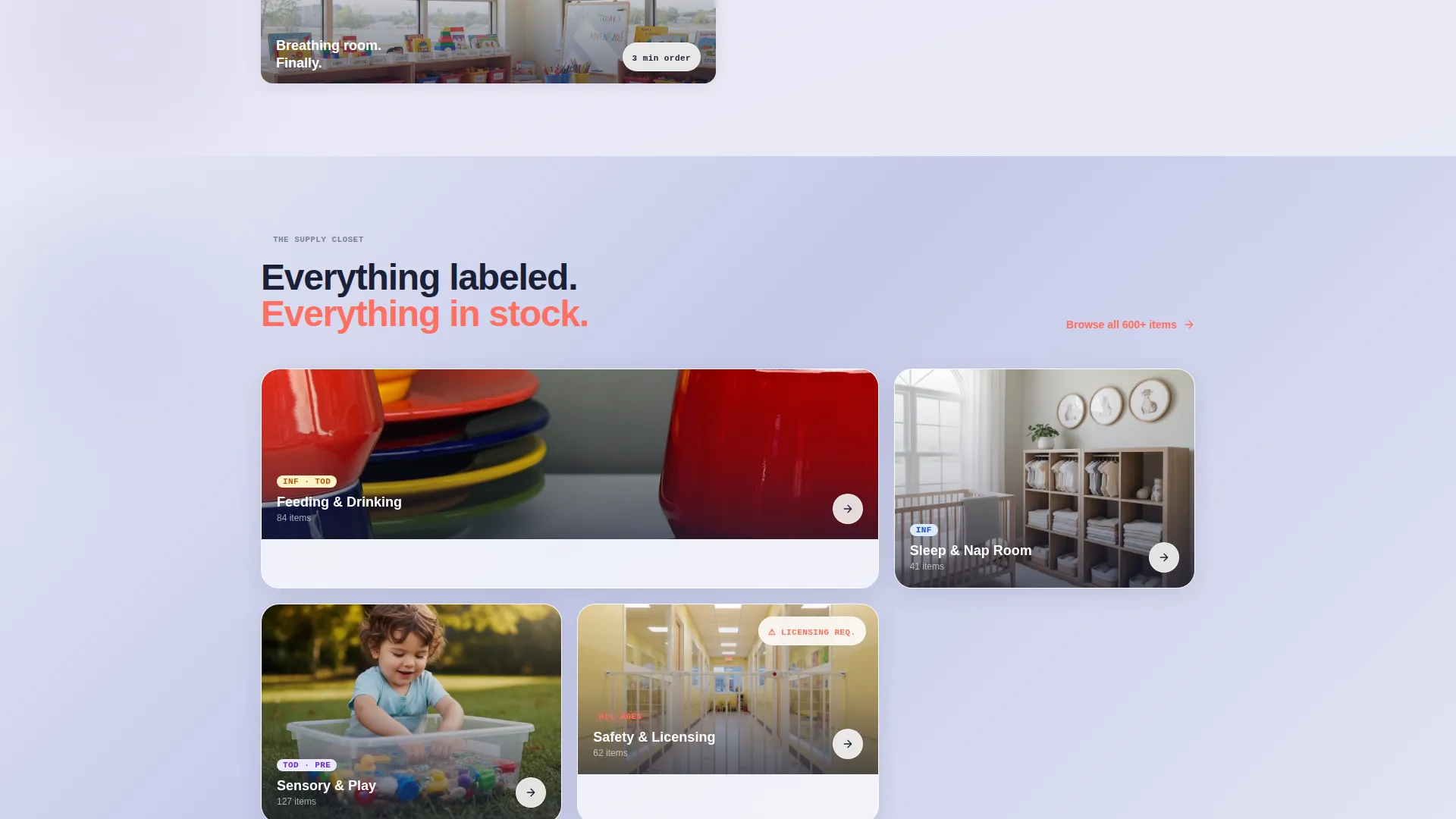
| Licensing Prep Bundles | Presents compliance-tagged bundle options with itemized licensing context |
| Floating call to action Bar | Pins the app download call to action with store badges after the second scroll |
| Secondary Text Path | Offers a single phone-field option to send the app link via text message |
Design & branding system
The visual identity follows a Data Command theme expressed through a glassmorphic color system. The palette is designed to feel like a tablet screen catching morning light through a nursery window: precise enough to command trust, soft enough to feel approachable.
- Core colors: frosted translucent white (#FFFFFFB3) over a soft periwinkle base (#E8EAF6), with deep command-center navy (#1A1F36) for all body text and a warm coral accent (#FF6F61) reserved strictly for interactive elements
- Glass-panel treatment: frosted translucent cards float over blurred gradients with 1-pixel white-opacity border glows and soft, diffused shadows that never appear hard or flat
- Coral usage rule: the coral accent appears only on buttons, badges, notification dots, and active tab edges, never as a background or dominant surface color
Mobile & speed optimization
The split-screen layout is designed with mobile interaction in mind. The floating call to action bar and the "Text Me the Link" field both acknowledge that many providers browse on a phone between tasks or during nap time.
- The floating app download bar stays pinned and accessible as the visitor scrolls through every section on any screen size
- The "Text Me the Link" secondary path removes friction for desktop visitors who prefer to complete the download on their phone
- Frosted-glass visual layers use soft gradients and blurred backgrounds rather than heavy image assets, keeping the visual system light and render-friendly
How this template helps you convert
Every structural and visual decision in Sprout is aimed at one outcome: getting a daycare provider to download the app. The page earns that tap before it asks for it.
- The Problem-to-Solution arc lets visitors watch their own week get easier, section by section, so the call to action feels like a natural next step rather than an interruption
- Three in-arc app screenshots give visitors a concrete preview of the smart-list builder before any download is requested, reducing hesitation and building confidence
- The floating coral call to action bar and the dual download paths (direct badge tap and SMS link) keep the conversion moment reachable from any point in the scroll
Other information about this template
Sprout is categorized under Technology with a subcategory focus on Daycare Digital Presence. It is purpose-built for the daycare online store niche and carries an intersection match score of 13 across its category alignment fields.
- Template style: Split Screen (50/50) with a Feature Tab Switcher header concept
- Theme and color system: Data Command theme with a Glassmorphic color treatment
- Landing page direction: App Download with both a primary badge path and a secondary SMS text-link field
- Creative direction: Problem-to-Solution Arc structured across multiple escalating split-screen sections
- The template title is Sprout, and it is designed as a single landing page, not a multi-page website
Theme
Data Command
Creative direction
Problem→Solution Arc
Color system
Glassmorphic
Style
Split Screen (50/50)
Direction
App Download
Page Sections
Feature Tab Switcher Header
Problem-to-solution Scroll Arc
Floating App Download Bar
In-arc App Screenshots
Glassmorphic Split-screen Layout
Related questions
Who is this landing page template designed for?
What does the Feature Tab Switcher do?
Where does the app download call to action appear?
Can I adapt the tab labels to match my store's categories?
Is Sprout a single landing page or a multi-page website?



