Daycare Discovery & Comparison Landing Page Template
Sprout is a hub-and-spoke anchor-nav landing page template built for childcare directory and discovery platforms. It helps parents compare daycare and preschool options side by side using animated stat counters, filterable center cards, a comparison drawer, and a waitlist birthdate input. The Monochrome Steel color palette keeps the experience clinical enough to trust and warm enough to stay.
by Rocket studio
Quick summary
Sprout is a single-page childcare discovery and comparison landing page template. It organizes complex daycare research into five focused spoke sections, each anchored by bold data and interactive comparison tools. Parents arrive overwhelmed and leave with a shortlist. The design communicates professionalism from the first scroll, earning immediate trust before a single marketing claim is read.
Who this template is for
This template is built for teams creating a childcare directory or discovery platform. It serves parents who need to compare multiple daycare and preschool options quickly and confidently. It works equally well for operators building a branded enrollment tool for a single childcare center network.
- Dual-income couples comparing two to four centers simultaneously and needing speed alongside depth
- Single parents with shift-schedule constraints who need clear hours and availability at a glance
- First-time parents who do not yet know what questions to ask about early childhood education
What problem this template solves
Childcare selection is one of the most stressful decisions families make. Most daycare websites scatter critical information across multiple pages, forcing parents to open browser tabs, call centers, and guess at ratios. This landing page replaces that scattered research with a structured, controlled experience.
- Parents search across too many sites and lose track of what matters most
- Childcare providers often present services without enough detailed information to support a real comparison
- Families cannot easily compare tuition, teacher-to-child ratios, safety protocols, or curriculum philosophy in one place
What you get with this template
You get a complete, single-page discovery hub designed specifically for childcare and preschool programs. Every section is pre-structured so visitors move from browsing to shortlisting to action without friction. The template is ready to adapt for any childcare directory or center-level enrollment platform.
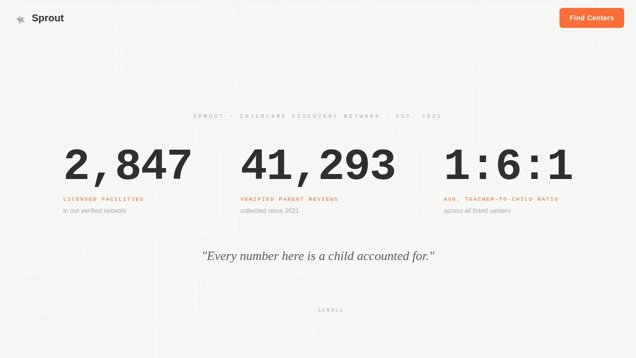
- A stats dashboard hero with three animated counters replacing stock photography with live-feeling data
- Five anchor-nav spoke sections covering center comparison, curriculum types, safety standards, parent reviews, and availability
- A persistent floating comparison drawer and a single-field waitlist birthdate input to reduce enrollment friction
Feature list
This template ships with a focused set of interactive and structural components. Each one is grounded in what parents search for when evaluating daycare options.
Animated Stats Dashboard Header
The hero section replaces traditional photography with three oversized animated counters. Each counter ticks upward on page load, displaying licensed facility count, verified parent review totals, and average teacher-to-child ratio. Numbers are set in a monospaced typeface at billboard scale, separated by thin vertical rules. The data builds immediate trust before any marketing copy is read.
Anchor Navigation Hub
A sticky anchor nav locks to the top of the page after the hero. Five labeled spokes, Compare Centers, Curriculum Types, Safety Standards, Parent Reviews, and Availability, let parents jump directly to the section most relevant to their decision. Each spoke section opens with a reframing stat that challenges common assumptions about childcare selection. The hub keeps the entire learning experience organized and scannable.
Filterable Center Cards with Bookmarking
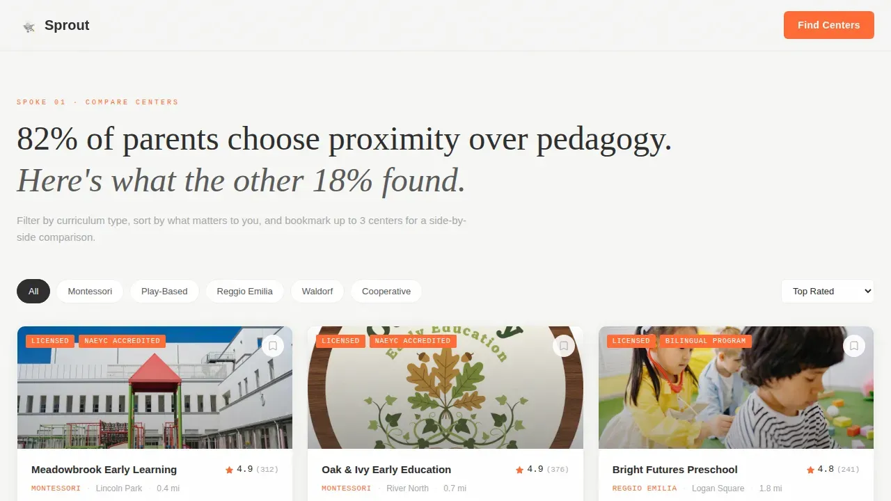
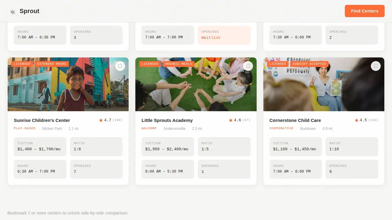
The Compare Centers section displays individual childcare center cards that parents can filter and bookmark. Each card surfaces key data points at a glance. Bookmarking at least two centers activates the floating comparison button, moving the visitor from passive browsing to active shortlisting. This mechanic converts visitors from readers into decision-makers.
Floating Comparison Drawer
Once a parent bookmarks two or more centers, a tangerine floating button appears. Tapping it slides a comparison drawer up from the bottom of the screen. The drawer displays side-by-side columns for tuition range, teacher-to-child ratio, hours, educational philosophy, and parent rating bars. This component is the core conversion engine of the landing page.
Waitlist Birthdate Input
The secondary conversion path is a single-field input asking for the child's birthdate. Submitting it instantly surfaces waitlist availability across all shortlisted centers. Minimal form fields mean higher completion rates. This feature helps parents seeking waitlist clarity get answers without filling out a long contact form.
Verified Parent Review Cards
The Parent Reviews spoke section displays filterable review cards with rating bars. Reviews are presented as verified, adding credibility to the social proof layer. Parents can filter by center type to find experiences relevant to their specific search. Testimonials are among the most trusted trust signals for families evaluating childcare providers.
Page sections overview
| Section | Purpose |
|---|---|
| Stats Dashboard Hero | Display animated counters as trust-building data signals |
| Anchor Navigation Bar | Lock five spoke links to top for persistent section access |
| Compare Centers | Filterable center cards with bookmark and shortlist mechanic |
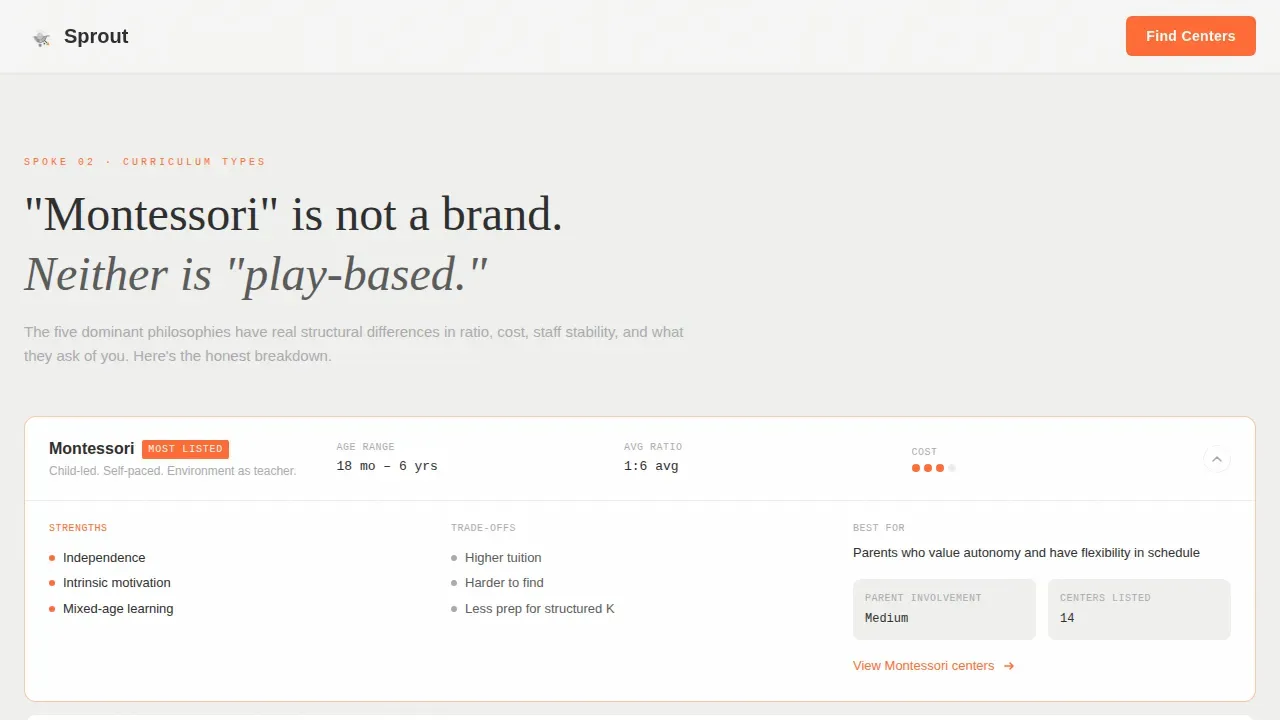
| Curriculum Types | Side-by-side philosophy breakdown across center types |
| Safety Standards | Licensing, ratio, and inspection records comparison table |
| Parent Reviews | Verified review cards with rating bars, filterable by type |
| Availability Spoke | Waitlist birthdate input surfacing real-time center availability |
| Floating Comparison Drawer | Slide-up side-by-side columns activated by bookmarking |
| Footer | Linear single-row footer with contact and navigation links |
Design & branding system
The visual identity uses a Monochrome Steel color palette that feels like a modern pediatrician's waiting room. It is clinical enough to build trust and warm enough to keep visitors engaged. The color palette uses only four values, and the accent color appears exclusively where a decision needs to happen.
- Structural charcoal (#2D2D2D) anchors all body text and navigation; nursery white (#F7F7F5) and brushed aluminum (#A8A9AD) alternate as section backgrounds
- Safety-cone tangerine (#FF6B35) is reserved exclusively for calls to action, comparison badges, and winner highlights, it never decorates
- Typography pairs JetBrains Mono for stat displays, DM Sans for body copy, and Fraunces for section headlines, creating a clean design with strong hierarchy
Mobile & speed optimization
This template is built with a mobile first design approach because parents search on mobile devices constantly, often during a commute or between work calls. Mobile optimization is not an afterthought here, it is the primary layout contract. The comparison drawer, filter cards, and anchor nav are all designed to work cleanly on smaller screens.
- The site is fully mobile responsive, with the comparison drawer, filter controls, and anchor nav adapted for touch interaction
- Static spoke sections are structured as server components while the interactive drawer and filter logic run as client components, keeping the page lean
- Mobile friendly layout choices, short labels, large tap targets, and single-field forms, reduce friction for parents on mobile devices during high-intent searches
How this template helps you convert
Designing a daycare landing page requires balancing functional data with emotional trust signals. Sprout is built to do both. The page earns the click by making the overwhelming decision architecture of childcare selection feel like a curated, already-half-finished task. A well-structured landing page can increase enrollment inquiries by 300% or more for daycare centers, and Sprout gives you the structural foundation to reach that outcome.
- The stats dashboard establishes credibility above the fold, so parents trust the platform before reading a single program description, this is how daycare websites build trust at first glance
- The bookmarking and comparison drawer turn passive browsing into active shortlisting, converting visitors into warm leads before they leave the page
- The single-field waitlist input lowers the barrier to the enrollment process, capturing high-intent parents who are ready to act but not ready to fill out a long contact form
Other information about this template
This template is a strong reference point when studying design examples for childcare platforms that need to convert visitors at scale. It reflects current best practices for daycare websites serving busy families and multiple childcare providers across a single directory.
- Platforms similar to Sunshine House, Discovery Point, Goddard School, Everbrook Academy, Petite Academy, and R Kids use structured directory layouts and detailed comparison tools, Sprout gives independent platforms the same professional presentation those brands rely on
- The template supports educational programs ranging from infant care through pre-K, making it adaptable across every age group a childcare directory might serve
- Virtual tours, staff bios, and staff qualifications sections can be added as additional pages or modal layers within the hub structure
- The page supports summer camp and seasonal enrollment promotion through the spoke architecture, a dedicated spoke can surface time-sensitive programs without disrupting the core comparison flow
- Creative kids imagery, happy children engaged in learning activities, and a nurturing environment can be introduced through center-level card media without overriding the data-first hero
- The template's clean design and welcoming colors help daycare websites build a strong digital presence and improve visibility in search results
- Enrolled families, caring staff profiles, and child development milestone content can all be layered into center profile cards to deepen the learning experience for researching parents
- The color palette and modern design language align with what the best daycare websites use to balance warmth with professionalism
- Landing pages built on this structure can promote specific events such as summer camp registration or open house nights to generate more leads from targeted audiences
- bright colors are deliberately excluded from the primary palette to keep the site feeling like an educational institution rather than a theme park, welcoming colors are achieved through warmth in typography and layout, not in hue
- The educational philosophy comparison spoke supports montessori based curriculum breakdowns alongside chain and cooperative center models
- Child development content and learning objectives can be documented per center within the card system
- This template reflects the childcare industry's shift toward data-led, comparison-first online presence
- Educational programs for each listed center can include detailed information about learning objectives, health screenings, and age-appropriate curriculum approaches
- The anchor nav structure and clean design keep the site easy to navigate, helping parents find detailed information quickly, a critical factor since parents spend roughly 15 seconds deciding whether to trust a childcare center based on its website alone
- The sprout trusted daycare discovery and comparison landing page template is purpose-built for the childcare discovery use case, combining directory functionality with conversion-focused design
Theme
Directory & Discovery
Creative direction
Launch Energy
Color system
Monochrome Steel
Style
Hub & Spoke (Anchor Nav)
Direction
Comparison/Versus
Page Sections
Animated Stats Dashboard Hero
Sticky Anchor Navigation Hub
Filterable Center Cards with Bookmarking
Floating Side-by-side Comparison Drawer
Single-field Waitlist Birthdate Input
Verified Parent Review Cards
Related questions
Can this template support a single daycare center or only a directory?
Does the comparison drawer work on phones?
Can I add virtual tours or staff bios to individual center profiles?
How does the waitlist feature work for parents?
Is this template suitable for promoting summer camp programs?



