Preschool Coming Soon Landing Page Template
Sprout is a bold brutalist coming soon landing page built for a daycare and preschool opening in three months. It combines a mission-control dashboard grid, a live countdown clock, an interactive floor plan, and a three-step enrollment form into one high-urgency page designed to turn curious parents into committed waitlist reservations before the doors open.
by Rocket studio
Quick summary
Sprout is a single-page coming soon template for a daycare and preschool. It uses a bold brutalist dashboard grid to build trust fast, surfacing live spot counters, construction progress photos, and transparent tuition tiers. The primary goal is to collect spot reservations before opening day through a structured, three-step progressive form.
Who this template is for
This template is built for early childhood programs that need to fill enrollment before they open. It speaks directly to school founders, directors, and marketing leads who understand that demand exists and want to capture it efficiently.
- Preschool and daycare founders launching a new neighborhood location
- Childcare directors managing a pre-opening waitlist campaign
- HR teams or employer partnership contacts scouting childcare options for staff
What problem this template solves
Parents in high-demand areas face a real, stressful problem: long local waitlists, unclear pricing, and no way to evaluate a school before it opens. This template makes the wait feel intentional and the school feel real, using hard data and visual honesty to convert interest into action.
- Families see live spot availability per age group, removing the guesswork about openings
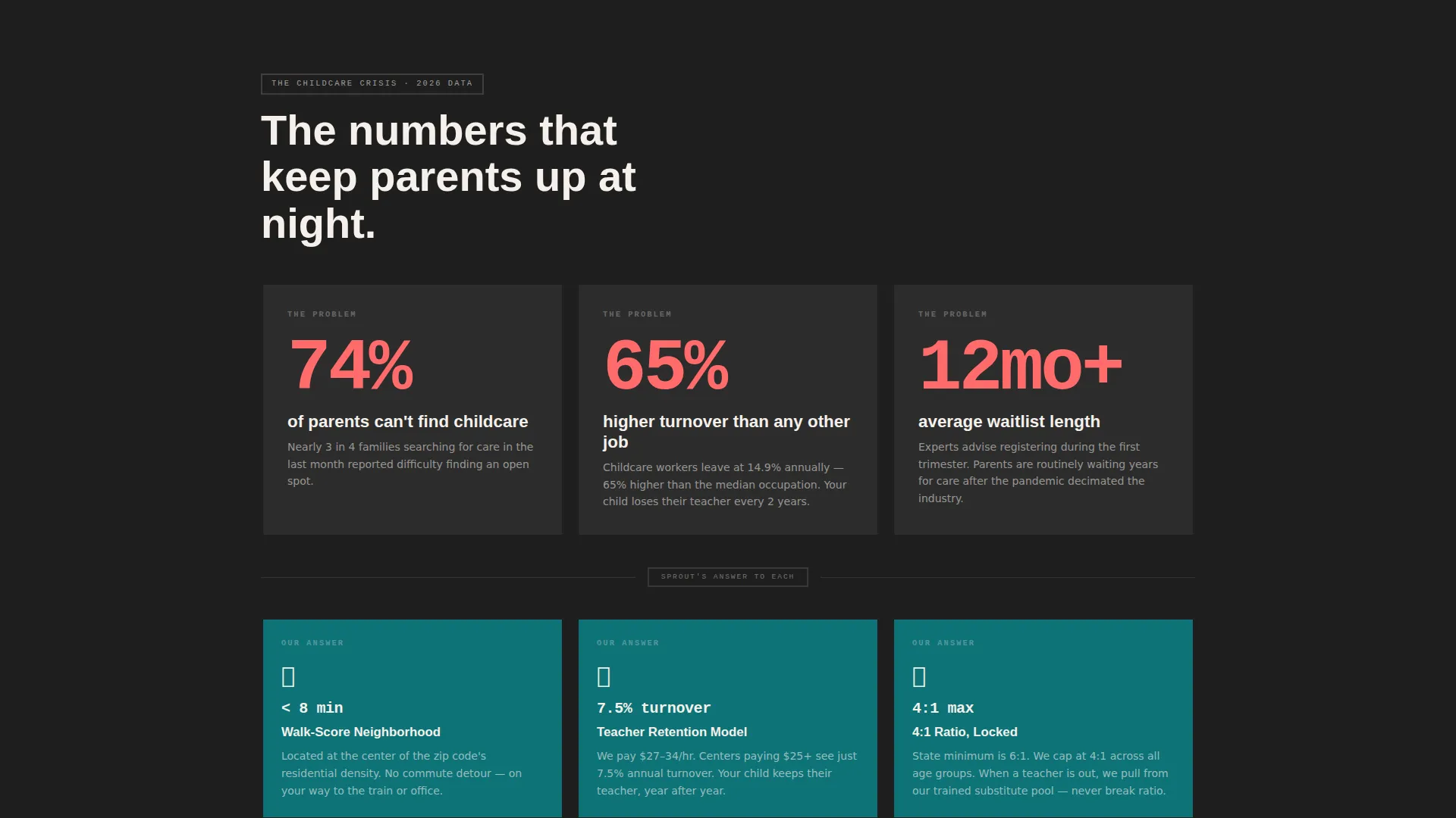
- Oversized data cards present local waitlist length, commute times, and teacher turnover rates before showing the school's own answers
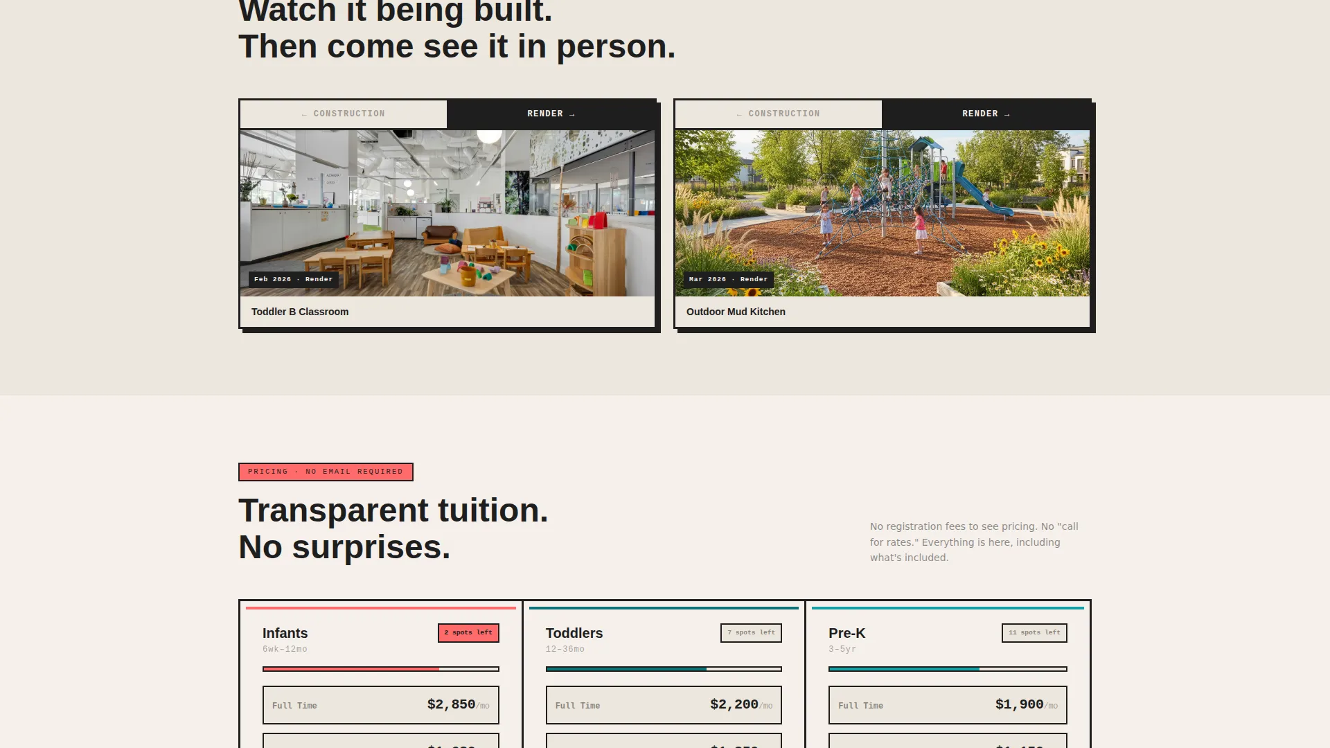
- Pricing tiers are visible without requiring an email, building immediate trust
What you get with this template
You get a fully structured coming soon landing page built around a brutalist dashboard grid. Every section is designed to escalate commitment from first glance to form submission.
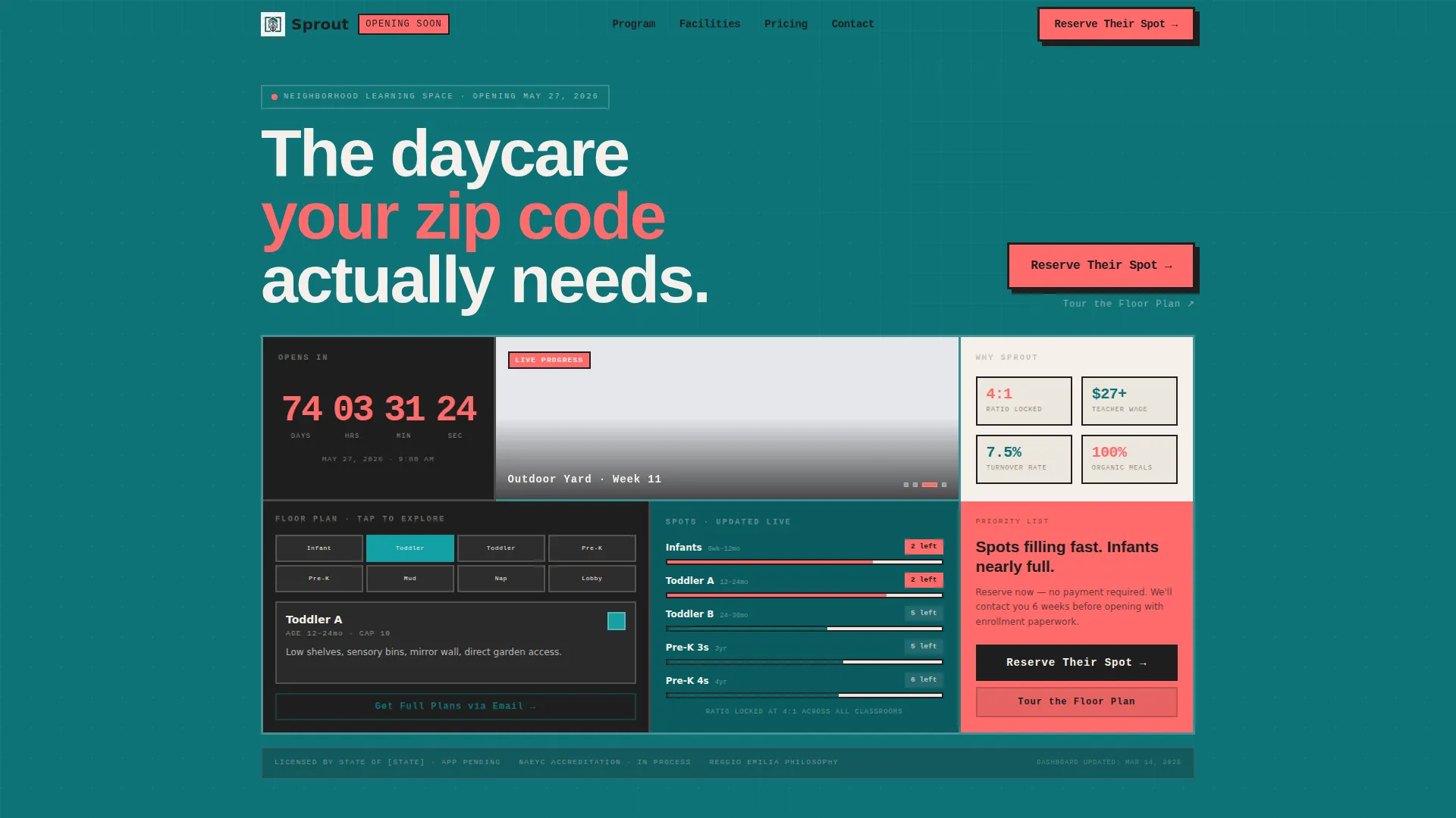
- An interactive header grid with a countdown clock, floor plan tile, ratio counter, and rotating construction photo tile
- A Problem to Solution Arc scroll section moving from raw area data cards to designed solution cards
- A three-step progressive enrollment form with a sticky coral "Reserve Their Spot" call-to-action button
Feature list
This template ships with a focused set of high-impact components. Each one is tied directly to the pre-opening enrollment goal.
Interactive Dashboard Header Grid
The header is a brutalist grid of thick-bordered cards. Each tile reveals a different facet of the school: a live countdown clock, an interactive floor plan, a per-age-group spot ratio counter, and a rotating construction progress photo tile. Cards lift on hover with hard box shadows, and numbers animate on scroll.
Problem to Solution Arc
Below the header, a stark data card presents raw local pain points in oversized type: average local waitlist length, median daycare commute time, and area teacher turnover rates. The next grid row answers each pain point with a designed solution card showing the school's teacher retention model, walk-score radius map, and a 4:1 student-to-teacher ratio.
Three-Step Progressive Enrollment Form
The enrollment form uses progressive disclosure to reduce friction. Step one collects the child's birthdate and desired start date. Step two captures parent name, email, and zip code. Step three offers optional sibling enrollment and employer partnership code fields. The confirmation screen shows the family's position number on the priority list.
Curriculum Visual Timeline Grid
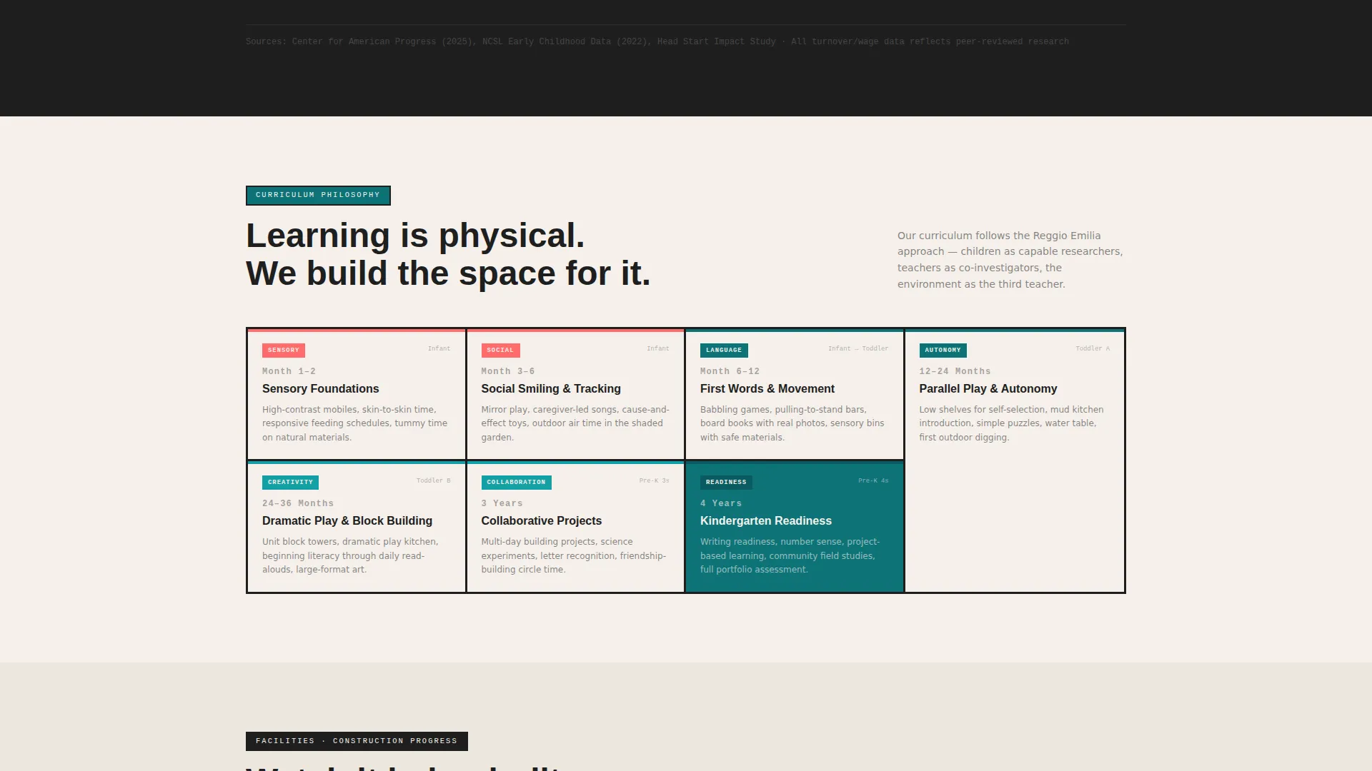
The curriculum philosophy section is presented as a visual timeline grid. It shows month-by-month developmental milestones, giving parents a concrete sense of what their child will experience after enrollment.
Facilities Before and After Card Pairs
The facilities section places construction photos beside architectural renders in before and after card pairs. This gives prospective families a tangible preview of the physical space before it opens.
Pricing Transparency Grid
Tuition tiers are displayed in a clear grid without requiring an email address first. This removes a common friction point and signals that the school has nothing to hide about cost.
Page sections overview
| Section | Purpose |
|---|---|
| Interactive Header Grid | Countdown, floor plan, spot counters, construction photos |
| Problem Data Cards | Display raw local childcare pain points in bold type |
| Solution Response Cards | Answer each pain point with the school's specific model |
| Curriculum Timeline Grid | Show month-by-month developmental milestones visually |
| Facilities Card Pairs | Compare construction photos with architectural renders |
| Pricing Transparency Grid | Show tuition tiers openly, no email required |
| Enrollment Form Steps | Collect reservation data across three progressive steps |
| Floor Plan Soft Gate | Capture emails via interactive building map engagement |
Design & branding system
The visual identity follows a Bold Brutalist theme using the Teal Catalyst color system. The palette is serious and deliberate, built for a school that respects its smallest occupants enough to avoid anything soft or condescending.
- Deep institutional teal (#0D7377) as the primary surface, raw charcoal (#1E1E1E) for structural grid lines and heavy type, warm chalk white (#F5F0EB) for card backgrounds, and hot coral (#FF6B6B) on buttons, countdown digits, and availability badges
- Thick card borders, hard box shadows on hover, and oversized brutalist numerals give the layout the weight of a stacking toy
- Micro-interactions include card lift on hover, number animation on scroll, and a rotating photo tile in the header grid
Mobile & speed optimization
The dashboard grid layout is designed to translate cleanly to smaller screens. The card-based structure stacks naturally without losing the visual hierarchy or the scarcity messaging.
- Sticky coral "Reserve Their Spot" button remains visible after the first scroll on all screen sizes
- The three-step form breaks enrollment into manageable steps, reducing drop-off on mobile devices
- Heavy-bordered card components maintain layout integrity across varying viewport widths
How this template helps you convert
This template is built around a single conversion objective: get families to reserve a spot before opening day. Every section either builds trust or applies pressure in the right order.
- The interactive header grid creates immediate curiosity and surfaces live spot counts, so visitors understand scarcity from the first second on the page.
- The Problem to Solution Arc moves visitors from recognizing a real pain to trusting this school as the answer, escalating commitment before they reach the form.
- The three-step progressive form, sticky call-to-action button, and priority list confirmation screen work together to close hesitant visitors who need one final push.
Other information about this template
This template is part of the Tealcatalyst template collection and carries the Sprout product name. It is built specifically for the daycare and preschool coming soon page use case within the broader category of daycare and preschool website templates.
- The secondary conversion path, "Tour the Floor Plan," lets hesitant visitors engage the interactive building map before committing, ending with a soft email gate for construction updates
- The template supports employer partnership codes in the enrollment form, making it practical for HR directors scouting childcare benefit options
- Each age group's remaining spots display as a live counter in the dashboard grid, reinforcing scarcity throughout the entire scroll experience
Theme
Bold Brutalist
Creative direction
Problem→Solution Arc
Color system
Teal Catalyst
Style
Dashboard/Data Grid
Direction
Lead Generation
Page Sections
Interactive Dashboard Header Grid
Problem to Solution Arc Scroll
Three-step Progressive Enrollment Form
Curriculum Visual Timeline Grid
Facilities Before and After Cards
Pricing Transparency Grid
Related questions
Who is this landing page template designed for?
Does the template show pricing without requiring a sign-up?
How does the three-step enrollment form work?
Can hesitant visitors engage without filling out the full form?
What makes the design feel urgent without feeling pushy?



