Squash - Powerful Bugtracking Landing Page Template
Squash is a split-screen bug tracking landing page template built for engineering teams who need clarity under pressure. It uses a dark, high-contrast Dashboard Pro design with a Feature Tab Switcher header, staged comparison sections, and a low-friction signup form. The layout guides visitors from problem recognition to confident sign-up in a single focused scroll.
by Rocket studio
Quick summary
Squash is a single-page landing page template for a bug tracking system. It uses a 50/50 split-screen layout, a Carbon Fiber color system, and a series of sharp versus-style comparison sections. The page moves visitors from recognizing a painful problem to clicking a clear call to action, all without unnecessary detours.
Who this template is for
This template speaks directly to technical decision-makers who feel the daily weight of unmanaged bug queues. It is designed for people who know exactly what a broken triage process costs.
- Engineering leads buried in Slack threads about failing builds
- Quality assurance managers tracking regression tickets across multiple spreadsheets
- Startup chief technology officers who still personally sort through bug reports late at night
What problem this template solves
Bug tracking tools often create as much noise as the bugs themselves. Teams lose time deciding what to fix first, and visitors to a product page cannot quickly see why your tool is different. This template solves both problems at once.
- It gives visitors an immediate, visual reason to stop using their current approach
- It removes confusion about priorities by showing a clean staged workflow
- It reduces signup hesitation with transparent pricing and a minimal form
What you get with this template
You get a fully structured landing page layout ready to present a bug report system with confidence. Every section is purposeful and sequenced to build conviction.
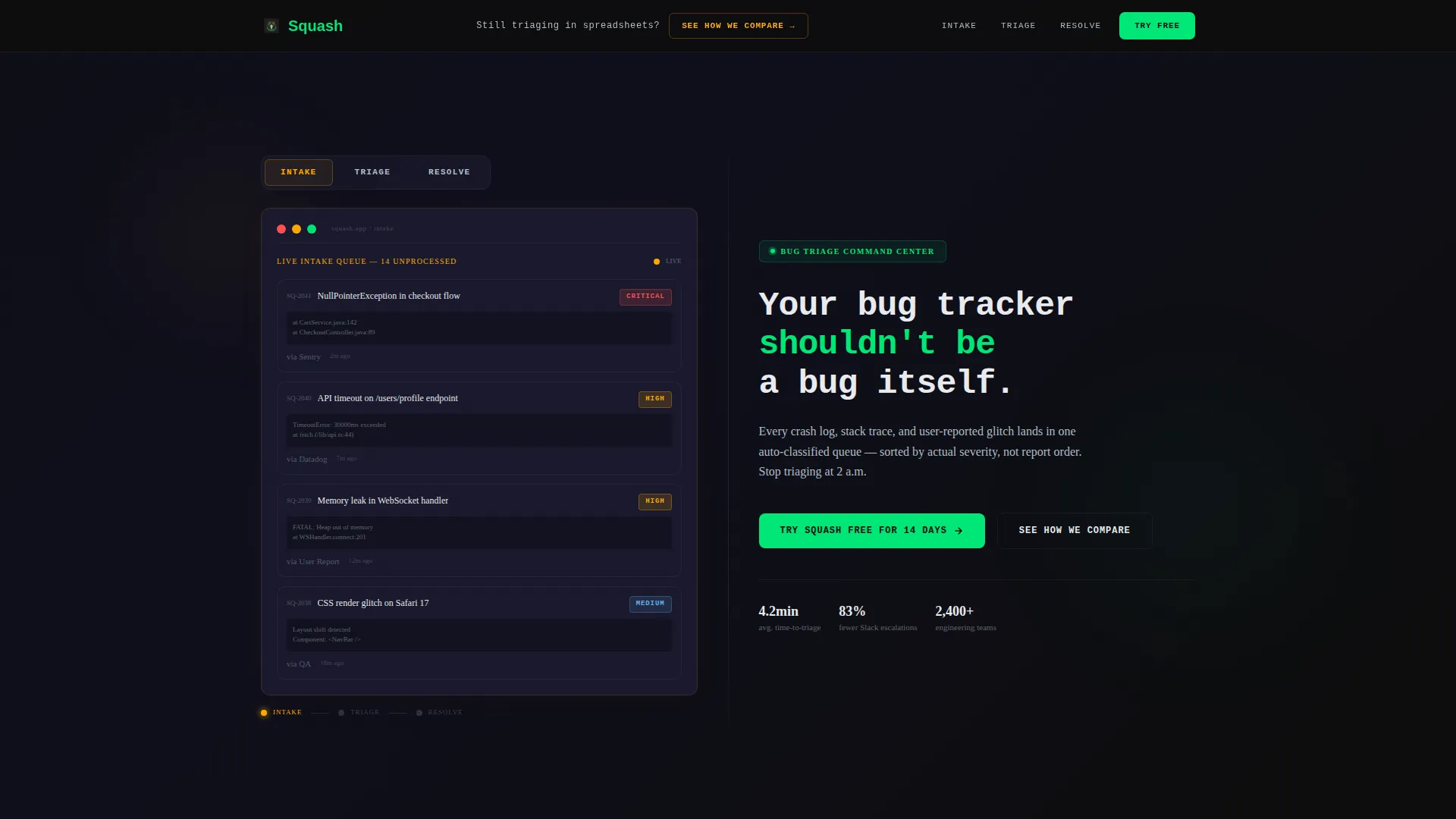
- A Feature Tab Switcher header with three interactive tab states: Intake, Triage, and Resolve
- A series of side-by-side comparison rounds contrasting the old way with the Squash interface
- An inline pricing toggle and a two-field signup form placed after the third comparison round
Feature list
This template ships with purpose-built components that work together to move a skeptical visitor toward a confident decision.
Feature Tab Switcher Header
The header splits into two halves. The left side holds three clickable tabs labeled Intake, Triage, and Resolve. Each tab swaps in a live-style dashboard screenshot showing bug cards at that stage. The right side holds a monospace headline, a one-line subhead, and two side-by-side call-to-action buttons.
Versus Comparison Sections
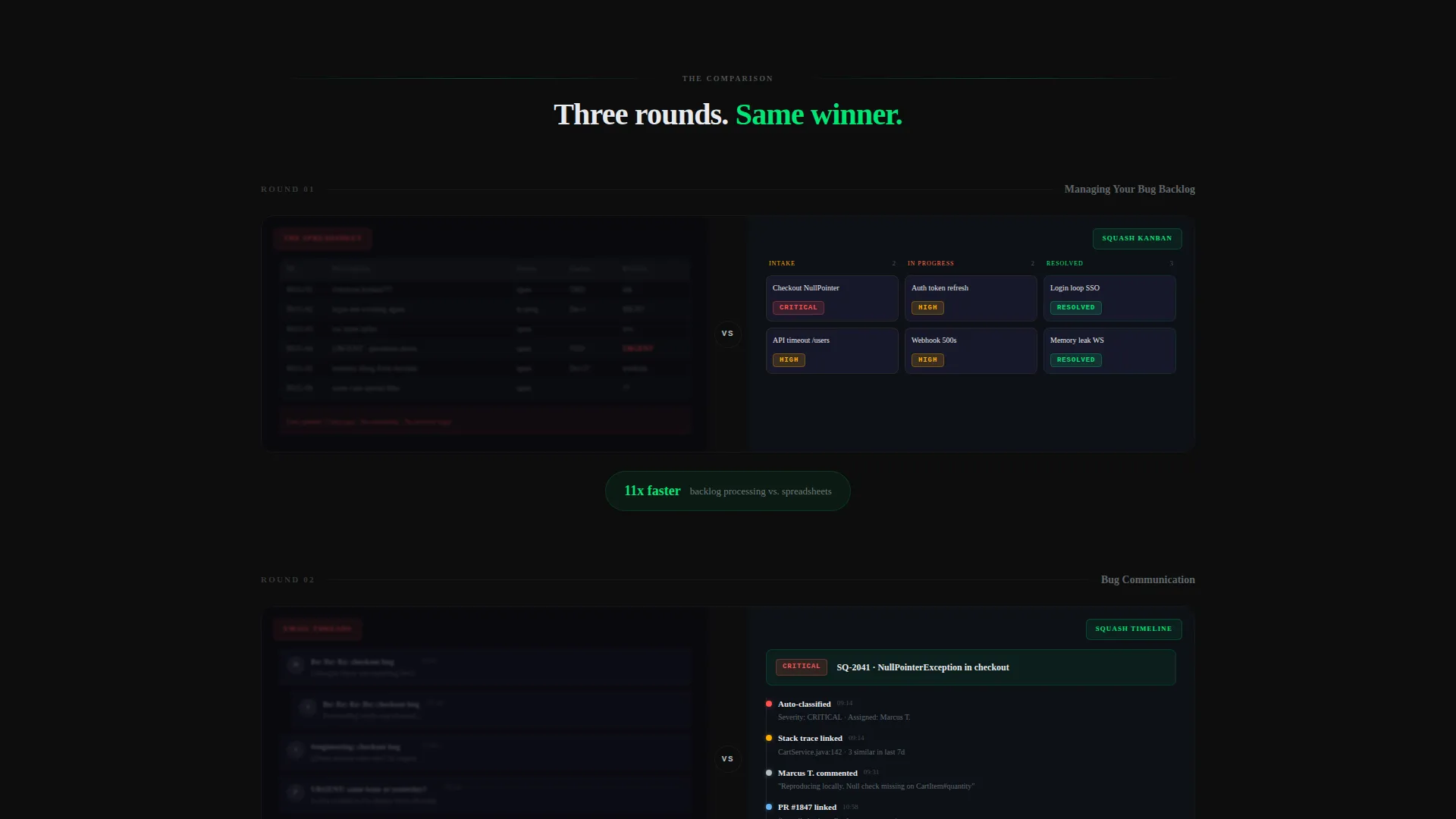
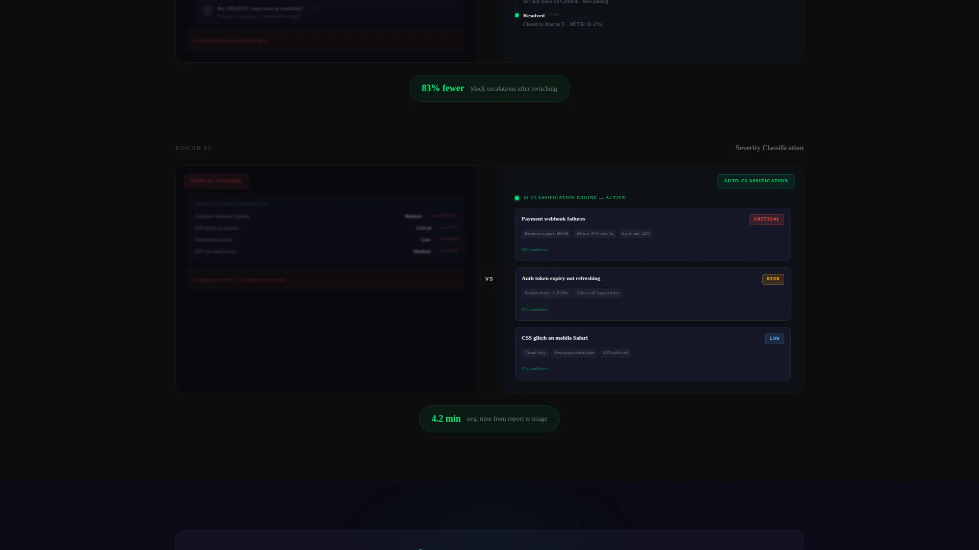
Below the fold, the layout runs a series of left-right comparison rounds. Each round places a cluttered legacy view on one side and a clean Squash interface on the other. The rounds escalate in contrast: spreadsheet versus Kanban board, email thread versus threaded comment timeline, manual tagging versus auto-classification badges.
Sticky Navigation Bar
A sticky bar sits at the top of the page at all times. It carries a secondary call to action labeled "See How We Compare" that scrolls visitors to the detailed feature matrix further down the page.
Primary Call-to-Action Placement
The main call to action reads "Try Squash Free for 14 Days" and appears after the third comparison round. Placement is deliberate: by that point, visitors have seen enough evidence to act without hesitation.
Low-Friction Signup Form
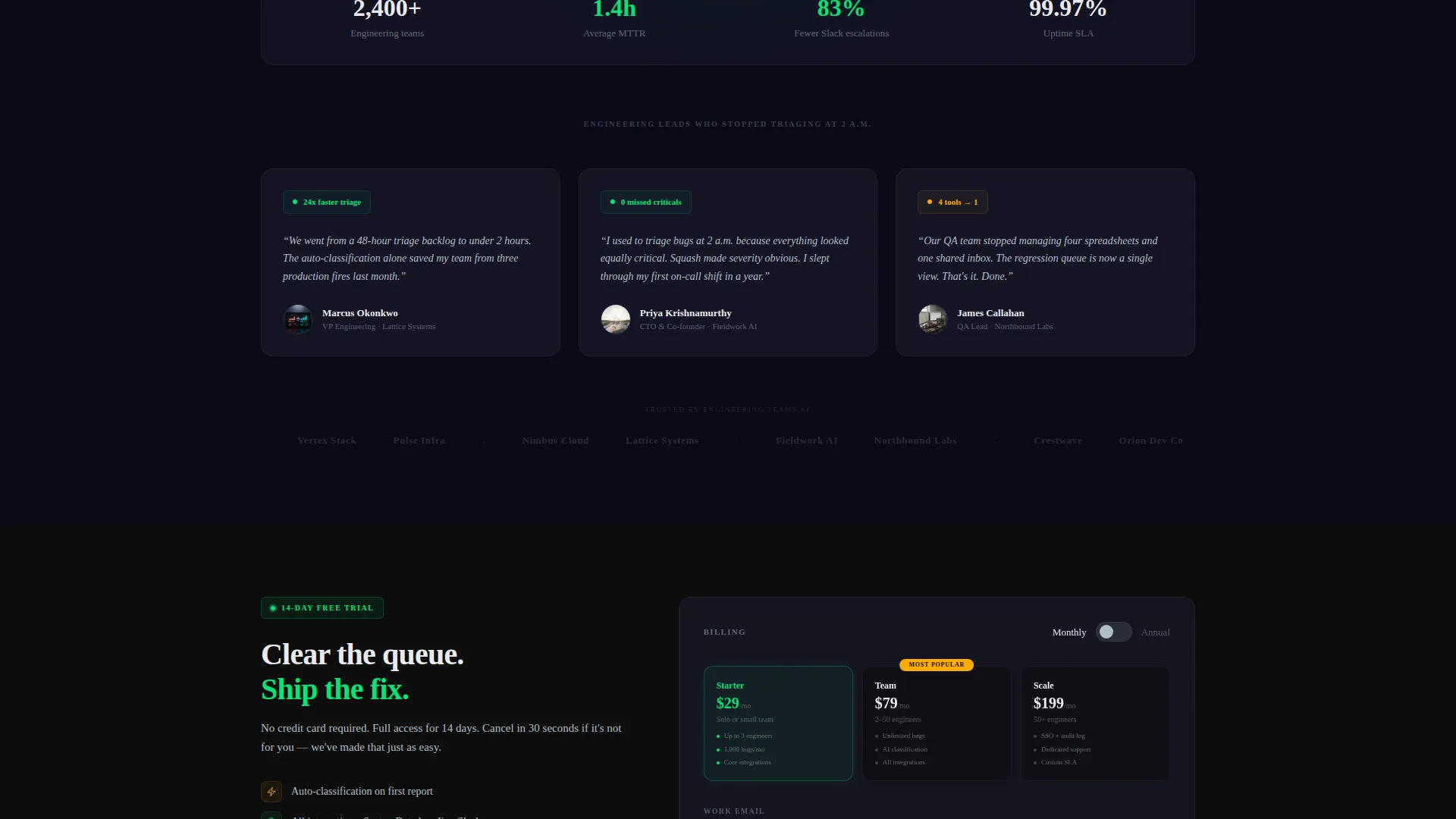
The signup form asks for only two inputs: work email address and team size. Team size options are solo, 2 to 10, 11 to 50, and 50 or more. This keeps entry fast while giving the product team useful context about each new user.
Inline Pricing Toggle
A monthly and annual pricing toggle sits directly beside the signup form. Visitors never need to hunt for pricing information. Transparency at the moment of decision is the final trust signal before the click.
Page sections overview
| Section | Purpose |
|---|---|
| Tab Switcher Header | Introduce three workflow stages with swappable dashboard screenshots and dual calls to action |
| Sticky Navigation Bar | Keep secondary call to action visible and link to the feature comparison matrix at all times |
| Comparison Round One | Contrast cluttered spreadsheet view with clean Kanban bug board |
| Comparison Round Two | Contrast email-based reporting with a threaded comment timeline |
| Comparison Round Three | Contrast manual severity tagging with automatic classification and severity badges |
| Primary call to action Block | Present the 14-day free trial offer after sufficient evidence has been built |
| Signup and Pricing | Collect work email and team size alongside an inline monthly/annual pricing toggle |
| Feature Matrix | Provide detailed side-by-side capability comparison for visitors who need more depth |
Design & branding system
The visual identity is built around a Carbon Fiber color system that feels like the interior of a fighter jet's heads-up display. Every color is earned by urgency, not decoration.
- Deep cockpit black (#0D0D0D) and woven graphite (#1A1A2E) form the dark matte base surfaces
- Status-green (#00E676) marks resolved states; alert amber (#FFAB00) signals active issues; titanium gray (#B0BEC5) handles secondary text
- A monospace typeface anchors the headline, reinforcing the technical, terminal-style aesthetic throughout the page
Mobile & speed optimization
The 50/50 split-screen layout is designed to reflow cleanly on smaller screens. Each comparison round and tab state is built to remain readable and functional without horizontal scrolling.
- The split panels stack vertically on mobile so each side gets full width and full attention
- The sticky navigation bar and call-to-action buttons remain accessible without zooming or excessive scrolling
- The two-field signup form stays compact and thumb-friendly across device sizes
How this template helps you convert
Every layout decision in this template is made to reduce doubt and lower the cost of the next click. The page is built as a structured argument, not a feature list.
- The Feature Tab Switcher lets visitors see the actual workflow before reading a single line of copy, making the product tangible from the first second on the page.
- The escalating versus comparison rounds build cumulative evidence, so by round three the visitor is not weighing options but confirming a decision they have already made emotionally.
- The inline pricing toggle and two-field form placed immediately after the third round remove the two most common final objections: cost confusion and signup friction.
Other information about this template
This template is categorized under Documentation and Support, with a focus on the bug report system niche. It is matched to the Community and Forum subcategory, reflecting the collaborative, team-based nature of modern bug triage workflows. The Dashboard Pro theme and Carbon Fiber color system give it a distinct visual personality that separates it from generic light-mode productivity tools. The Launch Energy creative direction keeps the scroll momentum building through each comparison round, so the page never feels static or slow. The Comparison/Versus landing page direction is central to the conversion strategy: visitors experience a clear before-and-after narrative rather than a passive feature list. This template is well suited for teams considering alternatives to tools like Jira, Linear, or similar issue-tracking platforms, as the comparison format naturally addresses switching hesitation.
- Built on a Split Screen (50/50) template style with alternating panel layouts throughout
- The Dashboard Pro theme ensures a professional, high-trust visual baseline for a technical audience
- Creative direction follows Launch Energy principles, accelerating scroll momentum across each comparison round
Theme
Dashboard Pro
Creative direction
Launch Energy
Color system
Carbon Fiber
Style
Split Screen (50/50)
Direction
Comparison/Versus
Page Sections
Feature Tab Switcher Header
Escalating Versus Comparison Sections
Sticky Secondary Navigation Bar
Post-evidence Primary Call to Action Block
Two-field Signup Form
Inline Pricing Toggle
Related questions
Can I change the tab labels in the header?
How many comparison rounds does the template include?
Is the pricing toggle connected to live pricing data?
Who is the signup form designed for?
Can this template work for products other than bug trackers?



