Software Discovery & Comparison Platform Website Template
Stackmatch is a dashboard-style SaaS landing page built for software discovery platforms. It combines a live terminal header, animated data grids, and a filterable comparison table to showcase intelligence-led product value. The layout guides operations teams, startup CTOs, and procurement managers toward a "Get Your Stack Report" lead capture form with a sharp, data-forward visual identity.
by Rocket studio
Quick summary
Stackmatch is a single-page lead capture template designed for SaaS directory and discovery platforms. It opens with an animated terminal header and flows through a live data grid, a filterable comparison table, and an interactive stack diagram before landing on a multi-step lead form. The Midnight Blue color system keeps the interface focused and data-driven throughout.
Who this template is for
This template suits teams building SaaS discovery or software intelligence products. The layout speaks directly to the audiences those platforms serve.
- Operations leads, procurement managers, and startup CTOs who need a fast, credible first impression from a SaaS matching tool
- Founders and product marketers launching a SaaS directory, vendor comparison platform, or software recommendation service
- Growth teams who need a high-converting lead capture page that earns trust through data before asking for a sign-up
What problem this template solves
Buyers evaluating SaaS tools are overwhelmed. They open dozens of browser tabs, build manual spreadsheets, and still feel uncertain. A landing page that looks generic will not hold their attention for more than a few seconds.
- Most SaaS landing pages lead with marketing claims rather than product proof, causing fast drop-off among technical buyers
- Operations teams and procurement managers need to see real data structure and tool logic before they will submit a work email
- Without a layered conversion path, visitors who are not yet ready to sign up leave and never return
What you get with this template
You get a complete, single-page lead capture layout built around a data-grid visual system. Every section is purposeful and flows toward conversion.
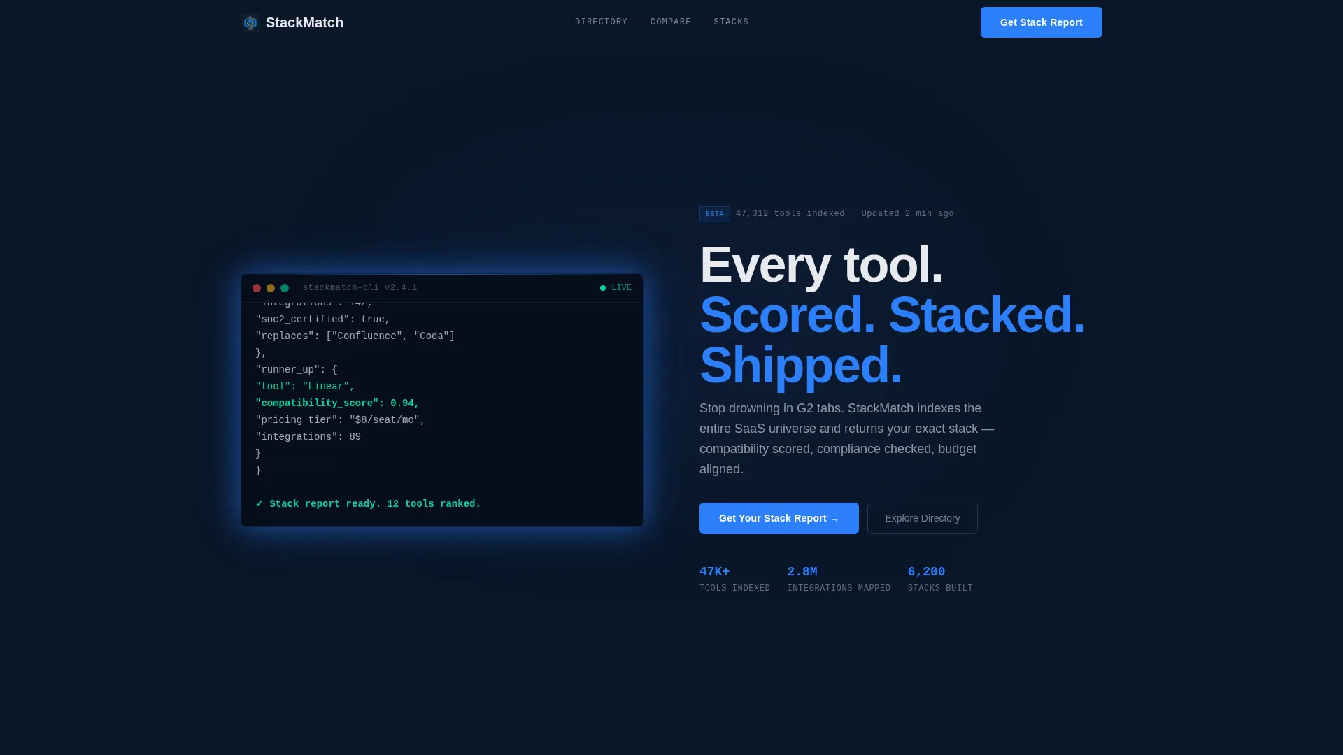
- A fullscreen animated terminal header with a live-typed API call and a JSON response object revealing matched SaaS tools, compatibility scores, pricing tiers, and integration counts
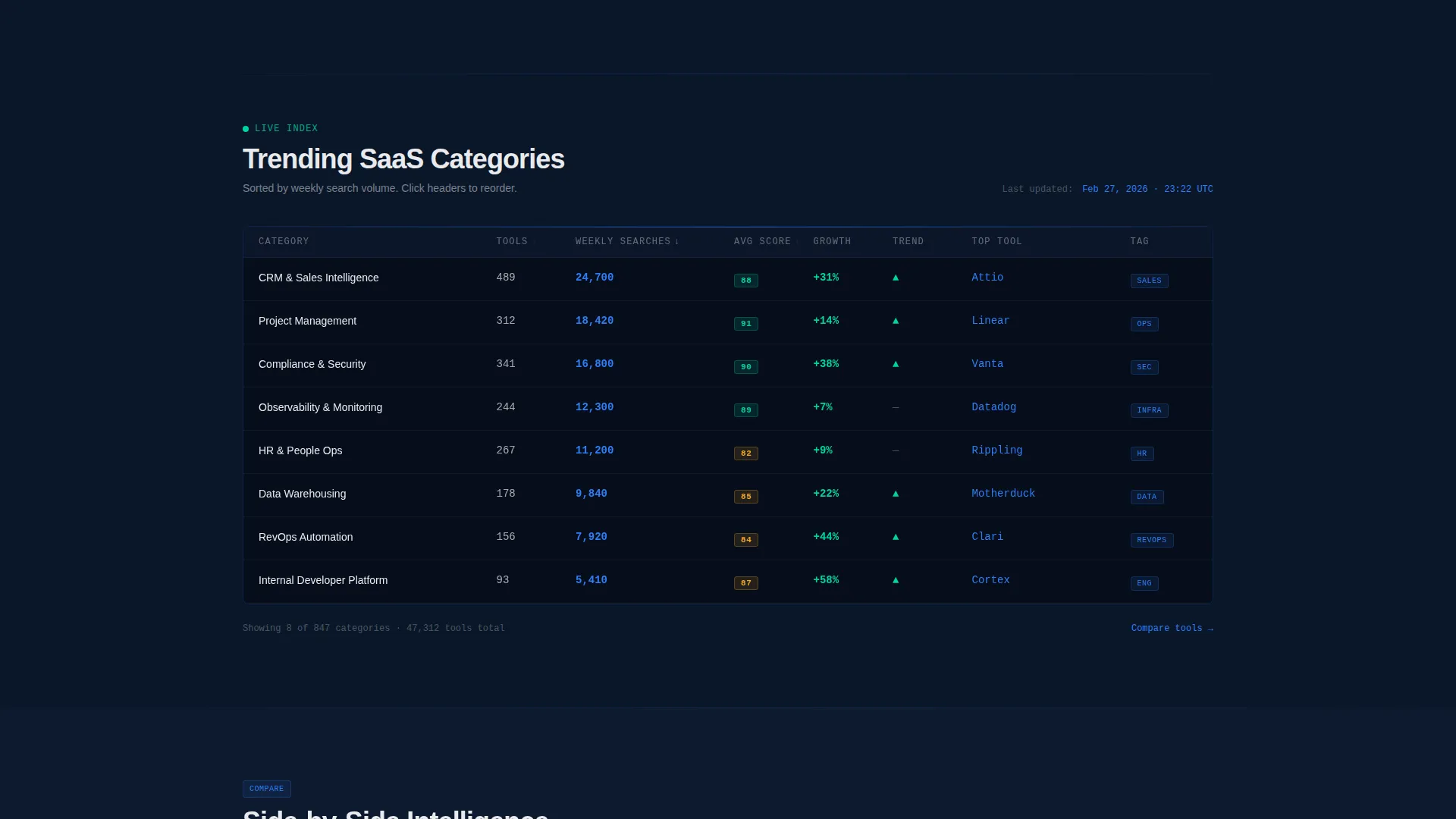
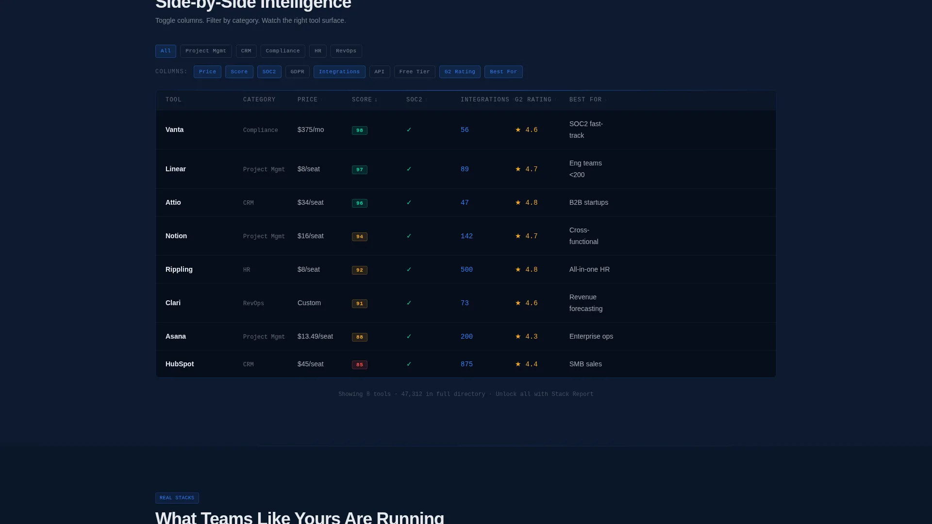
- A live data grid section with animated upward-counting numbers for trending SaaS categories, followed by a filterable comparison table with toggling columns and reordering rows
- Two lead capture touchpoints: a persistent bottom bar call to action and a full-width form section, plus a secondary "Explore the Directory" path with a gated interactive grid that captures email on the third filter applied
Feature list
This template includes six purpose-built components that work together to demonstrate product intelligence and capture qualified leads.
Animated Terminal Header
The header opens with a fullscreen dark terminal. Characters type themselves across the screen in monospaced electric blue, executing a real API call. The JSON response unfolds live, showing matched tools, compatibility scores, pricing tiers, and integration counts. No stock photography is used.
Live Data Grid with Animated Metrics
A section below the header renders trending SaaS categories with numbers that animate upward in real time. The grid gives visitors an immediate sense of platform scale and live activity, building confidence before any conversion ask.
Filterable Comparison Table
Visitors can toggle columns and watch rows reorder inside a built-in comparison table. This interactive layer lets technical buyers evaluate vendor data on their own terms, reducing friction and increasing time on page.
Interactive Stack Architecture Diagrams
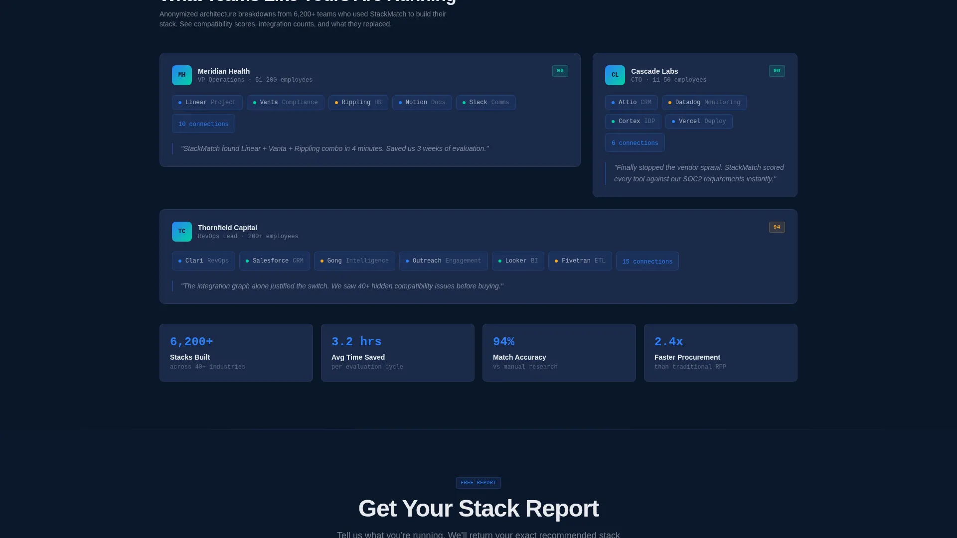
Customer stack breakdowns are rendered as interactive architecture diagrams. Each diagram shows how tools connect, giving prospects a concrete visual of what a matched software stack looks like in practice.
Multi-Step Lead Capture Form
The primary conversion form captures work email first, then company size via a four-option toggle (1 to 10, 11 to 50, 51 to 200, and 200 or more employees), then a multi-select of current tools in use. This progressive structure reduces perceived commitment at each step.
Gated Secondary Conversion Path
Visitors who bypass the primary form can explore a gated interactive directory. The template captures their email automatically on the third filter applied, earning the conversion by letting them experience the product intelligence before requesting any information.
Page sections overview
| Section | Purpose |
|---|---|
| Terminal Header | Opens with a live-typed API call and JSON payload to prove product capability immediately |
| Persistent call to action Bar | Keeps "Get Your Stack Report" visible as a bottom bar after the visitor scrolls past the header |
| Live Data Grid | Displays animated trending SaaS category metrics to signal platform scale and activity |
| Comparison Table | Lets visitors toggle columns and reorder rows to self-qualify through product interaction |
| Stack Architecture Diagrams | Shows real customer stack breakdowns as interactive diagrams to illustrate matched results |
| Full-Width Lead Form | Captures work email, company size, and current tool selection in a progressive multi-step form |
| Gated Directory Path | Offers a secondary exploration flow that triggers email capture after the third filter is applied |
Design & branding system
The visual identity follows a Directory and Discovery theme built entirely on a Midnight Blue color system. Every color decision reinforces data clarity and terminal-grade focus.
- Deep terminal navy (#0A1628) floods the background; muted interface slate (#1B2A4A) builds card and panel layers above it
- Active-state electric blue (#2D7FF9) fires on hover states, call-to-action buttons, and typed terminal characters to direct attention precisely
- High-contrast signal white (#E8EAED) handles all typography and data cell text, keeping the grid scannable without a clinical feel
Mobile & speed optimization
The template is structured to maintain grid clarity and form usability across screen sizes. Interactive components are designed to adapt without losing their data-forward character.
- The persistent call to action bar, multi-step form, and filterable table are all laid out to remain functional and readable on smaller screens
- Card layers and data grid sections use the slate and navy palette to preserve contrast and legibility on mobile displays without relying on images
How this template helps you convert
The layout is built around a Launch Energy creative direction that increases specificity and urgency with every scroll, pulling visitors deeper until they are ready to act.
- The terminal header establishes product credibility in the first three seconds. Visitors see working code, not marketing copy, which builds immediate trust with technical buyers.
- The comparison table and stack diagrams give procurement managers and operations leads a self-directed way to evaluate the product. Engaged visitors are far more likely to submit a lead form after interacting with live data.
- The two-path conversion system catches visitors at different stages of readiness. The primary form converts high-intent traffic, while the gated directory captures early-stage visitors who need more product exposure before committing.
Other information about this template
This template is built specifically for the SaaS company lead capture landing page use case within the broader SaaS company website templates category. It is part of the Technology template collection and carries a strong intersection match for teams building software discovery or vendor intelligence products.
- The template style is Dashboard and Data Grid, making it well suited for any data-heavy SaaS product that needs to prove its intelligence before asking for a sign-up
- The Launch Energy creative direction, Code Snippet header concept, Lead Generation layout direction, and Directory and Discovery theme all come from matched design context fields
- Teams can adapt the color tokens, form field labels, call to action text, and grid column headers to match their specific platform without redesigning the layout structure
Theme
Directory & Discovery
Creative direction
Launch Energy
Color system
Midnight Blue
Style
Dashboard/Data Grid
Direction
Lead Generation
Page Sections
Animated Terminal Code Header
Live Animated Data Grid
Filterable Comparison Table
Interactive Stack Diagrams
Multi-step Lead Capture Form
Gated Directory Conversion Path
Related questions
Who is this landing page template built for?
Can I change the call to action text and form fields?
Does the template include two separate conversion paths?
What does the terminal header actually show?
Is this template suitable for a B2B SaaS lead generation page?



