Library Booking System Landing Page Template
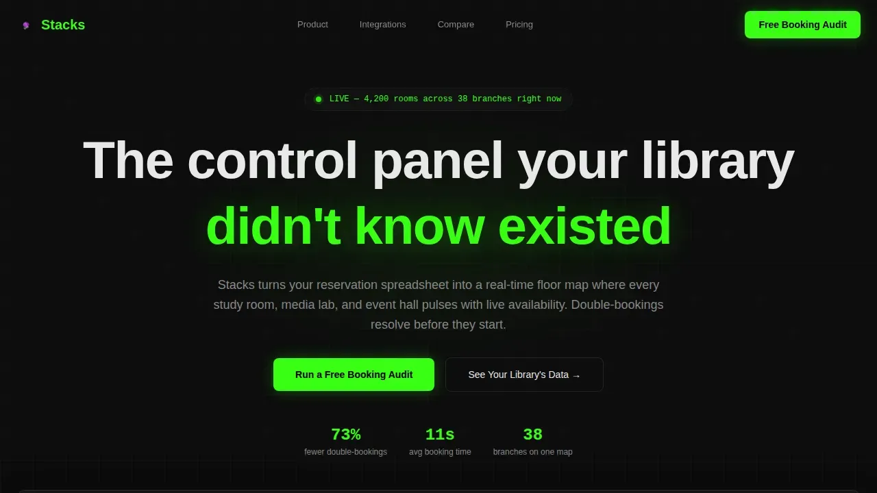
The Stacks real time library booking system landing page template is a single-page hub and spoke layout built for library software marketers. It combines a live-feeling dashboard hero, phosphor-green data callouts, a versus comparison table, and an audit form to convert university librarians, public library directors, and school media coordinators into qualified leads.
by Rocket studio
Quick summary
This landing page template is purpose-built for a real-time library room booking platform. It opens with a browser-chrome tab switcher showing three dashboard views, then radiates outward through anchor-nav spoke sections covering integrations, access control, and reporting. A sticky comparison table and a short audit form close the page with a clear call to action.
Who this template is for
This template is designed for teams marketing a library booking system to institutional decision-makers. It speaks directly to the people managing reservations at scale, every single day.
- University head librarians dealing with double-booked study rooms and back-to-back complaints
- Public library directors juggling community room requests across multiple branches and civic groups
- School district media coordinators who still route AV cart bookings through long email chains
What problem this template solves
Most library booking landing pages look like brochures. They bury the proof and lead with paragraphs. This template flips that order. It leads with numbers, shows the product in action, and lets the comparison table do the persuading.
- Staff waste hours each day resolving conflicts that a real-time system would catch automatically
- Patrons abandon self-service booking when the page is cluttered or the availability status is not clearly displayed
- Directors cannot justify a system change without seeing a measurable before-and-after view
What you get with this template
You get a complete single-page layout with every section pre-structured and ready to populate with your product content. The template saves significant setup time and gives your team a credible, conversion-focused starting point.
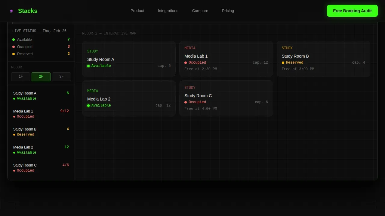
- A browser-chrome hero with three clickable tab views: Floor Map, Analytics, and Scheduling
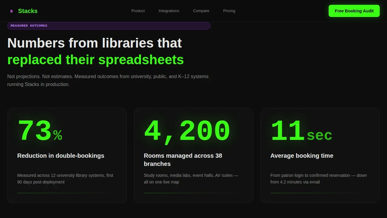
- A stats impact strip where phosphor-green numbers like "73% reduction in double-bookings" are displayed at display scale before any body copy
- A sticky versus comparison table, a hub and spoke anchor nav, and a short audit call-to-action form
Feature list
This template includes six core building blocks. Each one serves a specific conversion role on the page.
Browser Chrome Tab Switcher Hero
The header places three tabs inside a realistic browser frame. Each tab reveals a different live-feeling dashboard view. Users can click between Floor Map, Analytics, and Scheduling without any page reload, making the product feel like real software from the first screen.
Stats-First Impact Strip
Large phosphor-green data points are displayed before any explanatory text. Numbers like "4,200 rooms managed across 38 branches" and "11-second average booking time" hit the reader first. This approach front-loads proof and reduces the number of clicks needed to build trust.
Hub and Spoke Anchor Navigation
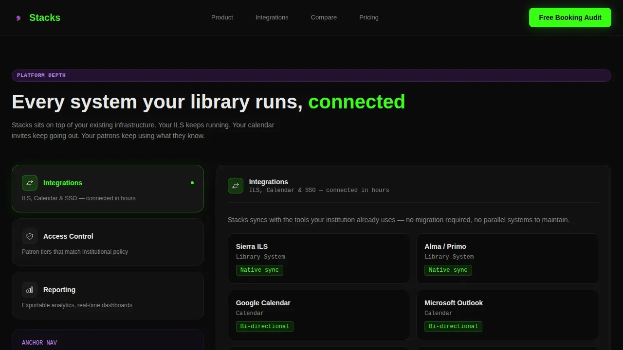
An anchor nav sits at the top of the content area and links to three spoke sections: Integrations, Access Control, and Reporting. Readers can navigate directly to the section most relevant to their role without scrolling the full page length.
Sticky Versus Comparison Table
A two-column table stays anchored mid-page. One column covers your current system; the other covers Stacks. Line items compare manual conflict resolution against auto-detection, email-based requests against patron self-service, and monthly exports against real-time dashboards. Each Stacks cell is displayed with a faint green highlight.
Booking Audit Call-to-Action Form
The primary call to action is a short form asking for institution type, number of bookable spaces, and current system name. Visitors select their institution type from a dropdown and submit in under a minute. A secondary link directs users to a live interactive demo pre-loaded with sample analytics.
Scroll-Triggered Animation Layer
Number reveals fire on scroll entry. Green availability indicators pulse on the floor map view. Comparison row highlights animate as the table enters the window. These details make the page feel like a working dashboard, not a static brochure.
Page sections overview
| Section | Purpose |
|---|---|
| Browser Chrome Hero | Show three live dashboard tab views |
| Stats Impact Strip | Display quantified proof points first |
| Anchor Nav Hub | Link to all three spoke sections |
| Integrations Spoke | Cover ILS, calendar, and email sync |
| Access Control Spoke | Explain patron authentication tiers |
| Reporting Spoke | Highlight exportable usage analytics |
| Versus Comparison Table | Contrast old workflows with Stacks |
| Audit call to action Form | Capture lead with a short booking audit |
| Footer Row | Add nav links and secondary services |
Design & branding system
The visual system is built around an Acid Digital palette on a void black background. Every color has a specific role, and the result feels like a hacker's monitor reflected in a librarian's glasses.
- Void black (#0D0D0D) backgrounds keep the dashboard atmosphere consistent across every section of the page
- Terminal phosphor green (#39FF14) fires on live data points, availability indicators, and booked status markers so critical numbers are always visible
- UV violet (#7B2FBE) marks interactive states, selected menu items, and anchor nav highlights; status-bar white (#E8E8E8) keeps body text breathable and legible at length
Mobile & speed optimization
The template is built desktop-first to match how library administrators actually use a dashboard product. That said, the layout does not break on smaller screens.
- Column structures adjust gracefully so the comparison table and stats strip remain readable on tablets
- The audit form is built with minimum fields to avoid user frustration on any screen size, following clean layout principles for booking pages
How this template helps you convert
Every structural choice on this page is made to reduce hesitation and move the right visitor toward submitting the audit form.
- Front-loading large data points at the top of the page means visitors check the proof before they read a single marketing claim, building trust faster than a paragraph ever could
- The comparison table gives directors a ready-made justification for change, displayed in a format they can save and share with a budget committee without necessarily requesting a sales call
- The anchor nav lets users navigate to the spoke section most relevant to their specific role, so an IT administrator can jump to Access Control while a director goes straight to Reporting
Other information about this template
The Stacks real time library booking system landing page template is found in the Library Vertical SaaS category. It is a great option for teams who need a production-ready landing page without building every section from scratch.
- The landing pages tile for this template is displayed under the Technology category in the marketplace, making it easy to locate
- Landing pages built on this framework use customizable panel sections; you can add custom blocks, sliders, and callouts to bring additional content into any spoke section
- To link directly to booking-related pages within your site, use the /availability or /rooms path in the appropriate link or URL field; note that the footer of your Stacks site also supports custom navigation links
- You can drag and drop content columns to change the layout of any landing page section, then click save to apply your updates; click save again after any content type change to keep edits from being lost
- The menu in the header can include call-to-action buttons that navigate users to internal pages or external services; use the menu to direct users to the booking form or demo window without making them scroll back to the top
- A Room List page can be added to your site so users can check all available spaces, select a room, enter the date and time needed, and submit their request in one place
- Real-time occupancy tracking increases resource usage rates by 25 to 35 percent through better visibility, and automated notifications help avoid no-shows by keeping patrons informed
Theme
Dashboard Pro
Creative direction
Stats-First Impact
Color system
Acid Digital
Direction
Comparison/Versus
Page Sections
Browser Chrome Tab Switcher Hero
Stats-first Impact Strip
Hub and Spoke Anchor Navigation
Sticky Versus Comparison Table
Booking Audit Call-to-action Form
Scroll-triggered Animation Layer
Related questions
Who is the primary audience for this landing page template?
What sections are included in this template?
Can I add my own content and branding?
How does the comparison table help convert visitors?
Does this template include a functional booking engine?



