Specialist Library & Research Center Professional Website Template
Stacks is a zigzag landing page template built for digital library and archive platforms. It follows a Problem→Solution Arc that turns institutional chaos into organized discovery. With a bold slate-and-sky color system, geometric visual motifs, and two low-friction lead capture forms, Stacks helps university librarians, museum curators, and nonprofit directors attract the right audiences and start real conversations.
by Rocket studio
Quick summary
Stacks is a single-page landing page template designed for digital archive and library platforms. It uses a striking Problem→Solution Arc layout to show how scattered collections become searchable, browsable experiences. The Playful Geometric visual identity combines deep slate tones with open-sky blue, geometric shape patterns, and a giant architectural headline to create a sense of discovery from the very first scroll.
Who this template is for
This template speaks directly to institutions and individuals who steward large collections of documents, photographs, manuscripts, or oral histories. It is designed for people who need to present their platform's value clearly and convert qualified visitors into leads.
- University librarians managing undigitized special collections or rare manuscript archives
- Museum curators whose photo archives exist on a single aging machine with no backup path
- Nonprofit directors sitting on decades of oral histories that no search engine can find
What problem this template solves
Many digital archive platforms struggle to explain their value to busy institutional buyers. The pain is real and specific: folders nested twelve levels deep, blank metadata fields, and file formats no modern browser can open. Visitors land on a page and leave before they understand what the platform actually does.
- There is no clear visual narrative connecting the problem to the solution
- Lead capture forms ask too many questions and lose visitors before they convert
- The design feels either too corporate or too plain to build trust with academic and cultural institutions
What you get with this template
You get a fully structured single-page landing page that walks visitors through a deliberate narrative arc. Every section has a defined role, from introducing the problem viscerally to celebrating the transformation and inviting action.
- A giant centered headline section, a full zigzag problem block, a sky-blue pivot band, and a mirrored solution block
- Two lead capture forms: a low-friction three-field audit request and an email-only PDF case study gate
- A cohesive Playful Geometric design system with slate, warm gray, and sky blue applied consistently across all sections
Feature list
This section covers the core design and structural capabilities built into this template.
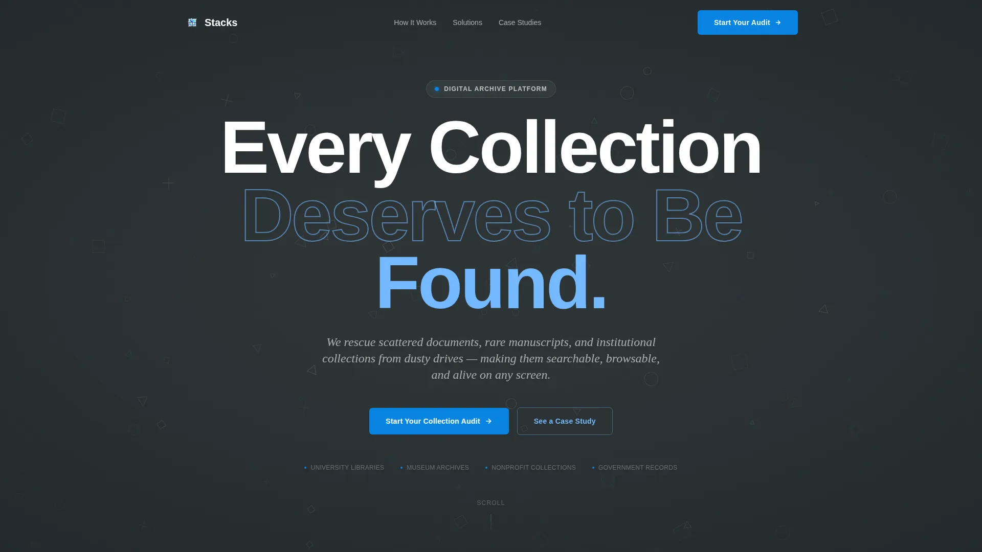
Giant Architectural Headline Section
The header places white geometric letterforms on a deep slate background at a scale that feels like carved library signage. A subtle animated grid of tiny geometric shapes slowly rotates behind the text, suggesting organizational intelligence without distracting from the words themselves.
Zigzag Problem and Solution Layout
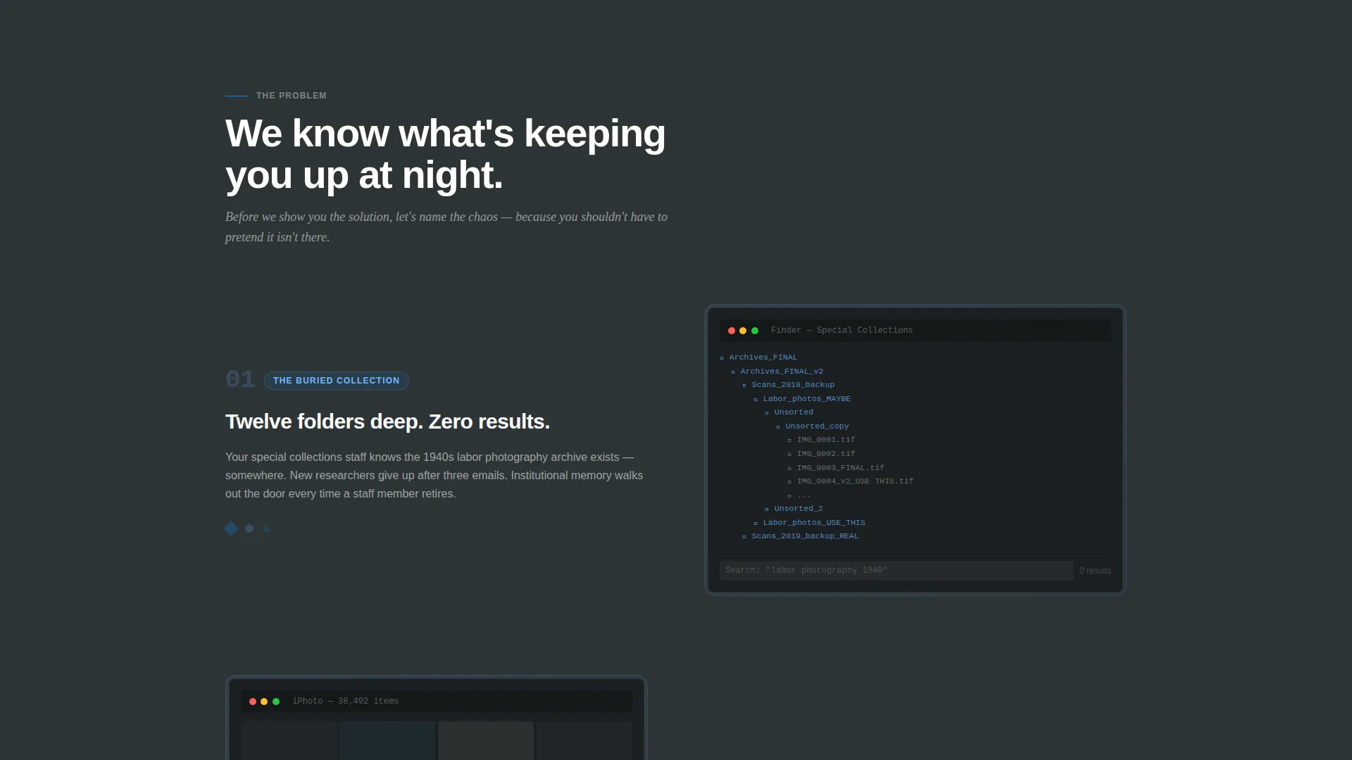
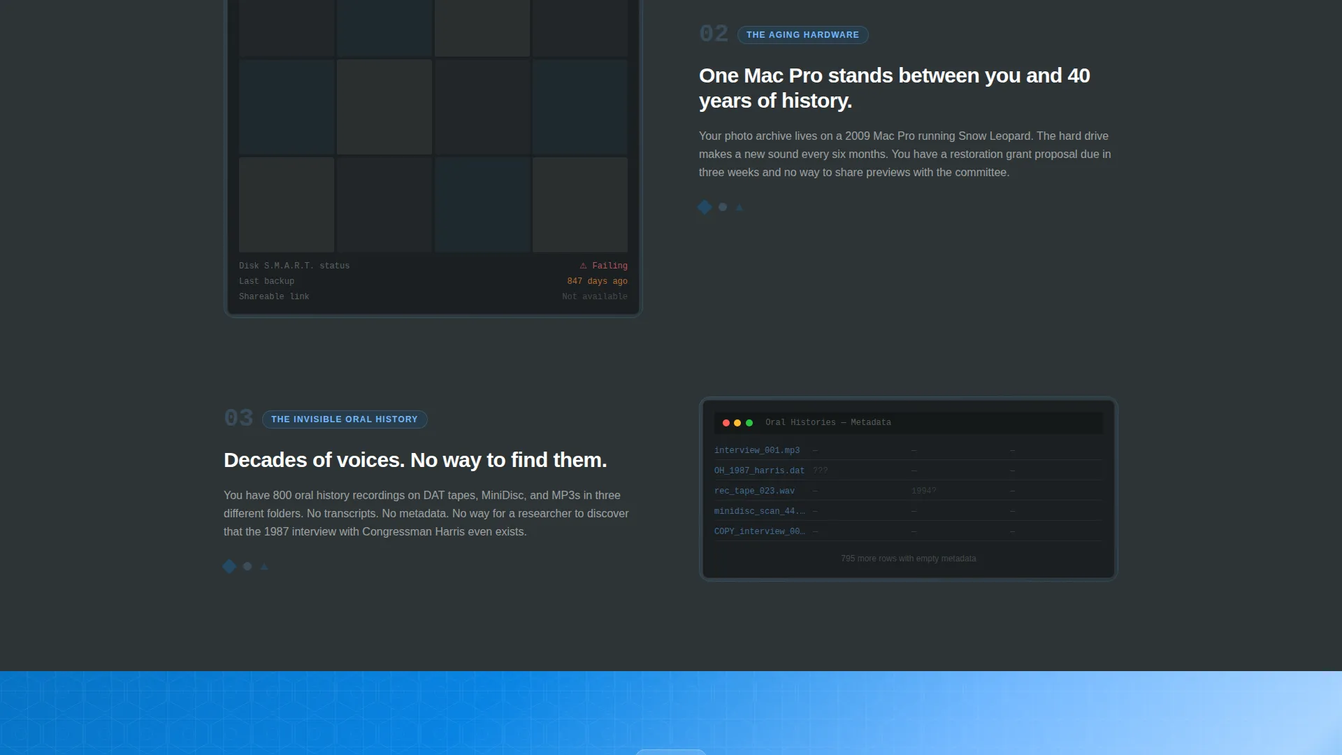
The page alternates left-right panel pairs throughout two distinct narrative phases. The first phase shows raw pain points with real visual examples. After the sky-blue pivot band, the second phase mirrors each problem with its resolved counterpart, from searchable interfaces to full-text results to mobile browsing of historical photo archives.
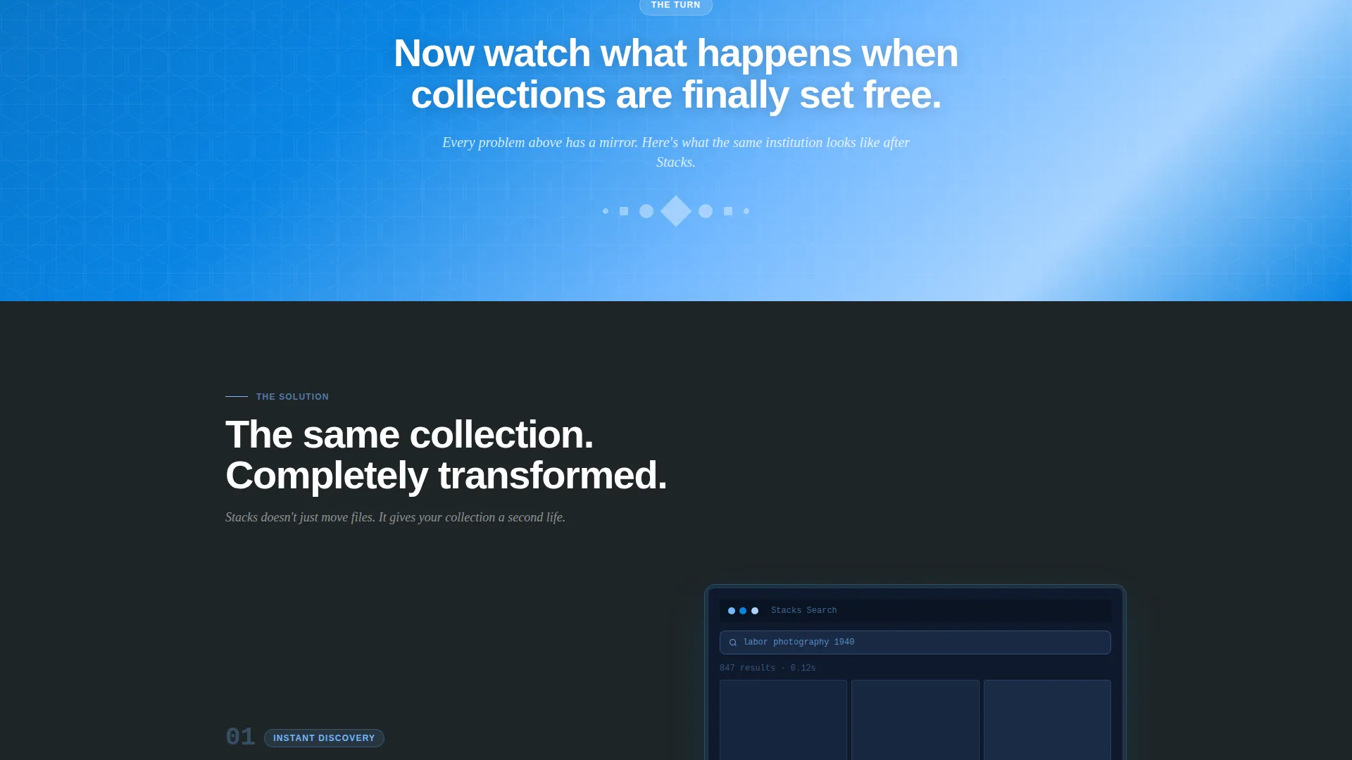
Sky-Blue Narrative Pivot Band
A full-width sky-blue band separates the problem phase from the solution phase. This single design element acts as a visual turning point, giving the scroll a clear before-and-after structure that visitors feel as they move down the page.
Low-Friction Lead Capture Forms
The mid-page audit form asks only three things: institution type via dropdown, estimated collection size via a playful slider, and a work email address. No phone number, no last name. A second form gates a downloadable PDF case study behind email only, offering a softer conversion path for visitors who are not yet ready to talk.
Evolving Geometric Shape System
Geometric motifs, including circles, triangles, and grid patterns, appear as section dividers and background textures throughout the page. As the visitor scrolls, shapes shift from scattered arrangements to clean tessellations, physically reinforcing the narrative of chaos becoming order.
Slate and Sky Color System
The palette pairs deep archive slate with open-sky blue and a bright catalog accent for all buttons and interactive elements. Warm gray handles secondary text and supporting elements, keeping the overall feel serious but approachable.
Page sections overview
| Section | Purpose |
|---|---|
| Header Headline | Architectural type and animated grid introduce the platform |
| Problem Panel One | First pain point shown with real visual context |
| Problem Panel Two | Second pain point in alternating layout |
| Problem Panel Three | Third pain point completing the problem phase |
| Pivot Band | Full-width sky-blue band signals the narrative turn |
| Solution Panel One | First collection transformation mirroring problem one |
| Solution Panel Two | Second transformation with searchable interface example |
| Solution Panel Three | Third transformation showing mobile archive browsing |
| Mid-Page call to action | Audit request form with three low-friction fields |
| Case Study Gate | Email-only PDF download for consideration-stage visitors |
| Bottom call to action | Second audit form instance closing the page |
Design & branding system
The visual identity is built around a Playful Geometric theme applied to a serious institutional context. The result feels like a brutalist library building on a bright spring day: structured and confident, but lit from above.
- Color system uses deep archive slate (#2D3436), reading-room warm gray (#636E72), open-sky blue (#74B9FF), and bright catalog accent (#0984E3) for all buttons and hover states
- Geometric shapes including circles, triangles, and grid patterns serve as dividers, background patterns, and section transitions throughout the page
- Typography is treated as architecture in the header: large-scale white letterforms dominate the viewport without competing with any image
Mobile & speed optimization
This template is built with responsive layout behavior in mind so the zigzag structure adapts cleanly across screen sizes. The alternating panel layout stacks vertically on smaller screens without breaking the narrative flow.
- Zigzag panels reflow to a single-column stacked layout on mobile and tablet viewports
- The slider input and dropdown fields in the lead capture form are touch-friendly by design
- Geometric background patterns scale and simplify on smaller screens to keep visual weight appropriate
How this template helps you convert
The page is structured to move visitors through an emotional and logical arc, ending at a moment of trust and low-stakes action. Every conversion element is placed with intention.
- The Problem→Solution Arc builds credibility before asking for anything. Visitors see their exact situation reflected in the problem panels, which earns the right to present the solution.
- Two separate conversion paths serve visitors at different stages. The audit form captures decision-ready leads; the case study PDF gate captures visitors who are still weighing their options.
Other information about this template
This template sits in the Education and Training category under the Library and Research Center subcategory, targeting the Digital Library and Archive niche. It is built for lead generation and follows a Zigzag and Alternating layout style.
- The template style is classified as Zigzag and Alternating with a Playful Geometric theme
- The creative direction is a Problem→Solution Arc, a proven structure for institutional software and platform marketing
- The header concept is Giant Headline Centered, making the typography itself the primary visual element
- This landing page template works well for platforms digitizing special collections, institutional photo archives, oral history repositories, and rare manuscript libraries
Theme
Playful Geometric
Creative direction
Problem→Solution Arc
Color system
Slate & Sky
Style
Zigzag/Alternating
Direction
Lead Generation
Page Sections
Giant Architectural Headline Section
Zigzag Problem and Solution Layout
Sky-blue Narrative Pivot Band
Low-friction Lead Capture Forms
Evolving Geometric Shape System
Slate and Sky Color System
Related questions
Who is this landing page template designed for?
What does the lead capture form ask visitors?
What is the PDF case study download for?
Can the color palette and typography be customized?
Does this template include more than one page?



