Premium Micro-SaaS & Developer Tools Comparison Website Template
Stacktrace is a Bold Brutalist landing page template built for error tracking and observability platforms. It opens with an interactive live error dashboard, then scrolls through an animated comparison table, a noise-reduction demo, and a sequential integration reveal. Every section is designed to show developers that the product works before they ever reach a call-to-action button.
by Rocket studio
Quick summary
Stacktrace is a scroll-reveal landing page template for developer tools focused on error tracking and production observability. It pairs a terminal-aesthetic visual identity with high-interactivity sections, guiding backend engineers and DevOps leads from a live error feed straight to a confident signup. The page converts by showing, not claiming.
Who this template is for
This template is built for founders, developers, and product teams shipping error tracking or observability platforms. It speaks the language of engineers who debug microservices at odd hours and DevOps leads who inherited systems with no visibility into what goes wrong in production.
- Backend engineers who need to quickly find the root cause of a production exception
- DevOps leads responsible for monitoring a legacy service stack with limited existing tools
- Startup CTOs who must demonstrate uptime and reliability before a funding round
What problem this template solves
Production errors are noisy. When thousands of exceptions fire simultaneously, a log feed becomes unreadable and alert fatigue sets in fast. Engineers lose hours chasing the wrong stack trace, and the devops team spends more time triaging than fixing. This template gives an error tracking platform a page that communicates signal over noise from the very first scroll.
- Raw error volume overwhelms teams when similar exceptions are not grouped by stack trace fingerprints
- A common mistake is launching an observability tool without a page that proves value before signup
- Visitors need to see a full stack trace rendered clearly before they trust any error tracking claim
What you get with this template
You get a fully structured, single-page scroll-reveal layout with six distinct content sections, each with its own animation behavior and conversion intent. Every section is built around the idea that developers need to see the product function before they reach the call-to-action button.
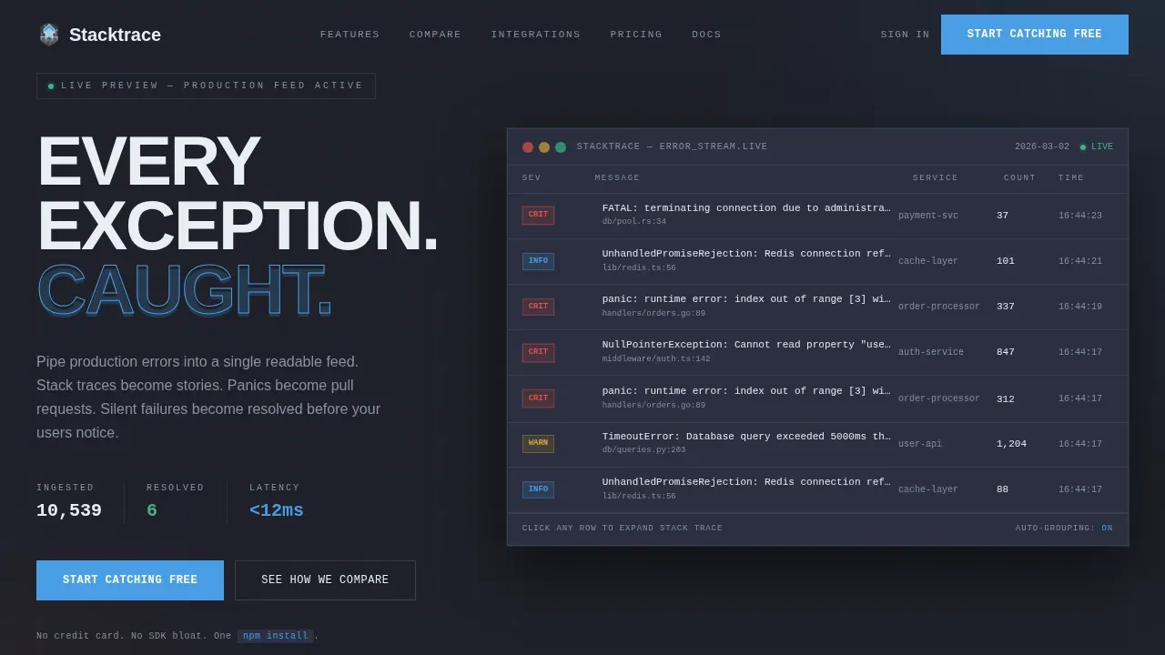
- An interactive hero dashboard showing a live mock error feed with stack trace hover-expand and a resolution counter
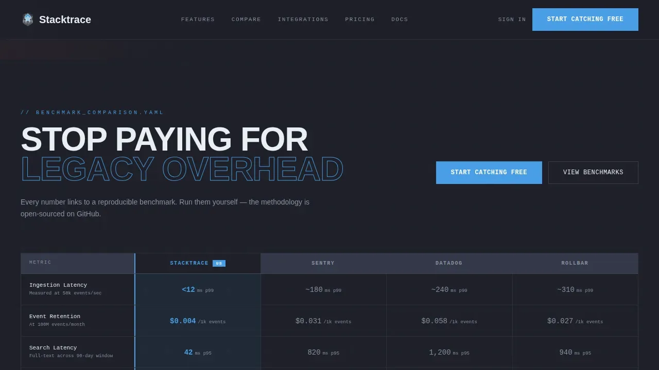
- An animated comparison table section that drops metrics into view as concrete blocks
- A noise-reduction demo, integration logo reveal, social proof section, and a single-row footer
Feature list
This template ships with a defined set of key features designed to move technical buyers from skepticism to signup. Each feature serves a specific function in the conversion path.
Interactive Live Error Dashboard
The header opens with a functioning mock error feed rendered directly in the viewport. Exceptions cascade in real time, severity badges pulse, and each stack trace expands on hover to reveal the full call stack and relevant details. A resolution counter ticks upward in the corner, making the product feel already alive. Visitors are inside the product before they scroll a single line.
Animated Comparison Table
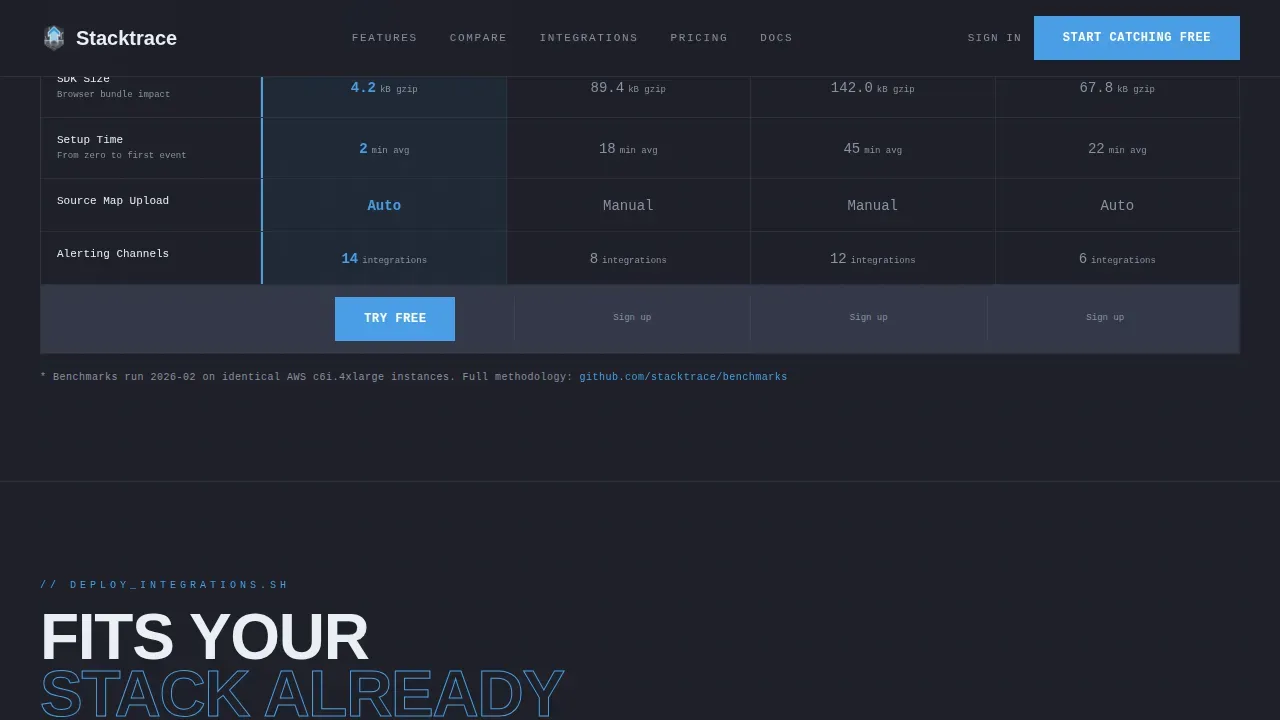
A side-by-side comparison section measures this tool against legacy competitors across ingestion speed, retention cost, and search latency. Numbers animate into view as concrete blocks dropping into place. Each metric can link to a reproducible benchmark, giving developers the technical granularity they need to make an informed decision. This section is the primary conversion anchor, with a call-to-action placed immediately after the final row.
Noise Reduction Demo Section
This section visualizes the platform's core value: 10,000 raw errors collapsing into 12 actionable issues. The animation shows how similar exceptions are automatically grouped using stack trace fingerprints, eliminating alert fatigue and surfacing only what matters. It is the clearest possible explanation of why noise reduction is the difference between a useful error tracking tool and one that gets muted.
Sequential Integration Reveal
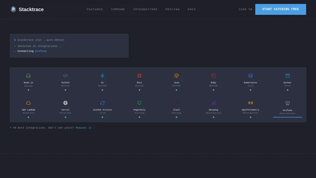
Integration logos appear one by one in a deploy-step aesthetic, reinforcing that the platform fits into the existing workflow. The reveal pacing mirrors the rhythm of a successful deployment, creating a moment of recognition for engineers who already use those tools in production. This section supports compatibility confidence without requiring verbose copy.
Social Proof Section
Testimonials from engineers and startup leaders appear with role, company context, and specific outcome metrics. Quotes are structured to speak to results, such as reduced mean time to resolution and fewer support tickets, giving the section the logical weight that technical buyers expect before they record a work email in a signup form.
Scroll-Reveal Progressive Layout
The entire page is built on a Launch Energy creative direction: maximum intensity at the top, decelerating into clarity as the visitor scrolls deeper. GSAP ScrollTrigger controls staggered reveals, counter animations, and the live error feed via a setInterval loop. Each section transitions from chaos to signal, mirroring the experience of watching a production incident resolve in real time.
Page sections overview
| Section | Purpose |
|---|---|
| Hero Dashboard | Live mock error feed with stack trace hover expand and resolution counter |
| Comparison Table | Animated metric drop-in versus legacy competitors with primary call-to-action |
| Integration Reveal | Sequential logo appearance showing framework and service compatibility |
| Noise Reduction Demo | Animated collapse of 10,000 raw errors into 12 grouped actionable issues |
| Social Proof | Engineer and CTO testimonials with specific outcome metrics |
| Footer | Linear single-row footer with secondary navigation links |
Design & branding system
The visual identity follows a Bold Brutalist theme built around a Slate and Sky color system. Every surface feels like a monitor glowing in a dark server room, with flat planes, hard edges, and monospaced type as the primary typographic voice.
- Colors: deep graphite (#1E2028) background, terminal slate (#2C3040) for card surfaces, atmosphere blue (#4A9EE5) for primary actions and severity badges, and cold sky white (#E8EEF4) for all body text
- Typography: JetBrains Mono for code labels, stack trace lines, and badge text; DM Sans for body copy and headings, creating a clear hierarchy between terminal output and human-readable context
Mobile & speed optimization
The template is designed desktop-first, reflecting the reality that backend engineers and DevOps professionals primarily work on workstations. Mobile fallback is fully structured so the page remains readable and functional for developers who check tools on the go.
- Client components handle the live error feed, comparison hover states, and stack trace expand interactions; static sections use server components to keep initial load lean
- GSAP ScrollTrigger animations degrade gracefully on smaller viewports, ensuring the scroll-reveal path stays coherent without breaking the layout or hiding critical conversion sections
How this template helps you convert
The page is structured around a Comparison and Versus conversion strategy. Every design and copy decision is aimed at reducing skepticism and lowering signup friction for a technical audience that does not respond to vague claims.
- The interactive header proves the product works before the visitor reads a single headline, placing a prominent action-oriented call-to-action button above the fold inside the live dashboard itself
- The animated comparison table anchors the second conversion point immediately after delivering concrete performance metrics, with a pinned call-to-action and a secondary path linking to an expanded benchmark breakdown
- The signup form asks only for a work email and primary language or framework, keeping friction lower than adding a console.log statement, with no credit card required to start
Other information about this template
This template is designed specifically for the error tracking and observability niche, where developers require technical depth before they trust a new tool. The content structure reflects how engineers actually evaluate software: they look at the stack, read the traces, check the integrations, and then decide. A stack trace is a list of the method calls the application was executing when an exception was thrown. Reading the first line of the stack trace shows you the exact function call that threw the error, and the lowest "Caused by" statement is often the root cause. Developer observability is a new pillar adapted specifically for developers, providing a direct connection between the source code and observable production behavior. Unlike traditional tools built for the DevOps team, developer observability tools can provide function-level root cause analysis without additional logging or configuration changes. They can add logs in production without changing the code, and they can capture snapshots of application state without breaking production threads.
- The template supports positioning around Java-based and multi-language stacks, with the ability to explain chained exceptions, call stack depth, and how a full stack trace reads across microservices
- Out-of-the-box language support positioning covers JavaScript, Python, Go, Ruby, and.NET, with the signup form collecting framework preference to personalize the onboarding path
- The comparison table section is pre-structured to reference well-known error tracking tools in the market, giving buyers the context they need to make an informed decision when choosing among the numerous options available
- Security and data privacy positioning, including mentions of data privacy practices and compliance signals, can be added to the footer or a dedicated trust row without restructuring the existing layout
- Source maps support can be highlighted in the noise-reduction demo section, showing how human-readable stack traces are recovered from minified production builds down to the exact line number
- Notifications via Slack, email, or webhooks and two-way sync with version control systems like GitHub can be featured in the integration reveal section to reinforce seamless workflow fit
- Performance monitoring context can be layered into the comparison table rows to broaden the positioning beyond pure error tracking toward full production observability
Theme
Bold Brutalist
Creative direction
Launch Energy
Color system
Slate & Sky
Style
Scroll Reveal (Progressive)
Direction
Comparison/Versus
Page Sections
Interactive Live Error Dashboard Header
Animated Comparison Table with Call to Action Anchor
Noise Reduction Demo Animation
Sequential Integration Logo Reveal
Social Proof Section with Metric-led Testimonials
GSAP Scroll-reveal Progressive Layout
Related questions
What kind of team is this template built for?
Can I adapt the comparison table for different competitors?
How does the noise-reduction demo section work visually?
Does the template support multiple programming language contexts?
Is the live error feed connected to a real backend?



