Stage — Pro Entertainment Hub Landing Page Template
Showrunner is a comparison table landing page template built for entertainment marketing automation platforms. It combines an interactive campaign dashboard preview, a sticky three-tier feature matrix, and a freemium sign-up flow into one dark-to-light scrolling experience. Studio marketers, streaming growth leads, and indie distributors can evaluate every plan tier and start a free campaign in minutes.
by Rocket studio
Quick summary
Showrunner is a single-page comparison table template for entertainment marketing automation platforms. It opens with a live-rendered campaign dashboard preview, walks visitors through a sticky three-column plan matrix, and closes with a freemium sign-up flow. The dark-to-light Slate and Sky color system gives the page a control-room aesthetic that feels built for launch night.
Who this template is for
This template is designed for entertainment technology companies that need to communicate complex, multi-tier platform value to a sophisticated marketing buyer. It speaks directly to people who live inside campaign dashboards and make budget decisions.
- Studio marketing leaders managing tentpole release windows across multiple channels
- Streaming platform growth teams running trailer A/B tests on TikTok and connected television
- Indie distributors converting festival momentum into opening-weekend ticket sales
What problem this template solves
Entertainment marketers often juggle audience targeting, creative scheduling, and cross-channel reporting across many separate tools. A fragmented setup slows decisions and burns time before a release window closes.
- No single page clearly shows what each plan tier includes versus excludes
- Buyers leave without converting because they cannot verify feature depth before signing up
- The free tier goes unnoticed when the sign-up flow feels gated or complicated
What you get with this template
This template delivers a complete, section-led landing page structure ready for an entertainment marketing automation product. Every component is defined and purposeful.
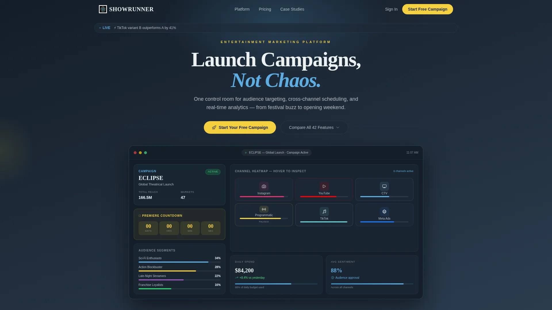
- An interactive browser-rendered campaign dashboard in the header with a live countdown clock and channel heatmap
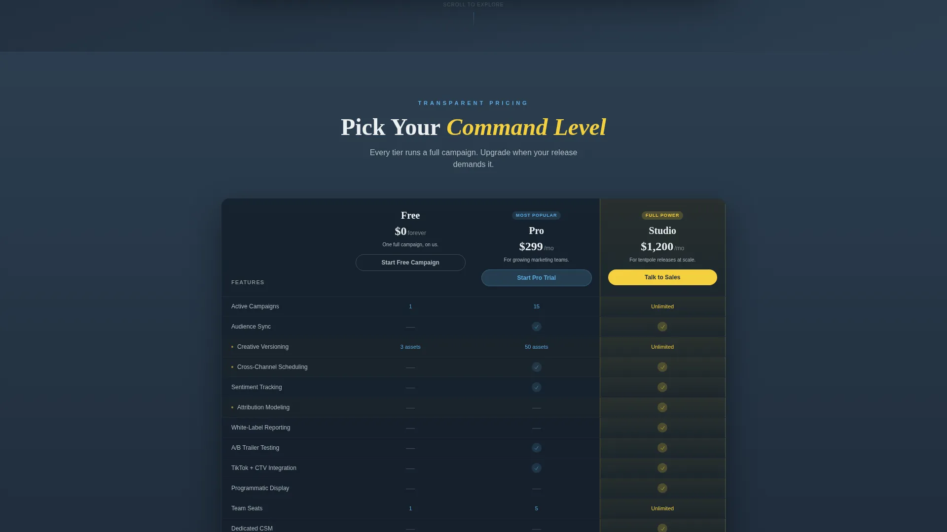
- A sticky three-column comparison table covering Free, Pro, and Studio plan tiers with expandable full-depth view
- A two-step freemium sign-up form and three strategically placed calls to action across the page
Feature list
This template ships with six purpose-built components. Each one is designed to carry a specific conversion job on the page.
Interactive Campaign Dashboard Header
The header renders a functioning miniature campaign dashboard directly in the browser. Visitors see a mock tentpole film campaign with live-updating audience segments, a channel heatmap across Instagram, YouTube, connected television, and programmatic display, and a countdown clock. Hovering any channel tile flips it to reveal impressions, cost per thousand impressions, and sentiment score.
Sticky Three-Tier Comparison Table
The comparison table locks to the top of the viewport as visitors scroll. It displays Free, Pro, and Studio columns side by side with rows covering audience sync, creative versioning, cross-channel scheduling, sentiment tracking, attribution modeling, and white-label reporting. Sky-blue checkmarks and slate dashes keep the table scannable at a glance.
Cinematic Feature Deep-Dive Sections
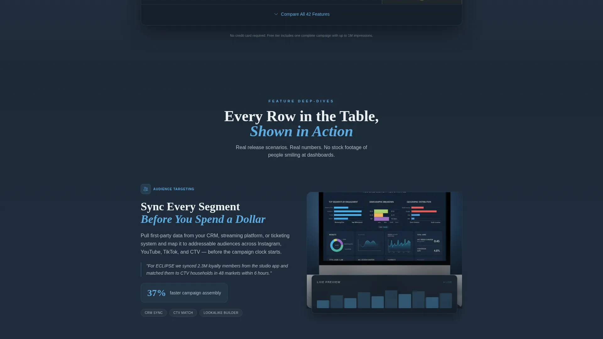
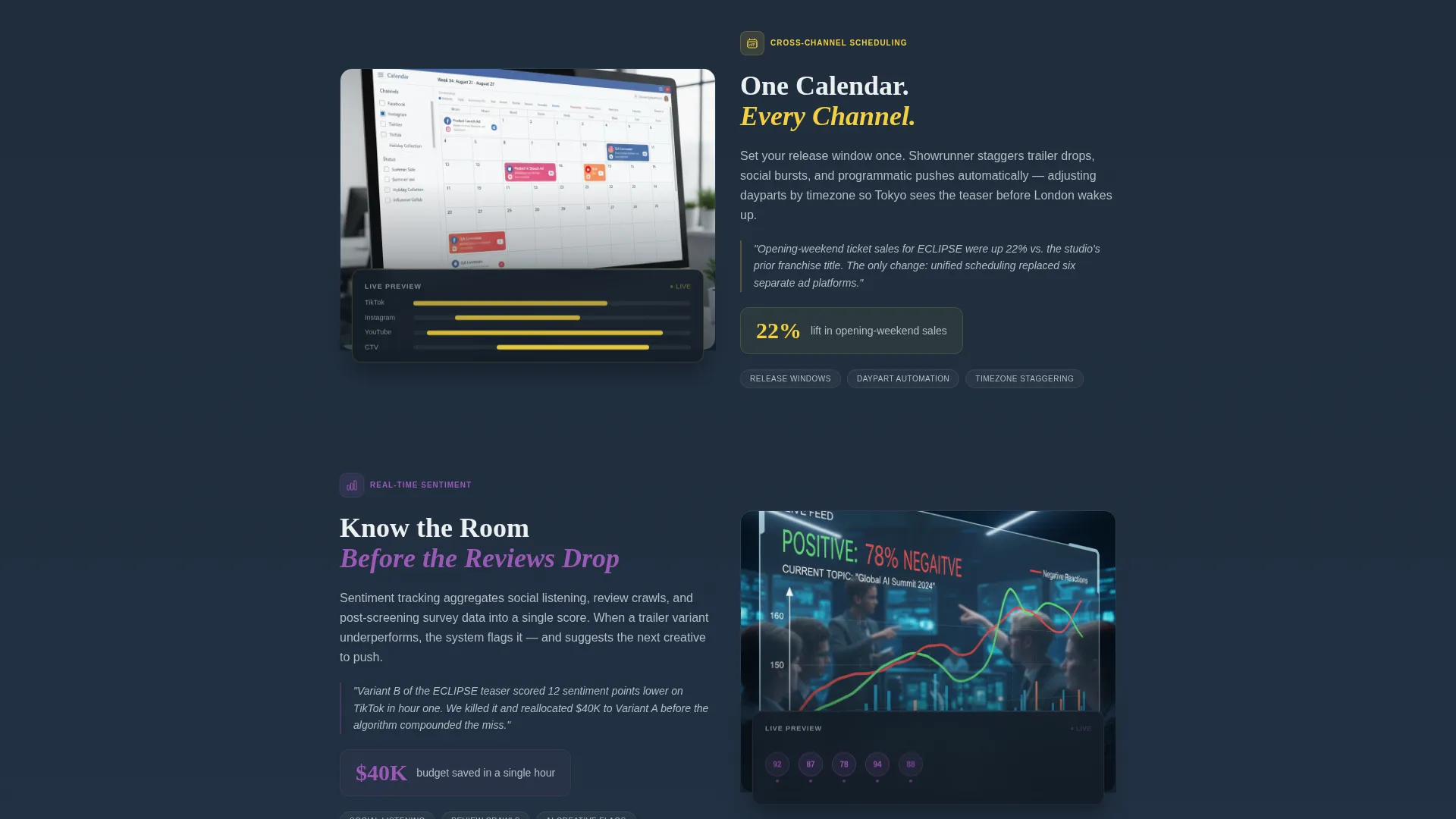
Each row in the comparison table links to a dedicated section below the matrix. Every deep-dive section includes a short looping animation of the feature in action, a one-sentence use case drawn from a real release scenario, and a supporting performance metric such as "37% faster campaign assembly."
Expandable Full-Feature View
A secondary call to action labeled "Compare All 42 Features" expands the comparison table to show every available row. This serves the methodical buyer who needs complete feature parity before committing to a plan or starting a trial.
Two-Step Freemium Sign-Up Form
The primary call to action opens a two-step form. Step one captures work email and company name. Step two asks for campaign type, choosing from film, series, live event, or music, and expected monthly ad spend range. No credit card is required at any point.
Triple Call-to-Action Placement
The "Start Your Free Campaign" button appears three times: pinned inside the Free column header, floating after the feature deep-dive sections, and anchored in the final footer. Repetition ensures the conversion point is always visible regardless of scroll depth.
Page sections overview
| Section | Purpose |
|---|---|
| Interactive Dashboard Header | Demonstrates the platform live before any text explanation |
| Headline and Subheadline | States the core value proposition above the dashboard preview |
| Sticky Comparison Table | Lets visitors evaluate all three plan tiers side by side |
| Feature Deep-Dive Blocks | Unpacks each table row with animation, use case, and metric |
| Expandable Full Matrix | Satisfies detail-oriented buyers with complete feature rows |
| Freemium Sign-Up Form | Captures lead data across two lightweight steps |
| Footer call to action Block | Provides a final dark-slate conversion anchor at page end |
Design & branding system
The visual identity follows a Directory and Discovery theme expressed through a Slate and Sky color system. The palette moves from dark infrastructure at the top to open sky at the bottom, so the page literally brightens as the product reveals itself during scroll.
- Core colors: deep broadcast slate (#1E2A38), control-room charcoal (#2C3E50), open-sky blue (#5DADE2), and signal white (#ECF0F1) for text and dividers
- Accent color: premiere gold (#F4D03F) applied to toggle switches, active plan highlights, and hover states to direct the eye toward key decisions
- Background progression: charcoal at the top fades into slate, then opens into sky blue as visitors scroll toward the sign-up section
Mobile & speed optimization
The template is structured to remain fully functional and readable on smaller screens. The sticky comparison table and interactive header are each built with responsive layout behavior in mind.
- The sticky comparison table reflows gracefully so plan columns remain legible on narrower viewports
- Channel heatmap tiles and hover-flip interactions are adapted for touch so mobile visitors still experience the core product demo
How this template helps you convert
The page is engineered around a freemium model where the product demonstrates its value before any sales conversation happens. Every structural decision serves that conversion goal.
- The interactive header turns the first five seconds into a product experience rather than a marketing pitch, so visitors understand the platform immediately and stay on the page longer.
- The sticky comparison table keeps plan options visible throughout the scroll, reducing the need to navigate back before making a decision.
- The two-step sign-up form lowers friction by asking only for role-relevant information and removing the credit card requirement entirely.
Other information about this template
This template fits naturally within the entertainment software and SaaS category, particularly for teams building or marketing campaign management tools aimed at the film, television, and live events industries.
- The template style is a Comparison Table, making it suitable for any platform product that needs to communicate tiered pricing or feature parity clearly
- The creative direction follows a Feature Matrix structure, meaning each platform capability gets both a table row and a dedicated cinematic deep-dive section
- The header concept is an Interactive Preview, which positions the product demo as the first thing a visitor experiences rather than static screenshots or written claims
- The freemium and trial landing page direction is built into the page architecture, with no-credit-card messaging reinforced at every call-to-action placement
Theme
Directory & Discovery
Creative direction
Feature Matrix
Color system
Slate & Sky
Style
Comparison Table
Direction
Freemium/Trial
Page Sections
Interactive Browser-rendered Dashboard Header
Sticky Three-column Plan Matrix
Cinematic Feature Deep-dive Sections
Expandable Full-depth Feature View
Two-step Freemium Sign-up Form
Triple Call-to-action Architecture
Related questions
Does this template require a real working platform to launch?
Can I adjust the plan tier names and feature rows in the comparison table?
How does the two-step sign-up form connect to my tools?
Who is the free tier positioning designed for?
Is the expanded full-feature view customizable?



